Feedback on double page spread
-
It is awesome, love it
-
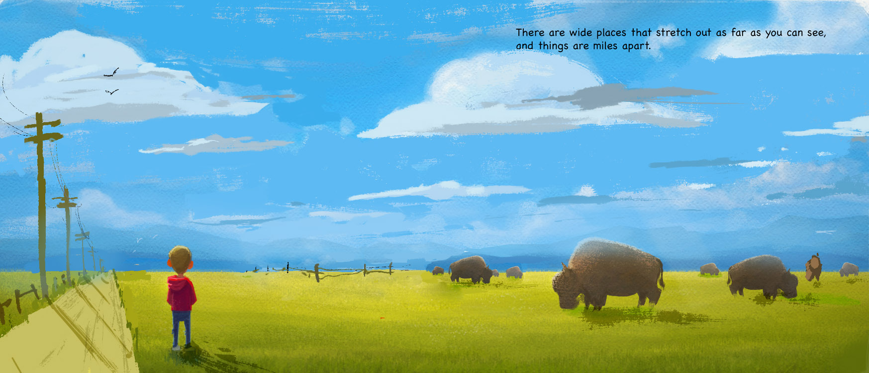
@natiwata This looks great Nat - i think you might be done so i hope i am not annoying you with this feedback - i really liked the original and all of the changes you've made too - but something on this new version that really jumps out at me is that the Bison look like they are the same animal cut and pasted at different distances - small head tilts and two tail shapes but otherwise the same - the variations of poses on the previous paintings looked more natural to me -
-
This looks great, as always!
-
This is why I love this school, we post, others see things we don't and we can only grow from it
-
Really nice! With this subject matter, I would consider using some perspective. Maybe spread out the clouds and layer them a bit. Group the buffalo together. This will give you more compositional elements and design options.
-
@Kevin-Longueil Thanks Kevin, and yeah I totally cut and pasted then slightly modified the bison! I meant to go back and add a few more variations and some at different angles but haven't yet, good call.
@Imrush @NoWayMe Thanks for the comments, it's great to grow and see things improve with everyone's help.
@Lee-White - Thanks for the suggestions, I do see that some of the elements of the composition may be too evenly spaced. Part of this illustration in the larger book idea is that this is a remote place, in the wilderness, so I'm wondering what I can use instead of man made things like roads, poles or fences out on the pains? Maybe make the clouds more sweeping toward the camera...or variation in the grass? Hmm...
-
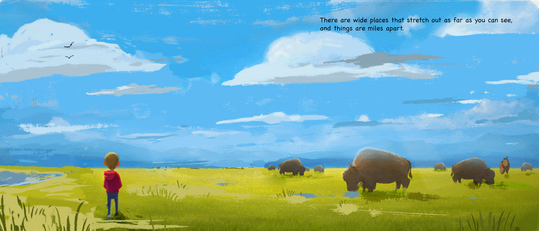
sure, those ideas should work. Just think of overlapping things and varying the shapes and spacing as things go back. Here's another option with maybe some puddles and a body of water...
SVS Faculty Instructor
www.leewhiteillustration.com -
@Lee-White Thank you for the feedback, lightning fast! Water, accentuating foreground grass, birds I really like these ideas, and they make the image less boring but keep it serene.