Society of Visual Storytelling

    SVSLearn Forums

    • Register
    • Login
    • Search
    • Recent
    • Tags
    • Popular
    • Users
    • Groups
    • Search

    Book project (June 17th updates!)

    Projects
    15
    47
    21972
    Loading More Posts
    • Oldest to Newest
    • Newest to Oldest
    • Most Votes
    Reply
    • Reply as topic
    Log in to reply
    This topic has been deleted. Only users with topic management privileges can see it.
    • NoWayMe
      NoWayMe last edited by

      Thank you @Marsha-Kay-Ottum-Owen, looking at it back, I think you are right, I will have to revisit the 3rd one!

      noemiegionetlandry.squarespace.com
      noemie_illustration on Instagram

      1 Reply Last reply Reply Quote 0
      • NoWayMe
        NoWayMe last edited by

        Hello again everyone!

        I reworked this composition a little and I think I am satisfied with it now! Any thoughts before I start cleaning it ? I kept the same basic comp, but try to improve the depth as @Marsha-Kay-Ottum-Owen suggested based on the 3rd comp I posted previously.

        0_1463486018249_Ella P2 (Copyright) - 3.jpg

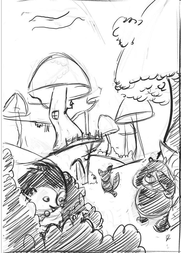
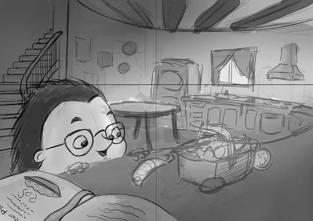
        Also, I started cleaning up another sketch for the book and wanted your opinion on it. I didn't post thumbnails and comp sketches for this one because... well I can't really post thumbnails for all the sketches of the book because I will overload the forum haha! But I would really like your opinion on it before I finish cleaning it! There will be text in the upper left and lower right corner (I was thinking of having reverse white over dark text). Also, it's a double page spread. Thanks!!

        0_1463486334582_Ella P4-5 Spread Kitchen 2.jpg

        noemiegionetlandry.squarespace.com
        noemie_illustration on Instagram

        mattramsey MOO 3 Replies Last reply Reply Quote 1
        • mattramsey
          mattramsey @NoWayMe last edited by mattramsey

          @NoWayMe I like it a lot. Depending on the final style you are going for you could maybe push the forms a tiny bit more to make them more whimsical*. You are already kind of doing it (for example: the window and refrigerator are not exactly perfect squares, etc.) but you could probably push the stairs a bit more (it's looking a little more "exact" than the other objects).

          Obviously the really tricky thing is to walk the line between "whimsical form" and "this artist doesn't really know how to draw" but when it's done well it adds so much charm and interest.

          *Does that make sense? I can try and explain it better if it doesn't.

          https://www.inprnt.com/gallery/mattramsey/
          https://mattramsey.artstation.com/
          https://twitter.com/mramseyART

          1 Reply Last reply Reply Quote 0
          • NoWayMe
            NoWayMe last edited by

            Hi @mattramsey ! It does make sense and I definitaly want it to be more whimsical! I noticed this morning that in the process of trying to get the perspective right on my staircase, it lost it's charm! I will definitaly work on that, thank you 🙂

            noemiegionetlandry.squarespace.com
            noemie_illustration on Instagram

            1 Reply Last reply Reply Quote 0
            • MOO
              MOO SVS OG @NoWayMe last edited by

              @NoWayMe I like this composition a lot and I think that the other one is good too. I'm not an expert but I like what you're doing 😉

              Marsha Ottum Owen

              1 Reply Last reply Reply Quote 0
              • NoWayMe
                NoWayMe last edited by

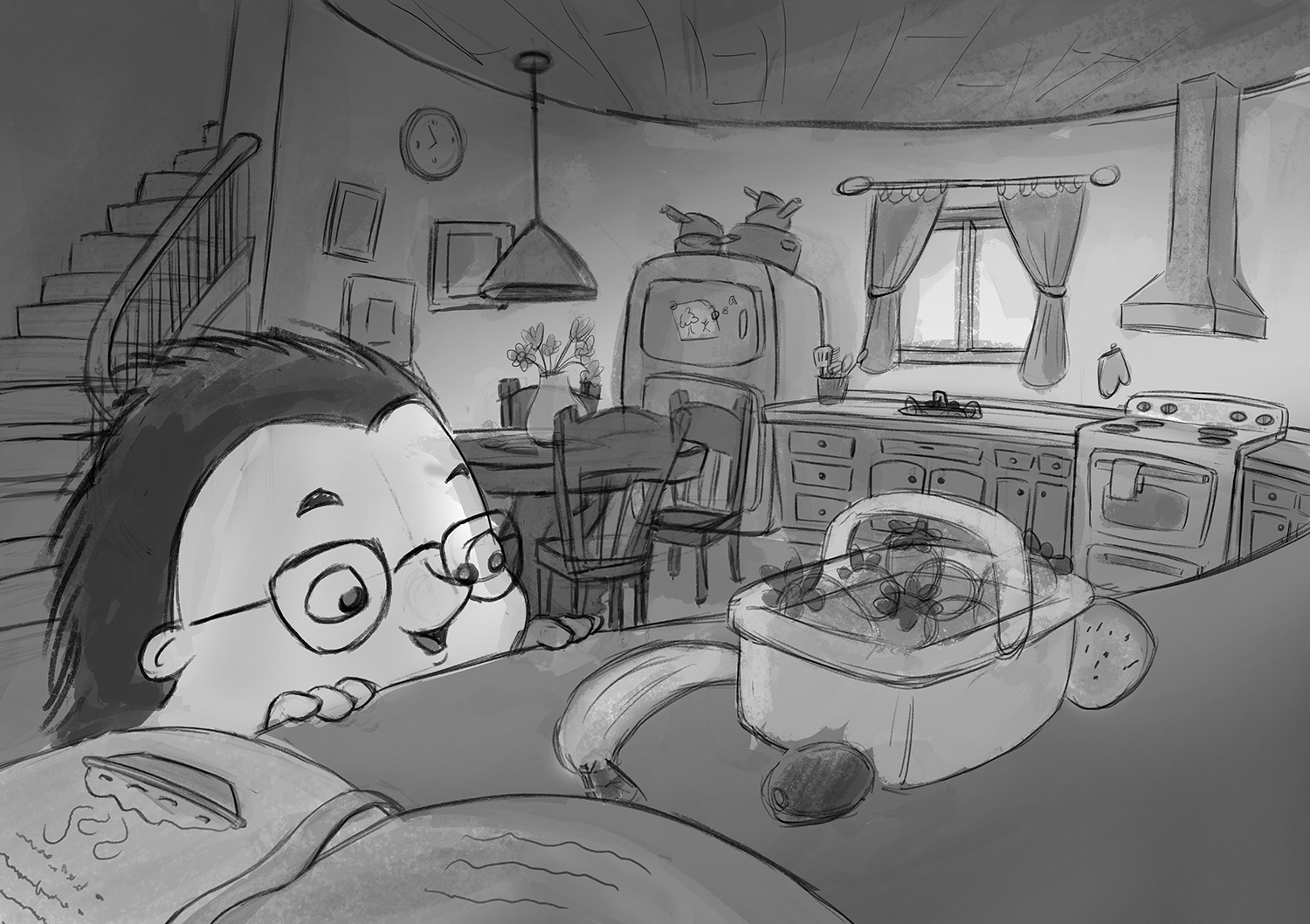
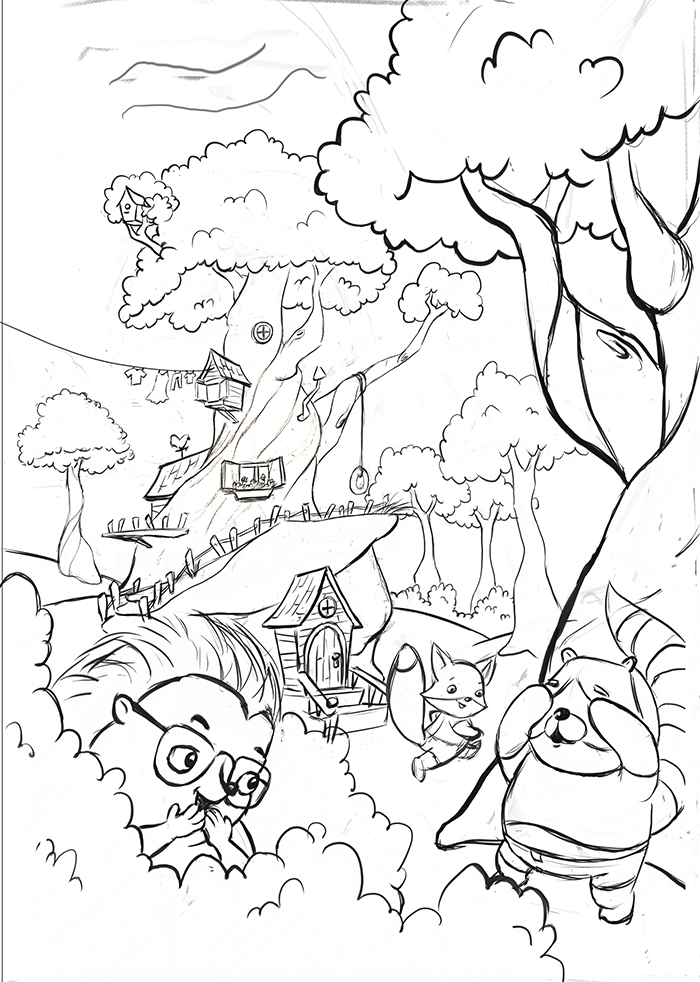
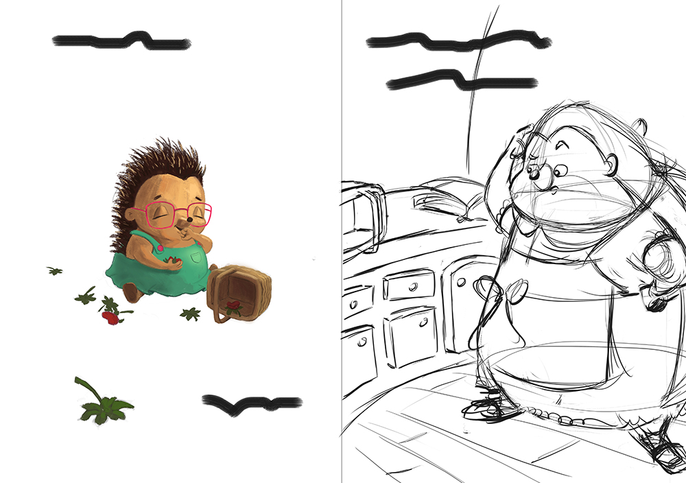
                Here is my semi-final sketch for this illustration, please if you see anything wrong with composition/perspective/or anything else, let me know! @mattramsey , I tried to make the stairs (and the whole image) more whimsical, is it working ?!

                I also decided I would try to incorporate @Will-Terry 's 50 item challenge in this, I don't know if I have 50 items yet, but I am probably close. I will try to keep values grouped in the background so these items don't distract from my focal point.

                Thanks for helping 🙂

                0_1463627119827_Ella P4-5 Spread Kitchen 4.jpg

                noemiegionetlandry.squarespace.com
                noemie_illustration on Instagram

                smceccarelli mattramsey 2 Replies Last reply Reply Quote 5
                • smceccarelli
                  smceccarelli Pro SVS OG @NoWayMe last edited by

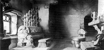
                  @NoWayMe It is a really nice sketch! I think composition works well, perspective is nearly there (there a few deviations here in there, but I do not think it is noticeable and probably you do not want it to be too perfect either), but I am not sure the whimsy is coming across. It looks still too much like a standard kitchen, maybe? Have a look at some of the interior design that was done for "Snow White and the Seven Dwarfs" - I am posting a bunch of images here if I manage:
                  2_1463632372074_image.jpeg 1_1463632372074_image.jpeg 0_1463632372073_image.jpeg

                  1 Reply Last reply Reply Quote 1
                  • mattramsey
                    mattramsey @NoWayMe last edited by

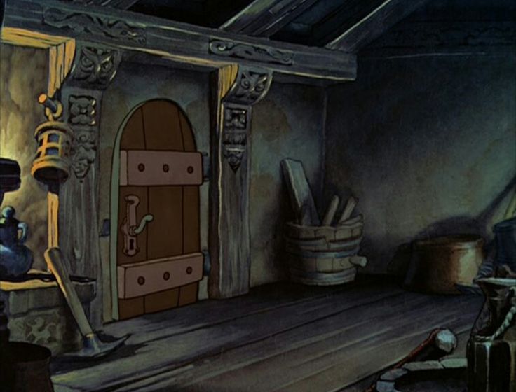
                    @NoWayMe I like it. This guy lives in a tree if I'm getting that right? If so maybe the stove fan could be brick or river rock? And maybe the light fixture could be changed to something that would fit that environment more.

                    But if you don't make any changes it's still a great piece--nice job on the stairs!

                    https://www.inprnt.com/gallery/mattramsey/
                    https://mattramsey.artstation.com/
                    https://twitter.com/mramseyART

                    1 Reply Last reply Reply Quote 1
                    • NoWayMe
                      NoWayMe last edited by

                      @mattramsey and @smceccarelli Thank you so much for helping! These pictures of snow white are really helpful and Matt's ideas are great! I already started to make some changes and I think it will look a lot better 🙂 I will post updates tonight!

                      noemiegionetlandry.squarespace.com
                      noemie_illustration on Instagram

                      1 Reply Last reply Reply Quote 0
                      • NoWayMe
                        NoWayMe last edited by

                        Here it is, more whimsical (I hope!) 🙂

                        Thank you very much @smceccarelli and @mattramsey for the tips! I think it looks a lot better. I will refine it more, and add details, but I like the direction it's taking!

                        If anyone else has comments, please go ahead!

                        0_1463711880251_Ella P4-5 Spread Kitchen 5.jpg

                        noemiegionetlandry.squarespace.com
                        noemie_illustration on Instagram

                        1 Reply Last reply Reply Quote 3
                        • smceccarelli
                          smceccarelli Pro SVS OG last edited by

                          Definitely, the environment has a lot more personality now!

                          1 Reply Last reply Reply Quote 0
                          • evilrobot
                            evilrobot SVS OG last edited by

                            Fantastic work so far. Love the old time stove and also how you have the room rounded. Really nice.

                            http://www.palacioillustration.com/

                            https://www.scbwi.org/illustrator-gallery/illustrator-detail/?illustrator_id=84142

                            https://www.pinterest.com/evilrobot2/pins/

                            https://twitter.com/MyEvilRobot

                            1 Reply Last reply Reply Quote 1
                            • Dulcie
                              Dulcie SVS OG last edited by

                              I think it's looking really nice - spacious but homely all at once.. it's quite tricky to get that feeling of character into inanimate objects but you've done it...it's going to be great 🙂

                              www.dulciemascord.com
                              https://www.instagram.com/dulciemascord
                              https://twitter.com/dulciemascord
                              https://www.facebook.com/dulciemascord

                              1 Reply Last reply Reply Quote 1
                              • Christine Garner
                                Christine Garner last edited by

                                Well done getting the project, I love the designs on this so far.

                                website: https://thimblefolio.com

                                1 Reply Last reply Reply Quote 1
                                • NoWayMe
                                  NoWayMe last edited by

                                  Thank you @smceccarelli , @evilrobot @Dulcie @Christine-Garner ! I'll continue to post updates! 🙂

                                  noemiegionetlandry.squarespace.com
                                  noemie_illustration on Instagram

                                  1 Reply Last reply Reply Quote 0
                                  • NoWayMe
                                    NoWayMe last edited by

                                    Hello again!

                                    I wanted to share updates of the progress on my book with you guys! I know it's moving slowly, but I in the process of moving, starting a new job and studying for my final exam at the same time! Please let me know if you have any advices/comments 🙂

                                    Thanks a lot!

                                    First my updated "template". As I said in my other topic, I will change either the front cover or page 10-11 to not have the same image twice, I am just not sure which one yet!
                                    0_1466218504849_Ella - Template 17-6-2016.jpg

                                    0_1466218629806_Ella P3 V2.jpg

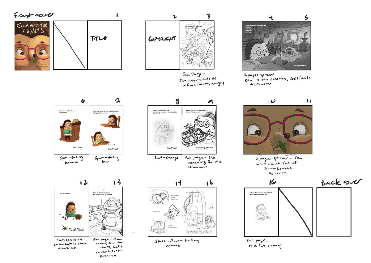
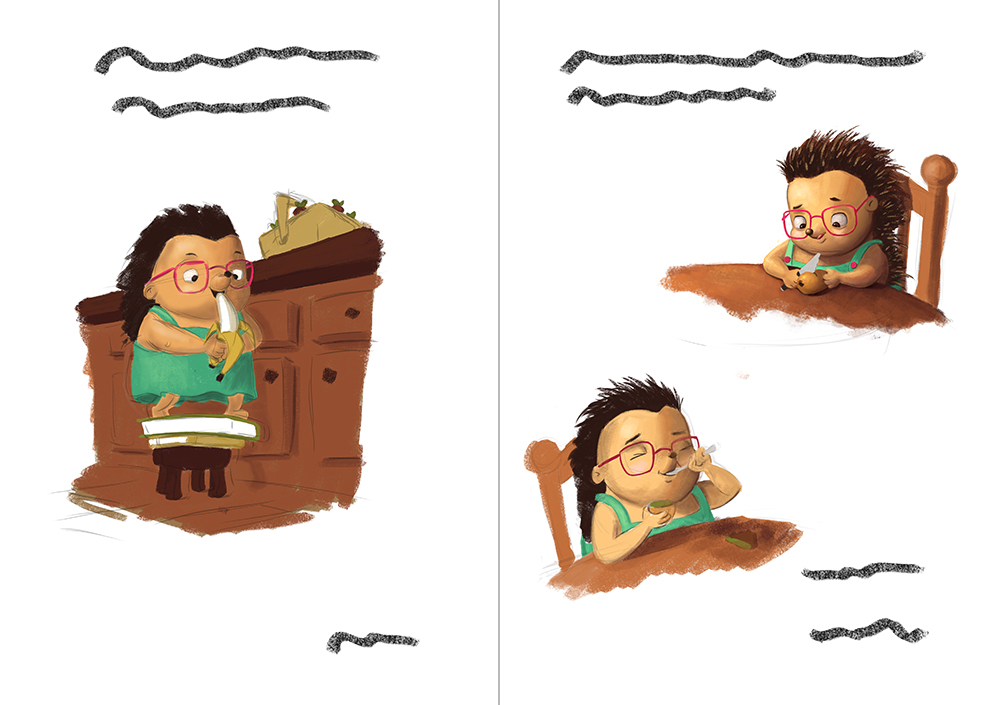
                                    On the next one, the banana-eating and the bottom kiwi-eating Ella are not finished.
                                    0_1466218649243_Ella P6-7 Banana Kiwi.jpg

                                    0_1466218724690_Ella P12-13 Straw + Mom2.jpg

                                    Thanks for helping!!

                                    noemiegionetlandry.squarespace.com
                                    noemie_illustration on Instagram

                                    1 Reply Last reply Reply Quote 5
                                    • Chip Valecek
                                      Chip Valecek SVS Team SVS OG last edited by

                                      Its looking great, I can tell you are putting in a lot of work. I would watch pages 10 and 11 where the gutter will cut the nose right done the middle.


                                      https://www.instagram.com/chipvalecek/
                                      https://www.facebook.com/cvalecek
                                      http://www.cshellmedia.com/

                                      1 Reply Last reply Reply Quote 1
                                      • NoWayMe
                                        NoWayMe last edited by

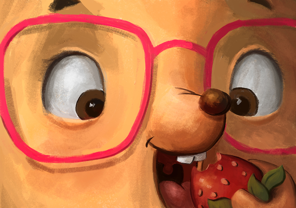
                                        I made this new illustration for page 10-11 (still a work in progress)! I wanted to keep the close-up view of Ella, because it goes well with the text, but I change it so it is different from the cover AND I made sure no important features of the face is in the $&%#* gutter.

                                        Any thoughts? Is it too similar to the cover ?

                                        Thanks!!

                                        0_1466307624477_Ella P10-11 Spread3.jpg

                                        noemiegionetlandry.squarespace.com
                                        noemie_illustration on Instagram

                                        Kevin Longueil 1 Reply Last reply Reply Quote 1
                                        • Kevin Longueil
                                          Kevin Longueil SVS OG @NoWayMe last edited by

                                          @NoWayMe This very cool Noemie! what jumped out at me on this was the shadows above the eyes. I think it might be worth looking at to go warmer there - i am unsure of myself here but i think so - i tried it with two quick swipes with a low opacity brush in Procreate and i think it looks nice with warmer shadows - The warmth under the nose is what made me think of this - anyways - really looking forward to seeing your book!!0_1466309821511_warmer?.jpeg

                                          Portfolio: kevinlongueil.com
                                          https://www.instagram.com/kevinlongueil/

                                          1 Reply Last reply Reply Quote 1
                                          • Dulcie
                                            Dulcie SVS OG last edited by

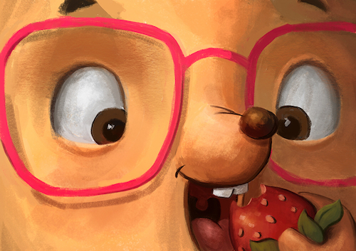
                                            It's looking fantastic @NoWayMe! As @Chip-Valecek said, it definitely shows that you're putting the work in and your sketches/WIP all look great. Your Ella really does love fruits!! So many scenes of her enjoying eating 🙂

                                            I also agree with Chip about the gutter on pages 10/11, I can see how your new version is trying to avoid this, but I wonder if there is another solution that doesn't look so much like the cover...

                                            With the strawberry section, correct me if I'm wrong (as I can't quite read the text) but story-wise it looks like you essentially have 4 pages of this - on page 9 she is about to eat the strawberries, then 10-11 she is eating a strawberry, and the next page eating more strawberries...so page 12 is kinda repeating pages 10 and 11. The other thing I wonder about, is that since it is Ella and the Fruits, the fruits must be important story-wise but we haven't had any super close-ups of them. So I wonder if on 10-11 you could have a super close up of her holding the strawberry, a beautiful, glistening, perfect strawberry...and she is holding it up so the strawberry is in the foreground, it is so tempting - too tempting!...then on page 12 she is munching the whole lot 🙂

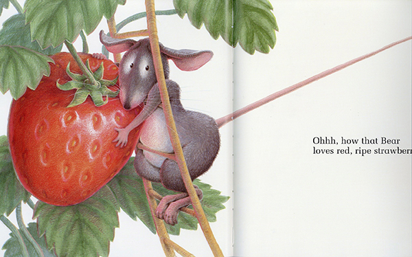
                                            Did you ever read the Big Hungry Bear and the Red Ripe Strawberry? That one has some lovely pictures of this massive juicy strawberry that the mouse so badly wants to keep for himself..here's a spread from it 🙂

                                            0_1466459081053_strawberry-web.jpg

                                            Anyway just thoughts (feel free to ignore!) and looking forward to next instalment 🙂

                                            www.dulciemascord.com
                                            https://www.instagram.com/dulciemascord
                                            https://twitter.com/dulciemascord
                                            https://www.facebook.com/dulciemascord

                                            NoWayMe 1 Reply Last reply Reply Quote 1
                                            • First post
                                              Last post