The yukky stage
-
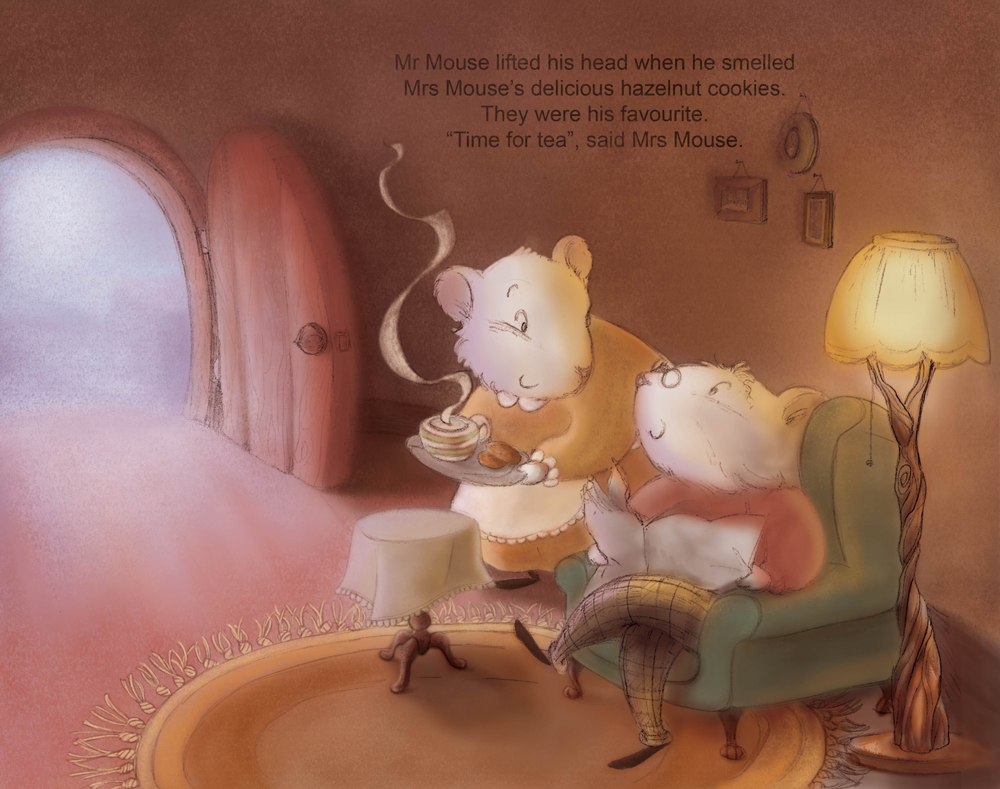
The yukky stage.
Every time I get there, I find it hard to trust myself to continue and manage to get somewhere, all I want to do is throw everything in the bin and start again. I get caught in it and cannot see anything but the yuk
How can you know if it's a good looking yukky stage or a bad looking one? How can you know that it's going to lead you somewhere good ot that you're just wasting your time?
I don't like showing this stage but you might be able to help me, so there you go
-
Hoping someone can shed some light on this for us, I feel this way too.
-
There is a relatively famous graph that shows the progress of any worthy endeavor or project. It goes something like this:
- This is going to be awesome
- This is more difficult than I thought
- I do not know what I am doing
- This is terrible
- I am terrible
- Maybe this is going somewhere after all
- It is finished and it is not as bad as I thought.
The majority of people apparently drop the project between stage 4 and 5 and never finish anything. The successful people go through stage 4 but skip stage 5 - they never loose confidence in themselves, no matter how bad it looks.
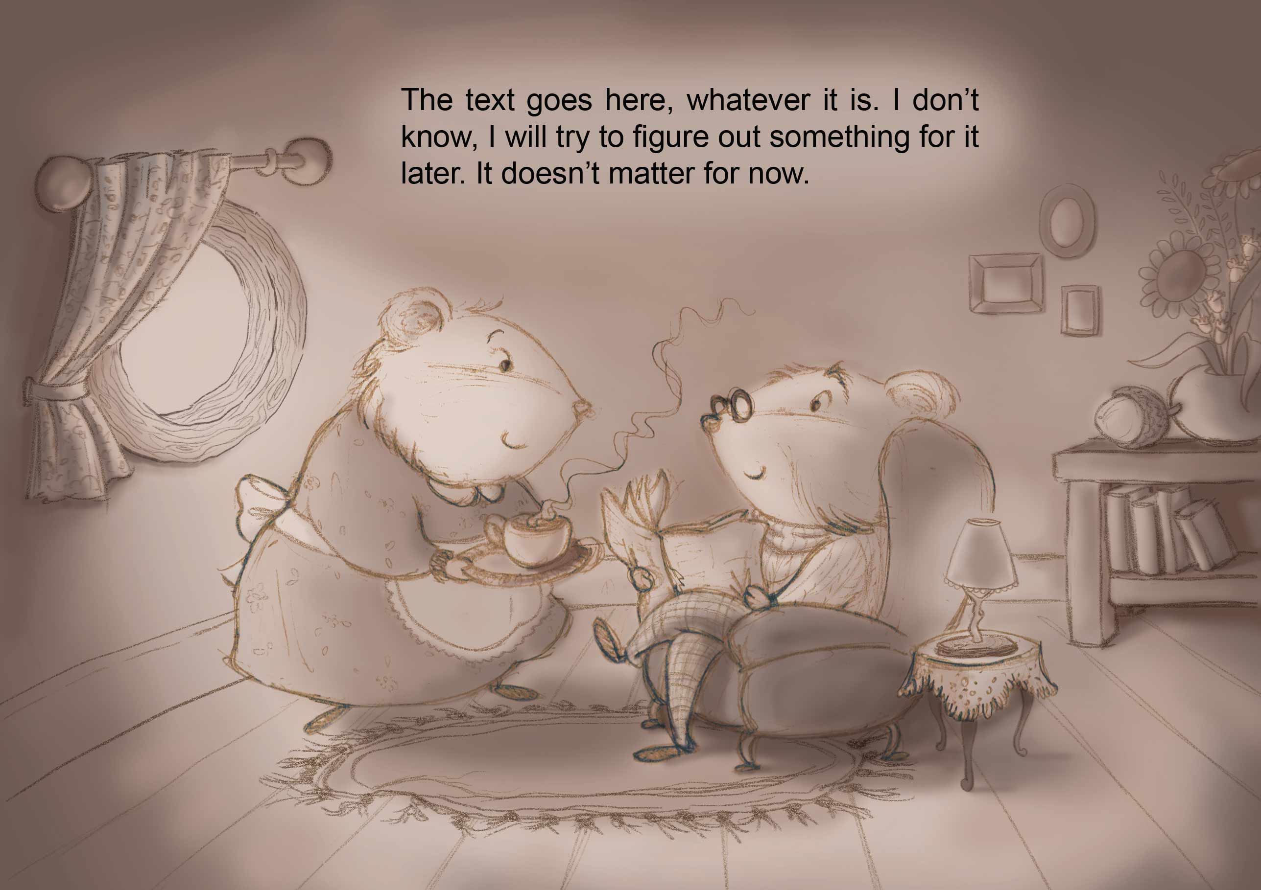
So - every piece I have ever made went through stage 4. Sometimes I also go to stage 5 for a few days at a time (and I stop working). But I am learning to pull through to 7 more often than not. So keep going! I think this is actually a pretty good base and I would consider it a very solid underpainting!
-
I have heard that one @smceccarelli and it makes me smile every time! Definitely worth remembering when we're feeling terrible about our work/ourselves as artists.
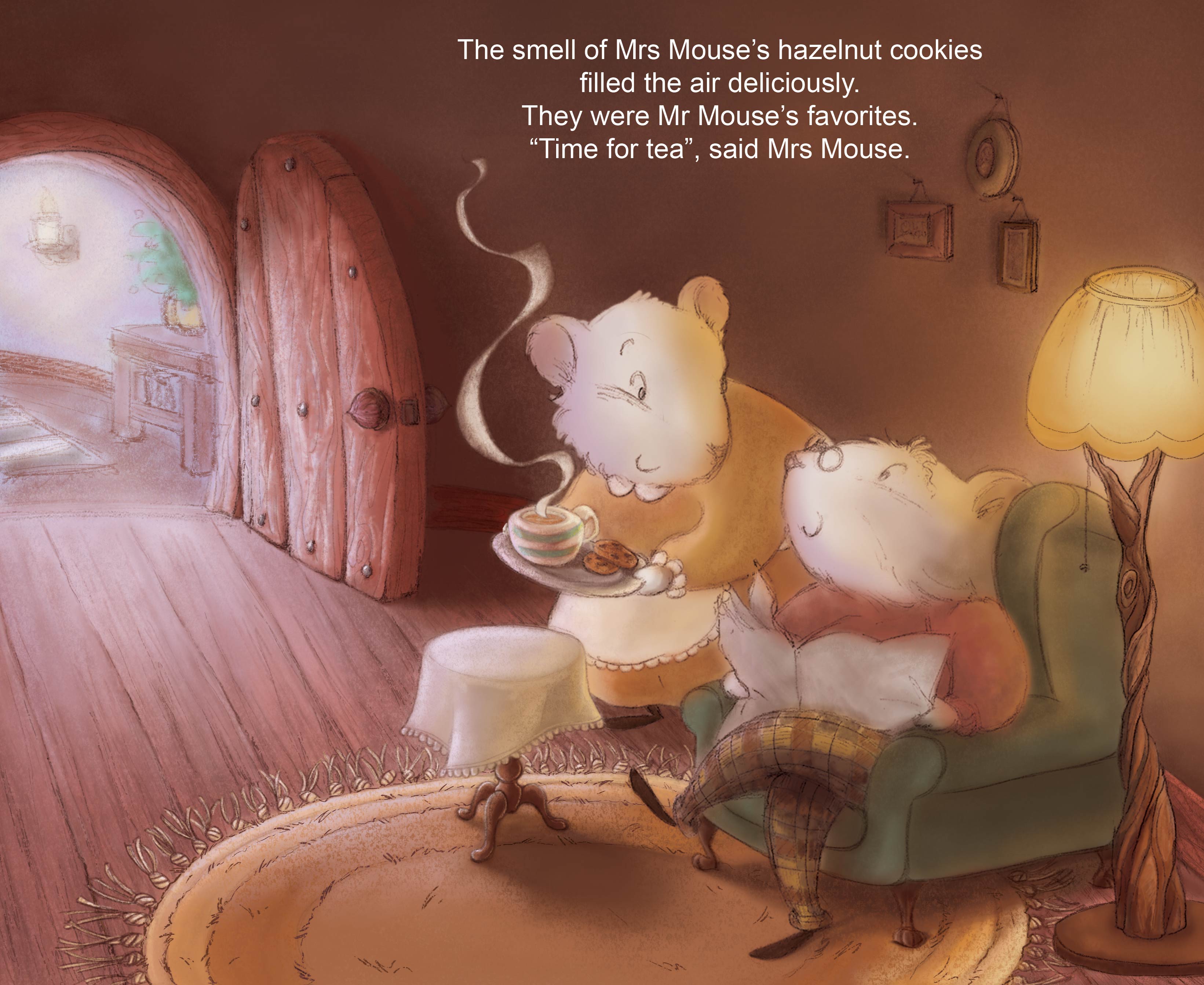
I'd add that if you have done the groundwork thoroughly - ie doing the sketches and making sure that the composition and values work well - then you should trust that it is going to be a good piece in the end. And I can see in your piece that the values work well - for example the highest contrast is at the focal point, with the white mice heads against the dark part of the room, and the little steaming cup of tea against the darkness...all of those things are working well and they're going to work even better once you're done. Other things like the yellow glow of the lamp vs the white light of the doorway...all nice things that will really be brought out by the finish. You just need to keep going and push through
") Do keep us updated!
Do keep us updated! -
How can you know if it's a good looking yukky stage or a bad looking one? How can you know that it's going to lead you somewhere good ot that you're just wasting your time?
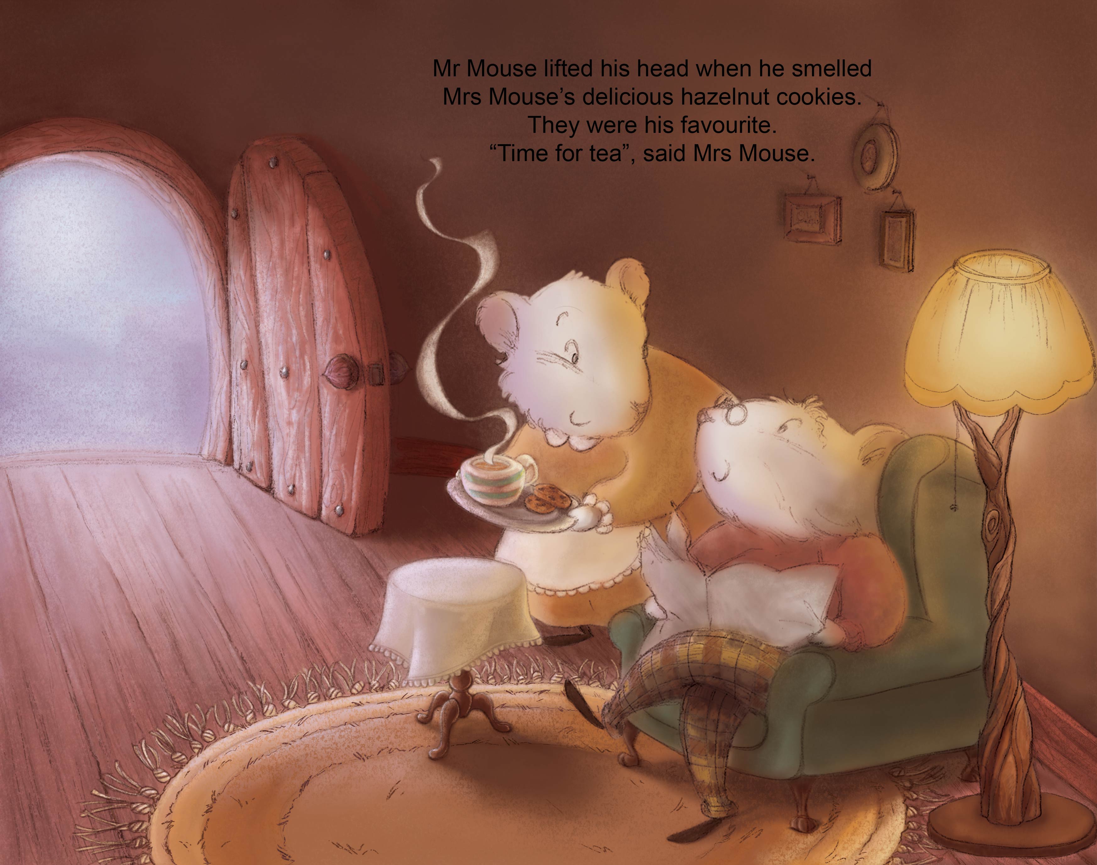
On the one hand, you're right that if there are serious, major composition errors in a picture, no amount of "rendering" will compensate. That's one reason why thumbnailing and preliminary value/color sketches are a part of so many artists' methods. However, it's also true that good pictures go through the unfinished stages, and you can't let yourself get too psyched out by that and give up.
However, that leaves the question: how do I know whether any given image has those fundamental problems that require a more severe reworking? For that, there are a few things to consider:
-
Could another person look at this image and tell roughly what's going on? This question applies more to very dynamic images where a lot is going on and there's not a single well-framed focus for the reader's attention. This question applies to "all over the place" pictures. The example you posted is NOT that sort of image, and it seems very clear to me what is happening in your picture.
-
Is there a clear establishment of values, based on a believable lighting scheme? The image you posted seems fairly well-thought-out in lighting: there are two light sources, one warm (the lamp) and one cool (the outside light coming in through the door). The characters and the space appear to be lit by those light sources, and nothing looks too horribly wrong given the lighting set up you've chosen. There are some good details that help the believability, like the cast shadows from the picture frames in the background.
- *One tip for checking your values in Photoshop -- don't use "Desaturate" or a Hue/Saturation adjustment layer with Saturation turned all the way down. It will not give you the correct values for your underlying colors! Instead, do this (apologies for linking to my own site): http://magicscience.tumblr.com/post/117948140162/easy-grayscale-preview-in-photoshop-keep-track
- Are the colors harmonious and within a unified scheme? Your sample image is very strong in this regard. The palette is within a nice range of warm, related hues. The cooler outlying colors (the blue of the outdoor light, the green of the chair) are less saturated and pulled more towards the neutral center of the color wheel, which keeps them in harmony with the dominant palette. You don't have any clashing, vibrating colors that stick out horribly.
Given that your image satisfies those three questions pretty well, I think you are doing OK. The next step in that case is to get more refined in terms of values. You could stand to push some of your darks darker in the corners (occlusion). Any place where something is touching something else, it's hard for light to get in. That's the source of a lot of the "lines" we see in the world, like where people's lips touch, or where a foot meets the ground. In your image, that includes the places where the mouse's head/shoulders touch the back of the chair. You've got a perfect one right on the bottom of the lamp's base. That small, intense shadow is a perfect example of an occlusion shadow. Those tend to do a lot of work in communicating the believability of the lighting.
I'd also suggest you refine your edges and transitions. Right now, you have a lot of soft edges/transitions, even in places that are hard corners. For example, the door is painted very softly, but the plane changes on that object should be firmer. Same thing with the armchair: the front plane of the chair should be more defined. Soft, airbrushy edges everywhere have a tendency to look messy and soupy. The firmer edges you already have, like the tops of the mice's heads against the dark background, are the strongest and clearest parts of the image. As you bring more definition to the interior of each character (like where the newspaper meets the mouse's red shirt; or where the seated mouse's head meets the other's dress), it will improve the overall image.
It's possible to get really fussy with all these things, but given the drawing style, you can afford be restrained in how far you push your form rendering. Sometimes you can have very well-painted lighting and form, but it looks weird because the painting style doesn't fit the aesthetic of the drawing.
There are some perspective issues in your drawing, but they're minor -- nothing that really disrupts the reality of the image or makes me think something is dramatically wrong. But for what it's worth, look at the degrees of the ellipses of your table, lamp base, lamp shade, etc. The rug is a very wide-open ellipse, but the lamp base is much thinner. If they're both on the same plane, and both in roughly the same place, they should have similar degrees. But I just want to re-emphasize, I don't think these things are make-or-break to your image as a whole. The big picture is very strong.
Overall, I think you don't need to be too hard on yourself and throw anything away. You're closer than you think!
-
-
thanks for all your advice, I tried to keep them in mind as I progressed
I've worked mainly on the background and middle ground there. next is the group "mice-armchair-lamp", and refine lighting and soft and hard edges
as for getting past the yukky stage block, I really forced myself to stop thinking and JUST DO IT, ffs! ^_^ Let's hope it will pay in the end
-
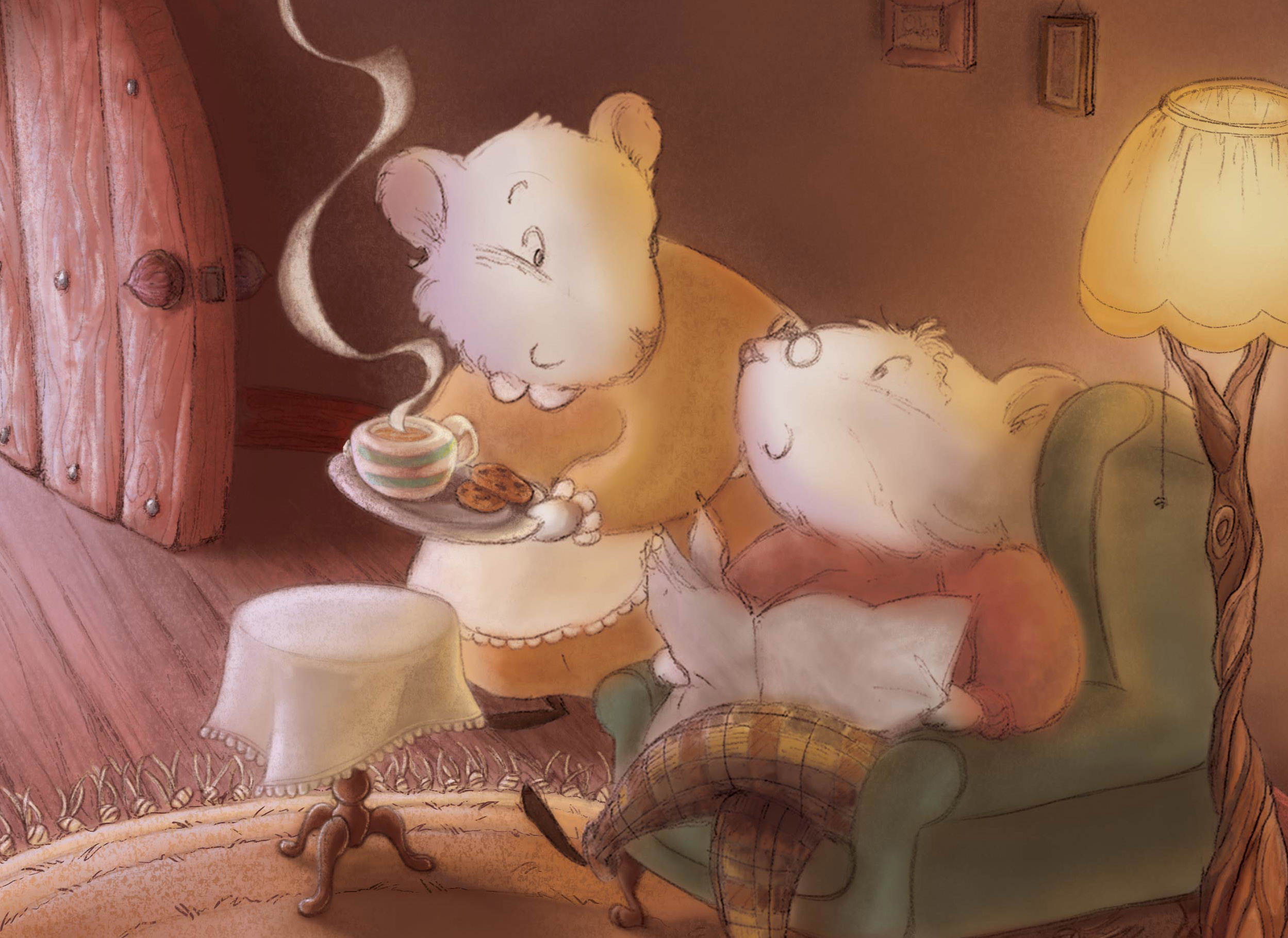
I think your painting is lovely. I think maybe it's just the composition. That open door is probably a key point in the story, otherwise it wouldn't be open. So maybe it needs to be shown. It is drawing a huge amount of attention in the image. If it's not totally needed in this spread, consider a closer crop. His leg being cut is still problematic, but I think this makes for a much more intimate scene and still leaves room for the type.
SVS Faculty Instructor
www.leewhiteillustration.com -
I think your details are coming along great! I like what Lee has to say about the cropping... can't wait to see this one finished!
-
Personally I never feel like I get past the yukky stage until I'm about an hour from completing a picture. I think you just have to stick with it.
Sometimes I'll look at it later and think- urghh what have I done though. Difficult thing to answer. -
@Lee-White, I finally have time to reply
that door and bright light were bothering me too. I had thought about cropping it, but was afraid the composition might be too centered then... like it was in my initial sketch
or else, I have thought of toning down the focus on the door by making the light softer and showing what's outside that door
what would you say works best?
cropped (but not as much as you did)
or showing what's outside the door
ps: my initial sketch was like this
-
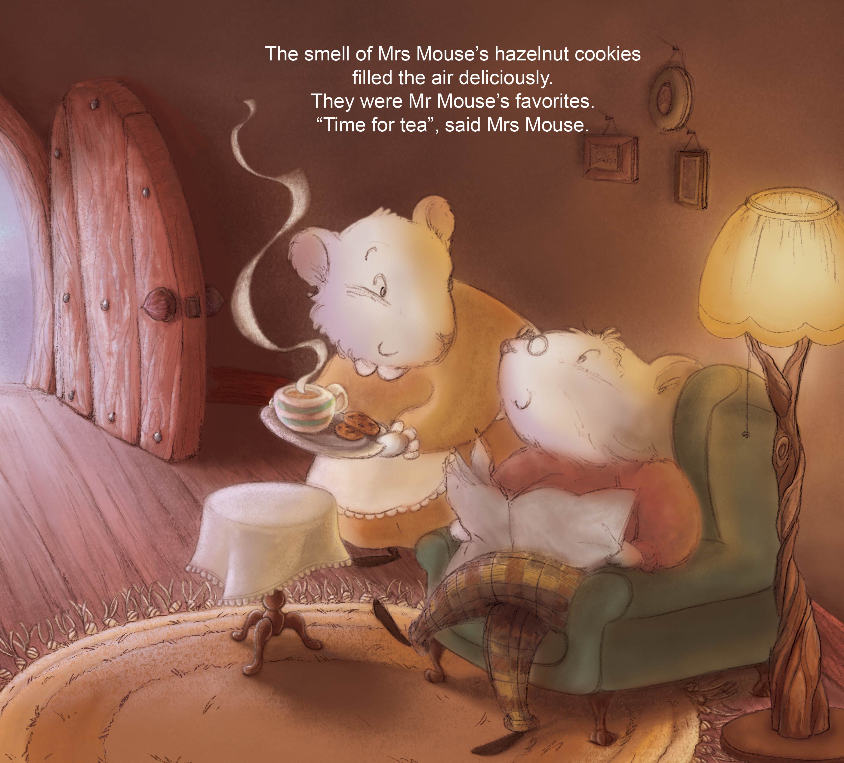
I think I have a preference for the second solution...
-
This is looking really nice
I agree the second solution is good. -
I think they are both strong images. i also like the detail you have put in the door way. well done
-
the detail on the floor and the rug, all awesome... are you going to put any more detail into the mice? I like the one with the door open and the detail outside... maybe you can put an acorn out there on the floor next to the table...
-
thanks! I'll go with the second one then.
I think I might soften and warm up the lighting a bit though
yes, Russ, I haven't started the mice yet")
-
There is something about the head on the first one that doesn't sit right. It kind of looks like the head i sattached to the neck wrong-if that makes sense but, since you're using the second one, it doesn't really matter. Both of them are really cute but, I do think the second composition looks better. I really like the colors you've used too. Looks so warm and cozy
-
@audrey-dowling Looks great.