Feedback/Margot Tenenbaum
-
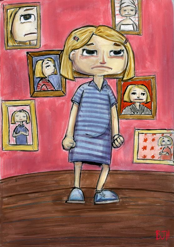
Hey Everyone. I worked this piece yesterday and there is just something about it I don't like. Maybe there are too many mediums (ink, gouache, digital).
-
I like the choice of colors your have used, but I think i understand what you mean by using too many mediums, Its making your image a bit messy. I think this did your image a bit of disservice.. If you painted your image ignoring the shapes, then made any corrections, then inked the outlines, this would of made your image cleaner. Also I noticed you had your shadows a bit mixed up. some where coming from the left and others from the right. (look at the girls arms), this has created a little confusion.. Hopes this helps.
-
I dont know about the medium thing, but i would try three things
- desaturate background to make your character pop (also red attracts eye mor than blue, so it might be harder to make it work)
- legs are weird
- where is your light coming from? On the face it seems like top right, but on the dress it seems like its coming from the left.
Maybe also try to cleanup the character in digital? I like the face, but I think the smudginess and dirtyniss might be a bit killing it.
-
Hi,
I like the expressionistic style.On the sides oif her face, the gray streaks might look better if ithey were more fleshy red, with a bit of blue shadow.
The bottom of her hair that's behind her head is so straight, it should be wrapping around her head. The straight line throws off the perspective. Also, the part in back would be darker, in shadow and maybe that dark line back there is too dark.
The curving floor is a little odd. And she could use some shadows, just something, under her feet that attach her to the floor plane.
Her left foot (on our right) seems too turned to the right.
The eyes could use some lighter parts, the irises look black.
I'd go with a more neutral, lighter background instead of the strong pink. The pink is about the same in tone as she iis, so she isn't popping. Try looking at this in black and white if you haven't already.
To me it looks like all gouache.
The part of her dress that is behind her would not be black, but a darker blue.
Her hair could use some darker areas.
I think you could crop this above the bottom of her dress, so we focus on her expression and hands.
To me it's working well except for some small details. I don't think there are too many
-
@Ben-J-Hutchison I want to echo everything Jiri Kus said. Great advice.
For the saturation/color issue he mentioned, are you working in photoshop? If so, it would be simple to add a "color" layer and repaint the background a desaturated blue and the dress a saturated red. This way, you could keep the nice paint quality you've gotten from the gouache.
I think the bent leg and the fist do a great job of communicating her feelings, and all the framed faces behind take this even further. Very cool.
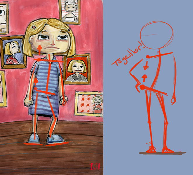
You can definitely strengthen her stance by really getting the perspective right on the feet. Have you tried the technique of drawing your character standing in a box?
-
Hi Ben! Since others have mentioned color and mediums, I thought I might mention the pose. Right now the character is very off balanced, do to her stance, and the fact that her feet don't seem to be on the same plane. People normally stand with their weight shifted to one leg, which your character seems to be doing, but her leg is too far out to support her. Also, the above shoulder tends to come down towards the raised (weight bearing) hip in order to counter balance, but hers is going away from the hip instead. Since that sounds way too complicated written out I did a quick paintover to explain what I mean. Hope that helps!