August 3rd Thursday
-
I love these @smceccarelli - fantastic work already! Really imaginative and fun.
-
love it, great characters
-
@smceccarelli
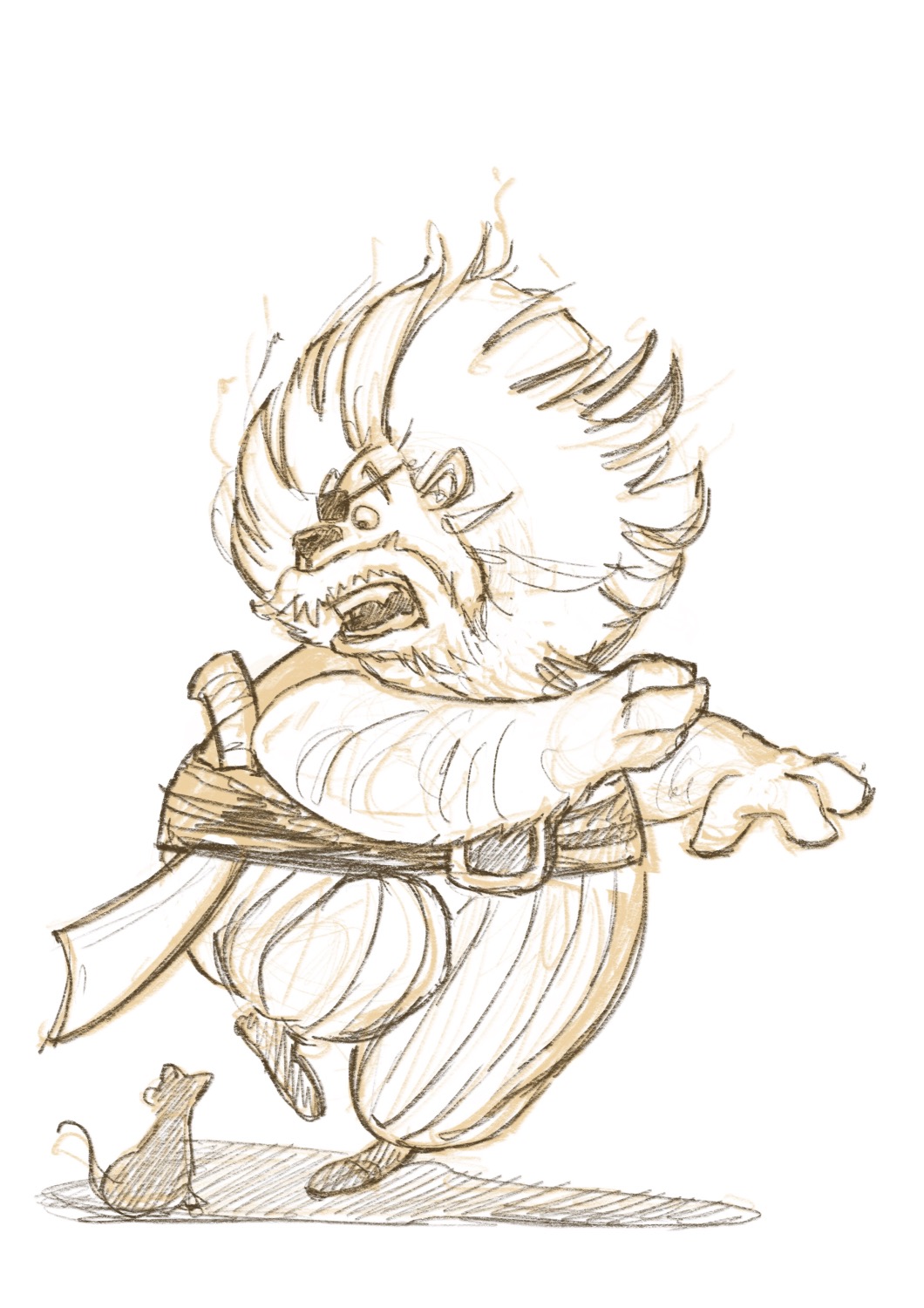
wow! just wow. but I wish that the lion was more.. liony? anyway hope to design great characters like that someday -
@smceccarelli good luck!
-
And here is Lionel Blackmane...what do you think?
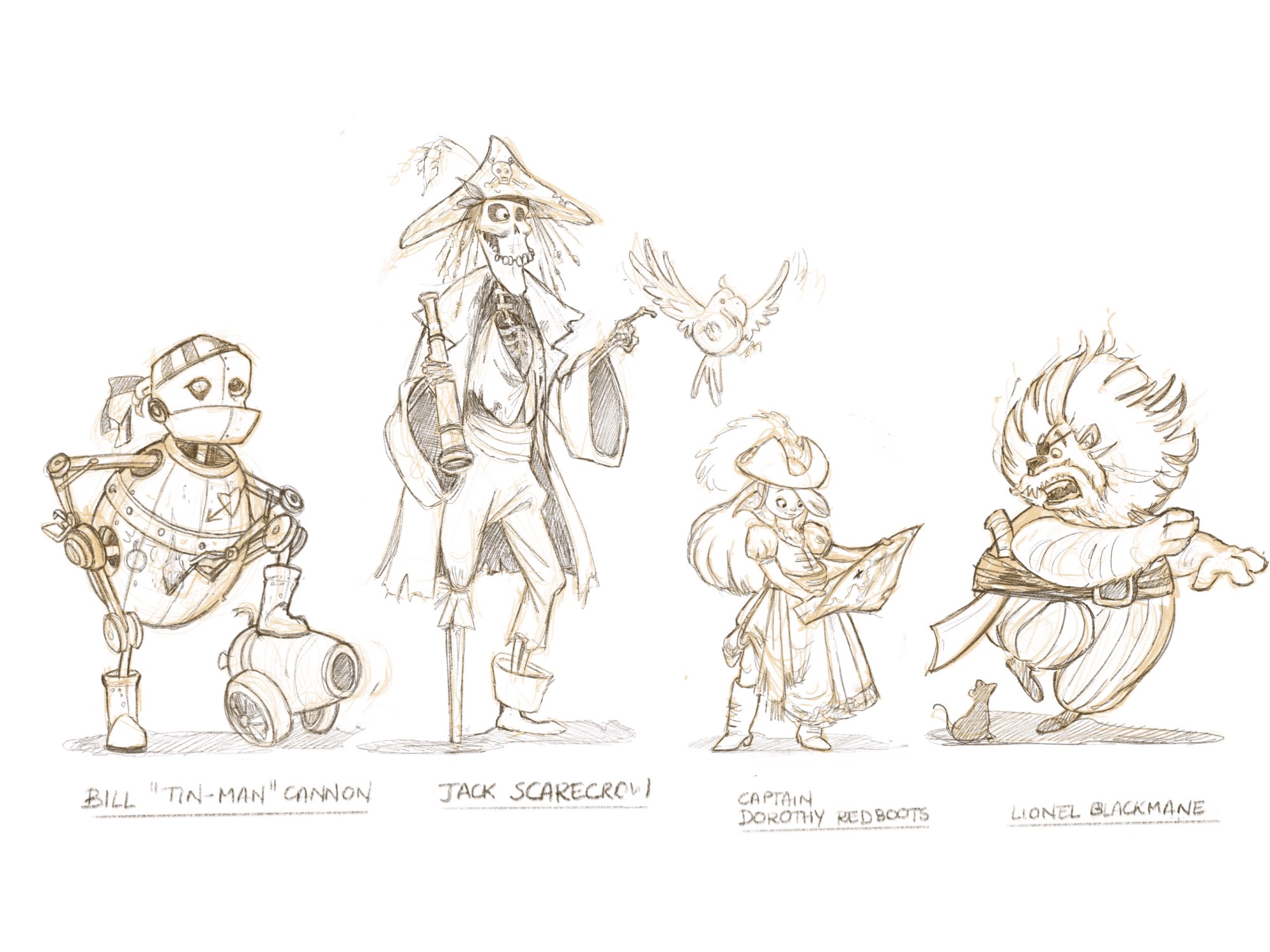
I have made some small changes to the other fantasy characters and I am going to completely re-design Dorothy - she does not really fit with the others and her pose is stiff and unnatural.
-
@smceccarelli all of your character work is so great! I just had a closer look around your website and your talents go far beyond what I had even realized! So good!!!
-
@smceccarelli This looks good - i have to say though that i really like the little fellow with the grog barrel - have you tried giving the original character a subtle muzzle of a lion and a lion''s tail? I think this might be worth a quick try - really nice line up you have here!
-
I love it, laughing...
-
@Rich-Green Thank you Rich! I can only return the compliment - your work is great! Love the mixing of illustration and photographs, it is a cool idea!
-
Much happier with this Dorothy. I think the four characters now fit well together - maybe not so sure about the relative sizes. I will let it rest for a while and then fix any further flaws and go to paint.

-
@smceccarelli It's an amazing line up - love new Dorothy - the older one was beautifully drawn too, but I like the fact that this new one looks like a captain, more authoritative, and on a technical note love the folds in her dress!
The one thing that makes me look twice/wonder how it works, is the huge collar on her outfit - it looks like her hair would have to be tied up for it not to get in the way/fall over the collar, yet the way the hair is falling on her back, it doesn't look like it's tied back. I'm not sure exactly what it is that needs fixing...and this is really super nitpicky because it's absolutely great work! But I mention it in case it's helpful.
-
Loving it, but I would change the name of Jack Scarecrow to something else. It is to close to Jack Sparrow even with the hat and all I think of Pirates of the Caribbean. If you had to come up with these concepts and present them to an art director I would assume they would turn it away due to being so close to the Disney character in my opinion.
-
Your characters look great. Love your line up.
-
@smceccarelli
really like the lion and Dorothy's design is fantastic! great work! -
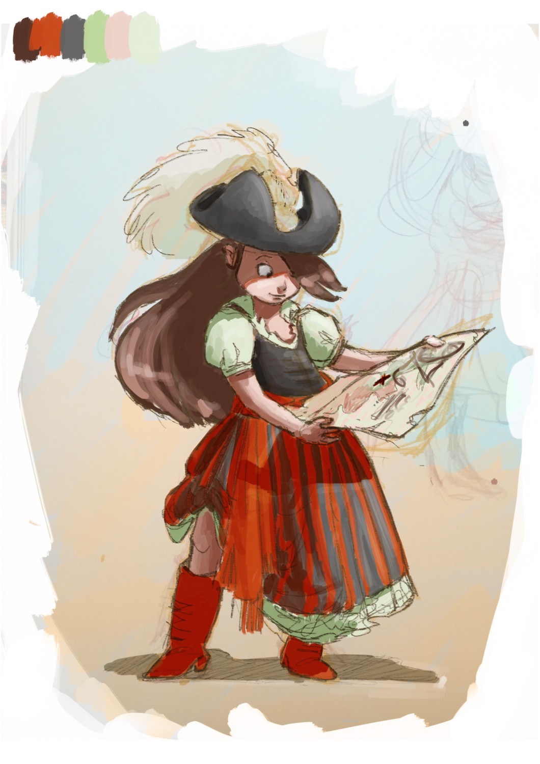
Just a color/value sketch. Although I work as a designer, I find I have to force myself to apply design principles to illustration. This time I am going to really make a commitment to stick to a limited palette throughout the characters. I am also thinking of strong midday sunlight for the lighting scheme and a vague background gradient suggesting a beach/marine setting.

-
@smceccarelli This version of Dorothy has so much personality! I love that you are moving away from the traditional color schemes and pushing the nautical/beach colors. The update to the Lion is great too! I understand exactly who they are now!
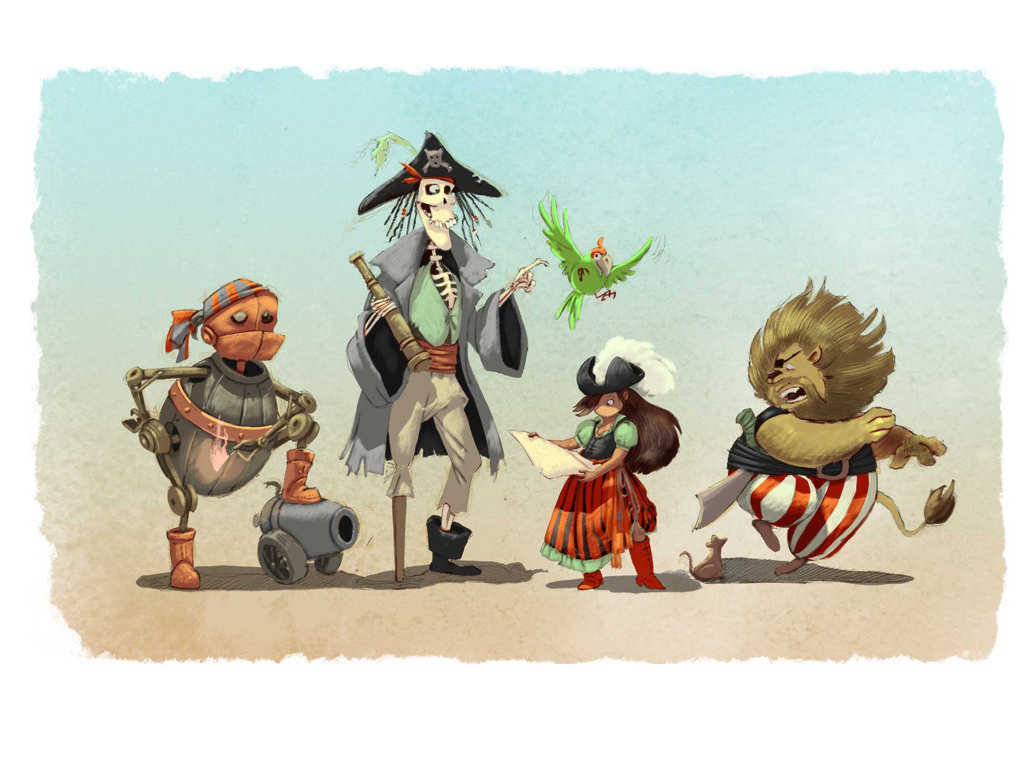
I'd suggest updating the scarecrow and tinman too. Maybe make the scarecrow's pose a little looser. He's maybe a more scatterbrained, forgetful kinda guy... maybe make him more frazzled or less put together (maybe literally falling apart?) Also, I'm losing the lit match on the tinman pose. Checking how the silhouette reads can help the pose be clearer. Maybe have the arm in the opposite direction so the tinman is looking directly at it.
Overall, the pirate designs on these are fantastic and really unique! I really really look forward to seeing these progress!! Keep up the stellar work!
-
Your work is really beautiful, continue please!
-
Work in progress...I am experimenting with a new process. Still many many hours to go!

-
really fun idea and twist.
-
It looks fantastic already
 Nice canvas textures going on in the paintwork, it all looks very natural.