August 3rd Thursday
-
@Rebecca-Hirsch forgot about the braids. Yes you are absolutely right.
Looks like one of the earlier sketches did have the braids.
-
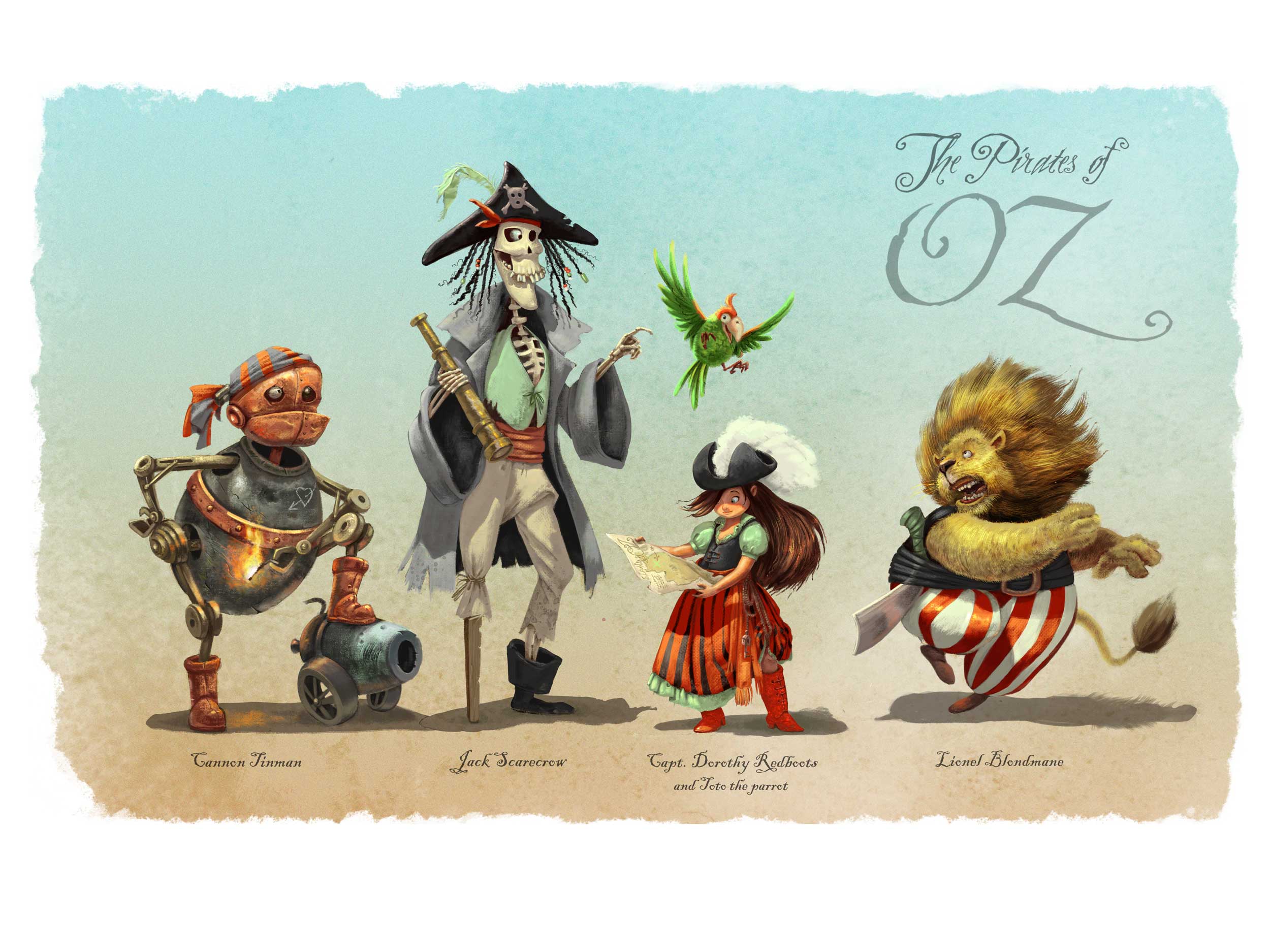
And here is where I am - finished? Not sure about whether to include the typography or not. Thank you every body for so many positive comments and feedback! I really set off to do a portfolio piece this time, and I think I am happy enough with the outcome to include it.
@mattramsey you have a very good point with the boots and the color scheme - but I decided to stick with the red/green as an experiment in limited palette: it is training I really need. I did add sparkles to the boots though. I do not thing there is an "iconic Dorothy design". There have been so many different version of the WOZ characters along the decades, everything and anything has been done. I love Greg Manchess' version, in which Dorothy is a black-haired punk-gothic teenager and Toto is a bulldog (and which, by the way, was featured on the cover of Spectrum 17).
I am not totally happy with the Lion - and anything else you can spot that needs tweaking would be welcome!!

-
Wow - amazing!! It's so beautifully painted, I love seeing it up close and just absorbing all the detail you put in there. Really well done! I love the textures, the way you've got that metallic texture on Tin Man and the lion's mane and cheeks also lovely brushstrokes. I could go on! ...but as you've asked for suggestions I'll make one - if I were to change anything, I'd make the Lion's cheek just cover his upper gums a bit more. There's something about his jawline and teeth that bothers me...but honestly it's a minor thing amongst so much awesome painting.
I like the typography, I'd keep it in there personally. Great piece all round!
-
@Dulcie Thank you so much! I see what you mean with the Lion's cheek. I am also seeing a few other things to correct here and there, so not finished yet!
Pausing for a couple of days - it's the best way to spot mistakes for me.
Does anybody else also need "simmering time" on pieces, before deciding whether they are finished or not? -
Oh yes I need simmering time - during final pieces, though actually I need it most when doing character sketches..often I do a new one, and immediately think YES this is the one...then when I look at it the next morning think 'Oh no way the first one was better', or 'I need to sketch some more', etc.
-
@smceccarelli I guess I would say that there is an iconic Dorthy. Imagine Manchess didn't have the red footwear. The only way we'd know it was Dorthy was the other characters around her--and really, we do need those because without them it could just be any punk girl. As soon as you see a monkey with wings (or the robot guy) it suddenly makes sense. If he would have only included her (and maybe her dog) I'm very confident he would have needed to add in other iconic elements such as a wicker basket, braids, a blue & white dress, etc or no one would have gotten the connection. He wouldn't need ALL of those items but there has to be some other elements there.
Another (not that anyone needs/wants one) example: Imagine an artist were to re-imagine Dorthy as a fat, balding, middle aged man sitting on a couch eating junk food. No one would have a clue that THAT'S supposed to be Dorthy. However, if the artist started adding in iconic Dorthy stuff, now the viewer gets it.
So really, the iconic Dorthy is the one first imagined by the movie (not the book which, relative to the movie, few people have been exposed).
All that doesn't really have to do with your (awesome!) piece but I'm just putting my 2 cents in.
-
@smceccarelli Really great work. I love it. There are probably a few little tweaks here and there like maybe a bit more rending on the tin man's hand holding the match to help it pop out from his body a bit more. But overall it's really beautiful I love the cast shadows on Dorothy's dress. And the rendering on the scarecrow's pants is done really nicely.
-
I think you've come really close to nailing this one. Would not be surprised to hear your name mentioned during the critique. Best of luck and great job!
-
@mattramsey I think you are raising a very good point - which is about context clues. I totally agree that if Manchess had just painted Dorothy that way by herself, nobody would have made the connection with Oz. Even with the red shoes. The other three characters (Tinman, scarecrow and lion) are also very very remote from the original, but when you put them together, some people may make the connection...probably still not everybody. It´s the winged monkey that does it for me. I see I winged monkey, I immediately think Oz. So one thought may be that it is the winged monkey the iconic character that drives the context. Also, Spectrum was doing an Oz-themed expo that year, so that would be an additional clue for the audience of Spectrum specifically.
If I saw a young girl with a blue dress, red shoes and braids, would I immediately think Dorothy? I am not sure....maybe if she was also holding a white little dog, and I had seen the film, then I would think Oz. So how much of these clues can you sacrifice by introducing other context clues (like the four characters together, or winged monkeys?). It also connects with the thought that Disney artists have expressed, that the main character in a story is always the least "iconic" of all, because it has to drive the identification of the audience and reflect the viewer.
Ok, I am getting very philosophical (which is always a risk with me), but you have raised a whole train of thought that I think is very interesting!
Maybe here I have sacrificed too many context clues for the audience to connect with Oz on a first read. If the parrot was a winged monkey maybe? -
@smceccarelli said in August 3rd Thursday:
If the parrot was a winged monkey maybe?
That. Would. Be. Awesome!
I was reading your response and I was liking the points you were making and then I got to that idea of yours and my mind got blown.
-
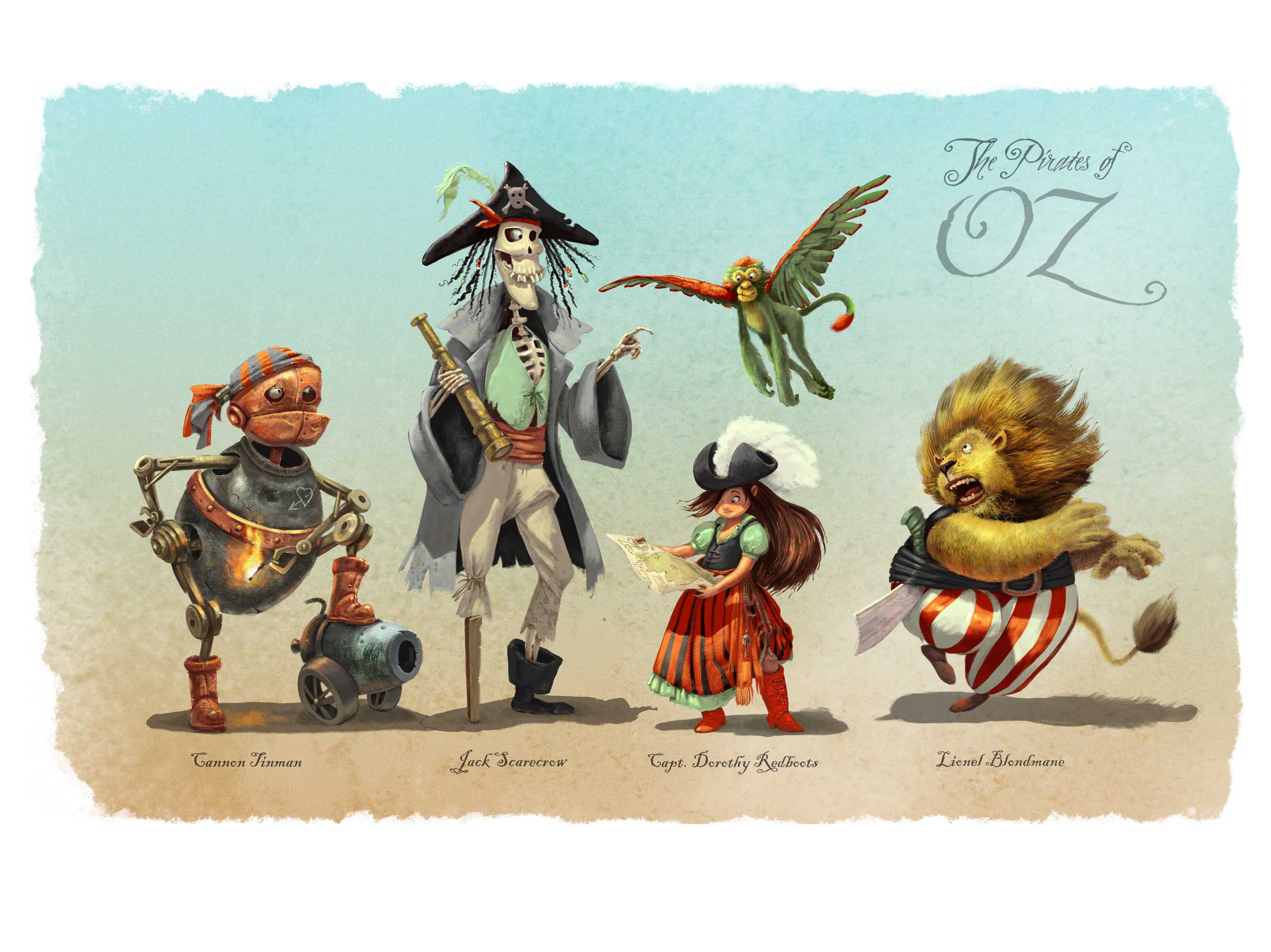
And here is the final ...I think...I hope. I have re-done the lion face and arms completely: they were definitely off.
And of course, could not resist the idea of a winged monkey-parrot....
-
@smceccarelli Amazing!
-
@smceccarelli Absolutely mind blowingly great! That switch to the winged monkey "parrot" is awesome!!! These are just pure fun!!!
-
That winged monkey parrot is genius! Great switch, I love the way it is designed and rendered with the gorgeous red and green! It was already an amazing piece, now even better.
Oh, I also noticed that you changed the lion's jawline/teeth, and eye - looks much better! It's also great that it now looks like the lion has been given a fright by the winged monkey

-
What a great change! You really nailed it. I wish I had something more constructive to say but I love it.
-
Wonderful! And I agree gotta have the flying monkey.. and that Lion freaking out over it is a great capture.

-
Absolutely gorgeous work!
-
You've nailed this one. Excellent job.
-
Ha, signed on just in time to see your crit and watch you take the win, congratulations!
-
@smceccarelli Congratulations again Simona! So well done and so well deserved!