Kids...
-
Well, I am at number 9 right now and I have already an identity crisis. I really love rendering - light and surface texture and all strings attached. But, I want to experiment with simpler, more straightforward forms of rendering, which I think are sometimes more appealing (like Szymon Biernacki does). The problem is, whenever I do not go into full rendering it looks unfinished to me.
Here is what I am working on right now. To me this would be stage 2 - still far from finished. And yet I look at it and I wonder if it could be considered finished at this stage - wether it has any kind of "finished" sense to it. What do you think?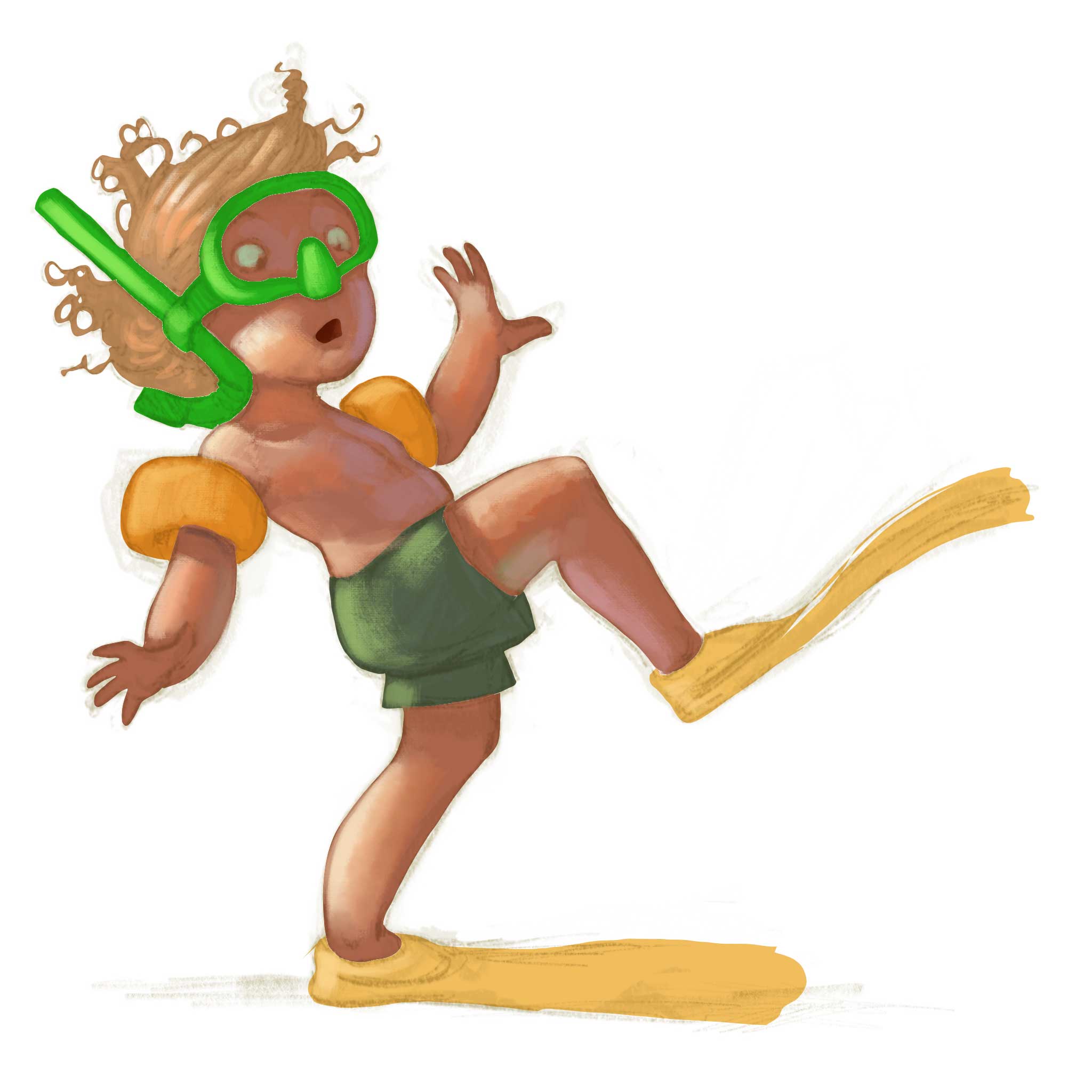
-
It looks unfinished to me, especially compared to your previous characters. The left hand looks weird and is much larger than the right. The face in particular looks unfinished. I think in your style if you want to make it simpler try omitting the texture and just render it smooth with lights and shadows. Let the brushstrokes give an illusion of texture.
-
@smceccarelli All wonderful drawings and gestures as usual. With this latest one I would say yes it does look unfinished...like it is following your usual method and it's in an earlier stage of development. I've just been on Szymon Biernacki's website (http://biernac.com/) to work out what style you were aiming for....that wonderful piece with the whale has a simpler method of rendering, but other pieces still look very detailed to me in terms of rendering (and closer to achieve with your usual method).
Thinking about the whale piece, to get the same style I would have thought you'd have to use the lasso tool to create flat colour areas, then lock it and use a grainy texture brush on top to add the detail. ...like those hills look like a lasso brush creation....then the trees look like they've been done with a triangular brush....the spray with another brush...lots of interesting things in there. There's another piece in his personal section featuring kids that looks like it's been done in the same way...If I were trying to match that look I'd try to get sharper edges, more flatness and greater use of texture brushes.
But there's definitely no need for you to have an identity crisis, your recent work is so very very good anyway
")
-
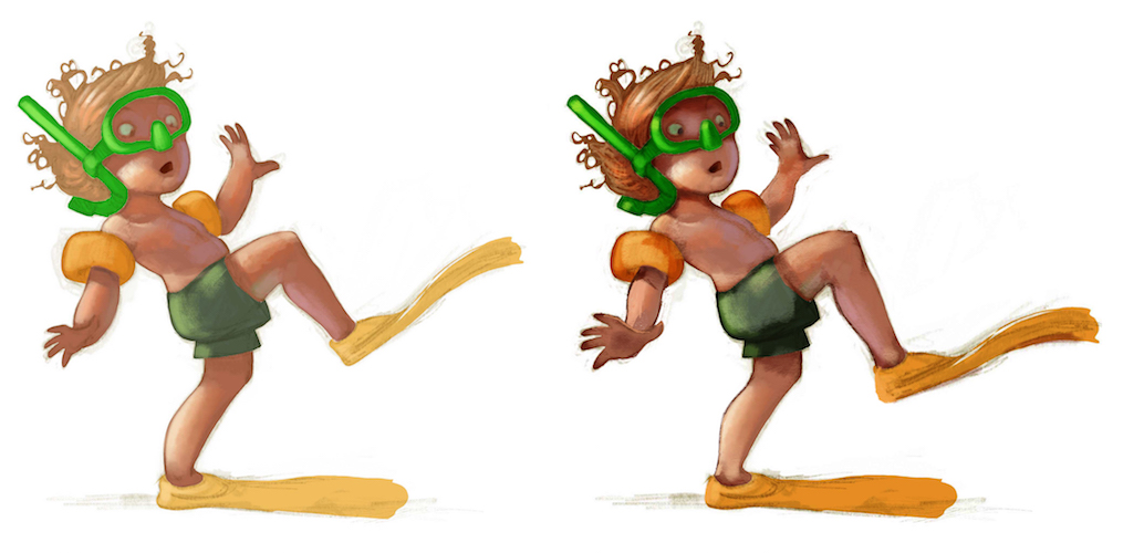
@smceccarelli Nice drawing! i do agree that it looks very slightly on the unfinished side - i thought maybe it just needed a bit in the way of sharp lines and a darker pupil in the eye (the pupil helped a lot)- i made two multiply layers and erased everything but the edges of the forms - made a couple little tweaks to calfs and hand size not sure if it looks any better to not - i was just mainly seeing if it would look more finishes with darker areas - also added a few hairs on the head - what i have done maybe does not look ideal and the lines are maybe too dark now but i think it looks more finished in a way - what do you think?
-
Yeah, I think for it to be finished at this stage you would have to add in some of the line work. The line work acts sort of like occlusion and helps to describe the forms. I'm sort of messing around with that myself. I love line work and love to render I just don't like how much time it takes. Dani Jones does a nice style like this where it's still rendered but she keeps some of the lines for a nice balance http://www.danijones.com/blog/
-
Thank you so very very much, this is sooo helpful. I spend so much time second-guessing myself sometimes - some days are worst than others I guess...
@washu - you are right with the hand, needs correcting. I very rarely use textures at all (especially recently) and work digitally very much like I would work in oils (my preferred medium before switching to digital) - so yes, I always preserve the brushwork, the questions is always how much brushwork!
@Dulcie - Szymon Biernacky uses the lasso tool throughout his painting process and lots of different texture brushes. I do not necessarily want to imitate him (though I have adopted some of his process in more complex work), but I love the freshness and simplicity of his finished pieces and I am wondering how do I bring some of that in mine (which sometimes looks overworked to me). That is why I experiment at the moment. I think a lot has to do with edges (and I am going generally harder in my terminators, which I quite like) and a lot has to do with the use of values and colors. I am looking at Aaron Blaise too, especially his use of light and color.
@Kevin-Longueil Thank you so much for the paintover! My next stage would be about occlusione and shadows indeed! And perfect corrections to the drawing, I will include them!
@evilrobot I have experimented with keeping the line in rendering. Then I experimented with dropping the line completely. Then I go in-between, which does not really work. Still have not decided what I like most. But you may want to check out "The Art of Alice - Madness Returns". It is a wonderful book all by itself (never played the game, but love the concept work). There is an artist in there that does props and has the most successful combination of line and rendering. I really imitated him in some of my older works (there is still one in my portfolio, a rat with a transport saddle), then I dropped it again. Always wonder if I should go back and revisit that.
Yes, sometimes I get concerned with the time it takes for render....but along the years it has gotten faster and faster, and if the trend goes on, I hope it is getting in the workable range. It takes me around 2 hours to render one of these kids to finish. This one I posted now was about 30 minutes into the process.Thank you for clarifying my frazzled thoughts....I will proceed to finish and stop doubting myself :-))
-
@smceccarelli I see now that i did not read your post very well - you were just wondering aloud if that stage could be considered finished - and that it was an early stage of your painting process - now i feel a bit foolish having done a paint over on your painting
-
- This is flipping amazing - I love all of your pieces!
- I've seen everyone talking about the "Design 100 something" challenge, but I don't know where it comes from or where to find out about it - could you please tell me where to look?
- Where is the Character Design Challenge? Is it here at SVS? Where did they announce it?
I can't wait to see more of your designs for the challenges!!
Facebook Page: http://www.facebook.com/amberwingart
Instagram: @savinafranciscoart
YouTube: http://www.youtube.com/amberwingart
Website: http://www.amberwingart.com
SVS Sketchbook: http://forum.svslearn.com/topic/915/savina-s-sketchbook-updated-2-13-16 -
@smceccarelli YEAAHHHH GREAT! 100 children will be so cool!
-
@amberwingart Thank you!!! At my present state of mind, positive feedback is very much appreciated! The "Design 100 something" challenge has been defined by Jake Parker (there is a video about it) but there is no social media or venue for it. It also does not have a time limit (which I really appreciate). The only important thing is to commit to the number 100 and not stop before you reached it. This 100Kids challenge is based on that. It is fully self-imposed. If anybody wants to join in, I am using the #100Kids hashtag for posting. I will do a blog post when I reach 10, so I can write about my thoughts on setting myself up to this.
The Character Design Challenge has its own FB community here: https://www.facebook.com/groups/CharacterDesignChallenge/
I occasionally do it, but the level of the entries is so high that I find it mildly depressing (I know, it is not an excuse...). It also has very strict criteria that are taken from the 2D animation world, where it actually comes from. Since I am born and bred in the 3D animation universe I find myself challenged by the strong focus on 2D design. -
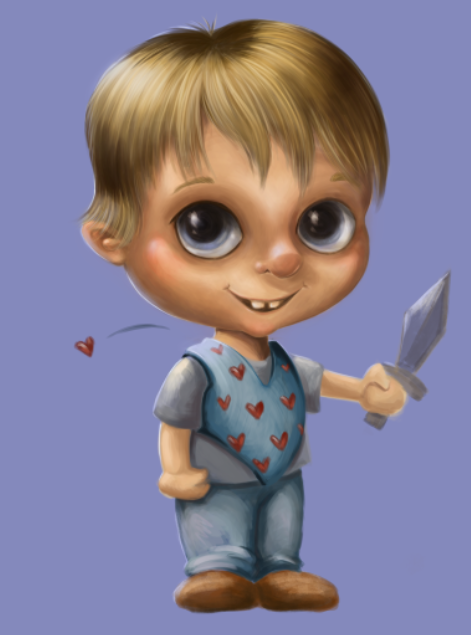
@smceccarelli Don't stop posting at the Character Challenge, its helpful for yourself, and it helps also to learn working on deadlines. I will gladly join in the challenge. Here's my latest character
 #100Kids
 -
Here are the last five - including my identity crisis friend, which I have now completed in my normal way.
To celebrate, the next one is going to be a full illustration featuring the last five characters (obviously will need to adapt style so that they match).
-
@smceccarelli woow, there so awesome! I see a view limps that are a bit long in comparance. The lightening and the colors are sublime!
-
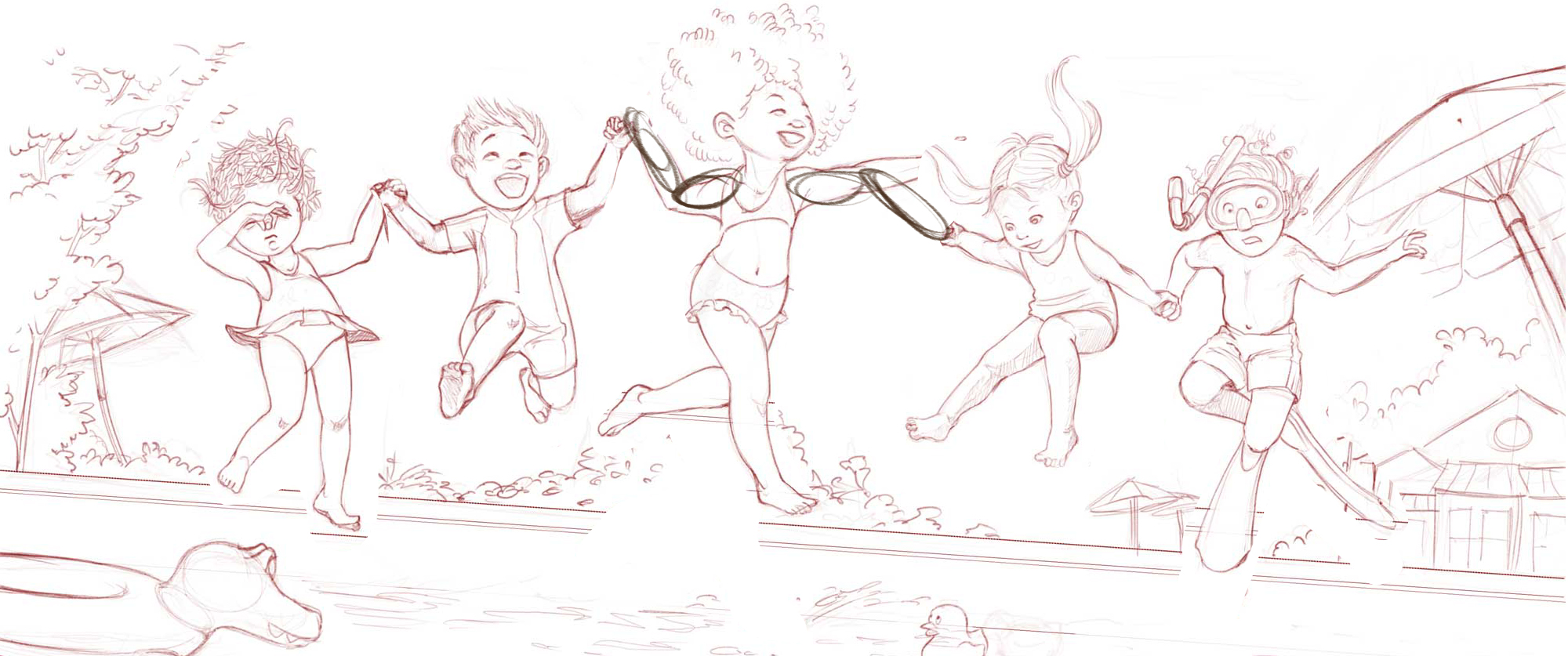
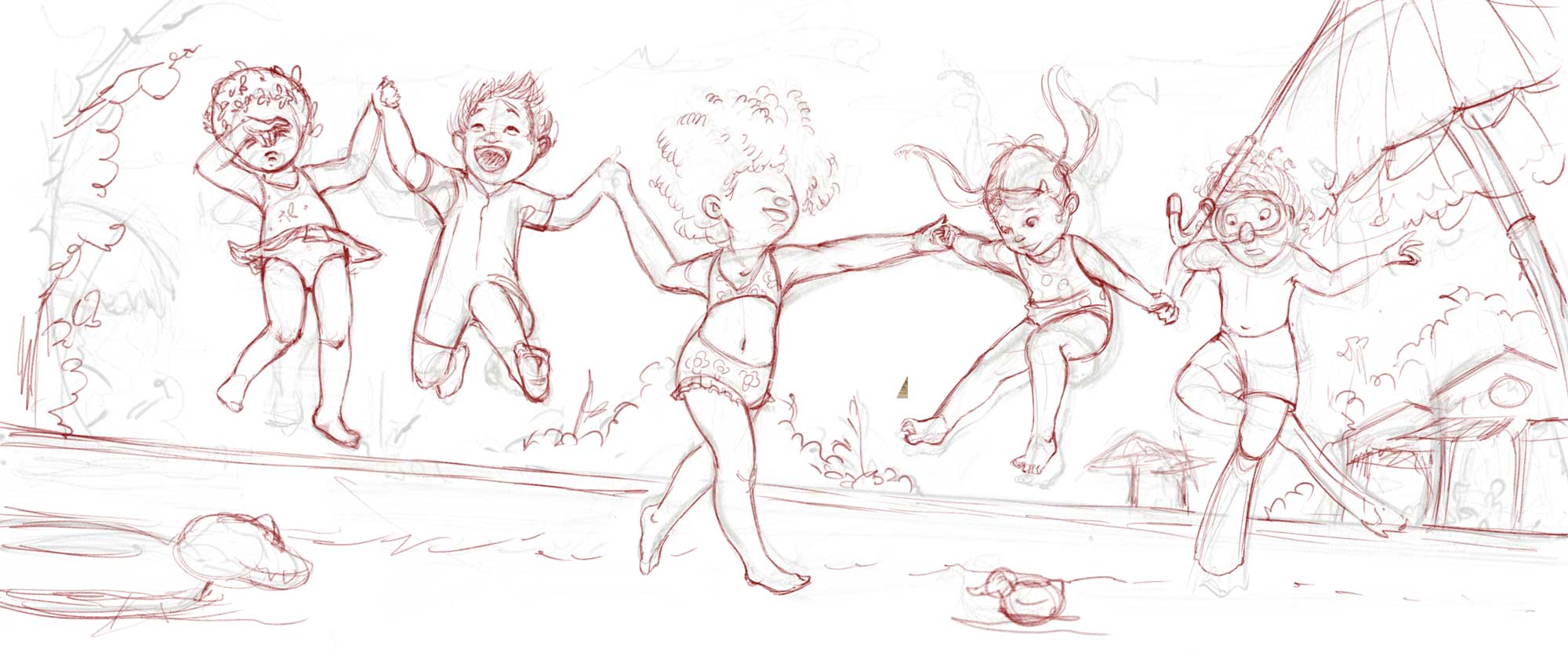
Very very rough still, but working on a full illustration with these last 5 kids. The poses are really stretching my grasp of anatomy....and the relative sizes are also costing me a lot of thought. Do you see anything glaringly wrong? Would you work in the background (the one that is sketched in now) or keep it as a vignette, with only the figures?
-
@smceccarelli Hi Simona - is this supposed to be for a double page spread in a book? I ask because I fear the girl in the middle will get a little bit lost in the gutter if that is the case.
Also I think all of the characters poses look really good - like they have jumped up and are now starting to fall into the pool Except the girl in the middle. Her pose and legs look more like she is dancing or walking on the water. Something about her does not quite fit in with the others movement to me.
But the rest of them - WOW - love the girl plugging her nose on the end. And the pure joy on the face of the boy next to her. Really fun!
-
Nice work. I think this is going to turn out fantastic. The girl in the middle does seem to be a lot larger than the other characters. I think working on her a bit more would be my only suggestion.
-
@smceccarelli Spectacular!!!!!!! all i got for critique is possibly the umbrella on the right side of the canvas looks like it would be planted in the pool - i'm reading the middle figure as being slightly older than the others - this really is beautiful - joyous - love the different expressions too - really great!
-
Thank you everyone for your comments and tips! The girl in the middle is supposed to be older (around 10-ish) - not sure it is coming across that well. I have tried out a bunch of different poses for her legs and landed on one similar to the original one - mostly for compositional reasons (I need one of her legs to be stretched). I hope it looks less like a walking pose....
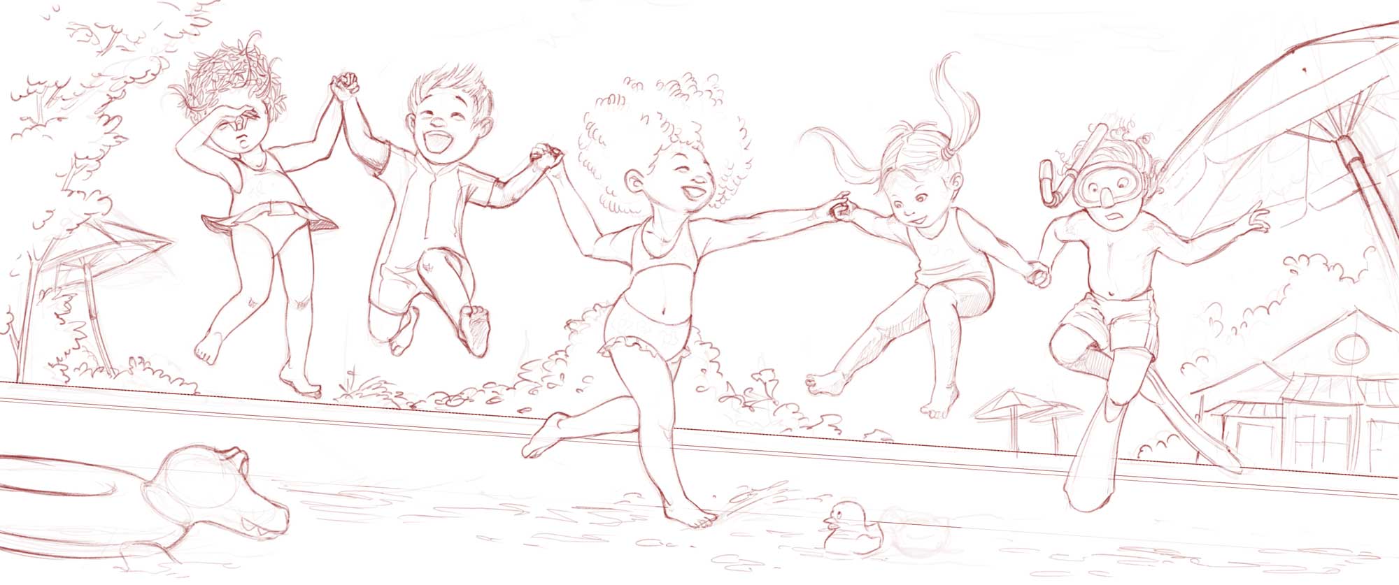
Anyhow, here is the final line. Wondering if it is worth painting it at this moment....But it may be the late hour...
@Rich-Green - it is not really for a specific print format, rather to accompany the swimming kids with a context illustration. I was imagining it as a banner, maybe on a water park FB page or as header for an article...gutter would not work on this one, you are right.
-
@smceccarelli Love this! My only comment on the middle girls position is I think if she is jumping in the pool her toes touching the water should be pointed. Right now to me it looks like she is standing on the water. I love the angle and the touches of background - great piece!
-
@smceccarelli - hope you dont mind but I did a little adjusting to your latest version:
I keep imagining that if the girl in the middle is a bit taller/older than the rest of the kids - that would make her "jump" a little stronger/higher than the rest. Plus she is so happy about jumping in - she is not tentative like the kids on the ends who would have jumped less or even a second or two later than the rest.
So I lowered the overall image down within your area a bit to give us a bit more sky - and then I moved your middle girl up above the rest. I adjusted the kids she is holding hands with to then make them each a bit higher than the other two. And to make the arms link up I also flipped the joyous boy. And in doing so I think having him facing in towards the center actually helps the composition and the direction the viewer follows within the image.
Some adjustments to the middle girls arm placement would be needed to properly link her hands to those kids but you get the idea.
And now her legs look like she is floating happily through the air and not walking/dancing on the water.