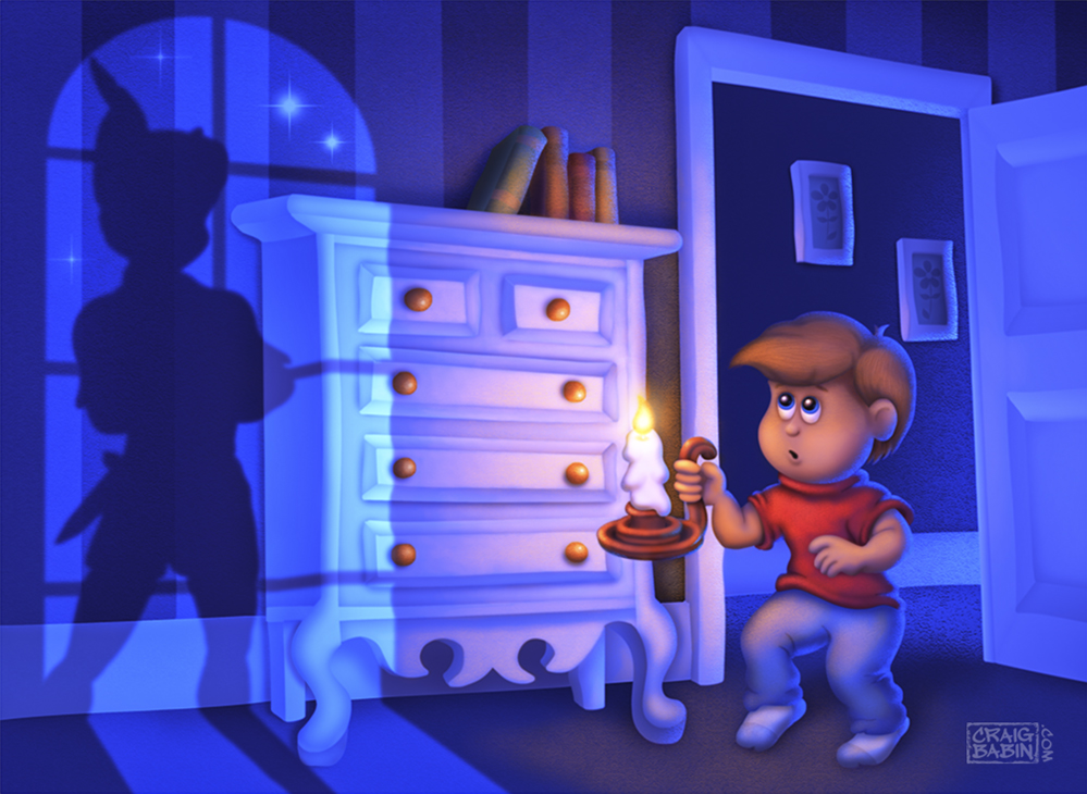
My Homage to Pan the Man
-
This was my first real attempt at digitally painting an original piece. I'm a 3D Artist by trade and I have to admit that I've become accustomed to the crutch of 3D software, putting all of the value into a piece with just a few clicks of the mouse. It's much harder when you have to do it yourself. My hat is off to all of you illustrators who do it so well.
Any feedback on this piece would be greatly appreciated. I have a long way to go and could use all the help I can get.
Thanks guys.
Craig

-
Looks really good to me!
-
@Thrace-Shirley-Mears Thanks.
-
Very well done, just one thing I spotted, from the window light, wont the sideboard/cupboard on the wall? Otherwise not bad at all.
-
Beautiful! Awesome color and mood
 At the top and bottom of your dresser, the light coming in doesn't shift(?) enough. It makes it look like the dresser is only 2 inches deep. does that make sense?
 -
@Steve-Young Thanks Steve. As per your comment. Did you mean that the dresser should throw a bigger shadow on the wall?
-
@Lynn-Larson Thanks Lynn. I'm not sure I know what you mean by shift enough. I did draw the dresser very shallow in this picture. The reference photo I used when drawing it was of an old style hutch. It was probably about a foot deep. I should have made mine a bit deeper I guess.
-
@Craig-Babin I knew i was going to have issues explaining it lol. I can't figure out exactly how to say it to come across clearly
-
Man, this is really great work. I'm not a pro so my feed back on this one would be just my own opinion or experimentation...
Have you tried making the child slightly smaller in size in contrast to the shadow? It feels like they are competing against each other. Or reverse the shadow of Peter pan to face the other direction so your eye leads from boy to Peter pan? I don't know... I'm just trying to give you what I would have done... other than that, this is an awesome image. Thanks for sharing. -
From What I can see the direction of the light, the shadows are not correct for the dresser.
-
@Lynn-Larson lol Thanks anyway Lynn.
-
@daiolupo Thanks. I considered making the boy smaller but there was so much empty space behind him, I just figured it would look empty.
-
@Steve-Young It's possible that I did screw up the shadows. I have two strong competing light sources, the candle and the moonlight. It gets confusing as to which one would over power the other for shadow, the distant moonlight or the very near candle.
-
Hey dont worry you still did a great job. Keep it up.
-
@Craig-Babin Thanks for sharing. I love your vibrant colors. There's definitely a mood of wonder here and magic here.
I agree with the others that the light feels a bit off, though I can't put my finger on exactly what it is. Might be interesting to see how this would look with a single light source.
This would solve the other question the image brought up for me, which is why a modern kid in a modern house is walking around with a candle like that. It does add a nice element of whimsy, but it feels out of place to me.
-
@Maile-McCarthy Thanks Maile. The original title for this piece was "When Peter Pan comes to your house and the power is out and you've killed all of the flashlight batteries in your Game Boy, so you have to carry around one of your mom's old candles". But I felt it was a little wordy, so I settled on "A Childhood Friend". lol
-
Hi Craig, I love it, the colors and the tension you can feel. Checked your website, nice work!
-
Really nice piece!
Overall I think people are not actually critiquing the light per se, but more so the quality of your shadow edges. It looks overly soft in most places. You want hard cast shadows and then softer form shadows and diffusing shadows as they get away from the object casting them. It's a weird thing, but edge quality is really programmed into our idea of how things look, and if it's off the light will feel "not right". That's why everyone is having a hard time describing what's off. They can't immediately tell, but your brain knows.
Beautiful color here. One last thing though. The interior looks fairly modern. So the candle seems a bit off as a prop. If you want that candle in there, can you adjust some details to match the period?
Look forward to seeing more!
-
@Leontine-Gaasenbeek Thanks Leontine. I really appreciate that.
-
@Lee-White Okay, now the shadow thing makes sense. Now I understand what everyone was talking about. I haven't quite nailed down the whole value thing just yet. And now that I look at it, I think a flashlight may have been a better choice. Thanks for the critique Lee.