SCBWI Tomie dePaola contest
-
@Dulcie Sorry I didn't get back to you sooner on this. I've been distracted. I Agree with @Joy-Heyer about pushing it more. More distance between the girl and the other kids? A jampacked school yard with her off to the side would give more contrast. And I still like both concepts so it's hard to choose.
-
Hi @Dulcie I'm really loving both! And I can actually relate to them as well. I like your reading one a lot (and might like it better if it were for something else), but I think for this contest in particular, the apprehension emotion of #1 is the way to go.
I agree with others that you can push it further though. Right now to me she's looked more shocked/in awe than scared/shy. Also - your perspective is off. Your main kid is larger than a few of the kids who're actually closer "to the camera". There's a bit of a line happening with a few of the kids too (the girl playing hopscotch, then the two kneeling behind her). The two kneeling I might push back a little further and stagger them.
I like all the movement and action that's happening and it really comes across that all these other kids are already comfortable in their environment, all except for poor young you.
Good luck! Can't wait to see it develop further

-
Hi Dulcie, sorry to tune in so late - It's been really hard lately to find time to write sensible comments - especially to really good work like yours! I love the prompt of this contest, it offers so many different angles! I like both concepts you brought forward (and both resonate with my own childhood!) but personally I like the second one (you reading a book quietly in the middle of the turmoil) a lot better. There may be personal associations here, but the first gives me a sense of anguish, while the second radiates a quiet contentement and the marvel of losing oneself in the world of a book and being one's own special place. In essence, the first is a negative and the second is a positive picture. Of course there is a good place for both, but I find the second one has a higher emotional content for me.
If you decided to go with that, I would consider revising the composition. The central composition with all the light around the face reminds a bit of a sacred throne. Maybe that is a good thing, and you could push it even more, giving a sense of "sacrality" to the whole situation of being enthralled by a book while the world is passing by. Or maybe you could go the other direction, and emphasize the sense of (positive) isolation by shifting yourself into a corner or background position, having the light do the job of bringing attention to the focal point.
These are obviously only my thoughts - I do feel like I had exactly those very same experiences (only without mummy to hide behind!). -
@Joy-Heyer Thanks so much for your thoughts, I appreciate the feedback! I really like your ideas for pushing the apprehension emotion further, especially the idea of her peeking out from behind mum (I think I actually did that on my first day) and making the expression more anxious. I’ll try to work that all in!
@Lydia-M Thanks very much for your comment, oh no worries - of course you’ve had a lot to think about. I really appreciate your (excellent!) ideas! I agree that I need to push it more, looking at it again. I like the idea of more contrast and a more jam-packed school yard…I think I might go for a lower perspective, so you get more of a feeling of being in a crowd…if I can just make that work on paper somehow…
@DanetteDraws Thanks for your comments and suggestions! Really appreciate it…Glad that you like the concepts
 I agree I need to push it more, and also that the relative sizing of the children is a bit off. I think I’m going to re-sketch and find a way to push the whole thing further taking all of this into account…
@smceccarelli Thanks for your thoughts (especially at a busy time!) - always so helpful. Oh it’s interesting that you like the second one better…maybe I will have to work up this one as well (even if I don’t submit, it could be a useful portfolio piece)…choices! I agree that they are totally different in tone with the second one much more positive. I’m going to have a think about your suggestions and see what other compositions I could do for #2.
One thing I worry about with #1, and now possibly when re-working #2, is how to make the piece work when the main character and focal point is in the background…the judges need to look at the piece and know which child is ‘me’ amongst all the others without being told (as there’s no text to help) … It’s going to be an interesting and challenging thing to make it work. I was planning to use value/contrast/colour but that’s much easier said than done
 Will see how the re-sketching goes… Thanks again for your thoughts!
 -
One thing I worry about with #1, and now possibly when re-working #2, is how to make the piece work when the main character and focal point is in the background…
Yes, most certainly value/contrast/colour will work well for this, but also I'd suggest using a photography trick where you want your main focal point to have the most level of detail, and the rest to be simplistic. Doing this in photography looks something like this: http://digital-photography-school.com/out-of-focus-foreground-framing/ but I wouldn't go so far as to make your foreground quite that blurry, but hopefully you get the idea.
-
@DanetteDraws Thanks very much for that suggestion and the link! Great idea..yes that would really help solve that problem. I've seen it used with illustrations on Instagram..and also the speed-painters on Facebook do it a lot.. but I've never done it myself yet, so I guess I'd better get busy and learn how to do it

-
Here's an updated thumbnail for #1...I think I'm going to go with this 'apprehension' concept for the contest, because the emotion is clearer and more immediate, which I think hits the brief better - but I'd definitely like to revisit/finish the 'contentment in reading' concept soon.
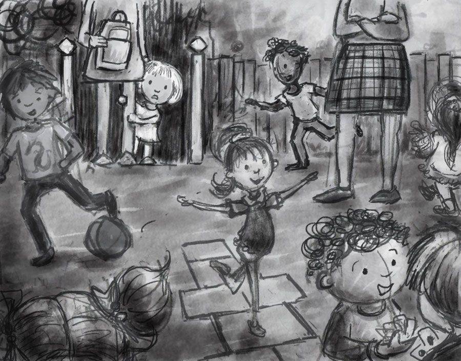
-
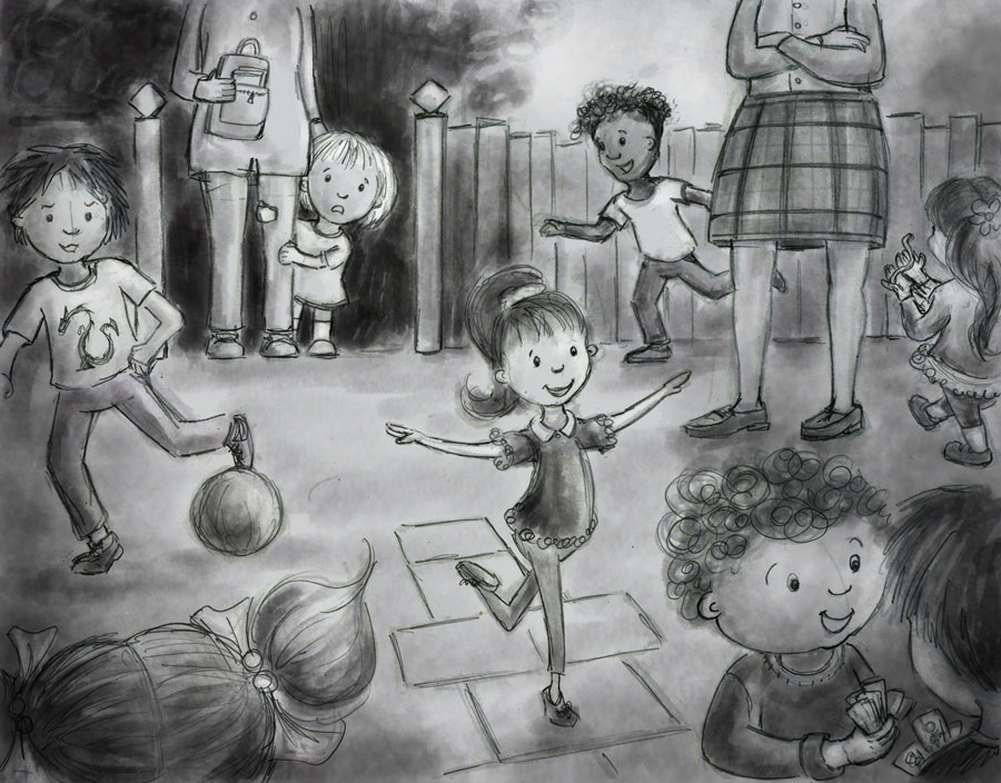
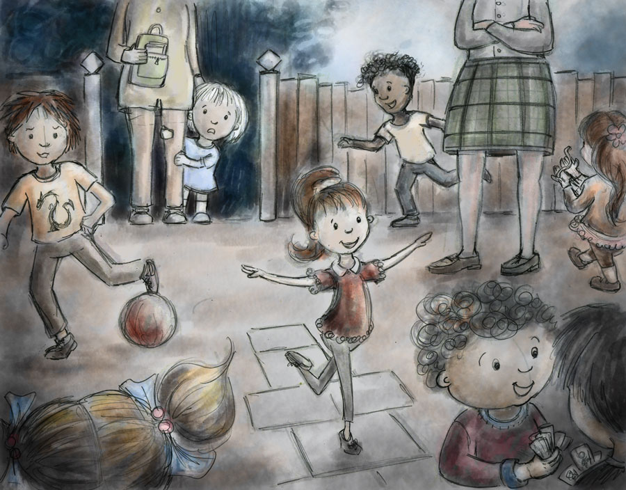
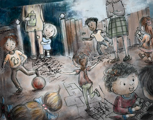
I neatened up the line and did a colour study (v rough, may change)...any critique/suggestions welcome...
-
It is looking wonderful! I would move the hopscotch girl so she is overlapping or overlapped by something. Right now she is framed by negative space making it seem like she is the focus. All the other characters are incomplete--either by the cropping of the frame or overlapping of another character. Also, the red shirt draws attention to her. The little girl (you) is very cute and I love her look of apprehension! With a few tweaks to the hopscotch girl, the apprehensive girl will stand out nicely with your values.
-
Thanks @Joy-Heyer, it's so useful to have another perspective on where the focus seems to be - I will try and think of a way to overlap the hopscotch girl, to take away the attention from her...somehow! Not sure how to do that yet, but hopefully will think of something....probably will involve changing the mystery girl in the near left corner though, into something else.... Thanks again for your thoughts

-
I like the one with the teacher. I think everyone has felt that at some time-being the odd man out.
-
Maybe if the hopscotch girl were facing away from us more and wasn't surrounded by such a light color it might draw more attention to the little girl. We tend to go for the faces looking toward us I think. Just a thought. I may be way off.
-
@Marsha-Kay-Ottum-Owen That is a really excellent suggestion, to flip her round so she's facing away - thank you. You're right that we tend to fix on faces, so hopefully that will help. I'm working on a new version with that idea

-
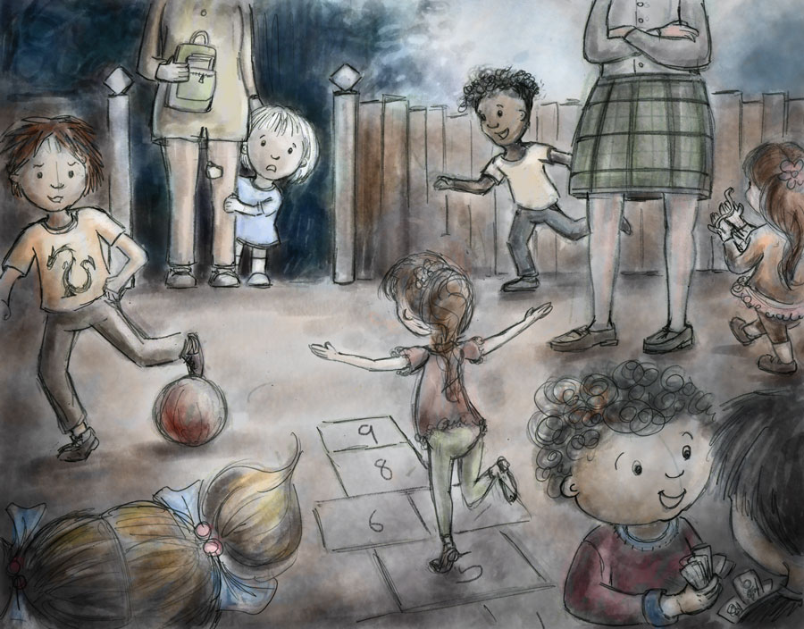
Here's an update with hopscotch girl facing away...I'm still going to think about whether there's any other way to make it better.
-
It's looking good @Dulcie but I think your first thumbnail was a lot more dynamic. You might try turning the image so the fence does not line straight up with the top and bottom edges of the paper. I think having the fence even at just a little bit of an angle would help the image a lot. The scale of the characters may be off a little too because that teacher looks as if she's gigantic.For some reason that first sketch you did of this everything seems to be working a lot better in it. Looking forward to seeing the finish on this. I did a few adjustments in Photoshop to see if the angle would help (hope you don't mind) anyway I think if you make a few adjustments you could get a stronger image without a lot of redrawing.
-
looks great!
-
@Dulcie Hey Dulcie - this is looking good! - main critique i would have is i keep getting stuck on the girl and the mom's feet - i think we would see a bit more length and a small amount of the top of the feet to get them to look like they are standing on the same plane as the rest of the figures in the image - i did want to mention one thing a bout a previous version of this image - i really feel that your second version of this image is very successful compositionally (the version where you mention taking Lydia-M's suggestions into account) - it reminded me of a Schoolism class of Nathan Fowkes's where he talks about "repetition with variation - he uses a lot of Degas paintings to show the point he is making - for instance -
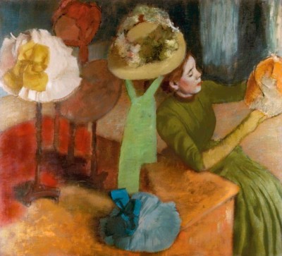
Many of Degas painting can be described this way whether the repeated shape is a hat or dancer - your piece reminded me of this with the curved fence - the circular spaces in the schoolyard and the round heads - there is a flow for the eye also in that image - it is stronger to me - in the newer version there is not a clear path for the eye - everything has equal weight or importance - in the earlier version i start on the little girl and i end up back with her after surveying the image - i know you can pull off either image with no doubt but i wanted to share that thought - i know this will turn out great whichever way you go

-
I like the idea of tilting the pic a little bit, but I also agree with @Kevin-Longueil that the earlier composition had a nice flow to it. Good luck!
-
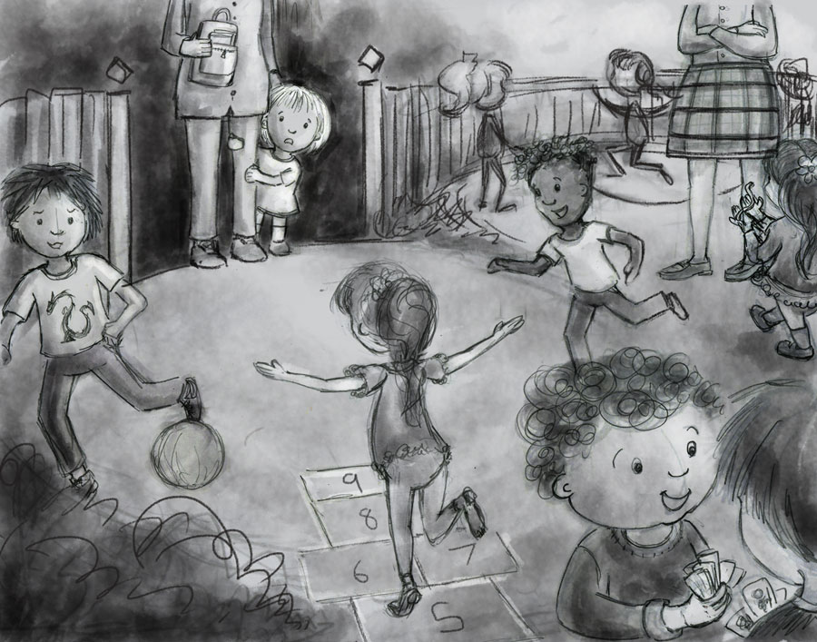
@evilrobot Thanks very much for your thoughts, I appreciate it, and the drawover too! (of course I don't mind - any feedback and/or suggestions are always really helpful, it really gives a sense of what's not quite working...). Yeah I wondered if the teacher was a bit big, after a while you get so used to looking, it's difficult to see afresh how things look. So I've changed her size... I did like a lot of things about the earlier composition, and judging from the other comments too, it looks like I lost some good stuff along the way when trying to improve/fix things. So...I've made a new thumbnail trying to blend both versions together, hope it's better but please feel free to say if I can still improve it!
@lmrush Thank you!
@holleywilliamson Thanks for your thoughts! Hopefully the next version will be a bit better....
@Kevin-Longueil Thank you, I really appreciate your thoughts (considered as always)... I've tried to fix the mum & girl's feet, but I wasn't 100% sure exactly how to fix, so I just tried to 'make it better' - but if it's not what you meant please say (perspective isn't my strongest suit...) Also really like your mini-lesson with Degas picture! That is great
 Love those hats...and the way he balances the colours in that piece. I do see what you mean about the 'repetition with variation', and flow - and how it applies to my earlier composition...I did like those circle shapes...and you are right I think I lost something by leaving that out. So - my big question today has been how do I fix that? And so I tried to blend both compositions together.
I'm finding it tricky to see this afresh after so many thumbs, hopefully it's an improvement (but if there are still silly things like giant teachers, or anything else please say

-
I think you're doing great
