SCBWI Tomie dePaola contest
-
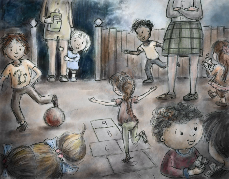
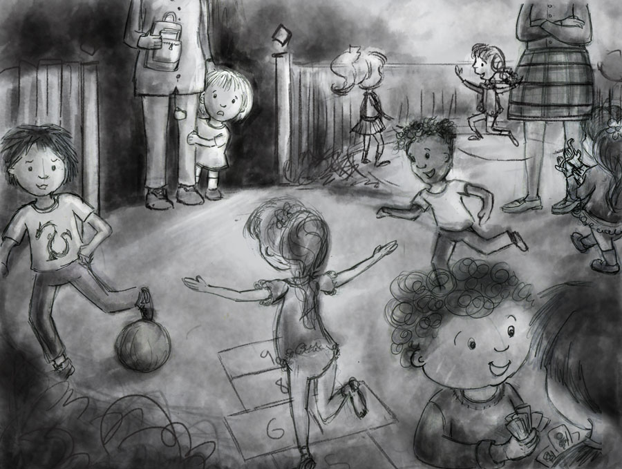
Here's an update with hopscotch girl facing away...I'm still going to think about whether there's any other way to make it better.
-
It's looking good @Dulcie but I think your first thumbnail was a lot more dynamic. You might try turning the image so the fence does not line straight up with the top and bottom edges of the paper. I think having the fence even at just a little bit of an angle would help the image a lot. The scale of the characters may be off a little too because that teacher looks as if she's gigantic.For some reason that first sketch you did of this everything seems to be working a lot better in it. Looking forward to seeing the finish on this. I did a few adjustments in Photoshop to see if the angle would help (hope you don't mind) anyway I think if you make a few adjustments you could get a stronger image without a lot of redrawing.
-
looks great!
-
@Dulcie Hey Dulcie - this is looking good! - main critique i would have is i keep getting stuck on the girl and the mom's feet - i think we would see a bit more length and a small amount of the top of the feet to get them to look like they are standing on the same plane as the rest of the figures in the image - i did want to mention one thing a bout a previous version of this image - i really feel that your second version of this image is very successful compositionally (the version where you mention taking Lydia-M's suggestions into account) - it reminded me of a Schoolism class of Nathan Fowkes's where he talks about "repetition with variation - he uses a lot of Degas paintings to show the point he is making - for instance -
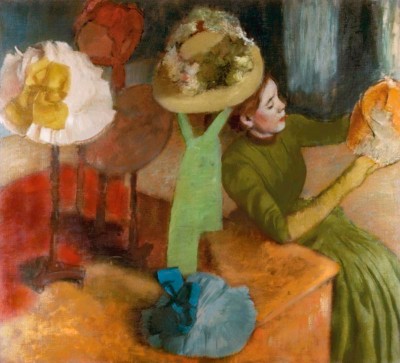
Many of Degas painting can be described this way whether the repeated shape is a hat or dancer - your piece reminded me of this with the curved fence - the circular spaces in the schoolyard and the round heads - there is a flow for the eye also in that image - it is stronger to me - in the newer version there is not a clear path for the eye - everything has equal weight or importance - in the earlier version i start on the little girl and i end up back with her after surveying the image - i know you can pull off either image with no doubt but i wanted to share that thought - i know this will turn out great whichever way you go
")
-
I like the idea of tilting the pic a little bit, but I also agree with @Kevin-Longueil that the earlier composition had a nice flow to it. Good luck!
-
@evilrobot Thanks very much for your thoughts, I appreciate it, and the drawover too! (of course I don't mind - any feedback and/or suggestions are always really helpful, it really gives a sense of what's not quite working...). Yeah I wondered if the teacher was a bit big, after a while you get so used to looking, it's difficult to see afresh how things look. So I've changed her size... I did like a lot of things about the earlier composition, and judging from the other comments too, it looks like I lost some good stuff along the way when trying to improve/fix things. So...I've made a new thumbnail trying to blend both versions together, hope it's better but please feel free to say if I can still improve it!
@lmrush Thank you!
@holleywilliamson Thanks for your thoughts! Hopefully the next version will be a bit better....
@Kevin-Longueil Thank you, I really appreciate your thoughts (considered as always)... I've tried to fix the mum & girl's feet, but I wasn't 100% sure exactly how to fix, so I just tried to 'make it better' - but if it's not what you meant please say (perspective isn't my strongest suit...) Also really like your mini-lesson with Degas picture! That is great
Love those hats...and the way he balances the colours in that piece. I do see what you mean about the 'repetition with variation', and flow - and how it applies to my earlier composition...I did like those circle shapes...and you are right I think I lost something by leaving that out. So - my big question today has been how do I fix that? And so I tried to blend both compositions together.I'm finding it tricky to see this afresh after so many thumbs, hopefully it's an improvement (but if there are still silly things like giant teachers, or anything else please say
")
-
I think you're doing great
-
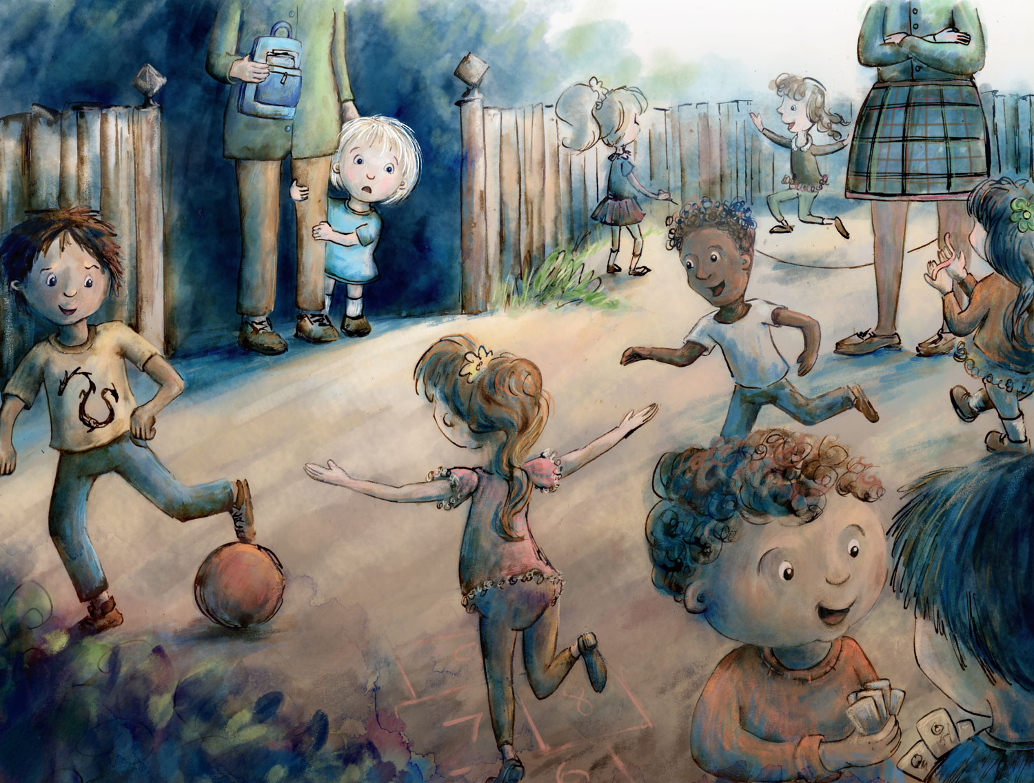
@Dulcie I think this looks better
I do have a couple more thoughts to share on the piece - i think part of what is throwing of some of the feet (which do look better for sure) is the hop scotch game drawn on the ground plane - i think it is establishing the ground plane and the vanishing point - it puts our point of view higher than any other visual queue i think - i think this is why i really wanted to see more of the tops of the shoes on the little girl and the mom - if i continue the lines of the grid of the hopscotch game off the bottom of the page and draw the legs of the kiddos in the corner they end up being very long legged - i think these are possibly nagging at me a bit when i look at the image - going back again to the earlier version i thing the hopscotch looks pretty well laid there - another thing about this image in contrast to the earlier is that it is may be overly crowded so my eye seems to bounce or zigzag from point to point - i have a feeling that it is not flowing as well as the earlier version possibly because of this - two other random thought are that i really am drawn also to the version 5 days ago where you start by saying "here's an updated thumbnail for #1..." what i think i like there is the thickness of your lines but mostly i think the contrast of the girl by the gate is very strong and she really pops as "the" focal point - the other thought is about the 2 kids in the bottom corner - i think they are a fairly strong focal point at the moment - but i am thinking you will subdue them somehow in your painting ......well i hope you don't mind all this rambling - i think you are like me though and really just want to hear every possible thing that folks might be seeing in a piece that is working or possibly not working and them decide what you think - i know this will turn out for sure - feel free to ignore -
@Marsha-Kay-Ottum-Owen Thank you very much, glad you like where it's going
Thanks @Kevin-Longueil for all your thoughts - it's really useful to hear all the things that stand out to you, that I could improve. You're right that, like you, I'm always really happy to hear anything at all about what is working/not working...because if I know about it, I can at least try to fix it (even if I don't succeed, hopefully I'll learn something along the way...)
Yes looking at it, I think you're right about the hopscotch. I've tried to make it better in the latest sketch... and the values/focus on the little girl, I'm going to try and increase that contrast in the final piece, to match that thumbnail better...and add some more chunky lines too (if it works). I'll also try to subdue those front right-corner kids with the lighting. So I'm moving into the final piece now, because if I don't I won't get it finished in time! But this is how I amended the final sketch...
Thanks again for your thoughts
-
Beautiful sketch. I really love it and I bet it will be a wonderful piece. Just wanted to point out one little thing: you need to change the little girl in the background in front of the fence a bit, because now her left hand is visible when it should be hidden behind the skirt of the lady standing there...
-
@Dulcie This is looking awesome! The only thing I can suggest is maybe lightening the value of the adult standing with her arms crossed and the little boy behind her. This is my first time seeing your piece and my eyes keep going directly to those two. They're kind of placed in the "sweet spot" of the image, so you'll need to really make them more mid-tone for them not to grab focus. Aside from that, I'm loving this image & concept!
-
@Hana-Hladikova Thank you, both for the kind words and the suggestion - that's an easy fix, I like that!
@amberwingart Thank you! I can see what you mean...hopefully now I've progressed it a bit, I'm hoping that the colours/contrast are keeping the focus on the girl...but any more suggestions always welcome!
Well, here's where I am now...I'm really tired of looking at it. So, any suggestions/nitpicky things?
-
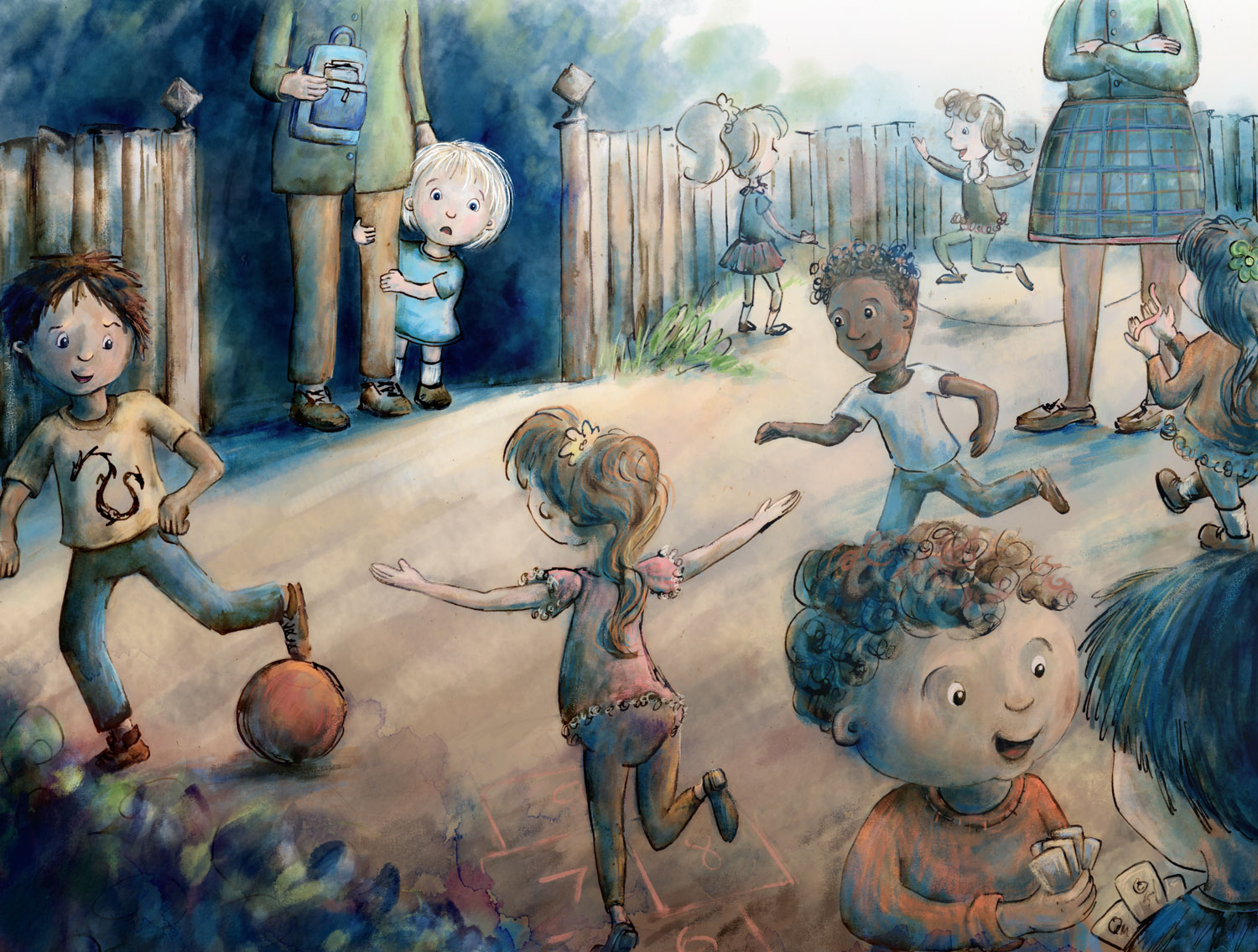
@Dulcie This looks amazing!! It definitely looks a lot better, but her skirt is still pulling the eye over there - I think it's the pattern and the fact that the stripes include black - it's the darkest dark competing with the lightest light (the child). Can you either make those stripes a mid-tone grey instead of black or make her skirt solid and the other teacher's pants striped? Everything else looks awesome (I especially LOVE the expression on the little girl's face!).
-
@Dulcie It's beautiful! Very nice color scheme, the warm-cool tension really gives a great richness to the piece. And the value scheme really works in putting the little you in focus. One thing to consider is to reduce the contrast on all the rest of the piece (a "curves" or "levels" andjustment layer with a soft mask is how I would do it). There are a lot of attention vampires in the image (that is a new word I learnt this week from an Art Director!) - faces, patterns, dynamic poses, etc... - and I feel they create a bit of unrest. A bit of contrast tweaking could also help in creating some more depth. Despite the perspective, many things appear to be on the same plane. I had some difficulty in sorting out the plane of the rope from the plane of the teacher's legs or the boys playing cards in front from the boy running in the back, etc... Maybe adding a little atmospheric perspective with contrast adjustement could make the image read more clearly.
It is however a very beautiful piece - I would try out a couple of contrast tweaks just to see if it gets even better, but it may just as well be perfect as is.
Good luck with the contest! -
@amberwingart Thank you, both for your kind words and the suggestion about turning the black skirt stripes to grey - I tried it with a greyish blue and I really loved how it changed the image. Hope it fixed the attention-grabbing-ness that you noticed
Thanks again for persevering with the suggestion!@smceccarelli Thank you! I really appreciate your considered thoughts, kind words and suggestions. Well, I started out making a contrast adjustment layer...but then I went completely off-piste by increasing the contrast instead...there was something that was bugging me about the bottom part, and that change fixed it for me (I did try lowering it, it made it look a little sludgy) ...but worrying that you were going to completely disapprove of my changes, I also tried to make some atmospheric perspective with a layer of light blue on screen mode...and I really liked how that worked - so thank you so much for making these suggestions! I realise that it is certainly a flawed piece - perspective and drawing people are some of my worst qualities as an artist right now..... but hopefully practice will help. Adjustment layers are a new thing to me too, so it's been good to explore them a bit...I think I'll be using them a lot more.
Anyway, here is a (final?) update...
-
@Dulcie It looks beautiful and I am sure it will be very much appreciated in the contest! Your style does not require to be fully accurate with perspective, so I would not worry too much about it.
Adjustment layers are one of the best inventions ever (together with brush modes!) and I use them continuously - both in my day job (I do a lot of image editing) and illustration work! So definitely worth exploring! -
@Dulcie BINGO! You fixed the "attention pull" on the skirt. Now the attention goes right where it needs to!
-
Great work @Dulcie the little girl in the focal point looks super cute.
-
I remember that feeling, great energy.