Central Park Critique Please
-
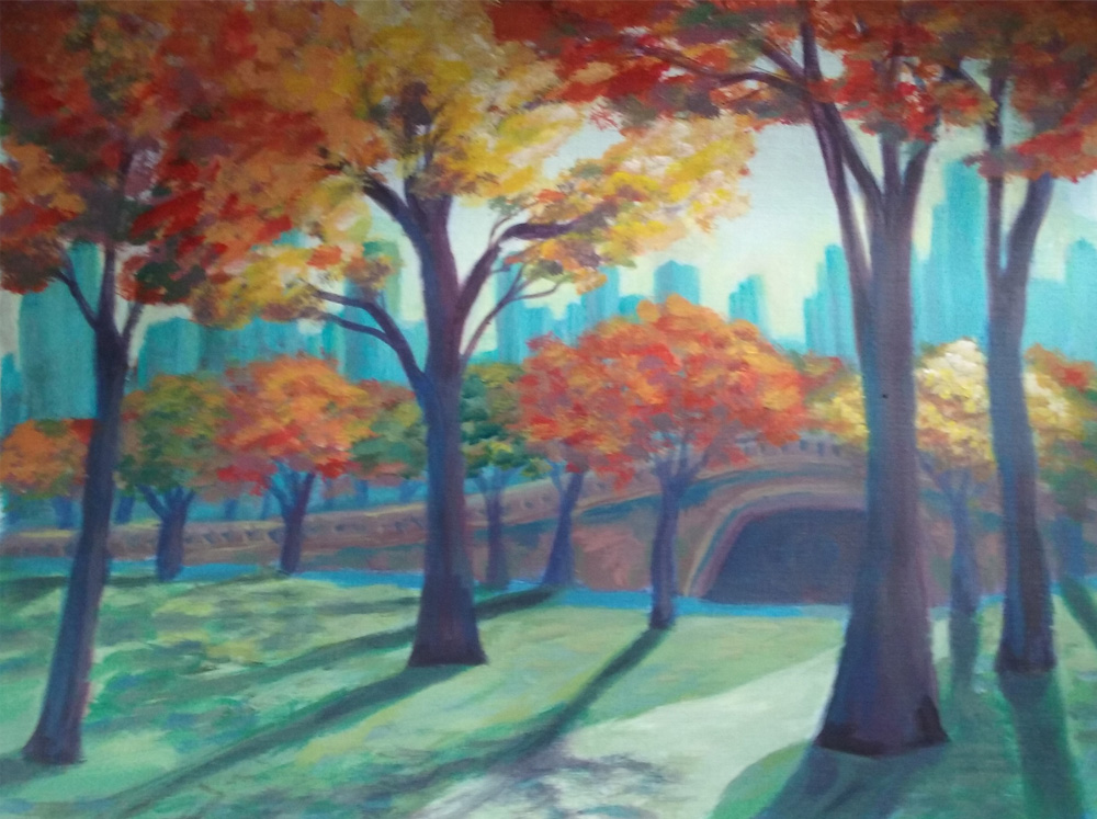
Hi I am painting this as a gift. We went to New York and my cousin let us stay in their apartment there. I was focusing on studying shadows and controlling my values. Also edge control, and keeping loose while painting. Any critique would be appreciated. I lost the skyline, didn't realize my leaves would go down so low. Do you think it is ok overlapping so much? also I lost a little of the top of the bridge. sorry it is just a quick shot from my phone. -
It looks good. I think the overlap is really nice! I might add a little darker color to the tree trunks to make the lights look brighter. Also, I don't understand what the blue line under the bridge is. Maybe it's water or a blue shadow? There are trees growing out of it so I didn't think it was water. If it's a shadow I'd make it he same color as the tree shadows with only a little blue hints here and there and add some highlights to the trees and top of the bridge.
Is this acrylics? It's really pretty so far.
-
@Washu thank you yes it is acrylic. It is crazy how you get so used to seeing your painting that you don't see things like the shadow of the bridge not looking like a shadow. Thanks for your thoughts!
-
Looks good, but I would suggest the same as Washu. Darken the shaded areas. That should bring out the path more too.
-
This is a really nice piece and it's looking good!
Two things I want to mention to hopefully improve it. The first is the angle of the shadows of the trees. The sun is so far away that any shadows from it should all point in the same direction. The only time you have shadows that radiate in different directions is when the light source is close (such as a street lamp). This is a subtle thing, but not having the shadows correct will cause it to have an "off" feeling for many people although they wont be able to tell you why.
The next thing is purely an opinion, but I think you should put some kind of subject matter in there. It doesn't have to dominate or be very big, but this picture is dying for something to attract the overall focus. It could be a park bench, a jogger, or anything you want. Just to give the viewer some main thing that the image is about.
Like I said, this is very lovely. It will be a great gift! : )
Cheers,
Lee