Society of Visual Storytelling

    SVSLearn Forums

    • Register
    • Login
    • Search
    • Recent
    • Tags
    • Popular
    • Users
    • Groups
    • Search

    50 Things Challenge

    General Discussion
    28
    50
    11989
    Loading More Posts
    • Oldest to Newest
    • Newest to Oldest
    • Most Votes
    Reply
    • Reply as topic
    Log in to reply
    This topic has been deleted. Only users with topic management privileges can see it.
    • smceccarelli
      smceccarelli Pro SVS OG last edited by

      Wow, thanks everyone for the feedback - I am going to smile for the rest of the day :-))
      @Eric-Castleman, I am at most an undercover student - I only pretend to know what I am doing, in reality every new image gives me panic attacks 😉
      Now getting started on color - no idea how to go about it....as usual.

      1 Reply Last reply Reply Quote 4
      • seelliott
        seelliott last edited by

        Great work @smceccarelli and all the little details are really nice. Can't wait to see the coloured version!
        The different line thicknesses and tones work so well to give the image depth.

        Website: http://www.seelliottcreations.com/
        Facebook: https://www.facebook.com/SEElliottCreations/

        1 Reply Last reply Reply Quote 1
        • Sarah LuAnn
          Sarah LuAnn SVS OG last edited by

          LOVE it! Such a fun steampunk-y vibe. Excited to see the color!

          sarahluann.com

          1 Reply Last reply Reply Quote 1
          • smceccarelli
            smceccarelli Pro SVS OG last edited by smceccarelli

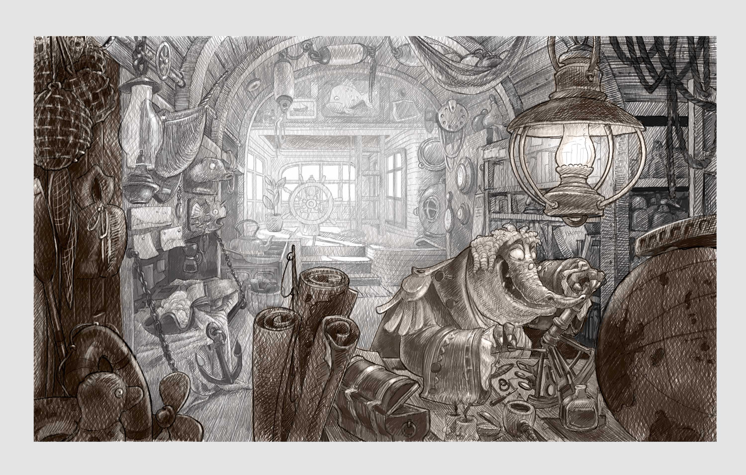
            I decided to follow Will Terry's process further and do a pencil-like value pass. Now I am toying with the idea of keeping the foreground on a completely different color space than the background. i have seen this done, for example, by John Howe...the images get somewhat graphic but very nice...very much out of my comfort zone, but still having fun!

            0_1487776979567_50Things_Value.jpg

            This is the image by John Howe that makes me think of a graphic foreground/background separation. Do you know of other examples? I know they are out there, because I have seen them more than once....

            alt text

            Kevin Longueil Mara 2 Replies Last reply Reply Quote 10
            • Kevin Longueil
              Kevin Longueil SVS OG @smceccarelli last edited by

              @smceccarelli Pencil pass looks great! .........Poor Mr. Narwhal!

              Portfolio: kevinlongueil.com
              https://www.instagram.com/kevinlongueil/

              1 Reply Last reply Reply Quote 1
              • evilrobot
                evilrobot SVS OG last edited by

                Yeah, love'n the pencil version. Hope you are able to keep some of that texture when you go to color.

                http://www.palacioillustration.com/

                https://www.scbwi.org/illustrator-gallery/illustrator-detail/?illustrator_id=84142

                https://www.pinterest.com/evilrobot2/pins/

                https://twitter.com/MyEvilRobot

                1 Reply Last reply Reply Quote 1
                • Naroth Kean
                  Naroth Kean last edited by

                  that is awesome!!! I love it!!!!

                  http://narothkean.com
                  https://twitter.com/narothkean
                  https://www.instagram.com/narothkean

                  1 Reply Last reply Reply Quote 1
                  • drawingmelee
                    drawingmelee last edited by

                    I'm so in love with that pencil version! 🙂

                    Instagram: https://www.instagram.com/drawingmelee/
                    Twitter: https://twitter.com/drawingmelee
                    Website: http://www.drawingmelee.com

                    1 Reply Last reply Reply Quote 1
                    • MOO
                      MOO SVS OG @smceccarelli last edited by

                      @smceccarelli I agree. Wow!

                      Marsha Ottum Owen

                      1 Reply Last reply Reply Quote 1
                      • smceccarelli
                        smceccarelli Pro SVS OG last edited by

                        Thank you all again!! I am still correcting and refining the drawing, but now many people are saying I should not color it, or only very very minimally, with a vintage look. That is a bit against the grain for me. What do you think?

                        Kevin Longueil MOO 2 Replies Last reply Reply Quote 1
                        • Kevin Longueil
                          Kevin Longueil SVS OG @smceccarelli last edited by

                          @smceccarelli My feeling is that you are Very good with color - i remember the first piece of yours that i saw and thinking "wow - this person really knows their stuff" - i believe it was the girl with the home-made time machine with the room full of dinosaurs (great piece!) - if i had drawn anything close to this awesome i would be afraid of ruining it somehow with my lack of color knowledge and experience - but since it is your awesome drawing i am excited to see how you will paint it........and secretly hope that you do another youtube video of your process 🙂

                          Portfolio: kevinlongueil.com
                          https://www.instagram.com/kevinlongueil/

                          1 Reply Last reply Reply Quote 1
                          • MOO
                            MOO SVS OG @smceccarelli last edited by

                            @smceccarelli I'm for color, myself 🙂

                            Marsha Ottum Owen

                            1 Reply Last reply Reply Quote 0
                            • Dulcie
                              Dulcie SVS OG last edited by

                              Oooh well, this is sort of tricky to answer - you are undoubtedly very good with colour, but this piece is already so full and real with just the linework and pencil texture...I think you have to be careful not to repaint over it so much that you cover too much of all the lovely line that you've done already (I'm sure you will also colour below the line, of course..and I know you could change the colour instead of painting on top)

                              So I would go with colour, but minimal enough to let the linework and texture sing. I wonder if you have seen the work of Corey Godbey, (http://corygodbey.com) he might be a good inspiration here on how to treat it...I was directed to look at his work by Will Terry during the Fall Critique last year - so I did, I looked at his works and even downloaded his paid-for video tutorial about his process (which was informative and interesting)...his art is also line-dominated, but it still has an ethereal quality and very good colour choices and delineation of foreground/background with value. They are often vintage/timeless looking but still colourful. Some pieces:

                              0_1487971345190_corey-godbey1.jpg

                              0_1487971377983_corey-godbey.jpg

                              0_1487971475832_corygodbey_scan-5a.jpg

                              0_1487971518810_f20b856d472abfa0-Labyrinth_Tales_HC_Cover.jpg

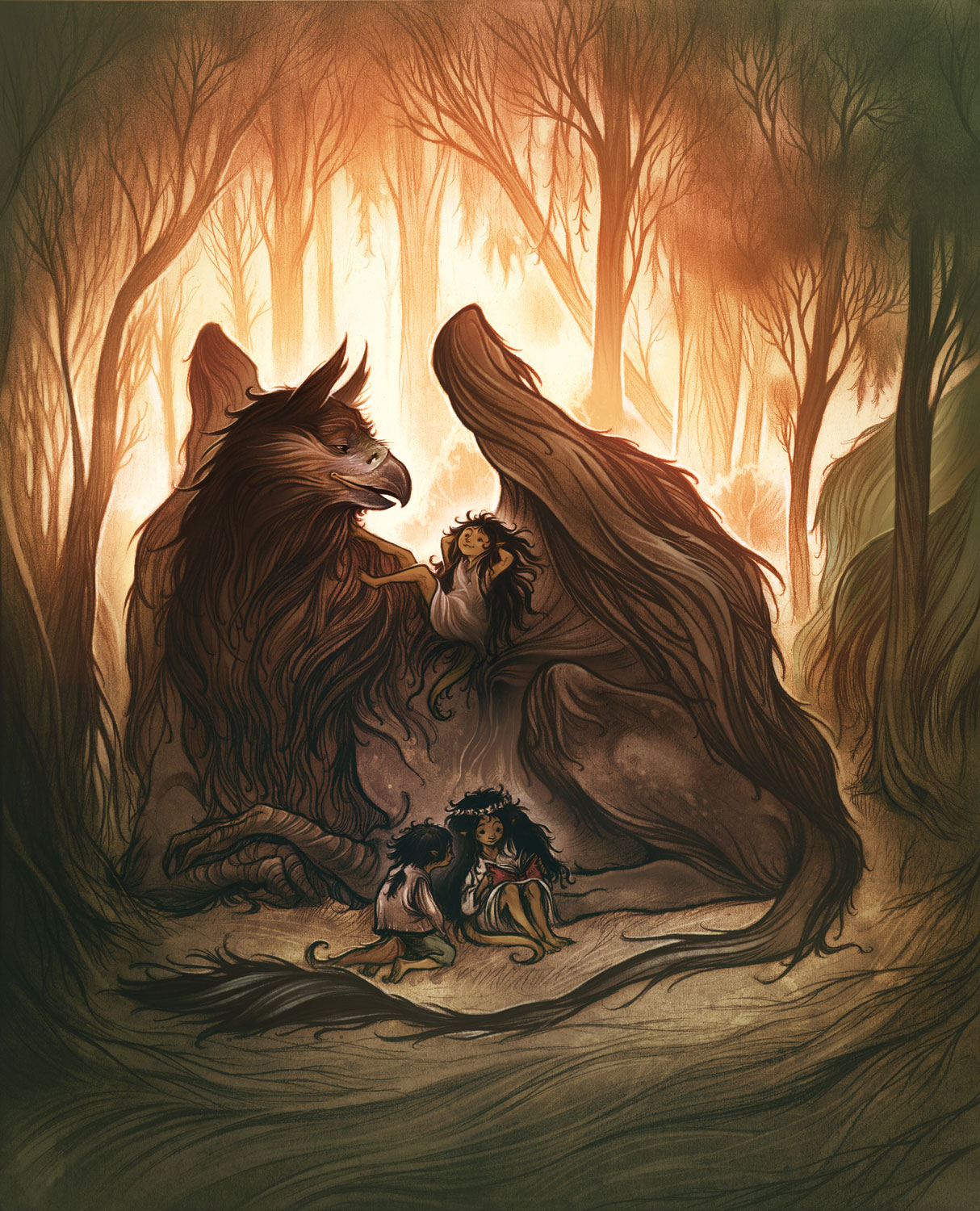
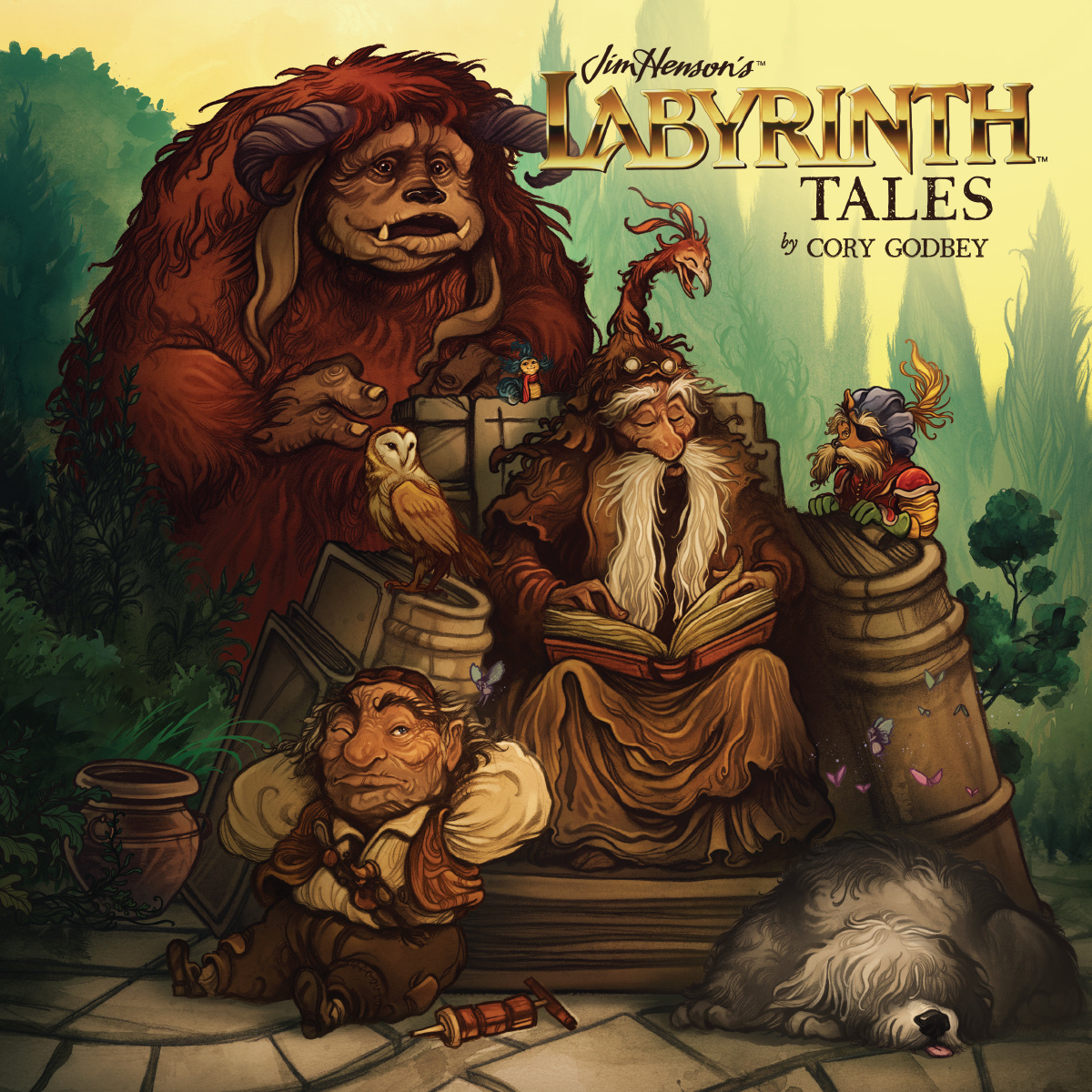
                              Hope this doesn't come across like I'm spamming your thread with pics, hope it's helpful in some way!

                              www.dulciemascord.com
                              https://www.instagram.com/dulciemascord
                              https://twitter.com/dulciemascord
                              https://www.facebook.com/dulciemascord

                              1 Reply Last reply Reply Quote 5
                              • Sarah LuAnn
                                Sarah LuAnn SVS OG last edited by

                                After the #kidlitart chat on twitter last night, I've been thinking about black and white illustrations a lot today! When working digitally it's easy enough to keep the black and white version, you can go back to that if you like it better. I say try color and see how it goes!

                                sarahluann.com

                                1 Reply Last reply Reply Quote 1
                                • smceccarelli
                                  smceccarelli Pro SVS OG last edited by

                                  Great comments and great advice throughout! @Dulcie , this is exactly what I was looking for, and I love that controlled treatment of color - reminds of Arthur Rackam but more modern. Justin Gerard does something similar too. That is what I am going to try to do. I was feeling the same about the pencil - there is already too much going on and color needs to give way a bit.
                                  I will be traveling for the next two weeks - not sure I will manage to transfer this to the iPad (I tried a couple of times to keep full layers from PS to ProCreate, but I always get error messages...) - so may have to wait a little....

                                  holleywilliamson 1 Reply Last reply Reply Quote 2
                                  • Eric Castleman
                                    Eric Castleman last edited by

                                    How long did it take you to put together the first image you posted?

                                    EricCastleman.com

                                    SCBWI profile
                                    https://www.scbwi.org/members-public/eric-castleman

                                    smceccarelli 1 Reply Last reply Reply Quote 0
                                    • smceccarelli
                                      smceccarelli Pro SVS OG @Eric Castleman last edited by

                                      @Eric-Castleman It is difficult for me to count together time used for an image - I use lots of scrap time for planning. I did some thumbnails on the plane to NY - probably for about one hour. From thumbnails to first pass and character design it was around 3 hours. Final line took two "short studio sessions" (I have two long ones of 10 hours and five or six short ones of about 2-3 hours during a normal week). So about 10 hours in total for the final line?

                                      1 Reply Last reply Reply Quote 1
                                      • holleywilliamson
                                        holleywilliamson SVS OG @smceccarelli last edited by

                                        @smceccarelli I believe you can transfer psd files from procreate to photo shop but not the other way around. Fantastic work!

                                        https://www.instagram.com/holleywilliamsonart/
                                        http://holleywilliamson.com

                                        1 Reply Last reply Reply Quote 0
                                        • Mara
                                          Mara @smceccarelli last edited by

                                          @smceccarelli
                                          Love it!

                                          Mara

                                          1 Reply Last reply Reply Quote 0
                                          • A
                                            admin @smceccarelli last edited by

                                            @smceccarelli This is looking great! It's exactly what I had in mind and so far the best example of how to do this assignment from someone at SVS! I just wanted to make sure that everyone knows I just launched the critiques for #draw50things class here at SVS. Doesn't look like you need it though 🙂 - Will

                                            smceccarelli 1 Reply Last reply Reply Quote 4
                                            • First post
                                              Last post