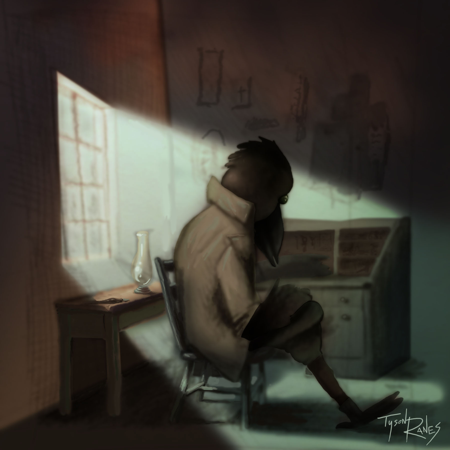
Raven @ His Writing Desk (work in progress)
-
This is a sketch I just rendered to a point. Any critiques would be greatly appreciated. What class impacted your rendering the most?
-
I really like the mood of the image, though I would try out how it looks with an expanded value range (you can do this in Photoshop with a levels or curves layer). I would not render it any further, I think it works perfectly as is, but I would feel like pushing the light a bit more.
Regarding rendering, the life-changing course for me was Sam Nielson's on Schoolism (the first course, not the second one). It is not a depreciation of SVS: SVS courses are better than nearly all Schoolism courses in my opinion. The only really outstanding course that has no equal anywhere else is Sam Nielson's Fundamentals of Lighting.
-
Why is a raven like a writing desk?
")
I think you have a really good mood and color scheme going on here. Cool scene, and nice details coming out.
One thing I notice is there is a very broad range of edges--lots of very soft edges and some very hard ones, and everything in between. It is a good thing to have that mix, but I feel like there could be more intention about WHICH edges are hard and which are soft.
For example, the edge between his sleeve and wing is one of the hardest I can see and it really draws the eye. I feel like that is an edge that would work better if it were softened a little bit.
On the other hand, the chair legs that are in shadow look so soft they seem like they're marshmallows. Some softness there is good, but I think a little more definition would help.
-
EDIT: Ninja'd by @Sarah-LuAnn !
I would actually second @smceccarelli : Sam's fundamentals of lighting is one of the strongest courses ever. I took it a few years ago and actually would probably get a lot out of it if I took it again.
And I'd also agree that SVS has much stronger courses than Schoolism when it comes to the world of illustration and children's books.
As far as your piece: I enjoyed the colors, the mood, the subject (creepy & interesting!) and I like how you've drawn things.
I'll use a word that @smceccarelli doesn't like (sorry!) in that it seems to "digital" to me and by that I mean "airbrushy" or too soft. Lee White has pointed this out in some of my work as well so I know I struggle with it.So the way it reads, for me, now is that the pen on the desk is the focal point. This is largely because A. It's in the light and B. it seems to be the sharpest image.
The lamp is also in the light but it has soft/fuzzy edges--as do most of the elements of the piece. I get why that background desk would be out of focus but most everything else probably shouldn't be.If you really start looking around you'll see where parts of the chair have sharp edges, the figure's leg and foot have sharp edges, etc.
If you did this in PS maybe run a sharpen or sharpen more filter on it and see how it changes everything. The "real" way to do it would be to go in with a harder edge and clean it up a bit.
I really like this piece--nicely done.
-
I'd be a third for Sam Nielson's class on rendering and lighting (Still one of the single best classes I've ever taken) As far as drawing I got a lot out of Jake Parker's drawing in perspective class, and Will Terry's Visualizing Drawing in Perspective class and digital pencil class.
Second best class I've ever taken is Lee White's How to Make Money in Illustration. I'd say this class is a must once you think you're ready.
-
@smceccarelli thank you. I'm going to hit the wall in the background above the desk and then see what other value adjustments I can do. I'll post the final. Also thank you for the course recommendation can't wait to watch it.
-
@Sarah-LuAnn thank you. For being an extra set of eyes. It's cool how interaction with other artists who want to relate and come along side encourage and critique enhances the beauty of what is unseen then created for others to see. Life is really amazing and the more I learn about these principles in art the more I see them translate to everything. I going to try to apply all the replies when I get time and I'm excited to see a better piece than one done in social isolation! Yippy!!!! Haha! Yes!!!
-
@mattramsey thanks !!! I'm cataloging the Intel and I'm going to go to town on this thing. I might just make bullet points and attack this thing like a rabid squirrel!
-
Thank you @evilrobot !
-
@Tyson Really liking this piece! - as Matt said it is creepy and interesting - nice mood - i would love to see this with a textured brush for the final rendering something with a bit of tooth to it - i will say that when i saw the original sketch for this painting it had the feel of a quick sketch done by one of the great masters to me - not sure why but that did pop into my head...there is something just right about it - also reminded me of Mark Andres work - very nice!
-
@Kevin-Longueil thank u for the awesome compliment it is encouraging and the advice on the piece. Hopefully I will have time to finish this before to long I think I'm going to write down all the critiques from this post make a bullet point sheet and go to work on this. Hopefully I'll have time I have a teething baby and I'm running on coffee juggling a million ideas and to do's like a wind storm barreling through a redneck yard collection! I need to catch my breath.
-
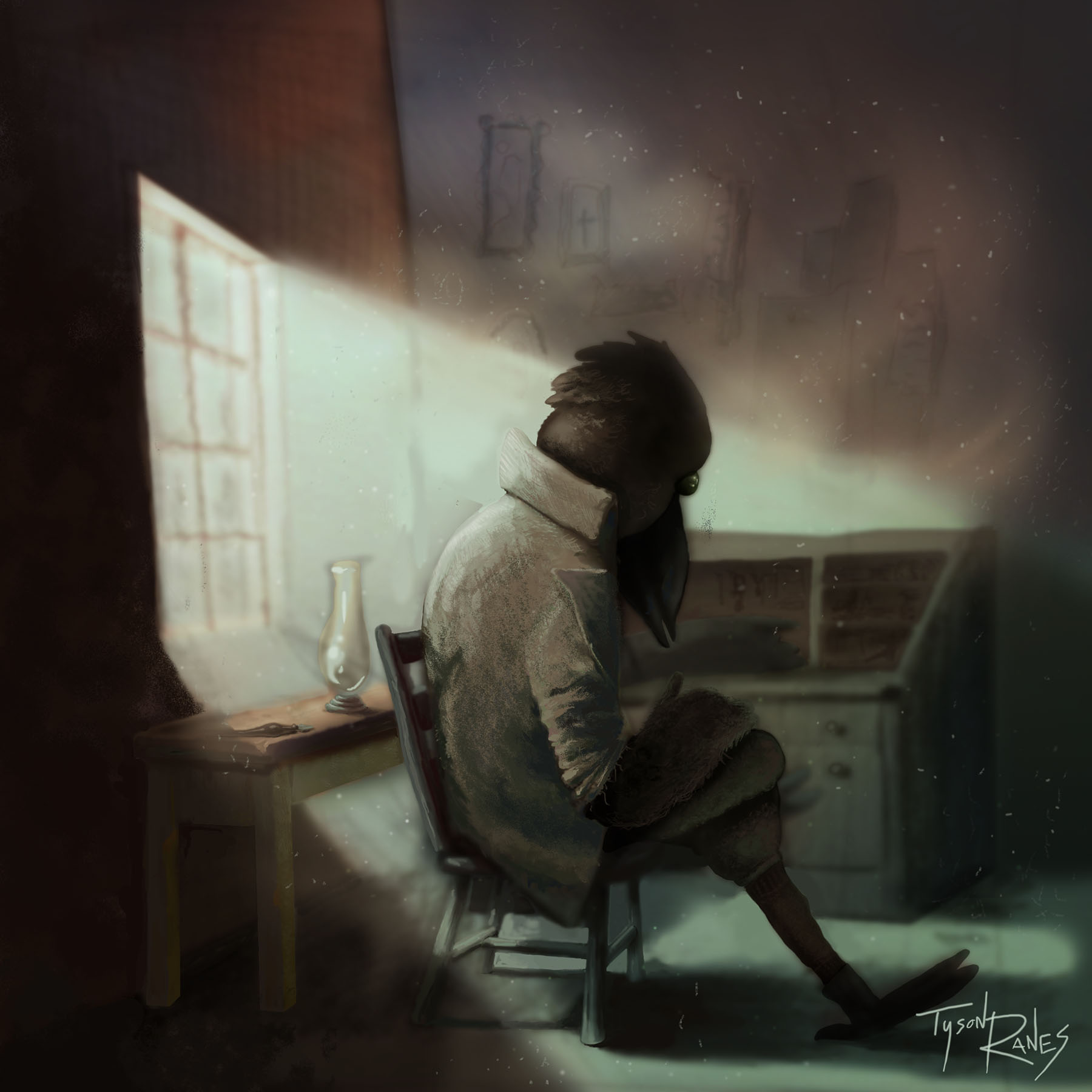
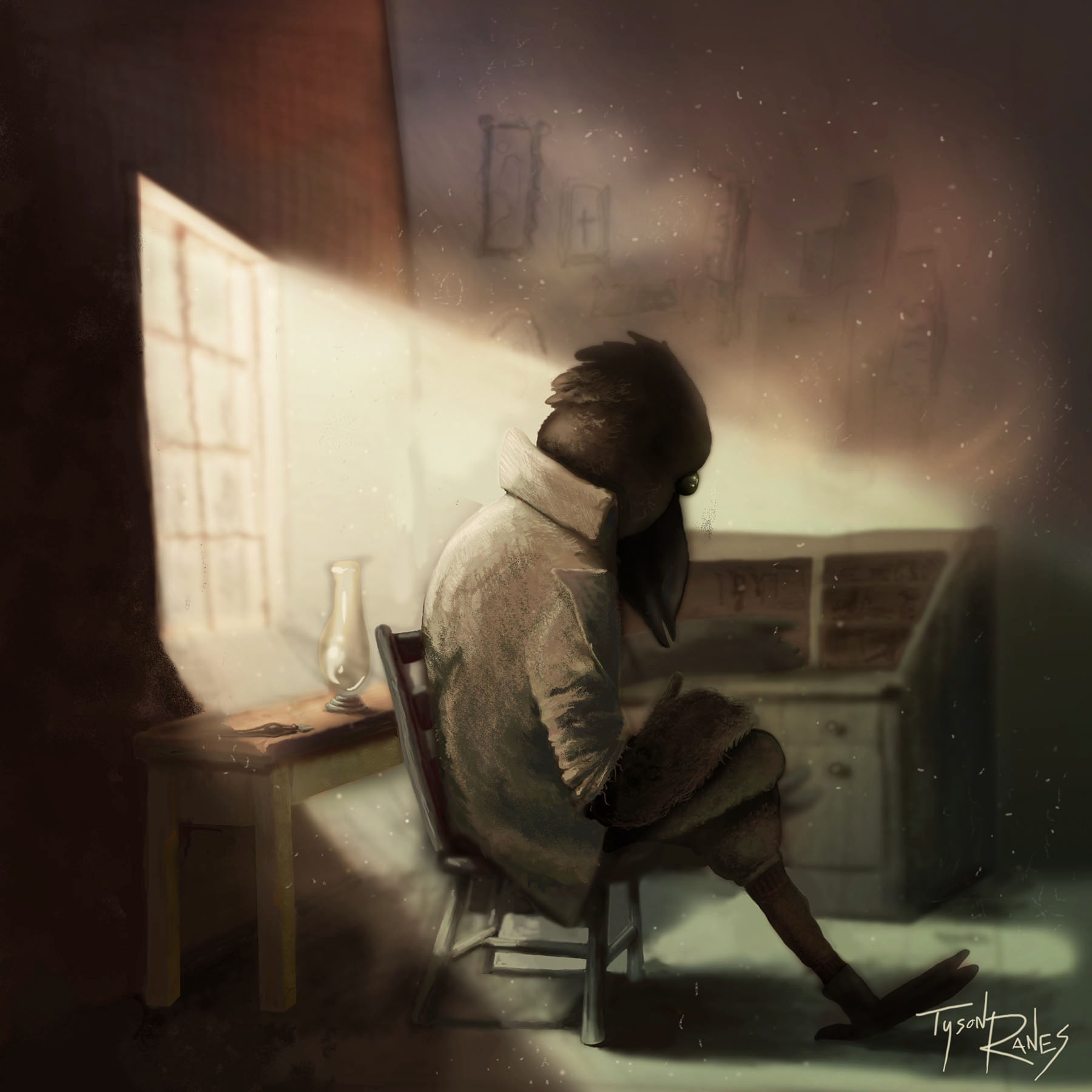
I took into account the posts and tried to fiddle with this piece. Here is an update this part of the learning curve is tuff but if a mans going to make he's got to be ruff.
-
A slight warmer render >>>>>
Which one looks better? Thank U!
-
@Tyson-Ranes The relatively cooler version has a better feel to it for me - they are both nice though!
-
I think the cool light probably captures the mood better, if you're going for sad? Also, watch the perspective on that table! The left leg should be a little shorter than the right one.
-
@Tyson-Ranes agree with @Kevin-Longueil
Nice work