Society of Visual Storytelling

    SVSLearn Forums

    • Register
    • Login
    • Search
    • Recent
    • Tags
    • Popular
    • Users
    • Groups
    • Search

    Composition Feedback?

    General Discussion
    9
    19
    2906
    Loading More Posts
    • Oldest to Newest
    • Newest to Oldest
    • Most Votes
    Reply
    • Reply as topic
    Log in to reply
    This topic has been deleted. Only users with topic management privileges can see it.
    • mcucchi
      mcucchi last edited by

      Hey Guys!

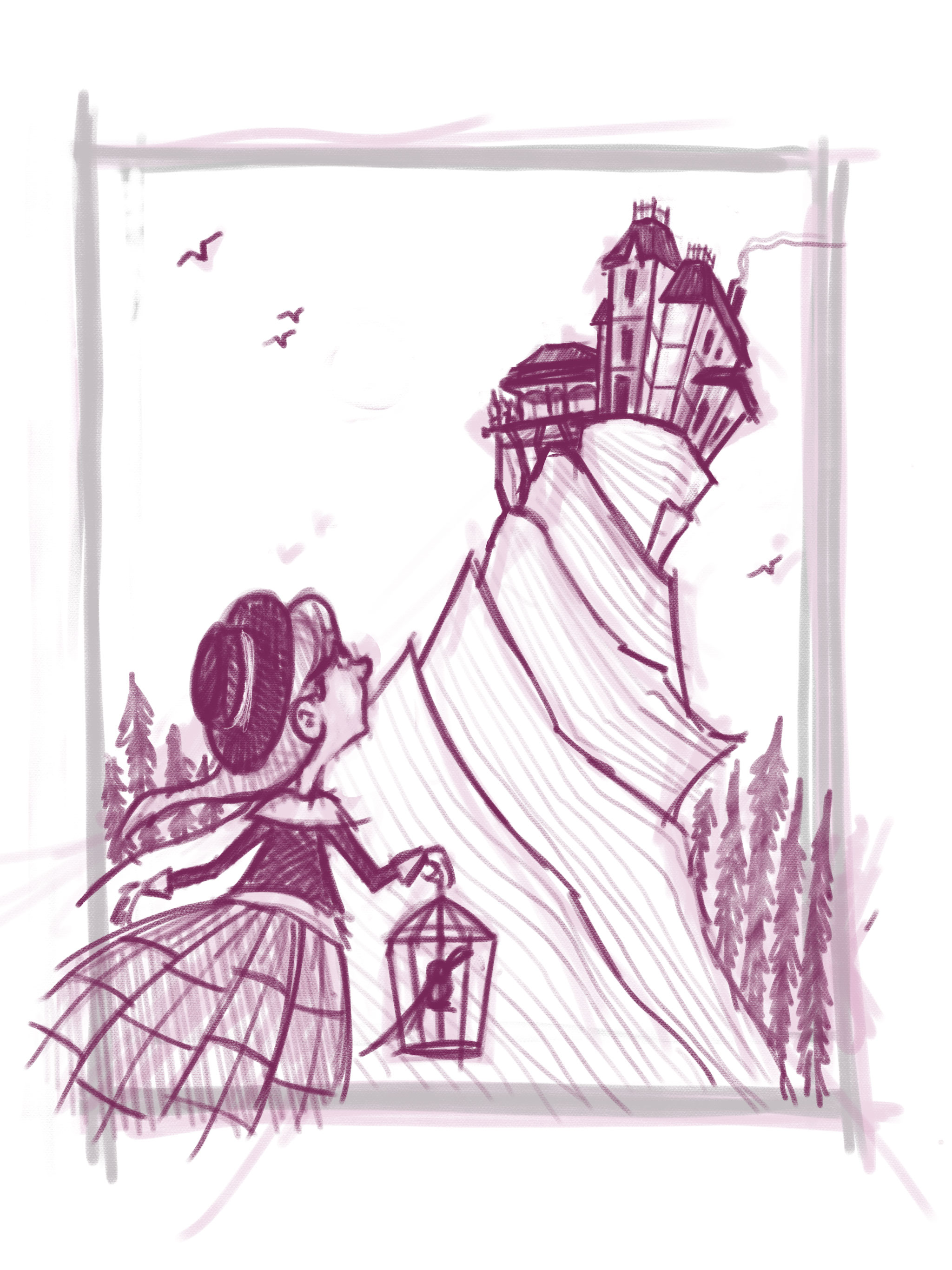
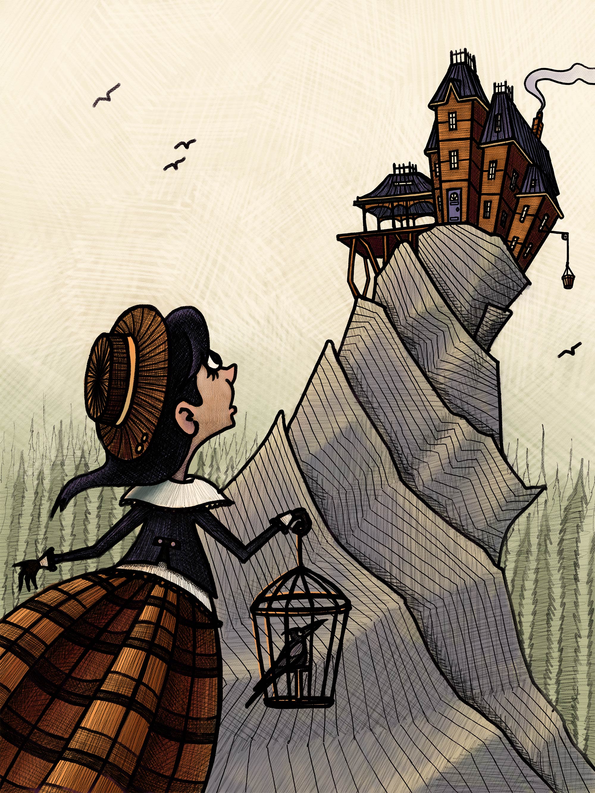
      I'm working on a concept image for a picture book that I am hoping to write and illustrate. In this scene, a young girl sees her mysterious grandmother's (somewhat intimidating) house for the first time. I just watched the Creative Environment Design class and was hoping to incorporate some of those principles here. Any feedback or advice you have about the composition and/or the environment design would be awesome.

      Thanks!!

      0_1490707174625_image1.jpg

      portfolio: moniquecucchi.com
      instagram.com/crookedandbeautiful
      shop: crookedandbeautiful.com

      1 Reply Last reply Reply Quote 2
      • Eric Castleman
        Eric Castleman last edited by

        I think it is great. Good balance

        EricCastleman.com

        SCBWI profile
        https://www.scbwi.org/members-public/eric-castleman

        mcucchi 1 Reply Last reply Reply Quote 0
        • mcucchi
          mcucchi @Eric Castleman last edited by

          @Eric-Castleman Thanks!

          portfolio: moniquecucchi.com
          instagram.com/crookedandbeautiful
          shop: crookedandbeautiful.com

          1 Reply Last reply Reply Quote 0
          • Spencer Hale
            Spencer Hale last edited by

            Awesome concept! Just a small tweak, I'd just adjust the mountain in the background so it passes behind the girls torso rather than behind her face. It should show a better silhouette of her face and pose. Love the perspective on the house!

            spencerhalefire.tumblr.com | instagram.com/spencerhalefire | twitter.com/spencerhale

            mcucchi 1 Reply Last reply Reply Quote 0
            • mcucchi
              mcucchi @Spencer Hale last edited by

              @Spencer-Hale Great comment! I was wondering about that exact thing this morning when I was looking at it.

              portfolio: moniquecucchi.com
              instagram.com/crookedandbeautiful
              shop: crookedandbeautiful.com

              1 Reply Last reply Reply Quote 1
              • mcucchi
                mcucchi last edited by

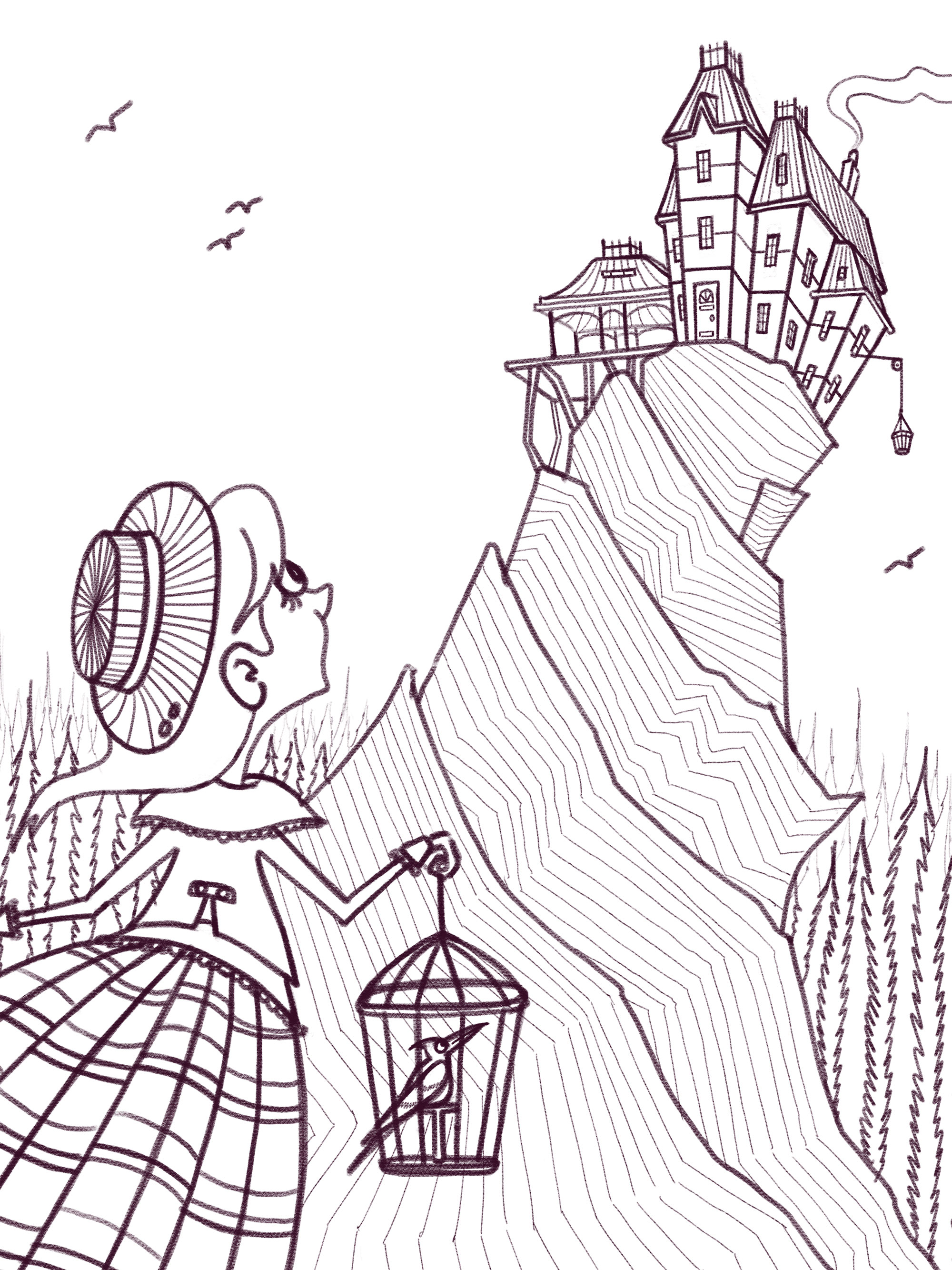
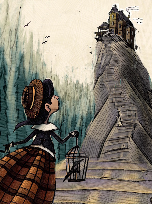
                Thanks for the advice! For anyone wondering, here are the final line drawing and the value exploration.

                0_1490793778297_line.jpg

                0_1490793830636_value.jpg

                portfolio: moniquecucchi.com
                instagram.com/crookedandbeautiful
                shop: crookedandbeautiful.com

                Chip Valecek 1 Reply Last reply Reply Quote 3
                • Chip Valecek
                  Chip Valecek SVS Team SVS OG @mcucchi last edited by

                  @mcucchi The only thing I might add is a hint of her mouth. I think at that view you would see a little of the side of her mouth. I may be wrong on that.


                  https://www.instagram.com/chipvalecek/
                  https://www.facebook.com/cvalecek
                  http://www.cshellmedia.com/

                  1 Reply Last reply Reply Quote 1
                  • mcucchi
                    mcucchi last edited by

                    Good call! I'll take a look. I want her to be feeling wonder/awe which would elicit a smaller, open mouth position. I tried to achieve it with a slight elongation of the jawline but I think I could probably give a hint of lips or push that elongation further to make it more clear.

                    portfolio: moniquecucchi.com
                    instagram.com/crookedandbeautiful
                    shop: crookedandbeautiful.com

                    holleywilliamson 1 Reply Last reply Reply Quote 1
                    • holleywilliamson
                      holleywilliamson SVS OG @mcucchi last edited by

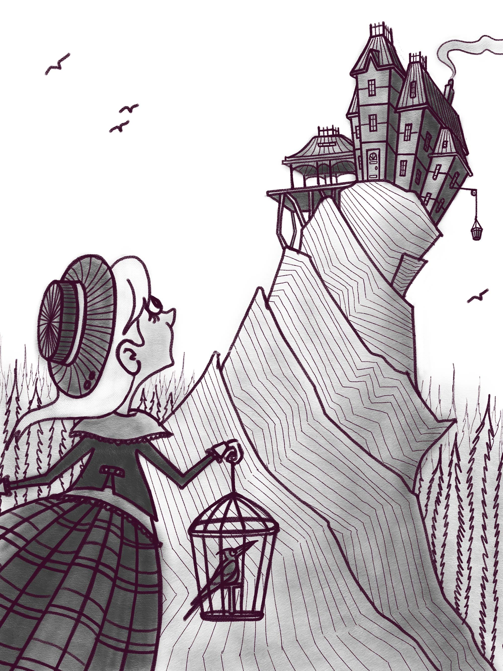
                      @mcucchi I think it is looking great, love the composition. Can you crop it differently so that we can see her whole hand? I think it is a no-no to crop at the wrist. Also I miss the flowiness of the girl's skirt.

                      https://www.instagram.com/holleywilliamsonart/
                      http://holleywilliamson.com

                      1 Reply Last reply Reply Quote 0
                      • mcucchi
                        mcucchi last edited by mcucchi

                        Thanks for all the great feedback! I was able to add the suggestion of a mouth and re-crop a little (thanks @holleywilliamson). Here we are today with tone and some more developed shadows. Onto the color!!

                        0_1490880656095_toneandshadow.jpg

                        portfolio: moniquecucchi.com
                        instagram.com/crookedandbeautiful
                        shop: crookedandbeautiful.com

                        kimchizerbe Tyson Ranes 2 Replies Last reply Reply Quote 6
                        • kimchizerbe
                          kimchizerbe @mcucchi last edited by

                          @mcucchi really loving where this is going!

                          http://zerbetron.com
                          http://kimchizerbe.com
                          ig: @kimchizerbe

                          mcucchi 1 Reply Last reply Reply Quote 0
                          • mcucchi
                            mcucchi @kimchizerbe last edited by

                            @kimchizerbe Thank you!

                            portfolio: moniquecucchi.com
                            instagram.com/crookedandbeautiful
                            shop: crookedandbeautiful.com

                            1 Reply Last reply Reply Quote 0
                            • Tyson Ranes
                              Tyson Ranes @mcucchi last edited by

                              @mcucchi this looks great!

                              1 Reply Last reply Reply Quote 1
                              • mcucchi
                                mcucchi last edited by

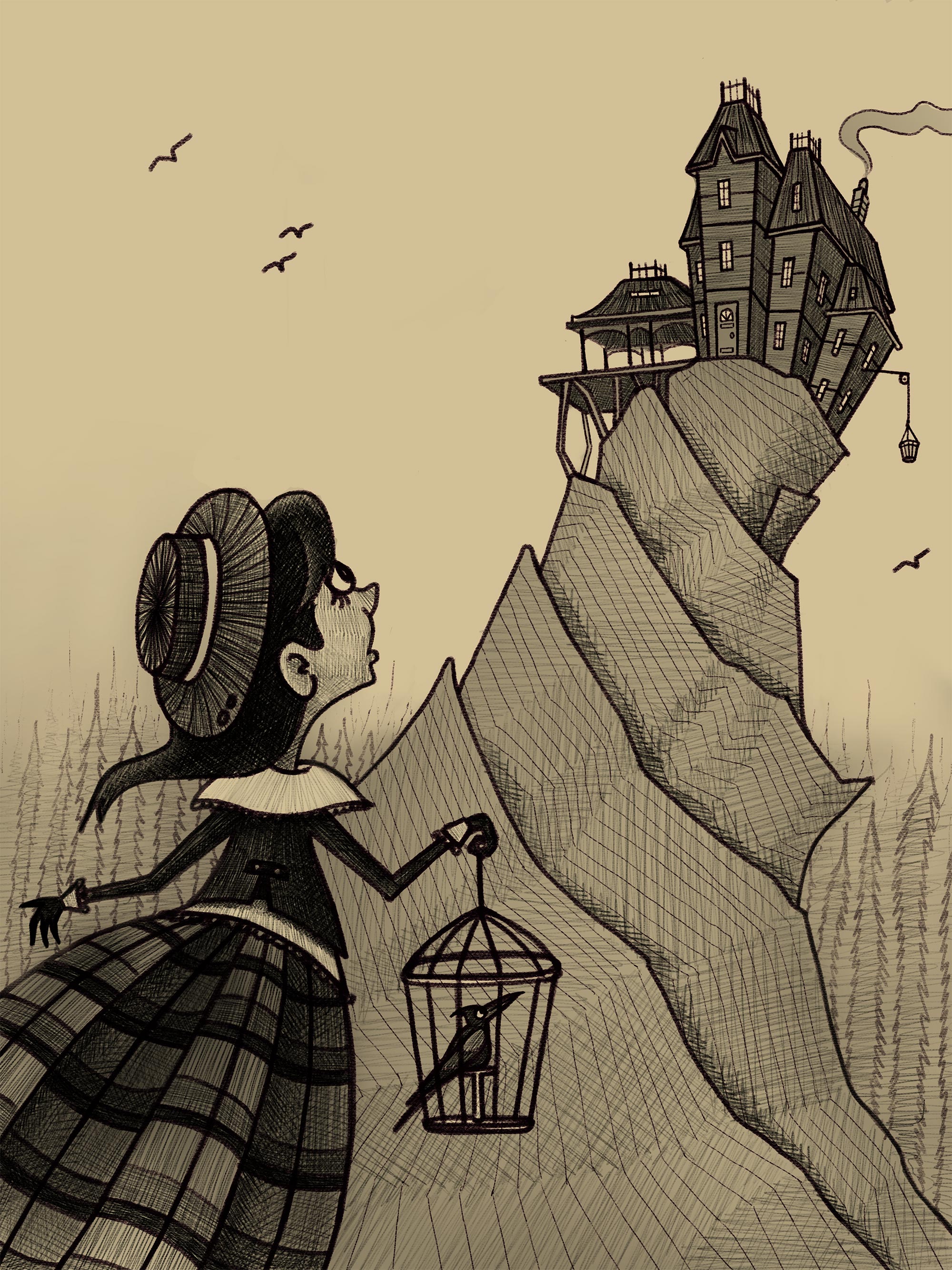
                                Color time! Color is my weakness. I have more experience drawing in black and white so my color pieces tend to move slowly and give me trouble. I never know how far I should take them. I've definitely overworked pieces in the past to the point where they're stiff and muddy. Here is the stopping point I reached last night. I'll spend some time away from it today and evaluate how I should proceed later.

                                0_1490967508645_color_1.jpg

                                portfolio: moniquecucchi.com
                                instagram.com/crookedandbeautiful
                                shop: crookedandbeautiful.com

                                Tyson Ranes Kevin Longueil 2 Replies Last reply Reply Quote 1
                                • DOTTYP
                                  DOTTYP last edited by

                                  Really enjoyed watching your process here ,lovely illustration!!

                                  scribbles.artstation.com
                                  www.instagram.com/dottypaints

                                  1 Reply Last reply Reply Quote 1
                                  • Tyson Ranes
                                    Tyson Ranes @mcucchi last edited by Tyson Ranes

                                    @mcucchi your discription is like a mirror. I'm also black&white guy learning about color and wrestling with it and burning allot of needed time. With this piece I would paint the house a cooler color to avoid making it creep to the foreground with the girl. The color and tone of the house and top part of mountain make it look flat competing with and not complimenting the girl in the foreground. I would change the color and tone towards the top of the mountain to not contrast as extremely with the house because the high contrast has a tendency to bring that section to the foreground . In general I would mess with the mountain and house area to push it farther back into the distance by using less contrast, cooler colors and possibly lighter tone. Maybe gradient tool on mountain? Awesome work

                                    mcucchi 1 Reply Last reply Reply Quote 1
                                    • mcucchi
                                      mcucchi @Tyson Ranes last edited by

                                      @Tyson-Ranes Yeah, I was thinking the same thing. I had grand plans in my mind of giving the house some atmospheric value and pushing it back farther... and then it didn't happen haha. Will definitely reevaluate to see if I can improve.

                                      portfolio: moniquecucchi.com
                                      instagram.com/crookedandbeautiful
                                      shop: crookedandbeautiful.com

                                      1 Reply Last reply Reply Quote 1
                                      • Kevin Longueil
                                        Kevin Longueil SVS OG @mcucchi last edited by Kevin Longueil

                                        @mcucchi This is looking good Monique! I did a quick cut and paste of your drawing to show the idea i had - i was thinking you possibly need a middle ground to help push the cliff/tower into the background a bit - i collaged and stretched pieces until i felt it was pushed back a bit - i feel like even the tiny middle ground in front of the girl helps to give a bit of depth - looks like you could do lots of interesting things with lighting here - i'm not much of a painter yet but it would be cool to have the top of the house and trees catching a bit of fading sunlight to show that the sun is setting - easily said right 🙂

                                        0_1490985850671_Cut and paste.jpeg

                                        i think desaturating the house and having the receding trees helped to push it back too

                                        Portfolio: kevinlongueil.com
                                        https://www.instagram.com/kevinlongueil/

                                        mcucchi 1 Reply Last reply Reply Quote 3
                                        • mcucchi
                                          mcucchi @Kevin Longueil last edited by

                                          @Kevin-Longueil Great ideas! Thanks a lot for the suggestion.

                                          portfolio: moniquecucchi.com
                                          instagram.com/crookedandbeautiful
                                          shop: crookedandbeautiful.com

                                          1 Reply Last reply Reply Quote 0
                                          • First post
                                            Last post