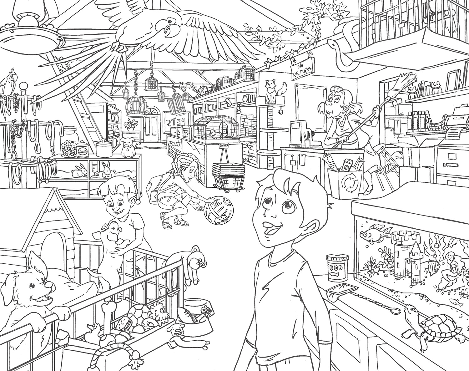
50 Things Pet Shop
-
 Okay I think I fixed things up better! Thanks guys for the feedback!
 -
Hi Brittany!
I saw this piece on instagram yesterday and I was really impressed! I just had a few thoughts I wanted to share.. Maybe you won't like the ideas, but maybe it can help!!
I did a really rough draw over to show you
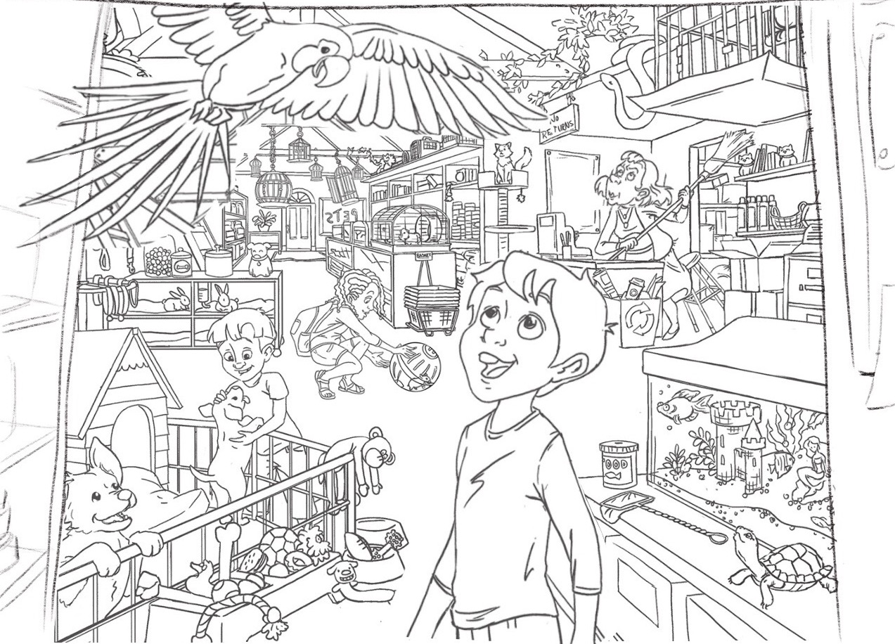
I was wondering if having something really big cropped up on both side could help frame the image ? Here I put a wall and shelves but really it could be anything.. I watched @Will-Terry youtube video critiques yesterday and he was critiquing a piece for the draw 50 things challenge and was talking about the small-medium-huge concept (and not just small-med-large) and I think having something big like the shelves/wall could help achieve that!
Also, I made the boy and parrot even bigger to really separate them from the rest of the action!
Finally I tilted the head of the shop owner a little more so that it feels more like she is looking at the snake (if it is what she is supposed to look at?!)
Anyway, I hope this will help! They are only suggestion as this is already a wonderful piece!!!
-
This is so amazing! I can't wait to see the color added!
-
Looks awesome!! I can't wait to see it in color!
 I don't have any crit to add now that you've changed the woman's face.
-
@NoWayMe Thanks!!
I really like the parrot bigger the boy, I'll play around with that. Thanks for your suggestions, you have a good eye! Which critique video was is with the 50 things?
@Lynn-Larson and @K.W. Thank you both, I'll post some progress stuff
-
@bharris https://www.youtube.com/watch?v=ntSIaIkzaTo There you go!
-
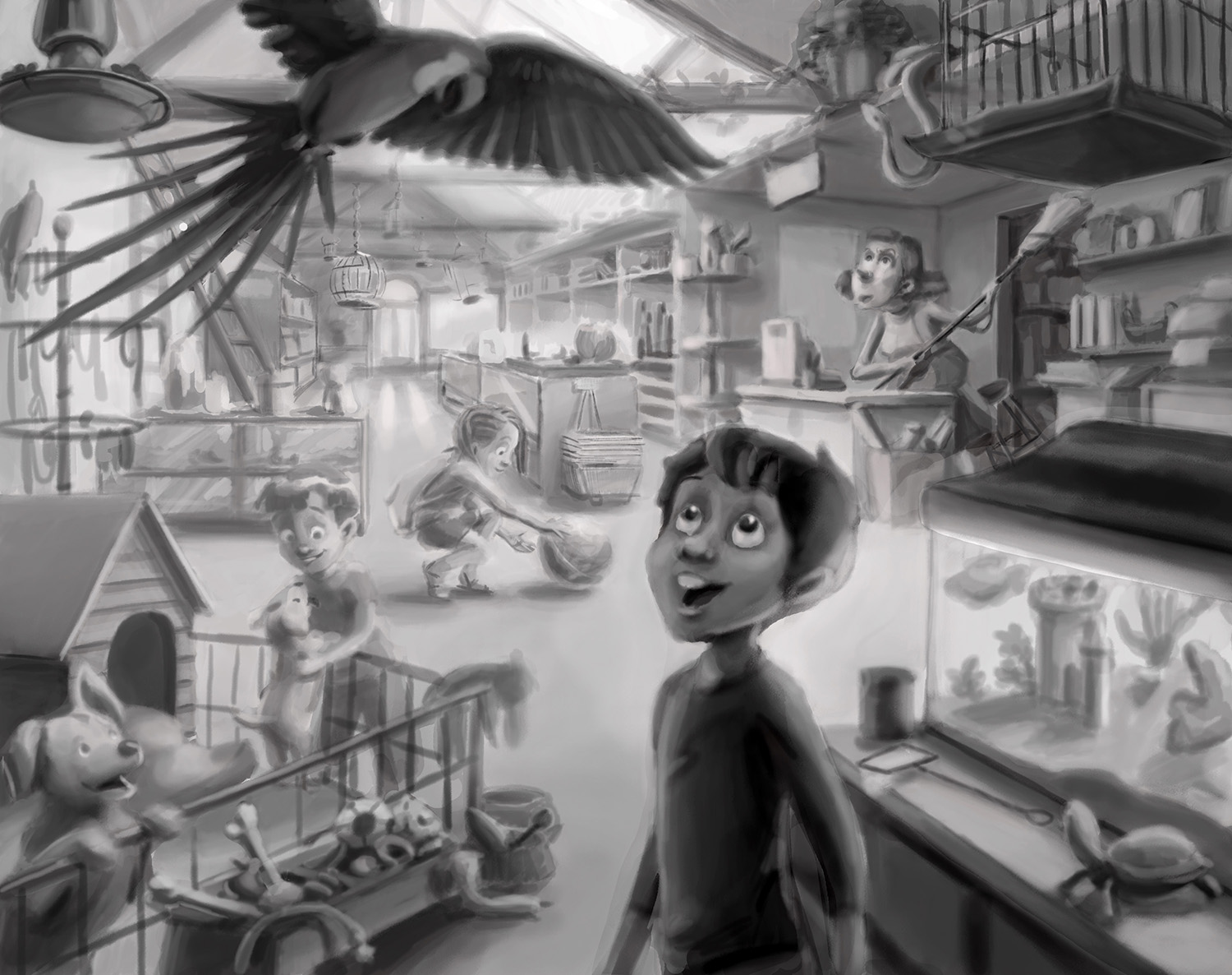
@bharris This is looking great! Will you be doing value studies next? It looks like you've gotten some great feedback on this - i like the larger foreground idea it matches the perspective and relative heights of things better i believe - one thing i think keeps grabbing my attention is the scale and perspective at the door - i think bringing the door forward and increasing the scale might be a good idea - right now it is so far away that it is a noticeable fact..does that make sense?.... i am wondering if it is a story element that this store is so long - i think bringing the door forward will help ground the middle ground too - it seems to be floating a tiny bit above where my brain thinks it should be (my brain could be wrong of though) - i think the main culprit for the perspective feeling slightly off is the carpet in front of the door - the perspective lines coming from the right converge on the bottom right leaf of the potted pant by the door ... so the left side of the carpet in front of the door should angle to the right....i feel like i'm sounding crazy...easy fix (if you think this is not crazy) would be to enlarge the door and center it on the vanishing point.... anyways - i did not change anything in the drawing but just followed your perspective lines to their vanishing point - feel free to ignore this post
") Looking forward to seeing your next step!
Looking forward to seeing your next step!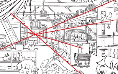
-
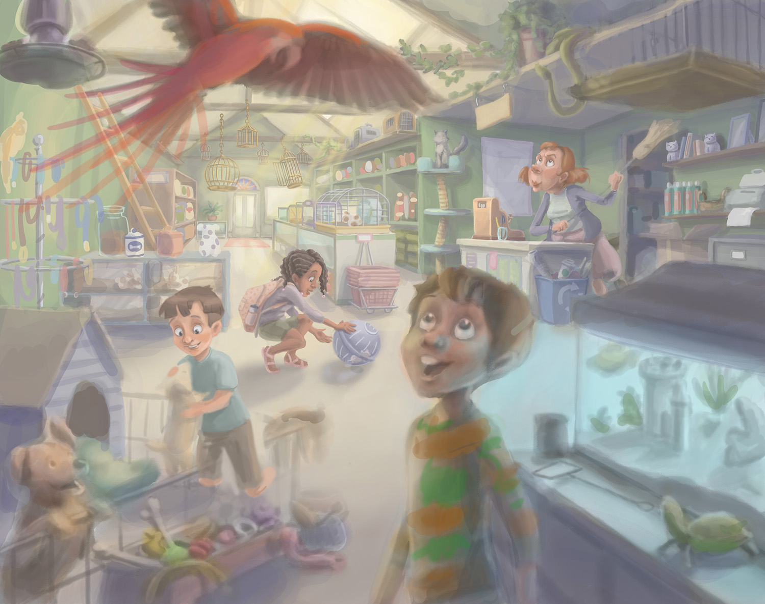
Still working out the kinks, and it is still in the "soft" stage. I haven't done an atmospheric effect before and I'm wondering how it is looking so far. Should I push the color in the back or front a little more?
@Kevin-Longueil I brought the door forward just a tiny bit, but I think I will move it down more. Now that I stare at it I see that "hovering."
-
This is wonderful I can not find any faults.
-
@DOTTYP Thank you for looking!
-
@bharris Hi Brittany - this entire scene is going to be fantastic when you are done.
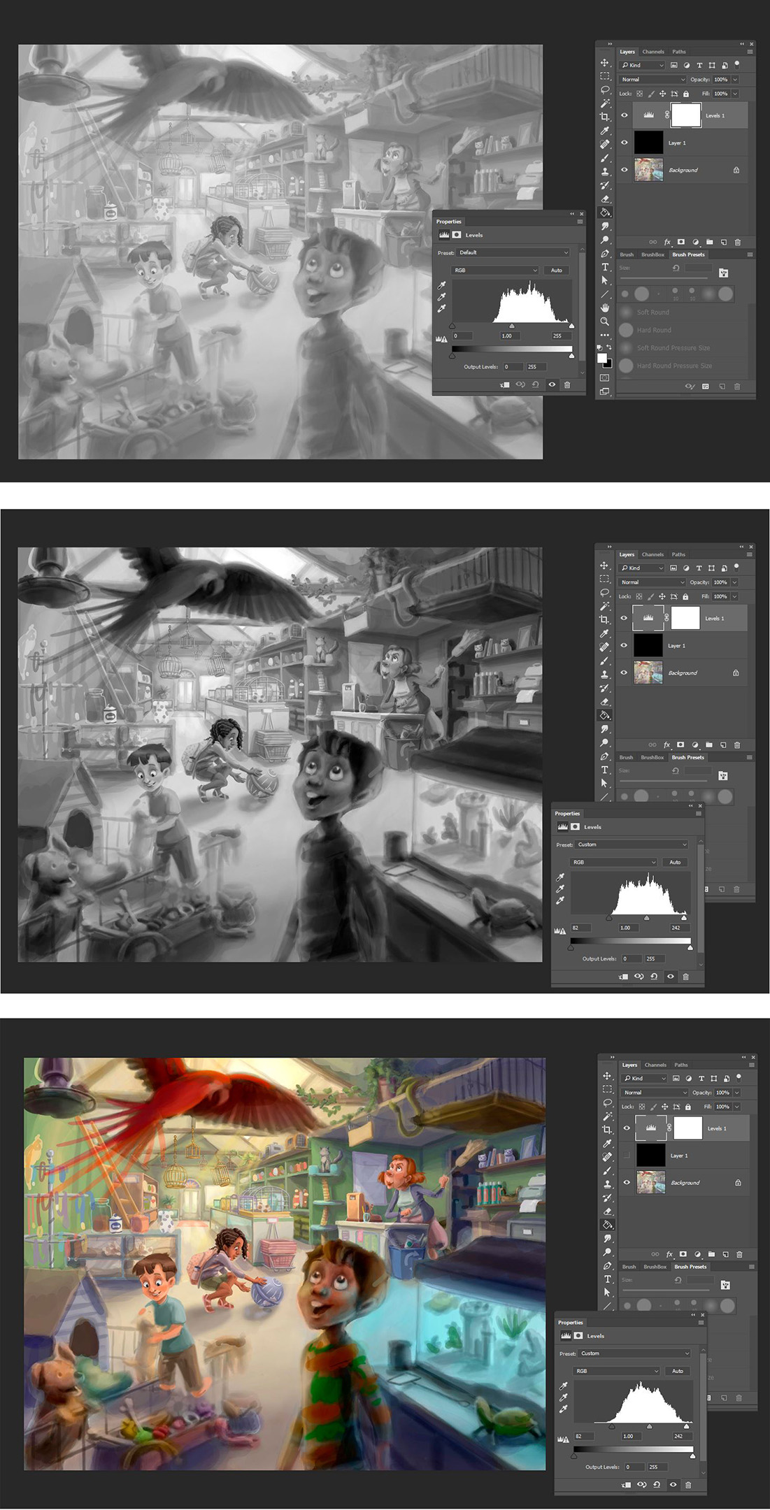
Right now I think that you really need to work on pushing your values in the image more.
For starters - go into Photoshop and add a layer of solid black over your image. Then change that layer to "Color" mode.
That will make it appear in its pure grayscale values. Then add a Levels adjustment layer and take a look at the little chart it draws - and notice that there are currently no values darker than about 50% gray. So definitely need some more range added in there as you continue to work the piece.
If you drag the slider from the black side of the adjustment over towards where that graph begins to appear - you will see it increased the range of your piece.
And then with that adjustment in place - turn off the Black Color layer so you see the image in full color again.
This may be too drastic of a value shift for your liking or the style you are going for - so play around with it. But its a great way to see where an illustration needs some more dynamics.
Now in this full color - also notice that your current lighting actually leads the viewers eye more towards the girl with the hamster and even the shop owner. At least for me it does. I actually look past the boy and the bird currently. Maybe others will see it differently - but that's what is so great about getting input here!
-
One other small note - the blue light coming out of the fish tank - would probably not create that area of blue that is between the edge of the tank and the boys head/neck/shoulder. As that is actually the floor behind the tank leading up to the register. So I would keep that as the floor color and just use fill/rim lighting on the tanks stand, the edge of the boy etc to get the glow of blue on them - as they are what it would impact. Not that floor area which is really in he mid-ground (not foreground).
-
Thank you @Rich-Green! This is the value I have behind the color currently, but I lightened it to about 50% because I was concerned that I was going too dark for a kid's book-style image. But I really like the contrast as you've shown here and I think I will push it more. I'm glad for the photoshop advice too, that will make it easier to fix! I think , I'll keep the girl slightly more washed out in the yellow lighting of the back. I imagine I'll be playing a lot with color in the front characters to get the focus right.
Yes I agree that the fish tank won't put off that kind of light, you can probably tell I haven't gotten to the front of the image yet.
")
-
OMG!! This is fantastic! I really love it.
-
Oh wow!
Love where you are headed with the colour! -
-
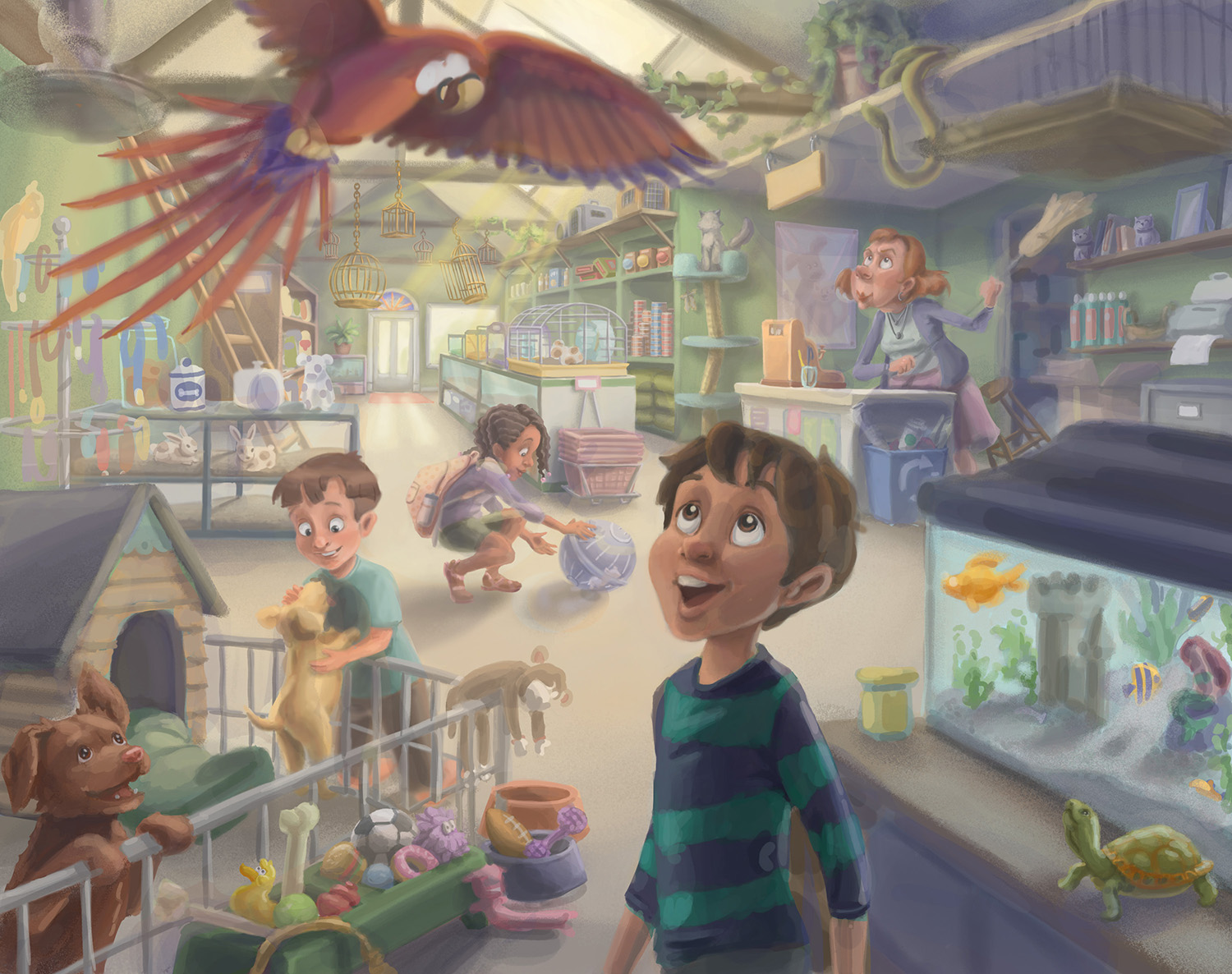
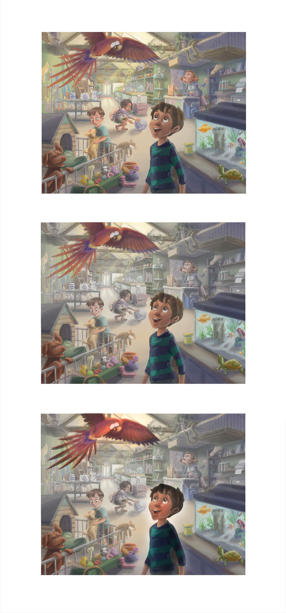
Hey everyone, getting to the point of sharpening everything, so what do you think? My concerns right now are the foreground colors, like the dog house and the chocolate lab (tribute to my sisters' family's new dog Cookie :)) Also did I go the right direction with the parrot reds contrasting cool and warms. The parrot will get a little darker value as I get into it.
Thank you!
-
@bharris it looks really great! Contrast is looking good, sounds like you want to push it further which will be good. This is going to be an awesome piece for your portfolio!
-
@bharris I hope I'm not too late to share. I don't know how finished you are and perhaps I'm getting ahead of you but I wanted to share an option for creating more focal point in the foreground and less distraction in the background. Your design is great and your muting of colors in the background is already working - I think you could push that even further... by darkening the foreground objects, saturating them, and washing out the areas directly behind them you can direct your viewer to the main idea and then let them experience the rest of the shop. This is one of the best #draw50things I've seen from SVS! Thank you!!
-
@holleywilliamson Thank you! Yes I am going to push it more and I'm so excited for it to be done
@Will-Terry I am still working on some things in it, but my plan was to washout that background more when I get into the lighting. I'm getting the front stuff pretty saturated in the foreground as well. Thank you so much for taking the time to look! I'm floored now!
It's been a great challenge, thank you for sharing it because I think it's given me, and everyone, that 3rd Thursday type assignment which is a great way to add more work to our portfolios.