Feedback please. :-)
-
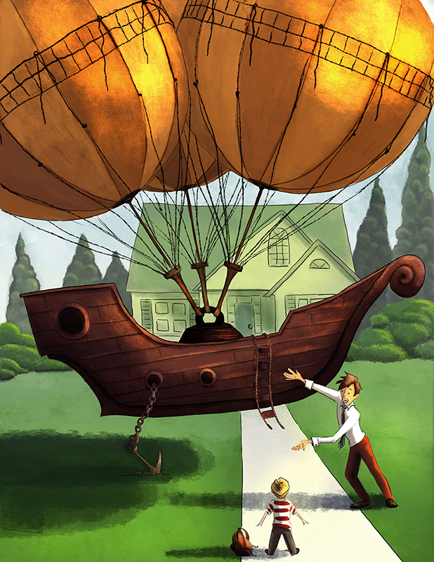
One of the first 3rd Thursdays prompts was Martin's Summer. I had missed actually submitting it, but always intended to finish it. Today is the day I finally did it! A thousand years later.
Anyway, I have been madly trying to complete pieces to put in my portfolio for our upcoming SCBWI conference. I would love some feedback in case there is something I have missed. I will be posting others pieces here as well for any helpful criticisms you, SVS friends, may have. Thank you!

-
@Tannie-Smith This is super fun. One thing I notice right way is the dad's shoulder seems a bit off and the right arm appears too short while the left arm appears too long. May want to adjust those, overall cool concept.
-
@Charlie-Eve-Ryan Thanks! I will look at that

-
@Tannie-Smith Kid looks super happy
 Looks great! However i am not sure about the house. It differs from the rest of pic. I would either add some texture and brighten it (although myself I am rubbish at this, but looking at your boat, i know you can;), or just blur it more.
 -
Glad you could finally get to this piece! It's a really cool idea.
I like the concept. I like the composition. I'm even ok with the design, the dad's pose doesn't bother me too much, but yeah, fix the proportions on the arms.
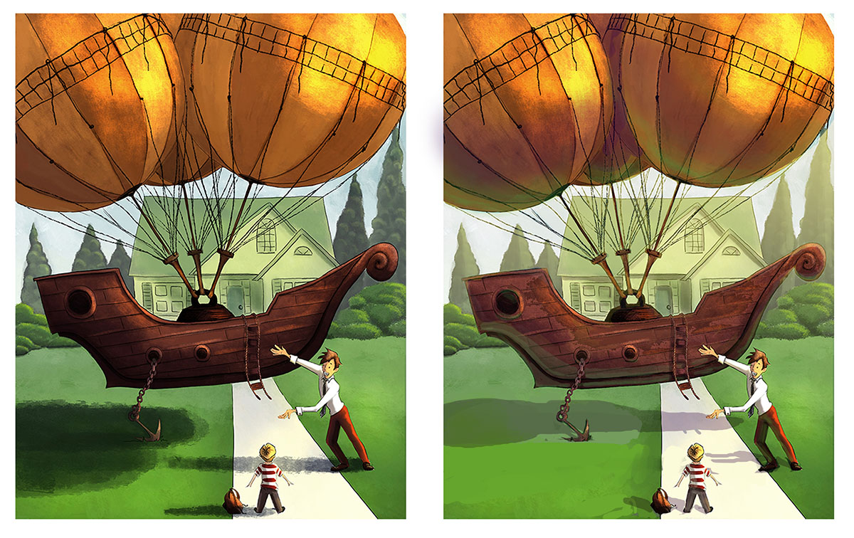
I do have a problem with the rendering. You're going WAY too dark on the shadows.
Here, I did a paint over for you. Lighten those shadows up. Put some reflective light under the boat and balloons. And soften the BG a little more to let your foreground elements pop.
If you want the PS file to see what I did you can download it here.

-
@Jake-Parker Thanks! Super super helpful.

-
Super fun concept (I love steampunk-y dirigibles, I have one in my portfolio too
 and it looks like you already have some great feedback. These forums are a great place for getting critiques, and its especially awesome when one of the instructors drops in
  lucky you! My only comment is your linework seems a little big inconsistent to me--its definitely all there on your dirigible and the dad and the house, but in places like the backpack and the bushes it looks more rendered. Variation in line work can be OK as long as there is some consistency and rhyme and reason to why things are different, which I'm not seeing in the way you have it right now.