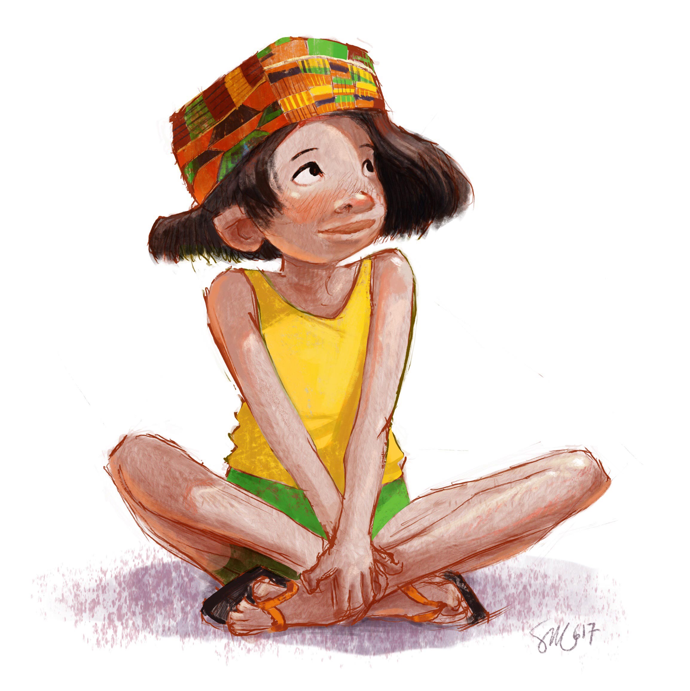
New kids, different style
-
I need to work in a simpler and looser rendering style for a book project - so I am experimenting with different processes and approaches.
I will post them here and of course would love to have some input - navigating the line between loose and unfinished is not easy....
-
@smceccarelli I agree that that line is hard. For me, loose and/or unfinished is insanely hard as I always want to go in and refine.
I think you are doing great!
A few of thoughts:
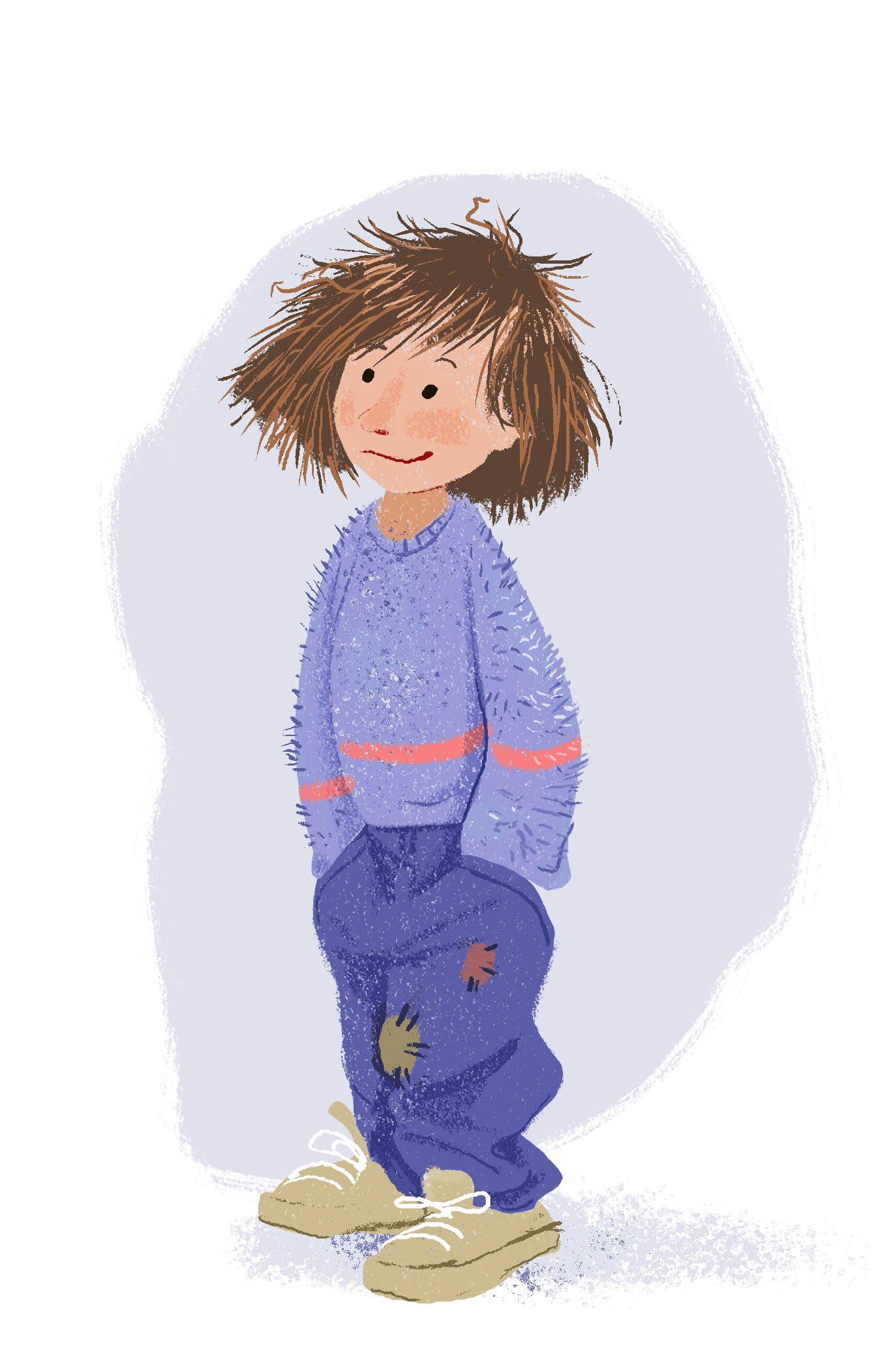
- Does the story require just the rendered style to be loose or does it also require that the character's clothes to be loose? It's just that I noticed that the clothes, particularly the pants & shoes seem oversized (i.e. wearing a size or 2 too big, thus making the pants baggy & loose). I'm assuming it does since there are patches on the pants and the hair appears somewhat unkept.
If so, then ignore me, but if not, I might throw out the thought that a loose style doesn't necessarily entail loose looking clothing.
-
Have you tried to place this on a textured background (like watercolor paper or some sort of more textured wash). In line with this, it might be worth also trying to use a little less opaque and hard-edged of paint (e.g. the base of the sweater, pants, & shoes is fairly solid & unified in tone, even with the periodic roughed edges & added texture on top)
-
Overall, I think the approach is probably a matter of not overthinking things too much. More of "letting things fall where they may". A little easier with physical media than digital media I suppose... I think that the planning is the important part (composition, value & color structure, etc.) but the actual drawing/rendering, while informed by the planning, is relaxed. ...But this is just me spewing my own unexperienced nonsense...
")
I think @Lee-White might have some good input on the loose direction. In fact, though I cannot quite recall, he may have already given some tips here that extend beyond literal watercolor: https://courses.svslearn.com/courses/loosening-up-in-watercolor
No matter what: Big thumbs up! I always enjoy the work you do and am inspired!
Scott Monaco | QuietYell.com
IG/FB/LI: @QuietYell
IG-2: @QuietYellSketches
TW/PIN/BEH/DEVART: @ScottMonaco
SCBWI: http://bit.ly/1r8Dmqr -
@QuietYell Thank you for your tips! I will definitely give it a try with a watercolory background (is on my list of things to try). This is not a character in the book, it is just testing - I want to have a couple of processes I can trust before going into experiments with the book illustration (I cannot post those, so I cannot get any feedback ;-)). I am looking at so many different artists - my head is exploding. I think you have a really good point with "not overthinking". I would add, "not zooming in" otherwise it is difficult to avoid over-rendering. Like with traditional painting, I think I should choose the size to work at and never ever zoom in closer....
I will re-watch Lee´s watercolor course! -
@smceccarelli oh my goodness yes! I am a zoom in addict! And I know that this has just got to be my downfall towards this kind of thing! Especially because I tend to create my files really huge (like 27x34.5" @ 300dpi; i.e. 10,000 pixels high) which gives all kinds of zoom-in desirability! The zoom calls my name!
I can't wait to see your next experiments here and hear what tips you have to share following your assured success!
Scott Monaco | QuietYell.com
IG/FB/LI: @QuietYell
IG-2: @QuietYellSketches
TW/PIN/BEH/DEVART: @ScottMonaco
SCBWI: http://bit.ly/1r8Dmqr -
... In the last sentence I said "Here & Hear"... sounds like a band name... or maybe a music venue...
-
I think she is adorable. the hair could also just be one color and not as many individual hairs. Have you looked at https://www.yasmeenismail.co.uk work? its super loose. I could never do it, and I admire her a lot for it.
-
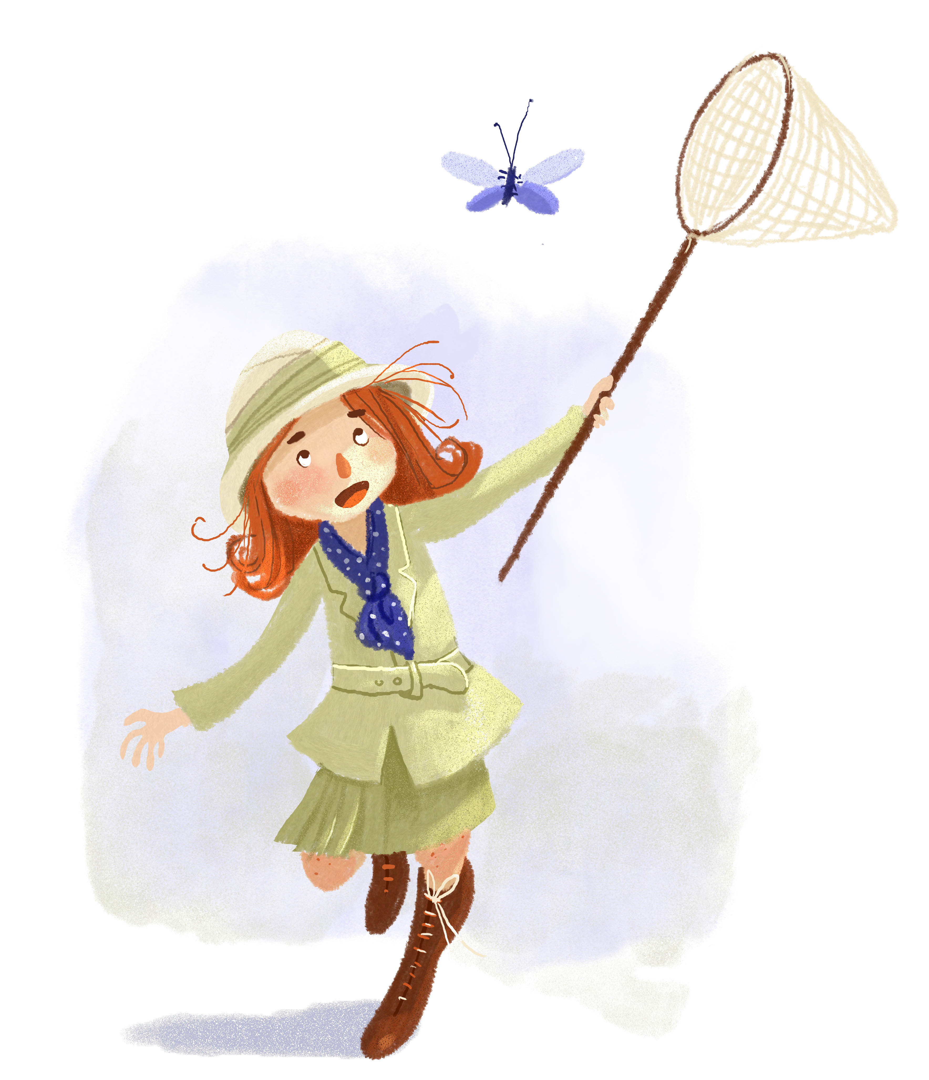
And another one. Not sure this is going anywhere, but it's sure much faster than my usual rendering!
-
@smceccarelli this second one is super cute!
-
What if you tried a style including some lineart (maybe using a "pencil" like brush to have some texture) and then very basic rendering with a lot of texture like you did with these two ? I feel like having some sort of lineart would help having them look more finished... And also would look a little more like your usual work! But the two you've shared look good! On the second one there is something not working with her feet/boots however... I think lines would help define the shape of the shoes a little more.
noemiegionetlandry.squarespace.com
noemie_illustration on Instagram -
@NoWayMe Thank you, I will look into that! I see the problem with the boot - good catch.
I have done some work with pencil textures - there are a few pieces in my online portfolio too. I think there is more exploration to do, though. I will spend the next few days doing copies - seeing what goes and exploring other artist´s work. -
I thnk i tlooks pretty loose. I like the multicolored hair. Loose doen't mean you can't have a lot of color!
-
I am in love with the first character! I wouldn't change or add a thing. With a style like that the simple the better and the pencil strokes that you did are on point.
-
And another one. This is my favourite so far - not too far from my usual, just less cleaned up and a simpler rendering. Too rough?