Feedback on illustration style for children's book works
-
Hi Everyone,
I just wanted some feedback on my illustration portfolio. I am going to my first SCBWI meeting in September to get critiqued, but also would like some feedback from anyone on this site before I go. I'm wanting to get into illustrating for Middle Grade books. I'd like to send out postcards, but I am uncertain which of my illustrations I should make for that.
Thanks for the feedback.
Mallette
-
Really like your illustrations I added you to my instagram,The reindeer pulling sleigh is wonderful and the kids outside the haunted house.
-
@dottyp Thank you! I've added you back on Instagram as well.
") Nice to meet you!
Nice to meet you! -
@mallette Hi Mallette,
I hope you have a great time at your first SCBWI meeting!
Here are a few thoughts:
-
You're probably going to be told that your work looks "commercial", "slick", or something to the effect of "too beautiful for children's books." What they are trying to express is that your work looks like the kind of art that's used on the back of cereal boxes, on games, cards, puzzles, etc. Most of the editors that will speak or that might review your portfolio are looking for a unique style - something they haven't seen before. This will come over time and @Lee-White is going to be presenting a 3rd Thursday dedicated to style. Your work looks like a lot of work out there - but don't worry because the longer you work the more your own personal style will emerge...but it does take time, dedication, and hard work.
-
Your portfolio ventures into the fantasy, children's, and YA book cover markets. It's going to be hard for an editor to have the confidence to hire you based on what you currently have because you're not demonstrating enough of one market. 10 pieces is a good rule of thumb to be able to present to an art buyer on just one of those areas. I really like the kids running from the Haunted house - but it's not backed up by more YA book cover looking art.
I really hope this helps. Please understand that I think you're well on your way - it just takes a lot of hard work and time!
Cheers,
WillSVS Instructor
http://willterry.com/ -
-
@will-terry Hi Will,
I was not expecting to get a reply from you, and thank you so much for doing so. I really appreciate it. This advice really helped, and I look forward to seeing Lee White's presentation on style. Thank you, again. -
@mallette Thank you Mallette nice to meet you to.A reply from Will terry wow
-
@mallette There is some really nice work on your website!! - i was thinking that just choosing a brush with a texture and an edge that is not uniform for your next piece or practice piece would get rid of any slickness - this would allow edges to be softer and allow layers of paint to show through ..... i think having crisp edges in focal areas is great but maybe not so crisp everywhere - just a thought - it seems like you just need a little tweak to get moved away from "commercial - slick" - another thing might be to reduce saturation slightly away from focal points and decrease contrast too...i love the hatched Griffon piece on your website - the griffon seems to recede into the background and the figures pull forward because of the saturation of the clothing and the low contrast on the griffon - here is the cutout of the one i'm talking about - the Griffon is not the first thing we see and it seems to be the intended focal point - well i hope this has not been annoying especially since you are way ahead of me in the paint department
but it just looks like tiny changes would get you to where Will is pointing you.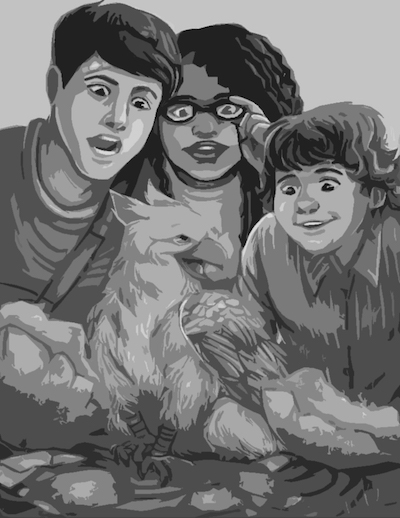
-
@kevin-longueil It's not annoying at all.
It's all that I want to hear instead of "Beautiful!" "Pretty!" But those are great too. ") Oh darn, I did use those griffon pieces for a recent contest, ah well... I'll try and fix it with your suggestions. Thank you!
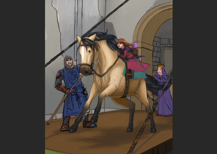
Oh darn, I did use those griffon pieces for a recent contest, ah well... I'll try and fix it with your suggestions. Thank you!I am currently working on this portfolio image here:
I've been using Kyle T Webster's Gouache brushes for my images a lot. I'll look for more brushes with a texture.
Thank you so much!
-
Hi Malette. Thanks for sharing your work, you have a great start on your portfolio. Your style is cohesive, you have good variety, and I love your characters- they are attractive and approachable.
It's harder to critique someone at your level, because things become less about the fundamentals and more about objective stylistic choices, but I'll give some thoughts on how I personally think you could improve.
First, I agree with what @Kevin-Longueil has said. . . especially his remarks about saturation and value.
Second, I feel that overall, you would benefit from studies on how to portray different materials. I know you are simplifying and stylizing a bit, but I still think that you could distinguish between materials more effectively and make them feel more believable- not necessarily hyper-realistic- but more believable in the style language you have created, if that makes sense.
One example would be in the way you portray fabric and hair. I'm seeing a tendency to over complicate and over emphasize the folds in your fabrics and hair. To me, this tends to distract from the piece as a whole. I think if you simplify the folds, and make some of the folds lighter, it would make for a stronger rendering.
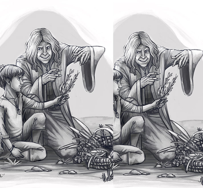
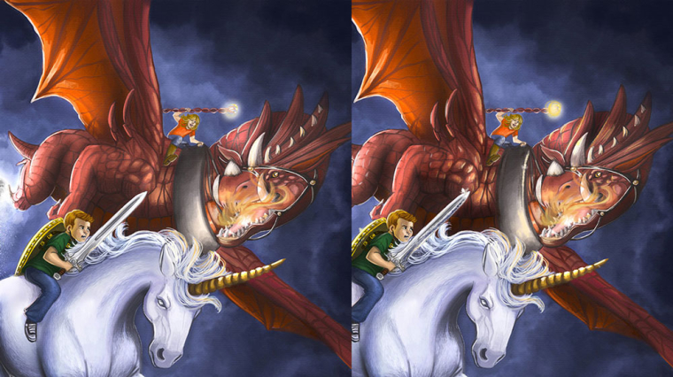
Another thing I'm seeing is that you perhaps don't distinguish enough between reflective surfaces and matte surfaces quite enough. I feel your metal would feel more like metal if you introduced some darker tones from the environment and add stronger highlights. Same goes for something that is slightly more reflective, like a dragon vs a unicorn. I imagine a dragon's skin to be harder and more reflective than a unicorn's. In your piece below, you've shown a nice texture on the dragon that distinguishes it from the smoother nature of a unicorn, but to me it looks like they could almost be made of the same material, because you've rendered the forms in a similar way with a similar value structure. To make something feel harder and shiner, you need to take advantage of adding some highlights to the different forms on it where the light might catch. I've attempted to add more reflected light to my paintover in the dragon and added a dark strip to the sword, but I think it could be pushed further.
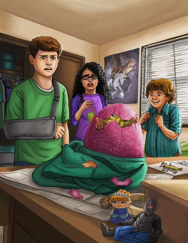
One last thing to be aware of is keeping you stylistic choices more consistent. For example in your piece below, I think you could unify some of you style choices. Two of your figures, the guy with the arm sling and the girl have outlines on their shirts that are darker versions of their shirt color, but the guy with the button up shirt has bold, black outlines. Also, on most of your objects, you have outlined the shadow side , but not so much on the egg. I feel if you added a darker outline on the shadow side of the egg and on the jagged pieces of it breaking apart, it would be more consistent with the style you've established and it will help the egg stand out more.
Well, those are some of my thoughts. You should be very proud of your portfolio thus far. Your style will only get stronger with the more pieces you produce. Good luck!
Website: www.tessawrathall.com
Instagram: www.instagram.com/tessawrathall_art/
-
@tessw
Thanks so much for reviewing the art pieces. I do see the things you point out and will work on those. I really like how you pushed the dragon's skin and the staff the girl is holding in my image more. I will work on that and think about it all with my next artworks.Thank you,
Mallette