Dummy Book spread
-
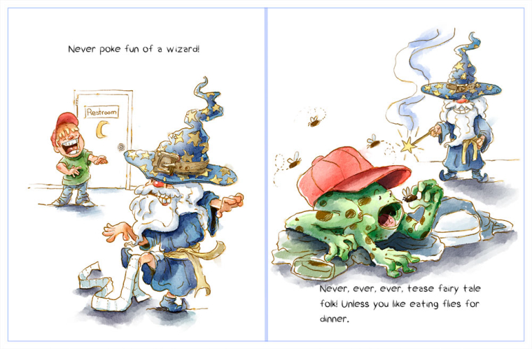
Finished this spread for a new dummy I'm working on. Not sure the action is reading well in the first part.

-
@evilrobot Great artwork!
I think the composition in the first scene should be reversed. I think the boy teasing should be in the foreground and the wizard in the background next to the restroom. It may read easier and make the transition to the second scene with the frog better connected to the boy.
(The baseball cap is an after thought but doesn't work right away because I didn't make the connection with the hat and the boy in the first scene, since it wasn't the primary focus. The wizard was.) -
@evilrobot I also agree with @harveywalls with having the boy in the foreground. Keeping that bathroom door in the background in both will tie the two pages together. Great style with the painting.
-
I love it! This is super cute! The wizard's hat is so quirky! :3
I like how the Point of View changes in the two pages because it makes the "victim" the main focus. I don't think you should change that.
I would like something that connects the second page to the first. I believe having the bit of the toilet paper still stuck to the wizard's foot would be funny and help connect the two.

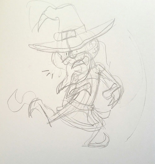
On the first page, the wizard's pose is a little confusing, but you can understand what's going on. I think the issue has to do with the line of action in the pose. Here is a super duper quick sketch of another pose you might want to try!

Not really a master piece but I hope it makes sense.
Either way, I like the style and how playful it is. This page spread is really nice! Great work!

-
I always love when you share your work, it's very appealing, and it's the kind of artwork I'd be drawn to when picking out books at the library for my daughter. The others have great advice. I'd agree with @Durribie, in that the wizard's pose on the first page is a bit confusing. After you look at it for a second or two, you see what's going on, but on my first initial impression it looks like the hand at the left is actually his bare foot being raised in the air. The leg is the same angle as the arm above it, and it's broken up with the toilet paper, which is white like the background. . . so my mind initially sees that hand as his foot. I hope that all made sense.
-
Yeah, that pose it wacky....lol....definitely reworking that. Really should have done a couple thumbnails...this is what happens when you jump straight in. Thanks for all the good advice and kind words. Will work on tying the two pages together better. Trying to keep this dummy all spots and vignettes, and keep the art loose so I'm able to finish it quickly. Goal is to just get something finished. I have so many projects 3/4 of the way done....just can't seem to get to the finish line. Always get bored or go back and think it's all crap and throw it away....