Greatest fear - WIP
-
@nowayme on target concept, great work.
-
You have such strong story telling. Great job love this one.
-
Oh yes, the second one really illustrates his fear much better. Great job!
-
ah my son is going through this right now LOL. The new version works really well. You always kill it!
-
@nowayme The heart decorations on the ceiling are an awesome touch.
-
Looking really good! Great image. Was definitely one of my worst fears growing up.
-
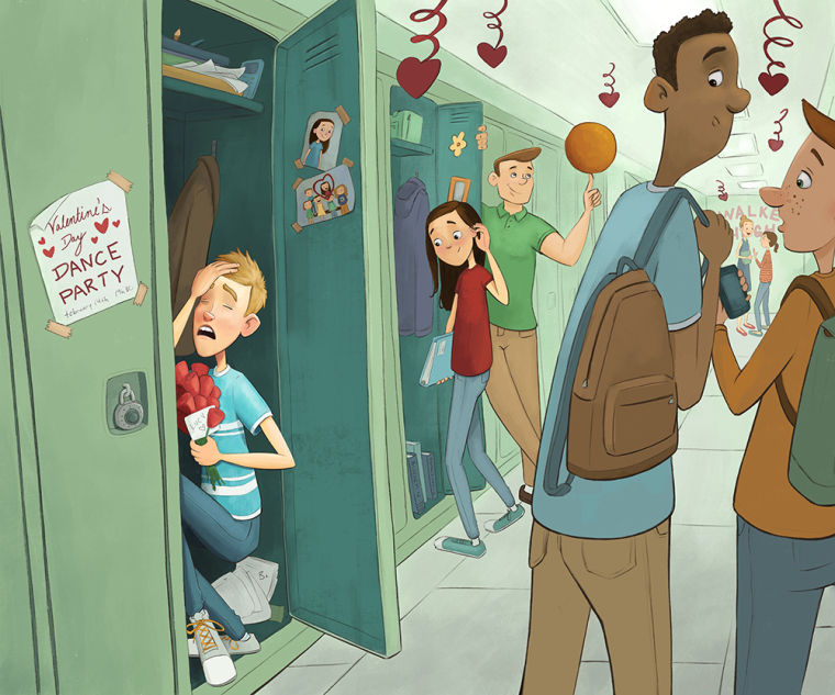
Thanks everyone! Here is my semi-final sketch. Still have to put in the decorations and finish the pictures in the locker. Critiques are welcome
")
noemiegionetlandry.squarespace.com
noemie_illustration on Instagram -
@nowayme This is great! The interaction between the characters are clear and interesting. My only critique would be of the teen in love. He looks worried but not terrified.
-
@nowayme Great composition, maybe the guys in foreground shoud to be bigger, or at least the head of the left one.
-
Second one much better,I thought the first boy was being bullied (which would be a good fear) Great idea you have come up with.
-
looking good. I would open the locker boy's eyes, looking toward the girl (even though he can't see her because of the door; makes the connection better). Also, I would turn both boys' heads in the foreground to the left. I assume the one on the left is looking at the boy in the locker, but his head turned right seems unnatural.
-
@nowayme I love this! The concept is great, and the drawing itself is well done. My only criticism is of the guy spinning the ball on his fingertip. To me he looks like an adult rather than a teenager.
There were so many shy guys in my highschool. In my graduating year, three different guys signed my yearbook confessing they always had a crush on me but were too afraid to say anything. I was like 'awww - I wish you'd said something sooner!' And I was super shy myself, but still I was the one to ask guys to dance with me at school dances. haha The struggle is real.")
Anyway - I can't wait to see it finished! -
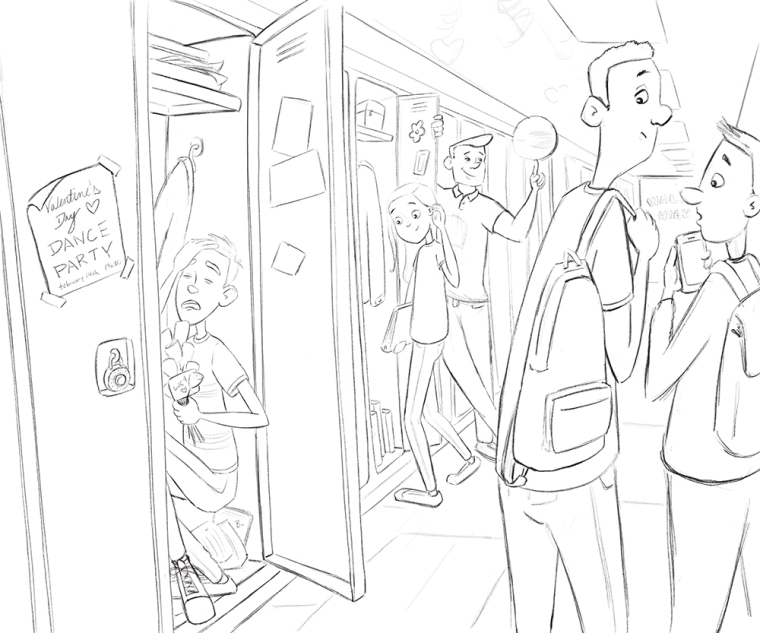
This is what I have so far! Critiques are more then welcome
noemiegionetlandry.squarespace.com
noemie_illustration on Instagram -
Looking good so far! As a graphic design, the small flyer stands out to me. Might make it larger to fill the width of the door, and taller to look more like a poster.
-
@nowayme Excellent work! You hit the criteria bullseye.
-
@tyson-ranes just noticed>>> basketball looks overly plain, if you could put some spinny line work or something that works with your overall style to show motion I think it would add an extra punch.
-
@nowayme this is so good! I love how you took the prompt and really played with the idea in a very different way.
-
@tyson-ranes Yes! I was planning to do that
-
Great image. Very impressed that you have so many characters and are still able to have such clear story telling. Love it.
-
Thanks everyone!!
It's almost there! (Still have to do the basketball and few touchups) I changed the background colors quite a bit, everything felt a little too green. Also, I played with some adjustment layers in photoshop to try to make my focal point clearer. Hope it's working better
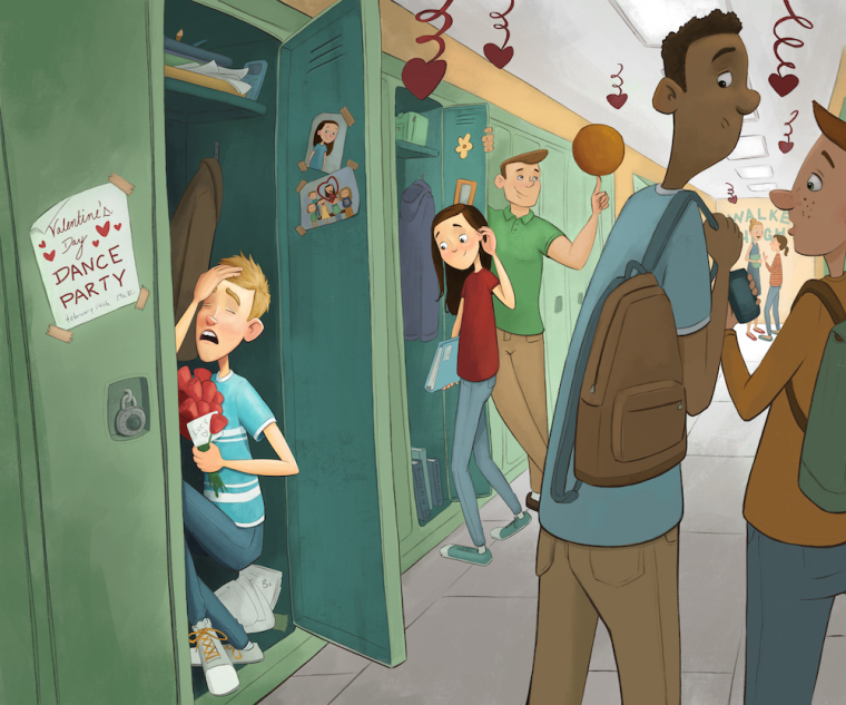
noemiegionetlandry.squarespace.com
noemie_illustration on Instagram