WIP: Worst Fear comp
-
Hello. If you have some time to look at my comp, your comments would be most welcome. Loving this forum and appreciating all the helpful comments I've gotten from you guys in the past. Thanks!!
-
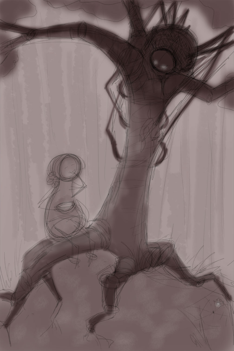
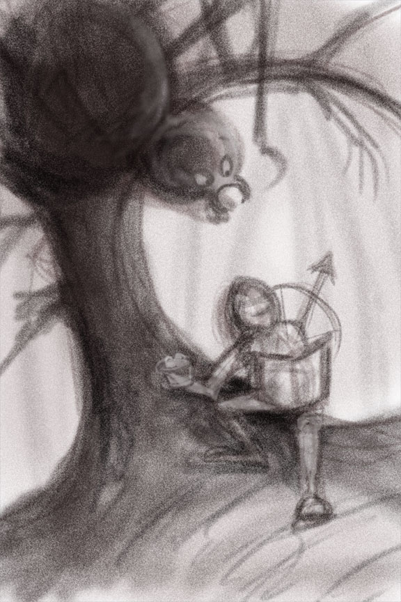
@laurel-aylesworth Oh, and this is my take on Little Miss Moffit, if that wasn't clear. Thanks!
-
perfectly clear! This is really good. I might bring the legs up above her eyeline, and have one or 2 stretched out to the outer branches to emphasize the creeping aspect. Other than that, can't wait to see the final!
-
Ooo, creepy!
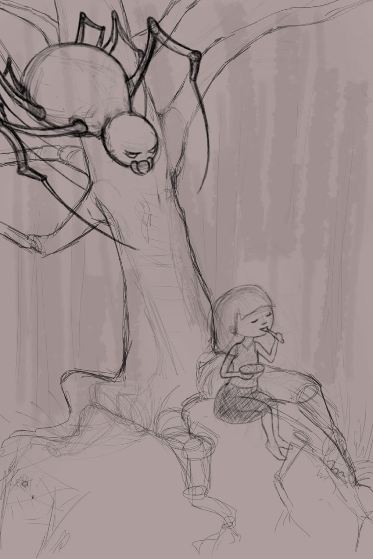
") I agree, with her face turned up and the legs so far down the trunk, she could easily see the spider. Maybe turn her face down so she's smiling at her bowl, and bring the spider legs up, almost like creepy branches of the tree?
I agree, with her face turned up and the legs so far down the trunk, she could easily see the spider. Maybe turn her face down so she's smiling at her bowl, and bring the spider legs up, almost like creepy branches of the tree? -
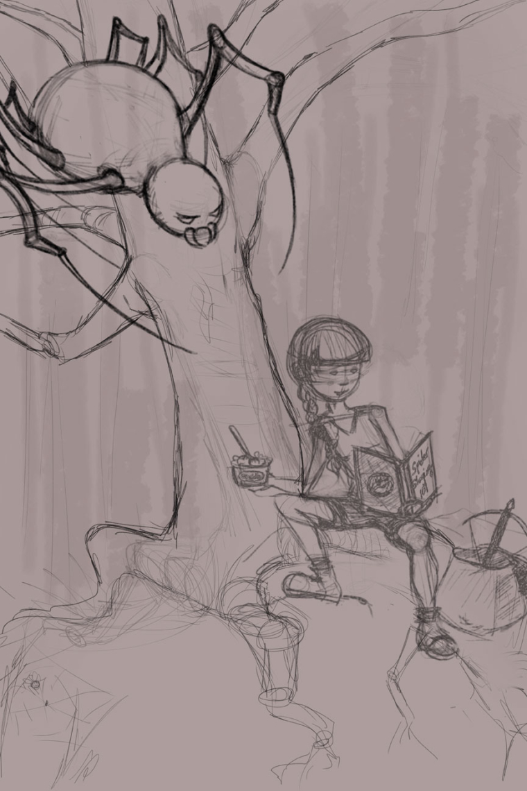
After working in the spider and Miss Moffit, I thought maybe the spider was too menacing for such a little kid (unless I put the spider deep in the shadows). I thought of another concept where the little girl is replaced as a teenager/spider slayer (book she's reading is "Spider Slaying 101"). What do you think would work best? Thanks again!
-
Hi Laurel,
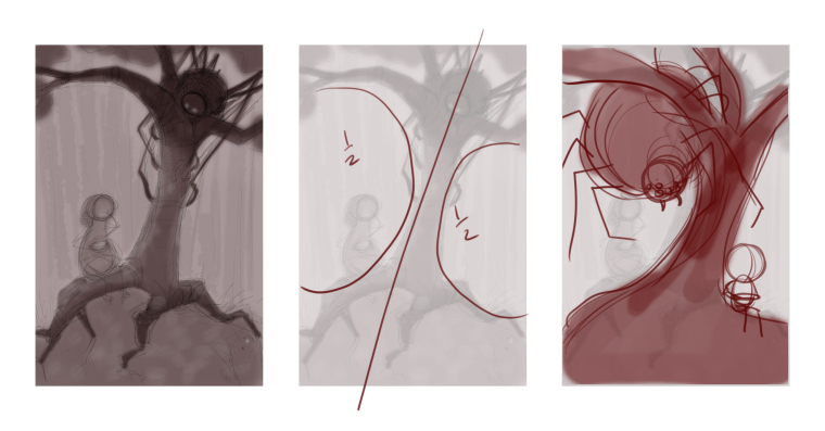
I thought I'd take a moment to show you a quick little design tip that I think will help you tell stories with more impact. Your current design cuts the image in half diagonally and creates two similar negative spaces on each side. If you alter it slightly you'll create two different negative spaces - one large and one small. For some reason we humans find this more appealing - it places more emphasis on one side vs the other...it also doesn't force us to pick one or the other. Also - if you make the characters very different size wise it will be more interesting. I hope this helps
SVS Instructor
http://willterry.com/ -
@will-terry Thanks, Will!
-
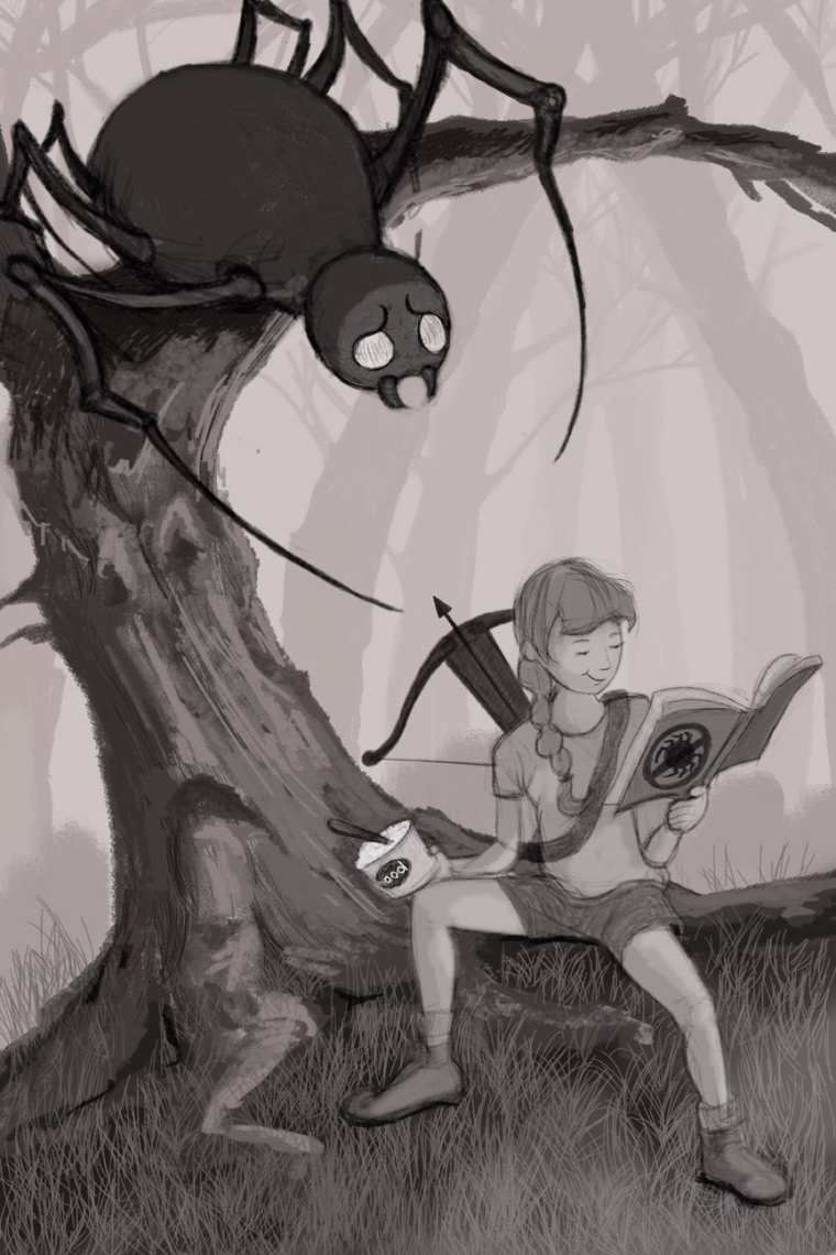
I like the spider slayer idea,it puts a whole new twist to the piece.
-
@will-terry Updated my comp per Will's suggestions.
-
Very cool. Who knows just how big that spider really is?! Much nicer composition.
-
I think I'm at a stopping point on this. If anyone has some time to critique, that would rock. Thanks!
-
I like it. The arrow pointing toward the spider is good. Since you have taken it this direction with the spider now worried/scared, I would put his left leg up on the branch and the other on the trunk of the tree and bring him in closer as if he is balancing and straining to see what is in the book. Add a title to the front cover of the book so the books orientation makes more sense. Really like how this is developing.