Society of Visual Storytelling

    SVSLearn Forums

    • Register
    • Login
    • Search
    • Recent
    • Tags
    • Popular
    • Users
    • Groups
    • Search

    Help wih composition

    Artwork
    4
    9
    2010
    Loading More Posts
    • Oldest to Newest
    • Newest to Oldest
    • Most Votes
    Reply
    • Reply as topic
    Log in to reply
    This topic has been deleted. Only users with topic management privileges can see it.
    • J
      Javier Algarra last edited by

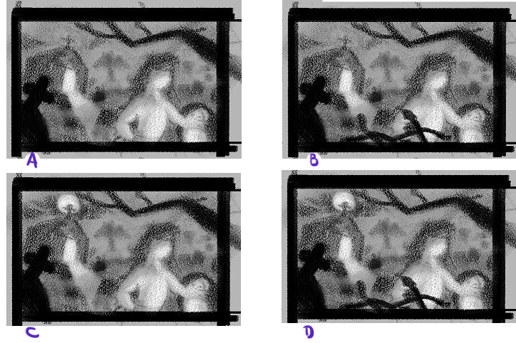
      Hello everyone! I'm working on an illustration and I'm having some doubts with the composition. The drawing is still in the refined sketch phase, but I wanted to work things out first before moving to the final illustration.
      0_1502834921035_comp.JPG

      The main issue I have is, if I add the moon on top, is it too distracting as it creates contrast with the sky and the cross? At the same time I feel it creates a path between the moon, the light from the grave and the light from the character.

      The other issue is adding the fence in the foreground, I think it creates some depth while adding some contrast to the main character. But at the same time it may be too intrusive?

      https://www.instagram.com/javier.algarra64

      1 Reply Last reply Reply Quote 0
      • stringfellowart
        stringfellowart SVS OG last edited by

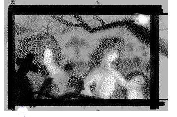
        I would flip the fence to the left side, and put the moon in the upper right corner.
        0_1502838145631_oaihgas.jpg

        Bringing whimsical creatures to life.
        www.stringfellowart.com
        www.instagram/stringfellowart

        J 1 Reply Last reply Reply Quote 0
        • J
          Javier Algarra @stringfellowart last edited by

          @stringfellowart Nice! Thank you

          https://www.instagram.com/javier.algarra64

          1 Reply Last reply Reply Quote 0
          • J
            Javier Algarra last edited by

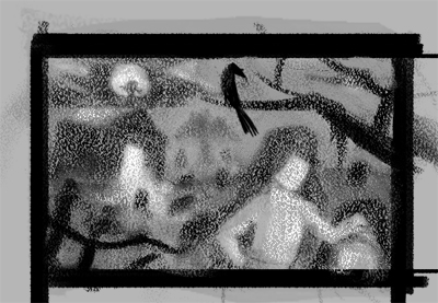
            I reworked it (a lot) and I came up with this:
            0_1502847239405_comp.JPG

            I feel a lot better with this one

            https://www.instagram.com/javier.algarra64

            Gary Wilkinson 1 Reply Last reply Reply Quote 1
            • Gary Wilkinson
              Gary Wilkinson @Javier Algarra last edited by

              @javier-algarra is the crow a major point of the story? its quite eye catching in it's current position. Also the branch seems to be pointing towards the church, whilst the fence is pointing towards the girl, so I can't decide on where my eyes want to go.

              I think if you put the gravestone in the foreground like Stringfellow did then that would help somewhat. It also looks like you want to put quite a strong light facing the character, is she holdig a lamp? I would have her be more silhouetted using a backlight from the church

              www.garywilkinsonart.com
              www.instagram.com/gwillustration/
              www.twitter.com/GWillustration

              J 1 Reply Last reply Reply Quote 0
              • J
                Javier Algarra @Gary Wilkinson last edited by

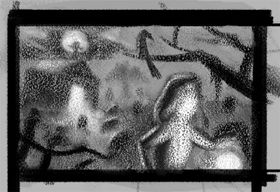
                @gary-wilkinson Tanks! I changed her lighting a bit, yes, she's holding a lamp. I did'nt want to put another gravestone, since I thought it would be a little repetitive, also I think the fence works better at pointing at the scene. I changed the value of the crow a little, since as you said it was sticking out
                0_1502848916579_comp.JPG

                https://www.instagram.com/javier.algarra64

                1 Reply Last reply Reply Quote 2
                • J
                  Javier Algarra last edited by

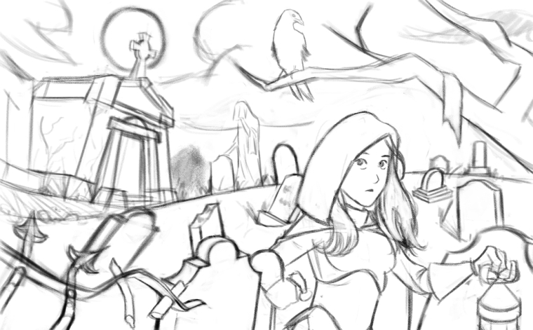
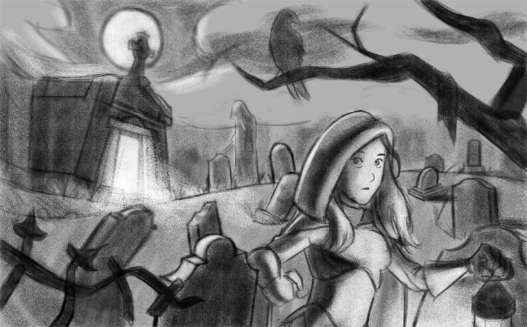
                  Hi everyone, I continued with this drawing and I wanted to know what you think of it before moving to the final stages. Thanks!
                  0_1503070566839_Cemetery2.jpg

                  0_1503070552475_Cemetery.jpg

                  https://www.instagram.com/javier.algarra64

                  1 Reply Last reply Reply Quote 1
                  • TessaW
                    TessaW last edited by

                    I think it's looking great, but I do wonder about the cropping. It almost looks like it's cropped from a piece that was originally square or portrait orientation. I find myself wanting to extend it to see her whole body. Maybe it's just me.

                    Website: www.tessawrathall.com

                    Instagram: www.instagram.com/tessawrathall_art/

                    J 1 Reply Last reply Reply Quote 1
                    • J
                      Javier Algarra @TessaW last edited by

                      @tessw Theanks for the reply. Yeah I can see it as a book cover too.

                      https://www.instagram.com/javier.algarra64

                      1 Reply Last reply Reply Quote 0
                      • First post
                        Last post