Society of Visual Storytelling

    SVSLearn Forums

    • Register
    • Login
    • Search
    • Recent
    • Tags
    • Popular
    • Users
    • Groups
    • Search

    Tiger and frogs before and after

    Artwork
    7
    11
    1799
    Loading More Posts
    • Oldest to Newest
    • Newest to Oldest
    • Most Votes
    Reply
    • Reply as topic
    Log in to reply
    This topic has been deleted. Only users with topic management privileges can see it.
    • O
      orangeni last edited by

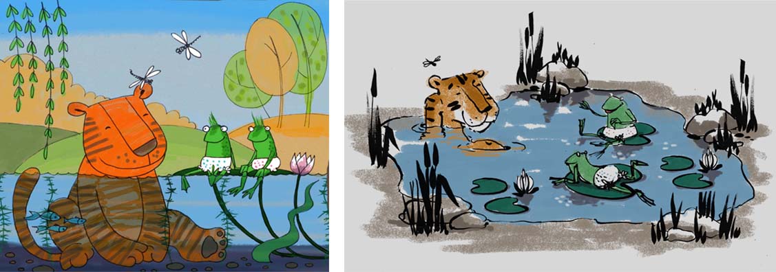
      I reworked one of my old illustrations where Tiger and two frogs chilling in the pond. Which one do you like better? 🙂

      alt text

      MOO 1 Reply Last reply Reply Quote 2
      • Russ Van Dine
        Russ Van Dine last edited by

        I actually like them both. The second one is better for several reason, both are good and I think you could use either style for a children's book.

        MOO 1 Reply Last reply Reply Quote 0
        • O
          orangeni last edited by

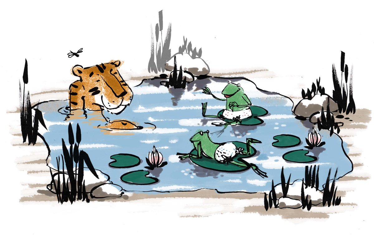
          I think I coloured the right one wrong... Is it better now?
          alt text

          rcartwright MOO 2 Replies Last reply Reply Quote 2
          • Chip Valecek
            Chip Valecek SVS Team SVS OG last edited by

            I personally like the second one better. But both are different styles of the same concept which shows some great range in your style.


            https://www.instagram.com/chipvalecek/
            https://www.facebook.com/cvalecek
            http://www.cshellmedia.com/

            1 Reply Last reply Reply Quote 0
            • rcartwright
              rcartwright @orangeni last edited by

              @orangeni Yes the frogs were originally a little hard to see but they stand out better now

              https://www.scbwi.org/members/richard-cartwright/
              https://www.instagram.com/richardwcartwright/
              https://www.pinterest.ca/richcartwright3/art-of-richard-cartwright/
              https://www.richardwcartwright.ca/

              1 Reply Last reply Reply Quote 0
              • DOTTYP
                DOTTYP last edited by

                I like the first one.

                scribbles.artstation.com
                www.instagram.com/dottypaints

                1 Reply Last reply Reply Quote 0
                • Gary Wilkinson
                  Gary Wilkinson last edited by

                  Both are good and i'm sure they would appeal to different people and age groups. I would say that left one is more kidsy, due to the saturated colors and simple linework, whereas the right one is a bit more wider in it's audience (it reminds me a little of Quentin Blake)

                  www.garywilkinsonart.com
                  www.instagram.com/gwillustration/
                  www.twitter.com/GWillustration

                  O 1 Reply Last reply Reply Quote 0
                  • O
                    orangeni @Gary Wilkinson last edited by

                    @gary-wilkinson Thank you! I love him a lot 🙂

                    1 Reply Last reply Reply Quote 0
                    • MOO
                      MOO SVS OG @Russ Van Dine last edited by

                      @russ-van-dine I agree.

                      Marsha Ottum Owen

                      1 Reply Last reply Reply Quote 0
                      • MOO
                        MOO SVS OG @orangeni last edited by

                        @orangeni I agree with Russ. I must say though that I liek th ecolors on teh left oen better and wonder how teh right one would look with that color palette 🙂 I tend to like bright colors. But both are awesome compositions and could both woork for books.

                        Marsha Ottum Owen

                        1 Reply Last reply Reply Quote 0
                        • MOO
                          MOO SVS OG @orangeni last edited by

                          @orangeni Yes 🙂

                          Marsha Ottum Owen

                          1 Reply Last reply Reply Quote 0
                          • First post
                            Last post