Society of Visual Storytelling

    SVSLearn Forums

    • Register
    • Login
    • Search
    • Recent
    • Tags
    • Popular
    • Users
    • Groups
    • Search

    Newest attempt at watercolor

    Artwork
    13
    19
    3291
    Loading More Posts
    • Oldest to Newest
    • Newest to Oldest
    • Most Votes
    Reply
    • Reply as topic
    Log in to reply
    This topic has been deleted. Only users with topic management privileges can see it.
    • evilrobot
      evilrobot SVS OG last edited by evilrobot

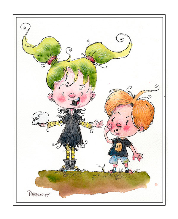
      My latest attempt at watercolor. Mixed media with some pen and ink and colored pencil. Note: the girls pose started off as a study of another artist's sketch. I kept the pose and changed the character and added the boy. 0_1504488601421_Skull_girl-finished.jpg

      http://www.palacioillustration.com/

      https://www.scbwi.org/illustrator-gallery/illustrator-detail/?illustrator_id=84142

      https://www.pinterest.com/evilrobot2/pins/

      https://twitter.com/MyEvilRobot

      Chip Valecek ? MOO 3 Replies Last reply Reply Quote 10
      • DOTTYP
        DOTTYP last edited by

        Really nice

        scribbles.artstation.com
        www.instagram.com/dottypaints

        1 Reply Last reply Reply Quote 1
        • julian beresford
          julian beresford SVS OG last edited by

          @evilrobot Great Illustration

          Julian Beresford - Freelance Illustrator
          www. jgberesford.com
          https://www.instagram.com/jbfantasticalemporium/

          1 Reply Last reply Reply Quote 1
          • Chip Valecek
            Chip Valecek SVS Team SVS OG @evilrobot last edited by

            @evilrobot great piece, really getting control of that water color.


            https://www.instagram.com/chipvalecek/
            https://www.facebook.com/cvalecek
            http://www.cshellmedia.com/

            1 Reply Last reply Reply Quote 1
            • bharris
              bharris last edited by

              Cute! I like the effect you got with the mixed media!

              www.brittanyharrisillustration.com/
              www.instagram.com/britillustration/

              1 Reply Last reply Reply Quote 1
              • Andyg
                Andyg last edited by

                Gorgeous. You may have ended up neutralising the ground a bit though? Compared to th rest o the picture it's gone slightly dull. That's my only thought and it's a very minor one! Something I found is to mess around with adding gum Arabic to the water at about 10 parts water to 1 part gum,. And if you want to lift off cleanly use things like lift off prep fluid (Windsor and newton) and gum Arabic on the watercolour paper.

                Helping writers tell their stories

                ? 1 Reply Last reply Reply Quote 1
                • ?
                  A Former User @evilrobot last edited by

                  @evilrobot I like this! I have yet to dip my hands fully into the medium myself. Keep posting along with what you've experienced! I'd like to know your journey.

                  1 Reply Last reply Reply Quote 1
                  • ?
                    A Former User @Andyg last edited by

                    @andyg What do you mean by lift off cleanly? I'd be interested in using watercolor with more control.

                    Andyg 1 Reply Last reply Reply Quote 1
                    • Andyg
                      Andyg @Guest last edited by

                      @harveywalls you have to check the permanent rating on the watercolours and some just won't lift. But basically so long as you use really thick high quality watercolour paper that has been sized well, then you prep it well first, you can even let the watercolour dry and still be able to rewet it and lift it off. Doing it over and over will damage the paper, but you can even put down layers of water colour, then lift off different layers to create blends and shifts in colour. You need to experiment a bit.

                      Here's an article I wrote and a Pic showing the technique

                      https://onegraydot.com/watercolour-experiments-lifting-preparation-fluid-gum-arabic/

                      0_1504536697126_IMG_4298.JPG (the picture is a copy of a character by Rodney Matthews, but it's done in watercolour using lift off technique...so the purple for example is painted flat, allowed to dry, then rewet and lift off until I got the lightness I wanted. Kinda photoshop dodge tool in the real world...and to some extent you can even do layers)

                      Helping writers tell their stories

                      1 Reply Last reply Reply Quote 1
                      • TessaW
                        TessaW last edited by

                        Looks great! Lovely work, as always. 🙂

                        Website: www.tessawrathall.com

                        Instagram: www.instagram.com/tessawrathall_art/

                        1 Reply Last reply Reply Quote 1
                        • evilrobot
                          evilrobot SVS OG last edited by evilrobot

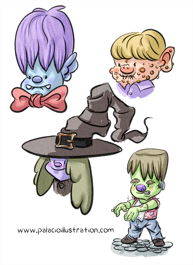
                          Thank you very much for the comments and watercolor tips. I was wondering if I could get your opinions on the style of the image. I've intentionally made the lines rough and sketchy and I've always been someone who has tried to get super smooth line work. Trying to decide if I'm going to keep the sketchy lines from now on or go back to the clean thicker line look like this example. Any thoughts? 0_1504543705747_7-31-skech.jpg

                          http://www.palacioillustration.com/

                          https://www.scbwi.org/illustrator-gallery/illustrator-detail/?illustrator_id=84142

                          https://www.pinterest.com/evilrobot2/pins/

                          https://twitter.com/MyEvilRobot

                          Kevin Longueil 1 Reply Last reply Reply Quote 3
                          • K
                            Kat SVS OG last edited by

                            Probably just a matter of taste. I like them both, but the sketchy line seems to have more life and energy.

                            1 Reply Last reply Reply Quote 1
                            • Andyg
                              Andyg last edited by

                              I'm the wrong person to ask. I love a lively line!

                              Helping writers tell their stories

                              1 Reply Last reply Reply Quote 1
                              • NoWayMe
                                NoWayMe last edited by

                                The sketchy lines match your overall style better I think 🙂 More natural. The cleaner lines are maybe a little too thick ? And maybe a little too uniform (I would try varying the thickness of the line a little more, it would look more "organic")

                                noemiegionetlandry.squarespace.com
                                noemie_illustration on Instagram

                                1 Reply Last reply Reply Quote 1
                                • TessaW
                                  TessaW last edited by

                                  I dunno. Both styles work for me, because your execution of all the elements are excellent. Like Kat said, it's a matter of taste at this point.

                                  Website: www.tessawrathall.com

                                  Instagram: www.instagram.com/tessawrathall_art/

                                  1 Reply Last reply Reply Quote 1
                                  • tombarrettillo
                                    tombarrettillo last edited by

                                    I am a sucker for sketchy lines myself, but it will come down to what you enjoy doing most. If you naturally lean toward the smoother lines, then I say stick with that. I would like to know your motivation for wanting to change.

                                    https://www.youtube.com/@tombarrettart

                                    1 Reply Last reply Reply Quote 1
                                    • Kevin Longueil
                                      Kevin Longueil SVS OG @evilrobot last edited by

                                      @evilrobot These look great! - i really like the slight ink bleed and feel it goes very well and looks natural with the textured background - this looks pro to me.

                                      Portfolio: kevinlongueil.com
                                      https://www.instagram.com/kevinlongueil/

                                      1 Reply Last reply Reply Quote 1
                                      • julian beresford
                                        julian beresford SVS OG last edited by

                                        @evilrobot When I sketch it's all about the shaky line, but when I go to line my work I alway end up doing thick smooth lines. but I think you sketchy line style really works well.

                                        Julian Beresford - Freelance Illustrator
                                        www. jgberesford.com
                                        https://www.instagram.com/jbfantasticalemporium/

                                        1 Reply Last reply Reply Quote 1
                                        • MOO
                                          MOO SVS OG @evilrobot last edited by

                                          @evilrobot Looking great!

                                          Marsha Ottum Owen

                                          1 Reply Last reply Reply Quote 1
                                          • First post
                                            Last post