Lonely old man painting WIP critiques welcome
-
Strong comp over all, but the darkness at the top does seem too far away. Especially compared to how dark it gets in the center of the couch. The spacial loneliness lost in height could be compensated by adding a little width. Possibly even showing the side wall coming foward slightly. Great shapes! Love the scene.
-
Nice job! Really nice feeling to it. I would make the cat a lighter tone so it stands out a bit more from the couch.
-
Thanks for everyone taking the time to comment. Your advice will really help me to get the piece just right
 My wedding is this month so i'm trying to spend what time I can on this and other projects I have on the go, but I will try to update as soon as I have chance to work on it a bit more!
The height of the piece is something I would like to keep as it is, but I agree with increasing the lights and darks a little more.
@bharris Thanks for the nice comments. I think the cat needs reworking so I will probably find a nice pose for him
")
@tombarrettillo The cat in a lap is a good idea. I will definitely try that out.
@IanS thanks Ian. Seconded on the cat, it never seemed right to me too.
@TessW Thanks Tess. I think the frame at the top was a happy accident. I might have to move it slightly though as it runs tangent with the line on the wallpaper. I want to try and further tell the story through the photos, without taking away the attention from the old guy.
@rcartwright Yeah I think the expression could be pushed a little more. I didn't want him to look too sad though, trying to go for a more subtle remembering the past expression
@Chip-Valecek That movie popped into my mind half way through working the piece. I might have to steal some color schemes from it
@Art-Dud Do you mean "does" or "doesn't"? Were you thinking that I should make the upper part darker? I didn't want to create too much darkness at the top incase it distracts from the main subject, but I can see where you are coming from.
@Spencer-Hale Thanks Spencer. I will probably just rework the whole cat as it seems the weakest part of the piece -
@gary-wilkinson I love grabbing colors from movies. I use this site which may be helpful to you or others: https://www.canva.com/color-palette/
-
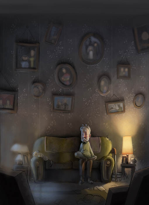
@gary-wilkinson I love this illustration! But, he is so lonely

-
@rcartwright I agree with you, Rich. It is so much lonelier. Also didn't know what the cat was.
-
@gary-wilkinson I meant does, as in it could be a bit closer. I definitely agree it should not get too close as you state.
-
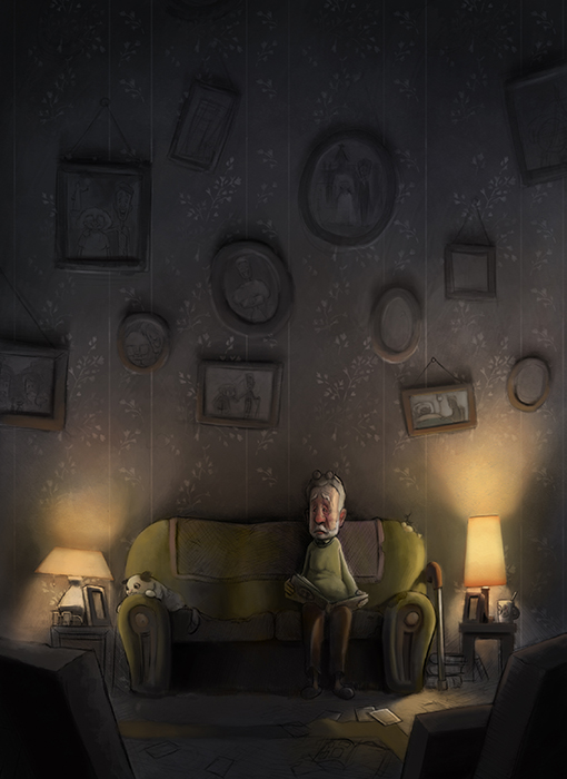
I'm revisiting this image I was working on last year, but end up dropping. I think it would be a good one for the portfolio so giving it another go. I adjusted the position of the cat and gave the man a beard to give him a slightly unkempt look. What do you think of the color scheme? I want to push the cool colors a bit more and I might dim the lamp on the left side as though the lightbulb is almost out of life. It's been a challenge so far, but I think I can get something good out of it at some point.....
-
@gary-wilkinson I like it! I would like to see a bit more blue in the shadows, just bit. He does look lonely. If you took the lamp on the left down just a notch but not too dark, the puppy needs enough light to reflect on him
I'm not the best critiquer but you seem to know what to do already anyway. I would like to hear what others say. -
Hey love the picture. I see you have been wavering over what happens to the light on left. How about turning it off altogether and putting in some window light to add some coolness to the missing his wife thoughts of the man.Hope you don't mind the paintover... I added more light to the whole painting which gives you a chance to colour the pictures on the wall, also I added a ceiling to enclose the emotion and maybe send the eye back down to the man?
Just an idea it might help...
-
I agree with @Jason-Bowen about the window light. It adds a new dimension without overpowering the lamp. I'm ok with the ceiling going off camera but it works to have a slanted or slightly jagged one. The ceiling in my opinion could draw too much undesired attention if done wrong so it's understandable to let it work as is. Another suggestion if you keep it that way might be to really exaggerate the height of the room and have the bottom of a few more dusty pictures barely visible. I'm glad you revisited this one.
-
@jason-bowen I'm looking forward to what happens on the left side.
-
@gary-wilkinson Just found this thread. I like the added light and how the cat is more legible and lit. Overall, the illo is painted very professionally, so my comments will focus more on the story. Is the cat looking at a photo of the man's wife? The image is very sad and lonely, and I feel that it can still evoke those emotions but include a glimmer of hope by having the cat maybe cuddling up next to the man to comfort him, or trying to get him to play with her. Otherwise, it feels just too bleak. Also, the photos/paintings on the wall--they seem to be an opportunity to tell a story about his life with his wife, the day they got married, prom night if they met at school, and perhaps even the day they adopted the cat. One of the images seems to be of a hospital room? If that's the case, I'd show him offering her a big bouquet of flowers or something more cheerful to contrast with the current scene.
-
@jason-bowen Thanks Jason. Having a cool light from that left side is a really nice idea. I will explore that and see if I can make it work! I cooling the pictures would be cool, but with the lack of white light most of them will be very desaturated. As for the ceiling the reason I didn't want to include one was to fit in as many photo frames as I could to push the feeling of him and his wife having many memories, kinda like an endless wall of memories. I like @Jon-Anderson idea about adding a few dusty ones at the top and will try and get that included in the painting.
@Johanna-Kim Thanks for your comment. I still have a lot of work left to do on the photos and do want to push the narrative of their lives through them. You may be able to see some light sketches in some of them, but I will have to refrain from making them too detailed as they will be dimly lit. As for the bleakness, I completely agree that it's insanely bleak, I will look at adding another cat in the scene that is comforting the man in some way to balance it out a little.
Thanks for the advice everyone!
-
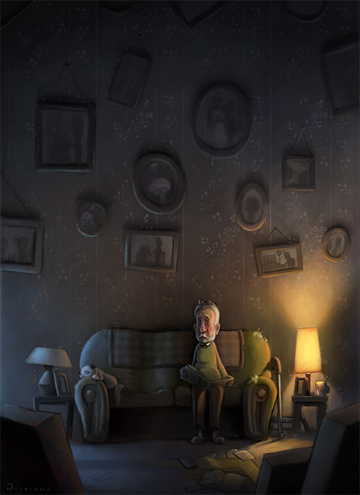
I think I will call this one done. I don't have the time to keep working on it and it's at a level I am quite happy with
onto the next piece!! Thank you all for your critiques and advice and I'm sorry it's so still so bleak Johanna 
-
This looks awesome! I love the area above him with all the frames, and great job with the lighting!
-
@gary-wilkinson haha, I really like this final illustration, even with its bleakness. It draws me in to wonder about the story behind this sad old man and his equally sad kitty, and it's beautifully rendered.
-
@gary-wilkinson This looks amazing. I really like the changes and it is sad and bleak but it's touching and has good storytelling, IMO. I like the other light being turned off now...cool symbolism.
-
Looks great! the lighting is working perfectly.
-
@gary-wilkinson Love how it turned out, Gary!