Society of Visual Storytelling

    SVSLearn Forums

    • Register
    • Login
    • Search
    • Recent
    • Tags
    • Popular
    • Users
    • Groups
    • Search

    Need some help with a piece

    Artwork
    10
    19
    3322
    Loading More Posts
    • Oldest to Newest
    • Newest to Oldest
    • Most Votes
    Reply
    • Reply as topic
    Log in to reply
    This topic has been deleted. Only users with topic management privileges can see it.
    • evilrobot
      evilrobot SVS OG @Eric Castleman last edited by

      @eric-castleman Love the updated version looks really good. I'd say to design the smoke a bit....all the other elements of the piece have your style (design to them) I'd take the same same approach to the smoke. Illustrate it make it your way of doing smoke....don't know if that helps...great work

      http://www.palacioillustration.com/

      https://www.scbwi.org/illustrator-gallery/illustrator-detail/?illustrator_id=84142

      https://www.pinterest.com/evilrobot2/pins/

      https://twitter.com/MyEvilRobot

      1 Reply Last reply Reply Quote 1
      • Spencer Hale
        Spencer Hale last edited by

        Looking good! It really has a nice feeling to it, and I dig the shapes. I would maybe lighten the buildings behind the cat to make it stand out some more. I also consider bringing back the moon or using some smoke to make the main guy stand out more as well. Just squint you eyes or shrink the art down to see if it still reads well.

        spencerhalefire.tumblr.com | instagram.com/spencerhalefire | twitter.com/spencerhale

        1 Reply Last reply Reply Quote 2
        • adamdohrmann
          adamdohrmann last edited by

          I really dig the concept and the composition is powerful. I think maybe bringing the moon back to help the violinist stand out more could be cool. Also, if the smoke kind of meandered into the sky that might eliminate the sharp direction it's giving off.

          https://www.instagram.com/adam_dohrmann/

          1 Reply Last reply Reply Quote 1
          • NoWayMe
            NoWayMe last edited by

            Hi Eric!
            I love this piece πŸ™‚

            However, there's a few element in your original piece that I like better than the new version. Like @Spencer-Hale and @adamdohrmann , I would definitely bring the moon back behind the guy (or lighten the sky and make him darker). I would also find a way to have the cat against the sky again (as oppose to having houses behind) as I feel he was reading much better then. Of course, your handling of light, color, perspective and just global rendering is way better in the new version, but the composition was a little stronger in the original on these two points. Great work πŸ™‚

            noemiegionetlandry.squarespace.com
            noemie_illustration on Instagram

            1 Reply Last reply Reply Quote 1
            • Eric Castleman
              Eric Castleman last edited by

              Awesome feedback everyone!! I will take everything everyone said and put a few changes to it and update up you all soon. Thanks again. πŸ˜‰

              EricCastleman.com

              SCBWI profile
              https://www.scbwi.org/members-public/eric-castleman

              1 Reply Last reply Reply Quote 0
              • Eric Castleman
                Eric Castleman last edited by

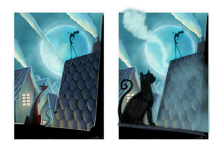
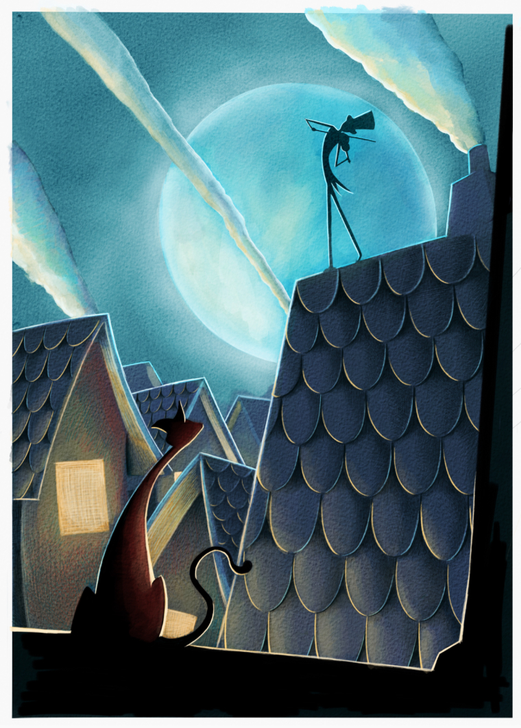
                So I added the moon in, and before I put much more detail in I wanted to see what people thought. I moved the middle smoke stream a bit so that it doesn’t imply too much wind. I assume that a little breeze would push the smoke, but not his jacket. Or, I can just assume that he is really into his music and flinging his butt in such a way that the coat moves that way (idk lol)
                0_1506048327086_8B6FB888-07C5-4ADC-AF15-00E8A1E578B7.jpeg

                EricCastleman.com

                SCBWI profile
                https://www.scbwi.org/members-public/eric-castleman

                tombarrettillo 1 Reply Last reply Reply Quote 2
                • Spencer Hale
                  Spencer Hale last edited by

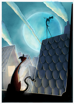
                  Nice! the main guy stands out much better now. Now I'd take a look at the cat and see You can make is stand out more too.

                  I tried to do a quick and ugly photoshop adjustment to see how you could approach it.
                  i lightened the houses and enlarged the cat a bit to frame him better an avoid some tangents
                  0_1506099336645_cat-drawover.png

                  I really like the warm/cool diffence between the characters. maybe you could push that some more as well.
                  It is a great piece! I can't wait to see the final.

                  spencerhalefire.tumblr.com | instagram.com/spencerhalefire | twitter.com/spencerhale

                  Eric Castleman 1 Reply Last reply Reply Quote 2
                  • tombarrettillo
                    tombarrettillo @Eric Castleman last edited by

                    @eric-castleman Better with the moon, though I think it works better brighter like the original. And is this digital?

                    https://www.youtube.com/@tombarrettart

                    1 Reply Last reply Reply Quote 1
                    • Eric Castleman
                      Eric Castleman @Spencer Hale last edited by

                      @spencer-hale great idea. That is what I will do.

                      EricCastleman.com

                      SCBWI profile
                      https://www.scbwi.org/members-public/eric-castleman

                      1 Reply Last reply Reply Quote 0
                      • Eric Castleman
                        Eric Castleman last edited by

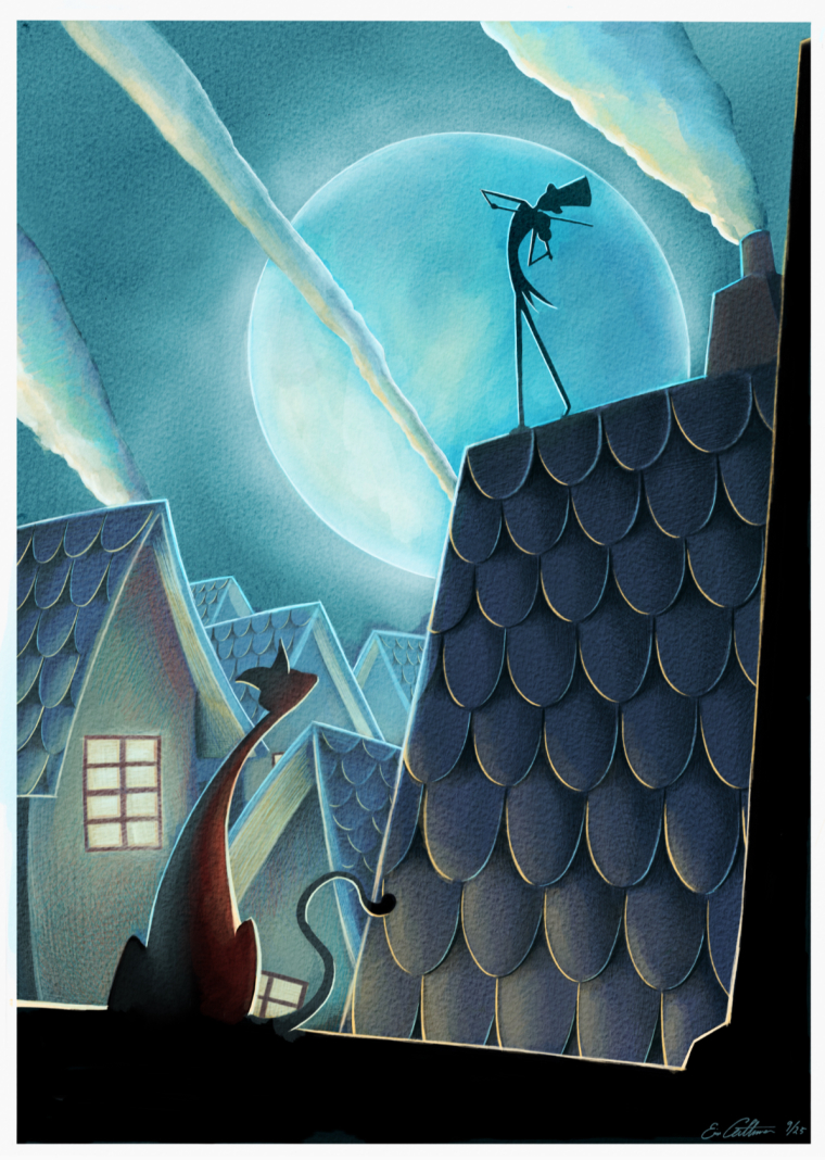
                        Here it is with the houses lightened up. Next I will work on the cat a bit more.
                        0_1506107281572_39416355-49D2-4841-B07F-B2AA5276D93A.jpeg

                        EricCastleman.com

                        SCBWI profile
                        https://www.scbwi.org/members-public/eric-castleman

                        Will Terry 1 Reply Last reply Reply Quote 5
                        • adamdohrmann
                          adamdohrmann last edited by

                          This looks so stunning. Amazing job!

                          https://www.instagram.com/adam_dohrmann/

                          1 Reply Last reply Reply Quote 1
                          • Will Terry
                            Will Terry @Eric Castleman last edited by

                            @eric-castleman Hi Eric, This is a really nice piece and I think it might have more impact if the cat were bigger than the cricket...right now there're about the same size on the page. Your cat has more character than mine but I think you could stylize the profile better than from straight behind the cat? I don't know - judgement call? Also I don't think you need rim lighting to highlight everything - I think you have enough plane changes to do it with value. Hope this helps...0_1506453208724_37675765.jpg

                            SVS Instructor
                            http://willterry.com/

                            Eric Castleman 1 Reply Last reply Reply Quote 8
                            • Eric Castleman
                              Eric Castleman @Will Terry last edited by

                              @will-terry thanks for your time!! I like the direction you took this, and is very similar to the other critiques I recieved from Lee White. I will rework it with your recommendation. πŸ˜‰

                              EricCastleman.com

                              SCBWI profile
                              https://www.scbwi.org/members-public/eric-castleman

                              1 Reply Last reply Reply Quote 4
                              • First post
                                Last post