Transportation WIP - Taking the elevator
-
Hi! I changed my initial idea for the contest and started making this, based on a story that I am developing.
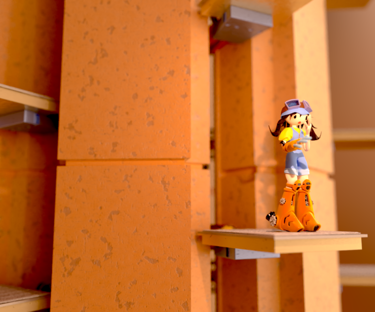
She is taking an elevator but she is afraid of heights.What do you think of the style and anything else? I usually illustrate with traditional media, mainly watercolor, but this one is done in 3D (Blender), and I still want to add some details and effects.
-
I love it!
-
@lynda_percival Thanks!
-
I think it's cute, but if you hadn't told me, I don't think I would get that she's afraid of heights. A vertical cropping or a different angle that conveys that she's high in the air might have bigger impact to illustrate her fear. Right now, there's no indication that she's high above the ground and it kind of looks like she's afraid of something just out of frame, that we can't see. Also think about how you can make it look more like an elevator. Right now it looks like it could just be a platform.
You've got a good start!
Website: www.tessawrathall.com
Instagram: www.instagram.com/tessawrathall_art/
-
@tessw good points (my wife jut told me the same)! Thanks! Gotta make it feel like an elevator!
-
agree with @TessW Perhaps an aerial angle with extreme perspective, or even an angle below where she is cautiously looking over the edge to the abyss below. Also, I think your depth of field is too shallow. You'll notice her fingers and the platform are blurry closest to the camera, and just behind her is blurry. And I would add some more details to the elevator shaft for interest.
-
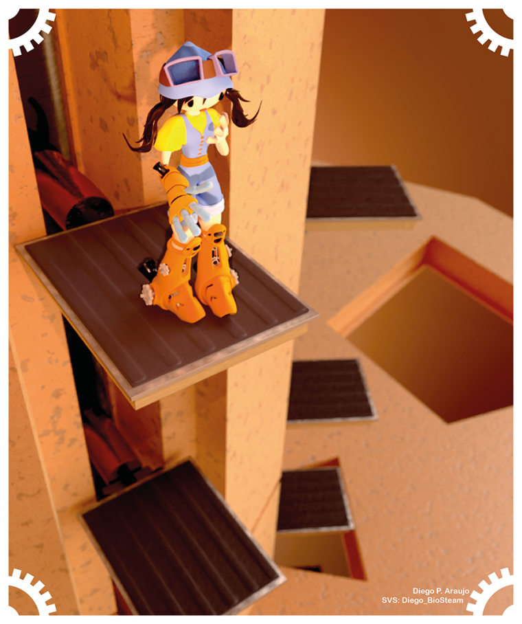
Thank you @TessW and @tombarrettillo for the critique. I made changes in the angle and added a floor such that it can be seem that the elevator platforms are going through it. Still want to add more details and adjust the background colours.
Also, after @Lee-White feedback suggesting that people improve on the presentation of their pieces, I am already starting to think on it and added a frame on my picture.
More feedback is welcome (and I hope there is time to make more changes)!
-
@diego_biosteam I think what @Lee-White meant was to make every effort to present a clean and polished illustration (by good scanning, cleaning it up in Photoshop, cropping it properly, etc), not necessarily embellishing it with borders, etc. If you look at the example he used, it was poorly lit when photographed, and had a hand-written, torn note to ID the creator.
As for feedback, your lighting is too even across the illustration. Things need to get a bit darker the farther down you go in the picture, even if there are other lights on that bottom floor. And I would add a few more characters to the scene to give more life, interest, and action.
If you do some research on character design, you will find many people talking about a character's silhouette—making the character's action recognizable even if the character was filled in with black. One way I read was that "a successful character should be recognizable by their silhouette alone". Consider adjusting her hands a bit so they are outside of her body frame, and maybe add a few more details to her outfit that would make her unique in the world she lives in. And you need to work on making her look more scared of the heights—have her further back on the platform, maybe leaning back some; maybe she is off balance.
Lastly, the background needs more than just an orange gradient. Make it look like an elevator shaft with pipes, panels, lights (think Death Star).
-
@diego_biosteam Not sure what program you are using but I'd run a black and white ambient occlusion pass and add it over the top in photoshop. At least on the character to give her some better shadows and break the forms up just a bit more. Maybe change the material you are using for her fingers so they don't blend into the outfit so much.
-
I like that you changed the angle to show the characters expression more. I'd like to see maybe some motion coming from the pallet that she is standing on. To show it's moving and transporting her. I also agree with tombarrettillo's feedback on the lighting and diego_biosteam comments too. I like this so far
")
-
Thank you all for the feedback! Really love when people notice issues that sometimes I can't notice.
Will make changes as much as possible and post the final piece!