Slowvember composition help.
-
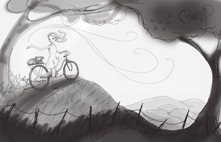 Hi all. For Slowvember, I'm reworking an old illustration (my take on Miss Rumphius) for my portfolio. I've uploaded a couple rough compositions. Any suggestions for improvement welcome. Thanks!
Hi all. For Slowvember, I'm reworking an old illustration (my take on Miss Rumphius) for my portfolio. I've uploaded a couple rough compositions. Any suggestions for improvement welcome. Thanks! 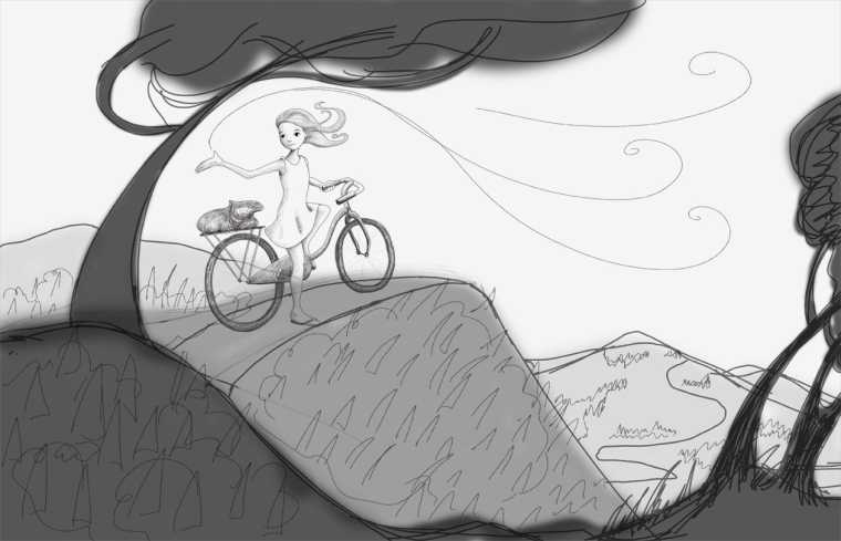
-
Pretty! I like the first comp better. It feels nicely framed, the shapes work better for the mood, and my eye flows through it well. How much linework are you planning to leave into the final? If you aren't planning on linework, I would just make sure that the girl stands out enough, because her values are very close to the background.
Website: www.tessawrathall.com
Instagram: www.instagram.com/tessawrathall_art/
-
Oh, btw, is one of your comps missing? I'm only seeing 2 and it looks like one might not have loaded properly.
-
@laurel-aylesworth Hey nice work. I’m new and trying color values at the thumbnail stage which I’m finding tremendously helpful. Dan Dos Santos has a really nice article on his process for playing w values at the prelim thumbnail stages. I’d post the link but I can’t seem to do it without closing this out atm.
Have you considered doing the foreground lighter and the mountains behind in the shadows? Since she seems happy I think it might lighten the mood? Also put her in contrast with her background w dark dress and hair or perhaps in front of low hanging darker leaves of the tree behind her? I think having her in contrast could create a stronger focal point. I just feel that the foreground as it is makes the image seem a little dark and ominous.
That’s all I got, thank you for sharing!
-kali -
@kali-williams Yes, I totally see your "ominous" point here. I'm having a hard time getting an interesting composition without a dramatic frame since the lighting is during the day. There will be a gazillion lupine flowers (including in the dark foreground) - do you think that would lighten the "ominous" feel? Thank you for your comments.
-
@tessw Thank you! I'll keep an eye on differentiating her value with the midground. I agree that option 1 is stronger, so I'll go with that one (there were only 2 options). Can I ask: what do you mean by line work? Do you mean detail? There's going to be a tone of lupine flowers surrounding her, so both she and the flowers will be the main focal points.
-
Hi @Laurel-Aylesworth . I really like this piece! It has a very nice breezy feeling, and that hill is going to be a blast to ride down!
") I definitely like the first one best--the fence adds interest and I like how the trees frame it in.
I definitely like the first one best--the fence adds interest and I like how the trees frame it in. -
Overall nice beginning! the only thing I can add to what everyone else has said, is maybe add a branch to the left tree to fill in the negative space between the tree and corner of the illustration (the first comp). Also, and I am sure this will change, but right now, the breeze appears to be emanating from the girls open hand. And, lastly, I am curious as to what or where her gaze is directed.
-
@tombarrettillo Good point about the gaze (her hand will have seeds that will blow into the wind behind her), but yeah, she should be looking at the seeds. Thanks!
-
@laurel-aylesworth When I say linework I mean using outlines, usually of a darker value to describe the edges of your forms- as opposed to just using blocks of color or light and shade to describe the forms. Right now you are using outlines, so it helps your figure standout a bit, even though the overall values within the sketch are very similar to the sky.
-
Hey Laurel, sorry it took so long to get back to you on this. I was looking over your composition again and I’m probably taking your darker tone too literally, like I think it won’t be so dramatic as a darker green for example compared to what you have going on in the lighter tones. It’s probably just the dark gray scale that threw me off. I was going to suggest maybe a more slender a tree but after thinking on that, you kind of need a bigger tree to balance out the left side.
Sorry I’m not very helpful on this, I’ll revisit if I️ can think of anything.
-Kali