My Slowvember (WIP)
-
Ok, so now that my place is unpacked, and I have a week under my belt at my new job I can finally get back to this.
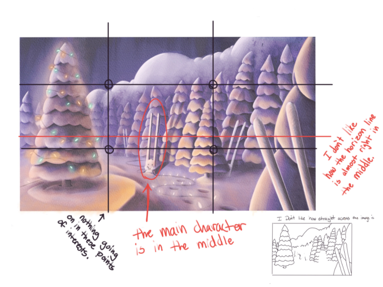
The issues I have had with this piece are my design and my values. My design issues are rooted in some bad habbits I have created over the last year. They began when I was able to save many of my drawings in the end by adding in elements that were not there in the earlier design, and I started leaning on this with confidence, but here it resulted in a botched piece. I also have known in the back of my mind that this is a bad habbit that digital has somewhat allowed me to fall into.
My other issue is understanding values. I don’t know if values have to do with lighting or color. When I do a black and white image, I am only thinking about shadows and depth. In my mind darker value are in the foreground and fade as things get further back, and if it is a darker scene that would be reverse. This might be wrong, but my limited understanding of values has forced me into these two seperate ideas. I also use a lot of light sources to make things more interesting value wise, and it seems to have been a winning formula so far.
As for this piece, snow has really thrown be for a loop. In my brain I know snow is white, and at the same time I do the values the same way I always do, but since I do not understand how value and color works vs value and light, the values in this piece change as I add more color to the snow.
So what I need to do is start over, and resdesign the drawing, since it is definitely something I need to pin point and get right first. So that will be my next few posts, and I will go over what I am thinking as I take into consideration what needs to be changed and added in.
-
I am just going to start posting outload. Feel free to stop me and insert your thoughts at anytime.
-
Just looking at this again. We're all going to learn as we watch you work
") I have to say, I loved the color nd reflection of your earlier painting. But, of course, you might be working into that? Looking forward to seein ghow it ends up!
I have to say, I loved the color nd reflection of your earlier painting. But, of course, you might be working into that? Looking forward to seein ghow it ends up! -
There is some great progress here, but I thought I would throw out a through things that came to mind. I would push dark's especially in the sky a lot more to make the tree pop and dark the tree in the foreground to make the center focal point stand out even more. As was previously mentioned the way to make something brighter is to make everything else around it darker (there is more to it than that but its a good rule)
I would redesign the rabbits if possible as Lee White mentioned, they are too similar the to trees and they would look much better if the shapes were somewhat opposite or at least different to the trees. I feel like they get lost in the design when they are not meant to (I am designing a creature that looks similar to it's surrounds because of the theme, but the ears in yours seem to be an afterthought or somewhat obstructive to the piece)
As Lee said, if it's getting too stressful then switch to some other piece for a while and come back and look at it with fresh eyes. I have a few pieces that have been put on hold because of that, but you will learn from your other work and that will help you when you come back to the pieces you dreaded. Hope that's of some help

You are doing some great work though Eric and I you definitely have the power to push on to learn more!!