My Slowvember (WIP)
-
Eric, you are doing great! Let's get something you are happy with. I will work with you on this. I'll get back to you tomorrow with some suggestions...
-
Some of you guys who are talking about trashing your images are running into the problem with REALLY finishing an image. That is where the difficulty of this project lies! What I tell my students is that it "gives you enough rope to hang yourself with!".
When doing a quick sketch, it's easy because it doesn't have to be good. But slowing down takes effort. You have to really know your tendencies and what you are going for in a piece. It will show you how good are at the moment. Some problems people run into: That hand that you always indicate in a quick sketch now needs to actually be figured out! Those values really need to work! What is the real level of finish you want to go to.
Fear not! Your feelings are normal. My big suggestion is to have a couple of pieces going at the same time. That way you don't hyper focus. Make sure you understand what you really want out of the piece and that will continue to drive the image.
In Eric's case, It seems there wasn't actually a concept which might be the culprit of not knowing where to go with it. Since there isn't an overall goal for the image, it's not telling you what it wants. We can fix that though!
As Mel Milton says, keep on keeping' on! : )
-
Thanks for all the encouragement everyone!! I really do appreciate it. A year and a half ago when I signed up for SVS I had no clue about that I was such a emotional weirdo when it comes to my art. Not until I started taking it seriously did I start to go through so many ups and downs.
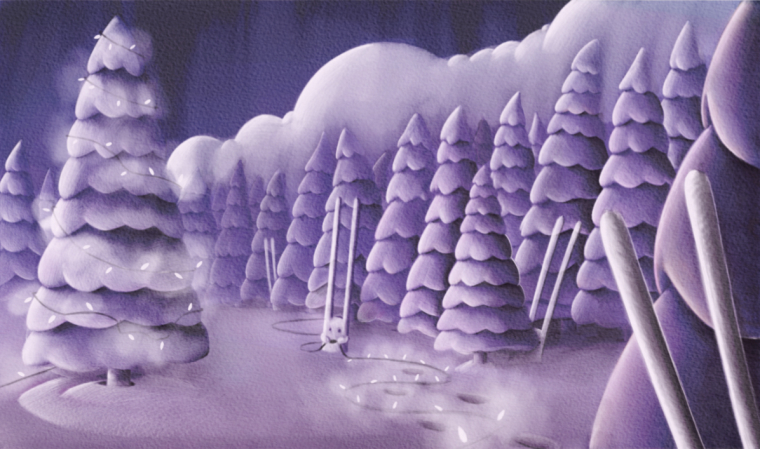
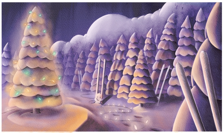
With that said here is the basic concept for the piece now. It may seem like it is on a similar track as before, but what I had done to it since showing everyone last was add in some elf luke characters that just didn’t look right, and the mountains and clouds just weren’t working. No matter how many times I reworked them, it just seemed off. So after starting back up a couple nights ago, and with the idea in my head to dedicate this to the SVS forums, I thought the rabbit theme was a good idea which somewhat represent the mascot of SVS, and I wanted it to reflect some sort of colloboration from a team, and those looking on to see if what I was working on could be finished. So, this is just the monochrome value, and the color is what I am starting on right now.
-
Here is a very rough idea of where I am going with this. Any changes anyone can throw out there Would be appreciated.
-
A bit more detail
-
@eric-castleman cool idea
") rabbits are very playfull
rabbits are very playfull -
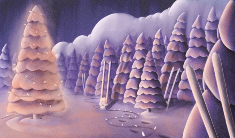
I really like this Eric and your changes make it read so much better. In the early paintings, I had to look for the rabbits that people were talking about but now with the lighting and the tracks, the one rabbit stands out as the focal point and your design leads my eye to look for the other rabbits which makes it so fun. It's really nice.
And on the subject of frustration, probably the most freeing thing I heard from the SVS teachers is their comments that they go through really ugly stages in their process when they start to say to themselves, "I can't draw." If even they go through that, it makes me think that it just comes with the territory and I've gotten better at telling my brain to shut up and let me persist. I also play classical mandolin and read of a famous violin teacher who said, "There's no such thing as a difficult piece. There are only time consuming pieces." I'm only an amateur but learning to ignore my frustration and accept that some paintings will just take me longer (sometimes A LOT longer) to figure out has really helped me improve.
-
@eric-castleman Nice to see you are back on track. I like what you have done with the foreground, pushes the eye into the painting! Now your rabbits are coming to life. Also great to read the inspiring words from Lee White.
-
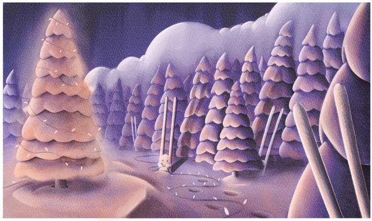
Hi Eric, I did a quick paint over on your image. I hope you don't mind. Here are the things I would address:
-
Make sure light, color, and value emphasize your focal point. You have a tendency to spread light and shadow a little too much. Let some things fade back and bring important things out. Try to only add complex lighting where needed.
-
Color: You had a great cool/warm balance going before and I feel the re-work may have lost some of that magic. Note: for any snow scene, defter to Will Terry because he has that stuff figured out!
-
The character design didn't need to be pushed so far in a piece like this and may have been hurting the overall scene design wise. If your trees are tall and pointy, then the other shapes should contrast that.
So, with those things in mind I painted this up. Feel free to take it in any other direction you see fit, those are just the bigger points I wanted to cover.
And most importantly, Keep going! : )
SVS Faculty Instructor
www.leewhiteillustration.com -
-
@lee-white awesome feedback. I will get to work on it tonight.
-
@lee-white Lee, what are you seeing in this that I am not getting? I just can’t get the light to work without making the tree look like a big light bulb. I see you are able to keep the tree lit and at th same time portray brightness.
-
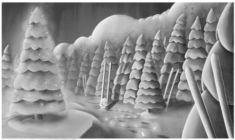
Your values are not working. Notice when I take your color out that you actually can't tell which tree is lit. The "lit" one is actually darker than the other ones.
In mine, I am using a warm light (which will look "lit") vs. a very cool surrounding area. In yours. In you're, The yellow is hardly warmer or brighter than the surrounding area. That snow pack over the tree tops is much too bright as well.
I'd go back to the cooler color balance you had before which is the one I used as a base. Will is really good at using the violet snow palette, but he is so experienced at it that he can pull it off.
SVS Faculty Instructor
www.leewhiteillustration.com -
@lee-white makes sense. Thanks for all your help. Do you mind if I don’t rush it and work on this until it is right instead of trying to get it done for the slowvember contest?
-
This is a great discussion, and it´s super interesting to follow.
I thought I´d mention a book I read a while ago. It´s a famous one: “Creative Color” by Faber Birren. It´s famous both because of its place in the history of color and as being one of the worst written books....ever. So, I do not recommend reading it unless you are obsessed with color theory, but it does say something extremely important: he calls it “the field”.
It basically means that light effects in paintings like light, translucency, transparency, iridescence, etc..., cannot be done in isolation - they are only possible. If the whole “field” - that is the all painting - works towards them. Often, they are only visible once the whole painting is done - even if there is a little white paper showing anywhere, the whole effect will be ruined. So, to have light in a painting, the rest of the painting - actually the rest of your field of view when you look at it - needs to be darker, otherwise the light will not show.
That makes it so difficult to get light to show in vignettes (I have tried!). It also simplifies the discussions with clients, when they insist on having a scene with candles, moon and whatnot, but they do not want the image to be “too dark”")
As for this piece, I definitely like it and I think it´s worth finishing it in any case. I feel the reason you run into frustration is possibly that you went too much into “finish” before the idea and composition for the whole piece was sorted out. Someone said that doing art is taking thousands of decisions, from start to finish. I´d add that it helps to take the big decisions at the beginning (composition, values, color scheme) and the questions to be answered should get smaller and simpler as you progress (should I add whiskers or not?). Keep going on this one!
-
@eric-castleman No Eric, you have to finish it RIGHT NOW!!!!
Just kidding! This is about getting good work. Nothing more. Take all the time you need.
-
@smceccarelli I just requested "Creative Color" from my library. I really struggle with color. Grayscale is my happy place, but not practical if I want to be a children's book illustrator. Do you have any other favorite books you'd recommend? I enjoy seeing how bold you're getting with color with your latest pieces. And also, I'm excited to see how Eric's piece ends up. Some great suggestions here.
-
@eric-castleman Yay!
-
@laurel-aylesworth Oh, I am not sure I am the right person to ask - I can get very “scientific” about color and I am not sure how much of that really influences my illustration work (I feel like I am struggling with color every time I set up a color palette ;-)) - and there are many different interpretations of color out there...
Without giving lists of books that may just end up confusing, I would suggest you aquaint yourself with the Munsell color system. He classifies color according to three parameters: hue, value and saturation.
There are many different color systems, but this is the one I find most useful for practical applications - you can even setup your palette (in photoshop easier than in real!) to show and control hue, saturation and value instead of rgb (it´s the so called HSL or HSA/HSB color space).
I nearly always work that way. Here is a widget where you can play with the relationships between the various ways to code color. If you get familiar with seeing color that way and keep in mind a few basic rules about painting (value separation between light and shadow, etc...) you may start feeling that color is under your control rather than the other way roundMuch of my use of color comes from the design world. I feel designers are given way more tools and information to control color than illustrators.
There are tons of books about this too, but the bottom line here is to decide your color palette before starting with color and to keep it limited. Designers feel that a 5-color palette is the maximum you need....and increasingly I find this to be true for nearly all illustration as well. The key is to make a clear decision about what you want to transmit with your piece: joy, sadness, sofistication, mystery....Here also there is a designer´s widget to play with: It used to be called Kuler, now it`s Adobe Color. Go to the “Explore” tab and just pick any of these color schemes to base an illustration on... -
@smceccarelli So much good stuff here. I love the Shade option on the Adobe color wheel as I sometimes have trouble figuring out what colors to use for shadows. I will definitely check out Munsell. And I agree, it seems a limited color palette is way more affective in conveying a particular emotion, which I find doing nighttime pieces easier than full light paintings as you can be more surgical about how the light affects everything else.
-
@smceccarelli I also wanted to share a resource I used when I was a graphic designer: http://www.colourlovers.com/
It's a great collection of color palettes for inspiration.