Whimsical Project: Process and Thoughts
-
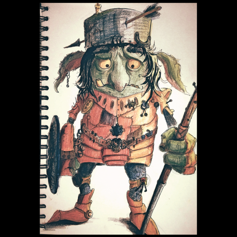
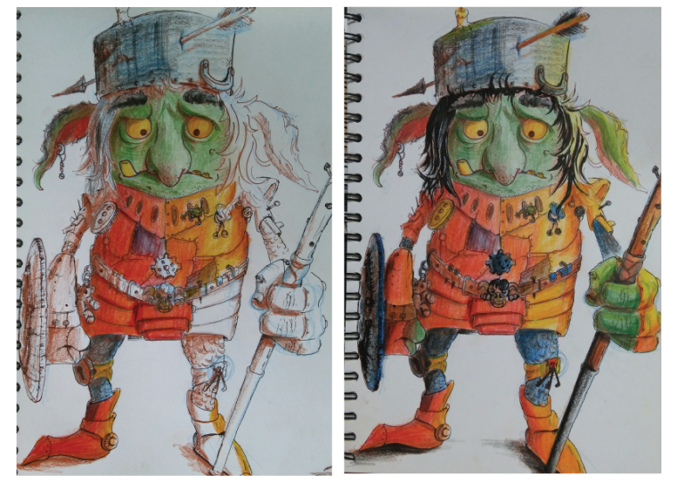
Worked a bit on the "Goblin Knight" that I created while studying Brian Fround art. From the previous sketch to this illustrated version.
The paper for this sketchbook is not good and cannot take water based media (watercolour or gouache). It also doesn't react very well with dry media, but I still gave it a try with colour pencils. I liked the result, but I don't really like working with colour pencils, mainly for a practical reason as they require too much effort to fill small areas on the paper (it's tiring and time consuming).
I did some digital post processing on the final illustration (just selected a filter and did some colour correction).
-
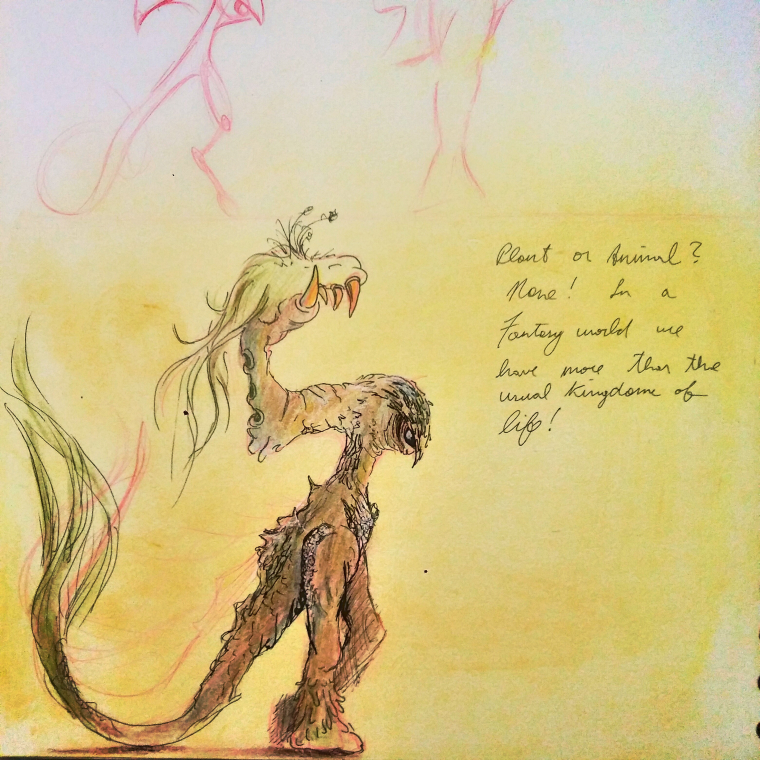
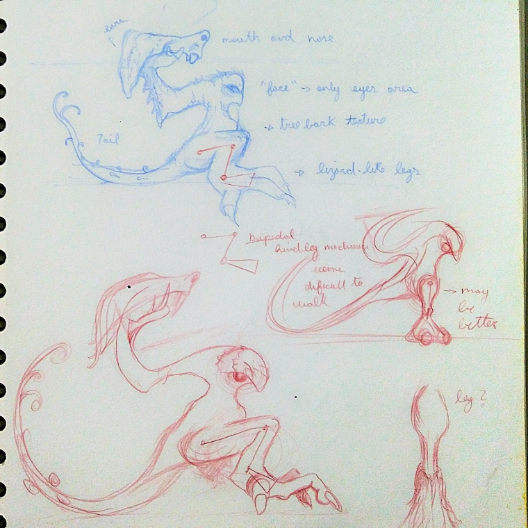
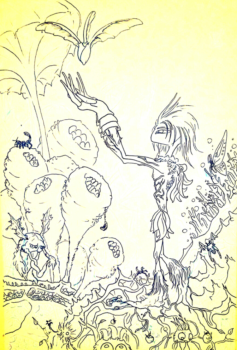
One more creature for the whimsical world.
Not a plant, nor an animal. Fantasy worlds allow for more than the conventional kingdoms of life.
This was based on a small water splash on the floor. Took me some time to get the right anatomy for this one!
-
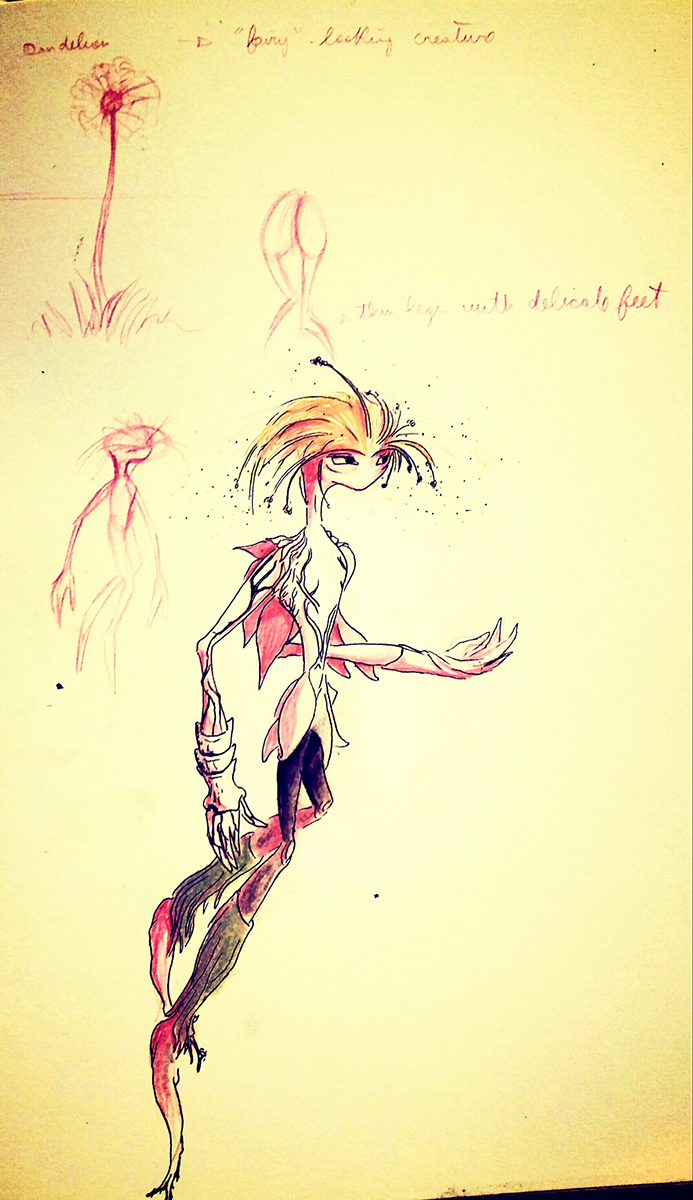
Created another character, this time based on a Dandelion. Not so sure about the direction this is going yet, but I am just letting things happen for now - it helps me develop a series of characters and environments as I put the ideas on the paper, and the story starts unfolding as this whimsical world comes to life. Some creations will be used, some will be discarded. I liked this one a lot and decided to make a full illustration with it - but it is still in progress. Still have some details to add and colouring!
-
@diego_biosteam
Have you watched Lee's class on finding creative style? It's an excellent class! I think the information & the exercise / assignment he gives would be helpful to you in researching styles and finding elements you want to emulate. -
Yes! I watched it. I did the selection of main artists that are influencing my work! And that is being reflected in this project!
-
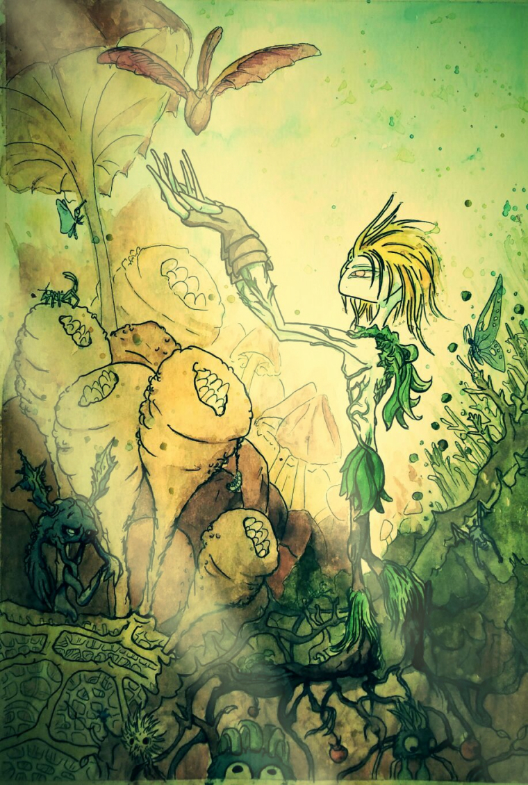
Done with the Dandelion illustration. There are about 4 to 5 layers of watercolour and 3 "layers" of inking. Took me about 6 hours to complete it. Then I did some basic digital post processing, including the light rays.
-
@diego_biosteam
The funnel-shaped plants are competing with your main character--especially the one in the middle with the tiny worm/caterpillar next to it. That is where my eye is drawn first. The dandelion character's feet/roots are getting lost at the bottom & the seed floating at the top is very blended with the mushroom behind it as well. It looks like you could use some value and color to separate things and draw the attention to the dandelion and the seed. I'm a beginner, so I don't know much about that yet! But maybe you could add some contrast by making the background darker and the more important object lighter or vice versa.Also, some of the line work looks faded out while other parts look darker. I think that is a lot of why the one funnel stands out so much. If all of the lines on the dandelion and the seed were darker than the other plants, I think they would stand out more.
I really like all the shades of green. It looks very lush.
It's fun to find all the little creatures hiding in the picture.
-
@miriam
Thanks for the feedback! The dandelion feet blending with the ground were more intentional than the other issues you mentioned. Will be more careful with the next piece! -
@diego_biosteam
If it follows the storyline, go with it.")
-
No critique, just wanted to say that I love the colors on this one!!
-
@eli Thank you! I wanted it to have a bit of a dark fantasy look.
-
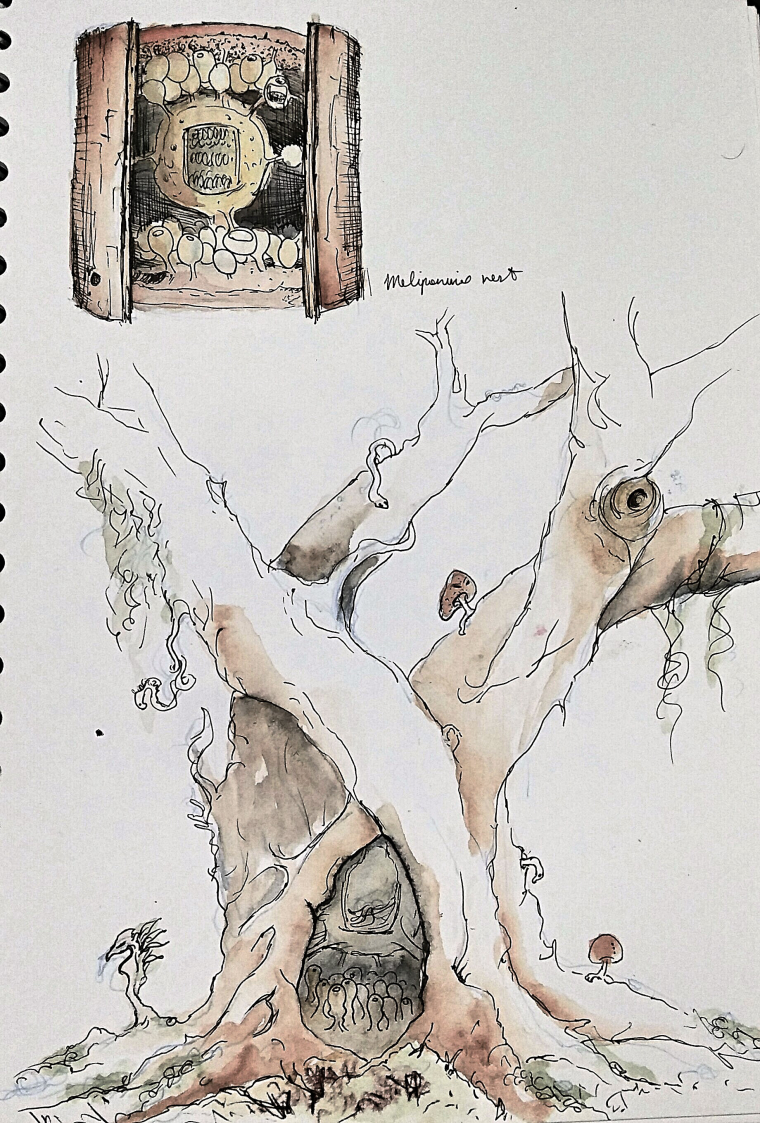
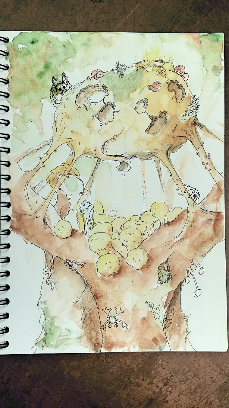
Planning to create the "lair" for the Dandelion character. Came with a quick sketch of a tree house inspired by the nest of stingless bees (meliponines). But I am already thinking of how much I will modify this idea.
P.s.: the nest on top is a loose copy of a scientific illustration of a bee nest that I found via google. It was more of a warm up exercise.
-
@diego_biosteam
Stingless bees sound nice! This made me curious and I had to Google it for myself. Unfortunately, many of them will bite or use other defenses instead. But some don't harm humans at all. Those honeypot shapes are very different and interesting.I was thinking that the honeypots don't leave any space to step on the floor, but your character flies, so I guess it's not a problem! A flower and bees should get along well as housemates.
I like the twisting shapes of your tree! It really supports the feel you are going for--especially with the crevices and knots, and the mosses and mushrooms mixed in.
This is my favorite one from the series so far.
-
@miriam
I am glad you are liking this one! I am still thinking how to arrange or fit the idea of the honey pots. Maybe they will just become weird shapes that complement the ground of his "lair". I will also modify the structure of the tree. Lets see what happens!Hope the final piece derived from this sketch will please you as well!
-
Another sketch with a modified version of the "tree house". This is the design I was aiming for.
-
@diego_biosteam
I like the other tree drawing better. I don't think I would have known what this was if I saw it on it's own. I'm not sure what is going on here. Is the round shape the Dandelion's home? It looks like it's breaking and the creature on top is eating it. -
@miriam
I was suspecting you would not like this one as much as the original sketch. I agree that it is very difficult to understand what is going on with the new version. I hope that it is because it's just a sketch. But I don't mind trying a more complete painting for both versions and then deciding which one is more interesting for this story.I think the challenge I am facing is on coming with these very odd structures and creatures that may be a bit distant from the usual - it is difficult for people to relate with them and like them. In most fantasy stories, a tree is a tree and that is it. Even if it is a walking tree (like a Treant), it still has all the features of a tree.
-
@diego_biosteam
If you want to have a tree that doesn't look like a normal tree, you would just have to make sure you explain it well in the story. -
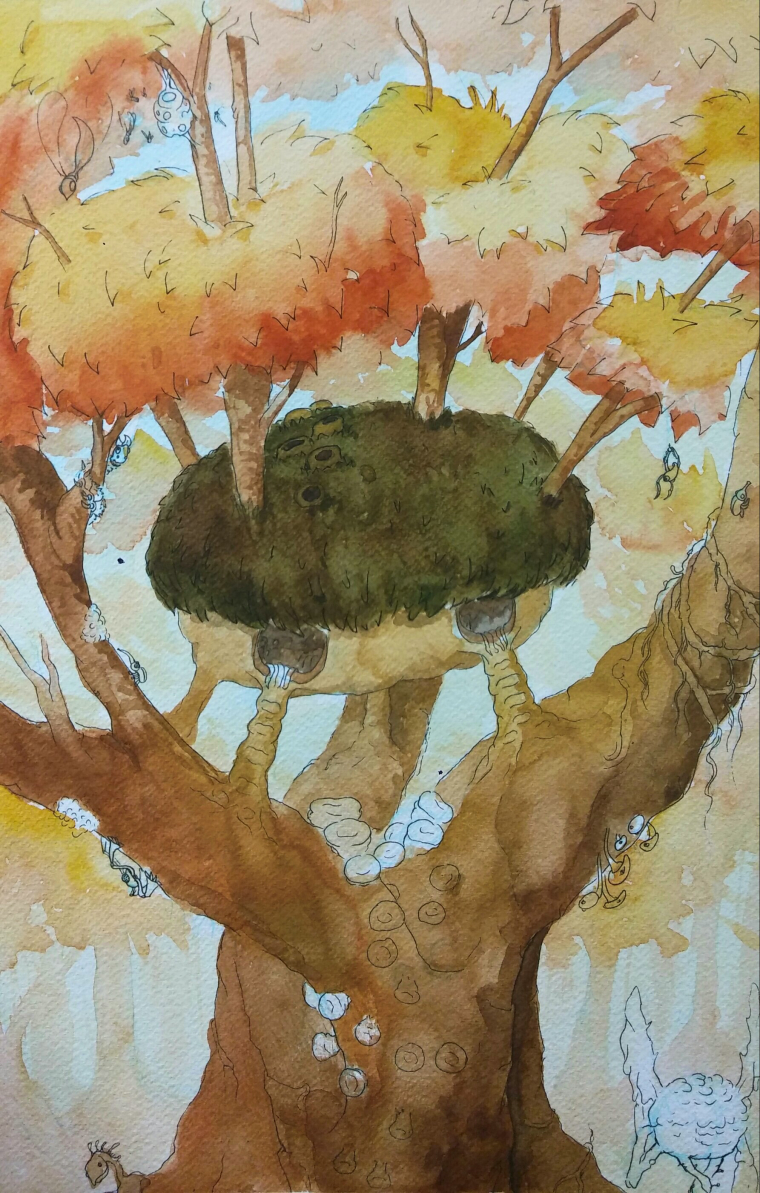
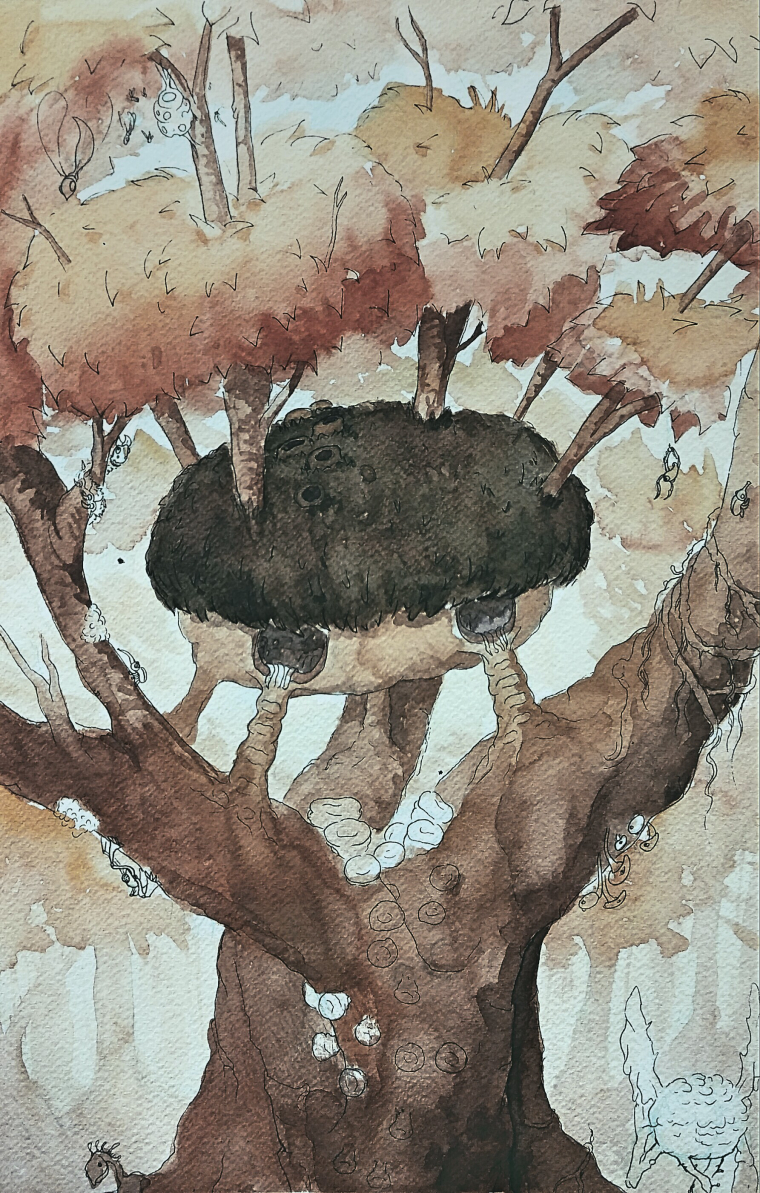
Moving forward to a final piece for the "tree house". Still in progress but I am questioning the colour choice. Even though I am liking it, it lost the "dark fantasy" feel. Post processing may help a bit, so I am comparing both (original as post-processed). Any critique is welcome.
-
@diego_biosteam
I think this one works much better than the last one. Showing more of the the trunk and main branches, and having the branches coming up out of the house part makes more sense and shows that it's all part of the tree. I still like the first tree the best. In the last ones, the bottom half looks heavier and messier than the top half of the painting.Yes, the oranges and the light blue in the top painting does give it a happy autumn look. Maybe you could place your painting with the adjusted coloring next to the ones you are trying to emulate to compare the colors and overall feel.