Finished Illustration / Exploration
-
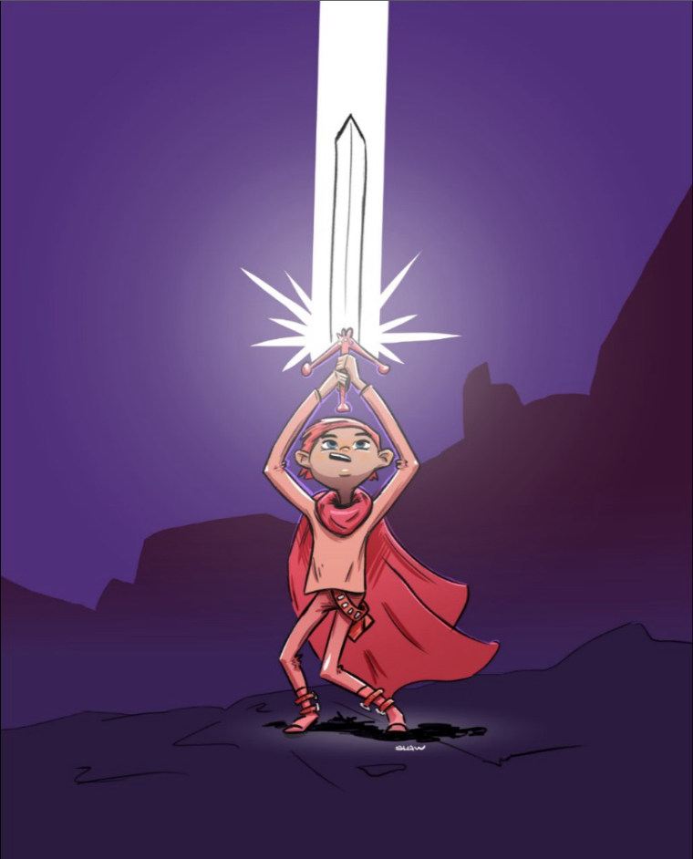
I thought I would post this here and ask for feedback. The problem is often I finish something and I feel really good about it, but then the next day I hate it. I don't know why I don't like it, so I am asking for your help if you have any ideas. There is no specific purpose or goal behind this piece except to explore my coloring and digital sketching process.
Thank you!
-
This is a fun piece! Its a style that makes me think of comics. You have a really strong silhouette in your composition as well--simple but it works. No distraction from your main character.
The main thing that jumps out at me for fixing is the character's pose. I feel like it would make more sense if the legs were not bending in the same direction like they are--he looks wobbly, like he's mid-fall. There are a couple proportion things that seem a little off as well--the arms seem quite long compared to the legs and torso.
Hope this helps.
") Thanks for showing your work!
Thanks for showing your work! -
@Sarah-LuAnn Thanks! I was aware of the proportion issue during my sketch, but I couldn't figure out how to get his hands over his head without making him look too long. I wanted him to look young. Originally the arms were shorter, but they overlapped the face and that hurt the silhouette.
-
@cory-shaw I like the composition and colors. Overall it looks interesting
However I agree with @Sarah-LuAnn that his pose could be improved. I thought that while legs show the weight of the sword, his body above waist doesn't. His corpse looks too straight for me. But thats only me, i am not very experience myself, so i might be wrong. Nevertheless, you should definitely not hate this piece and push yourself to improve it in a way that you will be satisfied. Few days break and starting a different piece are always good for it -
@aska Thank you for your help! I will definitely spend more time on the sketch in the future.