Society of Visual Storytelling

    SVSLearn Forums

    • Register
    • Login
    • Search
    • Recent
    • Tags
    • Popular
    • Users
    • Groups
    • Search

    Kid Lit 411 illustration

    General Discussion
    12
    20
    3134
    Loading More Posts
    • Oldest to Newest
    • Newest to Oldest
    • Most Votes
    Reply
    • Reply as topic
    Log in to reply
    This topic has been deleted. Only users with topic management privileges can see it.
    • Joy Heyer
      Joy Heyer last edited by

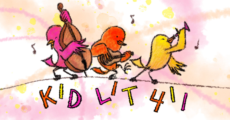
      Very cute! I like it. The movement and expressions are wonderful. I do think the second 1 in 411 should be moved a little to the left. I can't wait to see it in color!

      Twitter: @Joy_Illustrated
      Instagram: joy_illustrated
      Website: joyheyer.com

      RHirsch 1 Reply Last reply Reply Quote 2
      • RHirsch
        RHirsch @Chip Valecek last edited by

        @chip-valecek That's an interesting point, I'll play with it. Thanks!

        www.rhirschillustration.com
        https://www.facebook.com/rhirschillus
        Instagram: rhirschillus

        1 Reply Last reply Reply Quote 0
        • RHirsch
          RHirsch @Joy Heyer last edited by

          @joy-heyer Thanks! I'm looking at it again and I might warp the letters to follow the flow of the bar staff, so they aren't so straight up and down. It might work, it might not. Worth playing with. At this stage, nothing's set in stone.
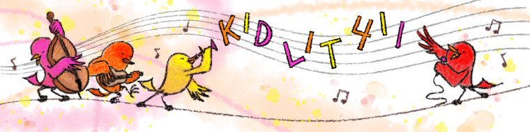
          www.rhirschillustration.com
          https://www.facebook.com/rhirschillus
          Instagram: rhirschillus

          1 Reply Last reply Reply Quote 1
          • RHirsch
            RHirsch last edited by

            Coming along...
            0_1517202207308_Kid Lit project3.jpg

            www.rhirschillustration.com
            https://www.facebook.com/rhirschillus
            Instagram: rhirschillus

            MirkaH 1 Reply Last reply Reply Quote 8
            • MirkaH
              MirkaH @RHirsch last edited by

              @rhirsch id make the letters a bit bigger, so they are easier to spot right away

              http://www.mirkah.com
              http://instagram.com/mirkadraws
              http://www.twitter.com/mirkahokkanen
              http://Shoppicadoodlepress.etsy.com
              http://facebook.com/mirkahokkanen

              DanetteDraws 1 Reply Last reply Reply Quote 0
              • DanetteDraws
                DanetteDraws @MirkaH last edited by

                Super cute @RHirsch! Great composition too.
                I agree with @MirkaH about the letters not standing out enough. I'd probably make them solid black myself so that they're not the same colour as the birds. It would be cool too if you made the 'I's and '1's look like musical notes - just a thought 🙂

                https://danettebyatt.com
                Twitter @DanetteDraws
                Instagram @DanetteDraws

                RHirsch 1 Reply Last reply Reply Quote 0
                • TraciVW
                  TraciVW last edited by

                  So much fun. love the cheering colors and playful birds. I would like to see the letters thicker.

                  Live, Laugh, Learn
                  twitter: @TraciVanWagoner
                  instagram: TraciVWCreations
                  FB: TraciVanWagonerIllustrator

                  1 Reply Last reply Reply Quote 0
                  • K
                    Kelanhordos last edited by Kelanhordos

                    Looks great, I can't help but think if the music bar had some more movement to it, like a wave almost, it would help lead the eye through the picture in a more pleasing way. I feel that both shapes arcing in kind of a mirror is fighting a bit for my eye to follow them both.

                    Keep it up 🙂

                    https://www.instagram.com/kelanhordos/

                    1 Reply Last reply Reply Quote 0
                    • RHirsch
                      RHirsch @DanetteDraws last edited by

                      @danettedraws Yeah, I tried that. It's not as legible, unfortunately, because it's a fun idea.

                      www.rhirschillustration.com
                      https://www.facebook.com/rhirschillus
                      Instagram: rhirschillus

                      1 Reply Last reply Reply Quote 0
                      • RHirsch
                        RHirsch last edited by

                        Agreed all, I will make the letters bigger, and alter either the wire or the bar staff so they don't mirror each other. Thanks for the advice.

                        www.rhirschillustration.com
                        https://www.facebook.com/rhirschillus
                        Instagram: rhirschillus

                        1 Reply Last reply Reply Quote 0
                        • Gary Wilkinson
                          Gary Wilkinson last edited by

                          Is the space between the "kid lit 411" and the wire needed for something later? If not it seems like wasted space to me

                          www.garywilkinsonart.com
                          www.instagram.com/gwillustration/
                          www.twitter.com/GWillustration

                          rcartwright 1 Reply Last reply Reply Quote 0
                          • rcartwright
                            rcartwright @Gary Wilkinson last edited by

                            @gary-wilkinson Filling a space just to fill it would be a waste, nothing wrong with having spaces

                            https://www.scbwi.org/members/richard-cartwright/
                            https://www.instagram.com/richardwcartwright/
                            https://www.pinterest.ca/richcartwright3/art-of-richard-cartwright/
                            https://www.richardwcartwright.ca/

                            1 Reply Last reply Reply Quote 0
                            • RHirsch
                              RHirsch last edited by

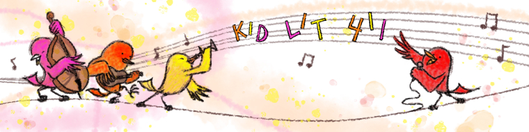
                              Finished piece and did the possible FB banner as well. Submitting tomorrow, thanks for the extra eyes.
                              0_1517727073413_Kid Lit 411 final.jpg
                              0_1517727096141_Kid Lit Fb banner.jpg

                              www.rhirschillustration.com
                              https://www.facebook.com/rhirschillus
                              Instagram: rhirschillus

                              Chip Valecek 1 Reply Last reply Reply Quote 9
                              • Eric Castleman
                                Eric Castleman last edited by

                                Loving it!!

                                EricCastleman.com

                                SCBWI profile
                                https://www.scbwi.org/members-public/eric-castleman

                                1 Reply Last reply Reply Quote 0
                                • Chip Valecek
                                  Chip Valecek SVS Team SVS OG @RHirsch last edited by

                                  @rhirsch turned out great!


                                  https://www.instagram.com/chipvalecek/
                                  https://www.facebook.com/cvalecek
                                  http://www.cshellmedia.com/

                                  1 Reply Last reply Reply Quote 0
                                  • K
                                    Kelanhordos last edited by

                                    Looks great 🙂

                                    https://www.instagram.com/kelanhordos/

                                    1 Reply Last reply Reply Quote 0
                                    • First post
                                      Last post