Illustration WIP. Critiques welcome.
-
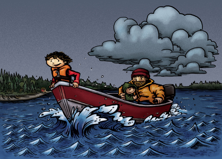
Hi everyone. This is a rework of my January submission for the Fearless challenge. I think this is pretty much done, but I'm not sure about the sky or the clouds. Something is not sitting right with me. I'm going to sleep on it, but I thought I'd show it here and see if anyone has some advice. Thanks for looking.
-
This is great..the expression on the brave little boys face is sweet. Maybe what might be bothering you is the placement of the storm cloud? I think I'd place that a bit higher or spread out across the image, not touching the figure..or perhaps its just that one small cloud directly over his head..it just looks a wee bit too low to me. Overall, it tells a great little story.
-
I agree with @djlambson about the small cloud and the placement. Other than that I think it looks really good.
-
@bnewman Really nice work! I like it.
Maybe you can add some atmospheric perspective, every edge in the background is too sharp. I also agree with the location of the cloud, I would try to locate it higher.
The horizon line seems to cut the image in half, try to lower it a bit, that will give you more space for that cloud. And, in my opinion, the noise effect is too strong.
Either way, it's a great job and I really like it! -
@djlambson Thank you! Good advice.
-
@allnightdesign Thanks! I will try that and see how it feels.
-
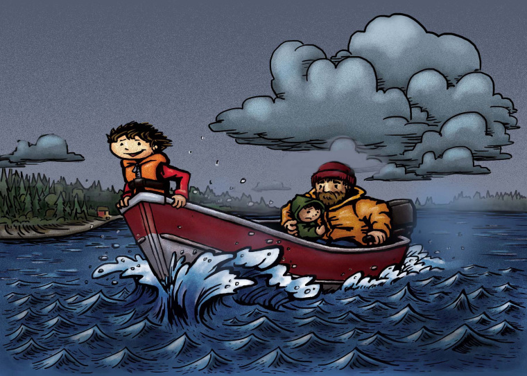 Hey I hope you don't mind I did a quick loose paint over. I added a little spray to knock back the bacground and darkened the water little waves a bit so your eyes focus on the boat more.
I really like your painting the characters and style is awesome.
")
-
For the cloud i think the thickness of the line brings it to the foreground with the characters in the boat, if that makes sense??? Try a thinner brush (Sorry i don't work in digital so i may use the wrong terminology) to outline the clouds, and you may find it puts them back into the background???
Find me on Facebook and instagram under NizhoniWolf, for my sketches, musings and W.I.P's!
-
It looks good! I like the bold use of line in the foreground characters and boat. Overall great work and the expressions of the characters help to sell their emotions. I would second that the background could be just a bit softer to give the illusion of atmospheric perspective; the lines and the colors desaturated a bit more compared to the trees in the foreground as an example. If the clouds still aren't sitting right with you, varying the clouds a bit more, spreading them, might help the flow of the composition. I do think that having no clouds in the foreground, or just a small one like in Jason's example, is a great decision because it gives your foreground character much more presence in the composition. Awesome work!
-
@jason-bowen Hi Jason, don't mind at all. Thanks for taking the time. Good suggestions man. Cheers!
-
@nizhoniwolf I know exactly what you mean. I looked at other artists who use strong line for foreground but it tends to get quite thin, light or not used at all for background elements. Thanks!
-
@sean-p-guzman Thanks Sean, good suggestions I appreciate you all taking the time to reply. I also like Jason's example of the small cloud. I'll post up the final when I have incorporated those changes. I agree with everyone's suggestions. Just need to get those clouds feeling right.