Society of Visual Storytelling

    SVSLearn Forums

    • Register
    • Login
    • Search
    • Recent
    • Tags
    • Popular
    • Users
    • Groups
    • Search

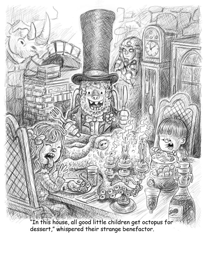
    February (Octopus) WIP

    Artwork
    14
    22
    3641
    Loading More Posts
    • Oldest to Newest
    • Newest to Oldest
    • Most Votes
    Reply
    • Reply as topic
    Log in to reply
    This topic has been deleted. Only users with topic management privileges can see it.
    • evilrobot
      evilrobot SVS OG last edited by

      Finished the line drawing for the first side of the spread. Now onto the second side. 0_1518978310894_WIP_6.jpg

      http://www.palacioillustration.com/

      https://www.scbwi.org/illustrator-gallery/illustrator-detail/?illustrator_id=84142

      https://www.pinterest.com/evilrobot2/pins/

      https://twitter.com/MyEvilRobot

      Kevin Longueil 1 Reply Last reply Reply Quote 5
      • Kevin Longueil
        Kevin Longueil SVS OG @evilrobot last edited by

        @evilrobot Great composition!! This will be a portfolio piece for sure - for critique the only thing I can come up with is to maybe not have texture or as much texture on the octopus so that he might pop more - really nice piece William!

        Portfolio: kevinlongueil.com
        https://www.instagram.com/kevinlongueil/

        1 Reply Last reply Reply Quote 1
        • artwithashley
          artwithashley last edited by

          The girl's expression is perfect! I can hear her making that yuck noise, and my face wants to do what she's doing because I feel her pain. Hahah way to go.

          1 Reply Last reply Reply Quote 1
          • K
            Kat SVS OG last edited by

            Love this, such a fun image!

            1 Reply Last reply Reply Quote 1
            • evilrobot
              evilrobot SVS OG last edited by

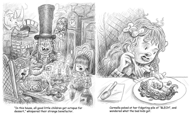
              Another WIP line drawing for the completed spread
              0_1519112864793_octopus-for-dessert-Finished-line.jpg

              http://www.palacioillustration.com/

              https://www.scbwi.org/illustrator-gallery/illustrator-detail/?illustrator_id=84142

              https://www.pinterest.com/evilrobot2/pins/

              https://twitter.com/MyEvilRobot

              1 Reply Last reply Reply Quote 5
              • K
                Kat SVS OG last edited by

                These are great! I love the expressions and details.

                1 Reply Last reply Reply Quote 1
                • evilrobot
                  evilrobot SVS OG last edited by

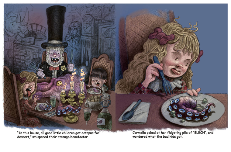
                  Next work in progress. Started on the colors. Going to let it sit for a day and come back to it.
                  0_1519202320961_octopus-for-dessert-WIP_10.jpg

                  http://www.palacioillustration.com/

                  https://www.scbwi.org/illustrator-gallery/illustrator-detail/?illustrator_id=84142

                  https://www.pinterest.com/evilrobot2/pins/

                  https://twitter.com/MyEvilRobot

                  Gary Wilkinson Eli 2 Replies Last reply Reply Quote 10
                  • Gary Wilkinson
                    Gary Wilkinson @evilrobot last edited by

                    @evilrobot Looking awesome! It may not be something you want to alter, but the tentacle in the foreground seems a little off to me and feels like it should behind the candelabra, maybe it's just me

                    www.garywilkinsonart.com
                    www.instagram.com/gwillustration/
                    www.twitter.com/GWillustration

                    1 Reply Last reply Reply Quote 2
                    • Eli
                      Eli @evilrobot last edited by

                      @evilrobot WOW. It looks amazing in color!

                      1 Reply Last reply Reply Quote 1
                      • evilrobot
                        evilrobot SVS OG last edited by

                        Thanks for the advice @Gary-Wilkinson Yeah I need to fix the front tentacle. I like it coming in front of the candle stick but it is a bit wonky.
                        With the background on the first page of the spread, do you think I should leave it blue? I was debating with my self over if I should just leave it, if I should throw in some flat colors, or if I should do a little rendering back there? I just want the foreground to be popped out no matter what I do. And on the other one not sure if I should put some texture on that blue background or erase it out on one side and have a gradient that goes to white.

                        http://www.palacioillustration.com/

                        https://www.scbwi.org/illustrator-gallery/illustrator-detail/?illustrator_id=84142

                        https://www.pinterest.com/evilrobot2/pins/

                        https://twitter.com/MyEvilRobot

                        stringfellowart 1 Reply Last reply Reply Quote 0
                        • stringfellowart
                          stringfellowart SVS OG @evilrobot last edited by stringfellowart

                          @evilrobot you could leave the background white, but maybe complete the top of the chair so it all pops off the page

                          Bringing whimsical creatures to life.
                          www.stringfellowart.com
                          www.instagram/stringfellowart

                          1 Reply Last reply Reply Quote 1
                          • bnewman
                            bnewman last edited by

                            @evilrobot Sick! I mean that in the nicest possible way. This is looking amazing.

                            1 Reply Last reply Reply Quote 1
                            • First post
                              Last post