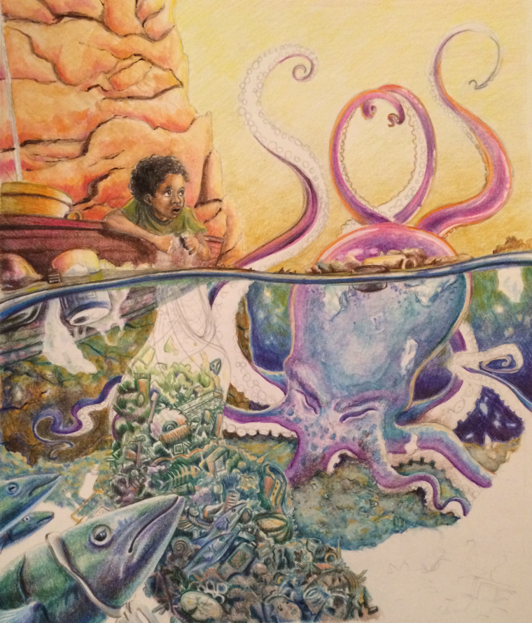
Would you critique my octopus? :)
-
Hello,
What amazing contest entries so far. I'm finding that the opportunity to enter offers a chance to learn about new mediums, so this month I'm trying watercolor pencils.
This is where the piece is so far... I feel like I have a few next steps in mind, but I'd love to learn from what others think. I have three main questions...
-
What color could the undersides of the tentacles be?
-
How can I make the concept of a polluted ocean clear?
-
What could be improved?
The boy eventually will be holding the fishing net which will drape over his arms, and the sky and tentacles in front of it will hopefully contrast more. I'm picturing more trash piled up in the foreground.
To anyone who has the time or interest in looking at this piece with a critical eye, I'd be most grateful for your help.
katy

-
-
@kathrynadebayo I would go with a pink for the under side. As far as the water, I think it works as you have it. If you try to pollute it, the image would get muddy. As far as improvements, I would watch your values. The fish in the foreground seem to be the same value as the trash in the middle.
-
I think the color of the sky is working against you in two ways. First, it's making it harder to make a choice for the underside of the tentacles. Secondly it's almost making the sky look polluted as compared to blues and greens of the water. If the water were polluted, visibility would reduced. Looks pretty clear down there. I think you could pull it off without getting all muddy. The fish in the foreground would be relatively clear to us, but the octo in the background would have muted neutral coloring and few, if any, sharp details. Even more of a shadowy silhouette depending on just how polluted you wanted it to appear. That would contrast with the tentacle above the water. Those, however, could be dripping some gunk or have a piece of trash (or two) stuck on them. The boy could also be fishing a piece of trash out of the water? But really the overall drawing is good, it's just the colors and atmosphere underwater that I believe is working against your intended effect. Try some small color studies off to the side and see if you can achieve the effect you're trying for.
-
What a stunning use of watercolour and pencil (I assume) I confess i'm a little jealous of your skill lol I hope you don't mind me keeping a close eye on you so that i may learn something from you (i too am a colour pencil artist).
The only thing i have to say at this point is more of a tip really, I don't know if you are finished with the sky or not? Sadly the scan has made the pencil marks quite clear (for me at least) as scanners do. I use i tiny bit of white spirit on a paint brush to blend big areas like sky, especially if there isn't many layers of colour in an area.
(i hope that made sense?)
-
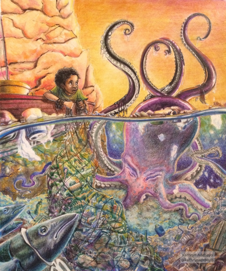
@Chip-Valecek Very valuable advice... thank you so much for these suggestions! I really took your thought about values to heart, and though I don't know if I achieved optimal results, I think it is an improvement from the original image. Thanks again!
@Jittles Wow, thank you so much. These suggestions really helped me out. Speckling the water with paint seemed to help give a more polluted feel without being too muddy. I tried implementing some of your other ideas too, and really liked how they changed the image. I think the adjustment to the sky also gave it more of a believable sunset feel instead of just weird yellow. Thanks again for taking the time to offer your thoughts... so appreciated.
@NizhoniWolf Hi! Thank you so much for your suggestion. Making the sky seem smooth with the watercolor pencils was actually one of the hardest parts for me. Hopefully it's better now. I ended up rubbing a wet paper towel over the dry pencils, and I think that worked pretty well, though certainly not perfectly. I'll have to keep learning and trying things. I haven't heard of using white spirit, so thanks for introducing me to something new. I looked at your work and it's great! Thanks again for the comment and the help.

-
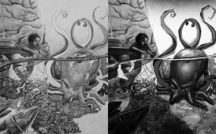
Great work!!! I believe your art will work will take a major leap forward if you focus on "value" study. That is a weak point I see in this piece that with some work you could easily flip to a strong point if you turn your attention to it. I did a quick crummy value tweak (my values need allot of work as well) to show you the difference in values. Wish you the best look forward to seeing your work!

-
@tyson-ranes Excellent, very helpful critique! Thank you so much. Before I dive into a piece next time, I'll try to set up values more intentionally... your example shows me how much further I could have pushed things.