Art licensing images mockup... ideas/help needed.
-
So I loved the licensing class that was recently added to SVS and wanted to try making one of my recent sketches into something licensable. Its a new avenue for me and I'm feeling a bit unsure.
I thought the image would work well for mailboxes, welcome mats, and garden flags because of the subject matter. The problem I'm running into is that my design is horizontal, which is fine for the mailbox and welcome mat, but doesn't work so well for the vertical format flags. This was my attempt to make it work, but I'm not sure it's the right approach--too busy, I feel like the focal point is getting lost.
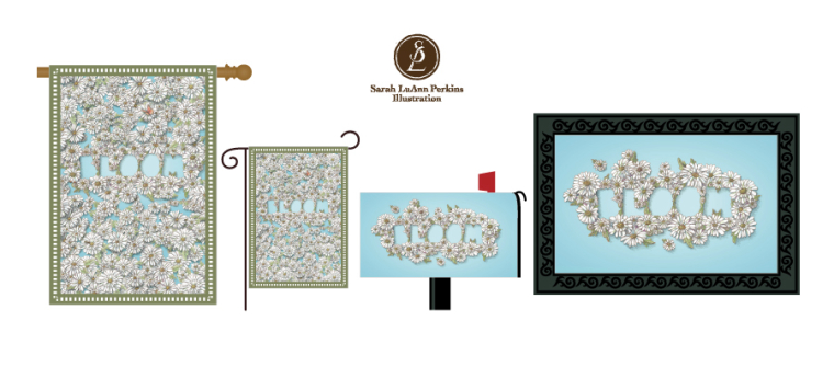
Any suggestions for me? What might be a better way to incorporate the design into a vertical format?
-
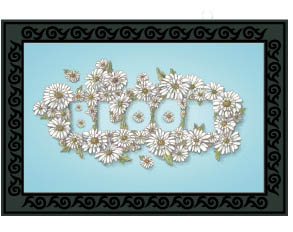
I think it works really well on the door mat. I think it's because of the black rubber frames it and draws your eye in towards the word. I think it gets lost in the vertical version. Almost need to have a gradient framing it and bringing our eyes towards the middle or perhaps have the outer flowers darker and getting lighter as they move in towards the word. Also maybe a darker background color because the flowers are so light having a bit more contrast might help. Also maybe a flower in the middle of your O's and your B
-
Have you considered adding the flowers in the holes of the lettering? Just a thought.")
-
Cool project! You original Bloom image showed up in my instagram feed and it really stood out to me. I agree that it sort of gets lost in the vertical format. Perhaps it wouldn't be an issue when it's actual size? Other than that a couple of options I'll throw out that may or may not work:
A slightly darker outline or subtle drop shadow on Bloom.
Maybe keep the flowers just centered on bloom for the vertical format, like you have for the horizontal, but also sprinkle in flowers here and there, sort of like a polka dot pattern on the rest of the banner. Not sure if it work, but it's worth a try.
Website: www.tessawrathall.com
Instagram: www.instagram.com/tessawrathall_art/
-
@tessaw my original solution just had fewer flowers scattered around, but I felt the letters got even more lost that way.
 maybe I had too many even then.
And yes, I did think about having flowers in the dropouts of the letters... but I don’t really like how it looks. I like having the solid shape of the letter as a negative space. However, if enough people disagree with me I could try it
 .
. -
As I’m thinking about it, I think the reason I like having the letter dropouts empty is that I wanted the letters to be a little bit subtle. But that doesn’t quite work for a flag, it needs a focal point that jumps out in a non subtle way. Also since I know the letters are there it doesn’t look as subtle to me as someone looking for the first time. So... I’m still torn on that part. Hmm.
-
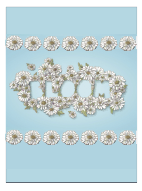
You could add borders below and above the "bloom" image. Maybe a row of daisies instead of daisies all over or even just a coordinating band of color. Like this...only with more thought and skill...
Twitter: @Joy_Illustrated
Instagram: joy_illustrated
Website: joyheyer.com -
@joy-heyer I like this idea! You have something here. Thanks!
-
@joy-heyer I like that idea! I also wonder about adding more contrast in general. Maybe darken the green on the leaves, and add more leaves in general to better frame the shape.
-
@sarah-luann loving these images! I also reviewed that licensing class but didn't see the templates for mocking up artwork on various items - where did you find them?
-
I made them, based on some product pics I found on a manufacturers website. The sizes etc are just guesses til I get more accurate templates. Just working with what I have
 .
.