Society of Visual Storytelling

    SVSLearn Forums

    • Register
    • Login
    • Search
    • Recent
    • Tags
    • Popular
    • Users
    • Groups
    • Search

    Need help with a color study and lighting.

    Artwork
    5
    8
    1145
    Loading More Posts
    • Oldest to Newest
    • Newest to Oldest
    • Most Votes
    Reply
    • Reply as topic
    Log in to reply
    This topic has been deleted. Only users with topic management privileges can see it.
    • Laurel Aylesworth
      Laurel Aylesworth last edited by

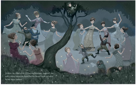
      Hi guys. I need some help with figuring out lighting/color on this piece. The light source is a full moon off camera, but I'm not sure about how strong to make that influence - I like the warmth of the color of their skin, and I don't want a blue light to make them look like zombies. The other light source to add some warmth is the fireflies. Anyway, any comments would be most welcome. Thanks!

      0_1522680099530_color.jpg

      www.laurelaylesworth.com
      instagram.com/laurelaylesworth

      djlambson 1 Reply Last reply Reply Quote 1
      • djlambson
        djlambson @Laurel Aylesworth last edited by

        @laurel-aylesworth Hi Laurel..my first thought looking at this scene is that the middle ground is too close in value to many of the figures. Especially looking from this distance, many of those figures sort of fade into the environment. Changing that in some way..different value, or slightly warmer hue may be a start? Looking forward to seeing this progress.

        https://www.instagram.com/deborahlambson_art/
        https://deborahlambson.com/folio

        Laurel Aylesworth 1 Reply Last reply Reply Quote 0
        • rcartwright
          rcartwright last edited by

          Hi, I actually really like your color pallet but I think you have issues with focusing the reader's eye, I'm not sure where to look. If there is an intended focal point I would to make a reason to have more saturation and light in that area possibly a torch light to add warmth in one area. I also think the tree is dividing the page directly in half and your hidden character in that tree will be in the gutter or very near it, not sure if that is an issue.

          https://www.scbwi.org/members/richard-cartwright/
          https://www.instagram.com/richardwcartwright/
          https://www.pinterest.ca/richcartwright3/art-of-richard-cartwright/
          https://www.richardwcartwright.ca/

          Laurel Aylesworth 1 Reply Last reply Reply Quote 0
          • Jason Bowen
            Jason Bowen SVS OG last edited by

            0_1522686106088_lights2.jpg

            You could always warm the party up with some Chinese style lights maybe?

            https://www.instagram.com/jasonbowenoils/

            1 Reply Last reply Reply Quote 1
            • Laurel Aylesworth
              Laurel Aylesworth @djlambson last edited by

              @djlambson Good thinking - I see what you're saying. I'll play around with the ground color.

              www.laurelaylesworth.com
              instagram.com/laurelaylesworth

              1 Reply Last reply Reply Quote 0
              • Laurel Aylesworth
                Laurel Aylesworth @rcartwright last edited by

                @rcartwright You're right about the focal point. I wanted to have the ladies in soft, muted tones and have the dwarfs more saturated so they stand out, so maybe I need to work on that contrast more.

                www.laurelaylesworth.com
                instagram.com/laurelaylesworth

                1 Reply Last reply Reply Quote 0
                • demetrius
                  demetrius last edited by

                  Hey Laurel. I like where this is going. I also love that you're putting a lot of characters in the same image. That's something I'm trying to force myself to do. I picked a few references that may help you (or not). They seem to share the same lighting situation you're trying to achieve.

                  0_1522693374843_e_gal_resc.jpg

                  0_1522693534995_p_a_f_2.jpg

                  0_1522693549160_p_a_f.jpg

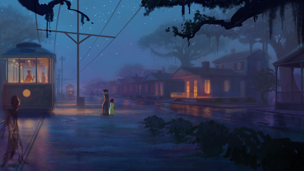
                  It looks like in each image, the moon is off to the side and out of view but not directly above.
                  I agree with the comment about the tree splitting the image in half. Also, since the 2 girls/women are in the foreground (and shielded from moonlight by the trees), it seems like they should be larger and darker to help the viewer determine distance. I did a quick adjustment to show what I mean.

                  0_1522693846799_1522680100081-color_2.jpg

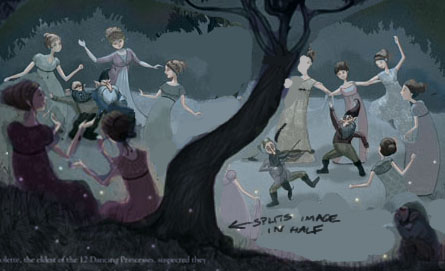
                  Anyway, that's how I would approach the image.
                  Good luck!

                  Laurel Aylesworth 1 Reply Last reply Reply Quote 2
                  • Laurel Aylesworth
                    Laurel Aylesworth @demetrius last edited by

                    @demetrius YES! Thank you so much.

                    www.laurelaylesworth.com
                    instagram.com/laurelaylesworth

                    1 Reply Last reply Reply Quote 0
                    • First post
                      Last post