Take me to the City (Travel WIP)
-
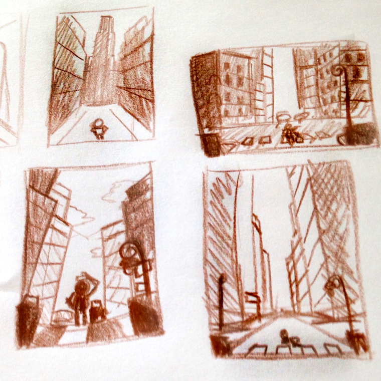
Okay you guys, I've been toying with a few ideas for this month's prompt. I love the idea of showing the magnitude of traveling to a big city. (I moved to New York City on my own when I was 19, after living in a small town my whole life.)
Here are a couple of thumbnails with some really rough values placed. What do you guys think? Should I make the person the main focus making them larger, (like the lower left sketch) or should I make them really small to make the buildings feel huge? Also, I kind of like the horizontal framing because it's less expected, but I'm not sure it conveys the scale of the skyscrapers.
Any thoughts? Thanks for taking a look.
-
My initial thought when seeing these is that they are all basically split down the middle. Try playing with the rule of thirds a bit. Also maybe tilt the camera a little so everything isn't parallel with the border of your image.
I'm liking your values! I think you've done a good job of making the focal point stand out in all of them.
-
@artwithashley
I really like the vibe of the bottom left one so far . . . it does have a symmetry but there is a sense the buildings are crowding around the kid in the middle which I think gets your idea across well. -
great thumbnails. I like the lower left one. It is so nice to see the thumbnail stage on peoples contest entries.
-
I like the lower right. It has more height.
-
@RajSolankiArt - Good point, I think playing with setting the buildings off of center-line would help make for a more dynamic composition. Thanks for the help.
@AirenHall - Thanks for helping me pick! I agree with the buildings giving the feeling of crowding around the kid, maybe I should push it a little more.
-
@Spencer-Hale - Thanks for the input. I always love to see everyone's process, but get so nervous to share my own.
@Jason-Bowen - I do really like the height of this one and that's why I was having such a touch time deciding. Thank you for your input!
-
Sorry I'm a bit late to the comments, and you may have already made your decisions and pushed on with your piece, but here are my thoughts if they are of use.
I like the bottom left one, but one thing that troubles me is that there are no people about (has there been a zombie apocalypse?). If you were to add a lot of hustle and bustle around your character with a lot of busy looking tall buildings, you could still put have the character as the focal point using color and/or lighting. It's just an idea, but it may help with the story. If you want to avoid additional people then how about a more worm pov which would emphasise the height of the buildings.
-
@gary-wilkinson - good point!! I should have added some people into my thumbnail sketches. (I'll have to save the zombie apocalypse for a later date) I have gotten into a bad habit of not roughing my sketches all the way out and then jumping into the artwork before taking it to the next refinement stage. Thank you for taking a look and sharing feedback! It's much appreciated.