Mixed media experiments
-
I think it's very cool and it looks like it takes a lot of work!
-
I love this--it looks amazing. I am a big fan of collage and this is awesome
-
@smceccarelli Definitely continue on with this! Love looking at all the dimensions, textures, marks, etc.
-
@smceccarelli this is really cool! I love the layers, it's such an interesting image to look at. Keep going with the project, it will be great t see more.
-
Wonderful concept. I think the illustration style is "fresh" and very expressive. I look forward to seeing more!
-
@w-coats Thank you! Animation is a good idea (and would be fairly easy to do on this one) but I'm just experimenting at the moment. No 3D software - just plain paper folding. I've actually looked into doing origami with 3D software but it's about 100 times more work than doing it by hand in the real world...
-
Thank you all for the encouragement!! I didn't expect such a positive reaction - it feels so weird to work this way. But I'll keep experimenting and seeing what suits best to the story. I've tried fully painted versions and maybe there is more to be done there, but for the moment I'll dig a bit deeper into this approach.
Another source of feedback told me that the boy it's too stylized and doesn't fit with the realistic paper shapes - and I think they're right. So either the boy can get more realistic or the paper shapes more stylized (and not done with collage anymore, obviously).
Here is a version with a more realistic boy. Curious which one you like best...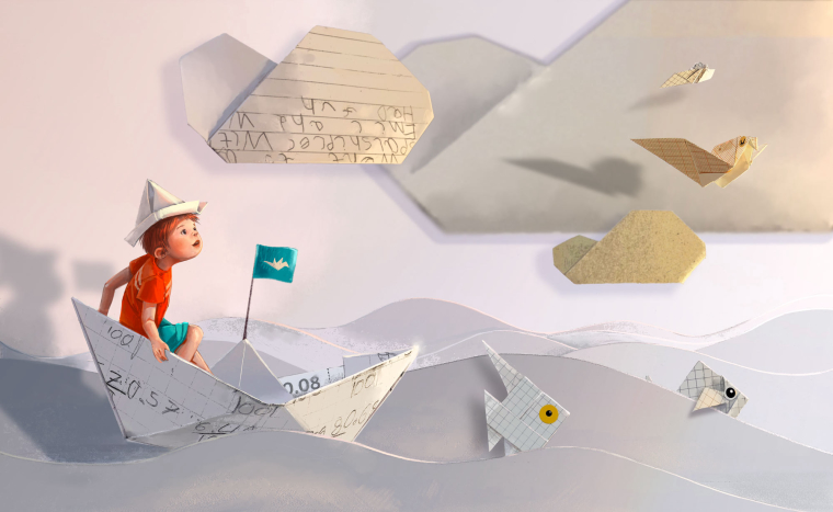
-
I love this idea I actually prefer the first boy,but both are good.It is a original and interesting idea.
-
I like the second, but it may be as much the expression on his face as it is style. In the first one, I was looking more at the paper cut outs but in the second, my eye was drawn immediately to the boy.
-
@smceccarelli fabulous! fabulous! Simona to my eye this one is much better, his expression makes me think of wonder. so I'm more drawn into the story (which is after all the point). Excellent!
If you wanted to animate you could use a 2D software because this scene is essentially flat. I would use Adobe After Effects, but I think there are other options. -
@smceccarelli
Both look great! I think it depends on the feel of the story. The first one would go well with light, fun, silly, & playful stories and the second one might be better for more serious, deeper, heart felt, &/or mysterious types of stories. The both have a sense of wonder, curiosity, creativity, and imagination.In the first one, I think the simplicity of the drawing and the flatter look of the character pair well with the basic shapes of the origami and the common quality and flatness of paper. I like the contrast of the realistic paper with the stylized character.
The pose and rendering on the second drawing give it a beautiful, 3D look. It has a nice contrast as well with the soft, round shapes of the boy against the sharp, flat lines of the paper.
I think the second boy does stand out more than the first boy, but adding a little sharpness / crispness to the lines on the first boy might pull more attention to him. Maybe you could try defining the edges of his face and arm a little more where they are blending into the background. You could also try softening the cloud with the writing on it, to drop it back a little.
Just something to think about in comparison with the story: The boy in the second version looks younger with a rounder face. To me, he looks like he probably couldn't have folded the origami on his own. The boy in the first illustration looks old enough to have made them.
It's great to be able to see you work on this. Thanks for sharing!
-
@smceccarelli I really like the 2nd version as the boy feels like he is interacting with his surrounds a lot more and I think going more realistic with the design fits well. I find the flag in the middle of the boat to be a slight distraction though as it feels as though I focus more on that when looking at the picture than at the boy.
Have you thought about the text on the paper being more relatable to the story as though he has become part of what he has written?
-
@smceccarelli I really like the second one! I'm not really analyzing my response so much as reacting, but I think it has to do with the dynamic pose and the boy's expression of wonder. He's looking right at that bird, which gives a great site line and makes the viewer's eye travel across the painting. It doesn't bother me at all that some parts are more realistic while others are flatter. It makes sense because it's all stuff that seems like it's going on in the child's mind. I like the handwriting details a lot, too.
-
Thank you all again, for your reactions and comments - it´s really helpful! @LauraA my agent favored the second one too, for nearly the same reasons - so spot on! She asked me to do a sample that doesn’t look “straight out of a book” - something which can stand alone better in terms of storytelling. So I´m working on that now, as well as on another spread. If all three work, I may string together a dummy and try her with that....
-
Next sample - still not sure this approach would work for a book. Have you ever seen something like this in a book?

-
@smceccarelli This looks really good! (i love the little detail of the sandal falling away from the heel)
-
This whole series is really cool! I love the dimensionality of the cranes and how they flow through the composition. Also the whole "shallow space as sky" concept. Are you working with photos (the cranes, with touches of drawing on top) combined with drawing (the boy)?
For some reason I want his face, back and arm to be a little more 3D. The boy was 3D enough in the last one, and in this one the dimensionality seems to work well from mid-back down. I think it's because the cranes are so realistic and he is not the imaginary part, they are. But take it for what it's worth as a suggestion, because you may have something else in mind.
And no, I don't recall ever having seen anything similar! I like it as a concept!
-
So wonderful Simona! love these..I think my preference is the more realistic boy as well.
There is an artist in Ontario...her name is Elly MacKay whose process involves cutting out her characters and setting them up in scenes to then photograph. Quite amazing.. you’d enjoy her work. (Theaterclouds.com)