Society of Visual Storytelling

    SVSLearn Forums

    • Register
    • Login
    • Search
    • Recent
    • Tags
    • Popular
    • Users
    • Groups
    • Search

    Travel WIP - tips welcome

    Artwork
    7
    17
    1843
    Loading More Posts
    • Oldest to Newest
    • Newest to Oldest
    • Most Votes
    Reply
    • Reply as topic
    Log in to reply
    This topic has been deleted. Only users with topic management privileges can see it.
    • Gary Wilkinson
      Gary Wilkinson @Sofie Schollaert last edited by

      I seond what @lenwen said. As a tip, turn your image to greyscale to see how well the image reads in black and white. I would also recommend looking at how other artists have tackled painting whales. Have you thought about changing the whale so that would stand out more, either by it's color/tone or by having a darker/lighter surrounding?

      Here are some examples of whale images that may be of help

      1_1524570006234_IMG_2055.JPG 0_1524570006233_IMG_2054.JPG

      www.garywilkinsonart.com
      www.instagram.com/gwillustration/
      www.twitter.com/GWillustration

      1 Reply Last reply Reply Quote 2
      • Sofie Schollaert
        Sofie Schollaert last edited by

        Thanks a million for your replies! I took it into account and feel it looks better already. If not, feel free to tell me 😉
        0_1524572362839_svs travel april 2018 totaal def.jpg

        • Life is cuter when you draw it! -

        instagram: https://www.instagram.com/sofie.schollaert/
        website: https://studiomosa.be/

        demotlj lenwen 2 Replies Last reply Reply Quote 6
        • Sofie Schollaert
          Sofie Schollaert last edited by

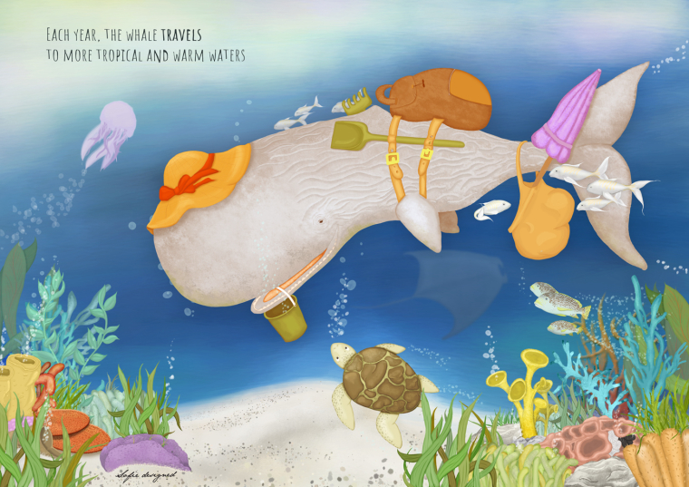
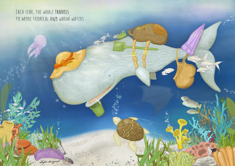
          @Gary-Wilkinson, I really wanted a sperm whale and I will not have time to change it to another type of whale, but it's not a bad idea :-).
          Also thanks for the grayscale tip, I feel my whale pops more now, CMIIW.

          • Life is cuter when you draw it! -

          instagram: https://www.instagram.com/sofie.schollaert/
          website: https://studiomosa.be/

          1 Reply Last reply Reply Quote 0
          • Sofie Schollaert
            Sofie Schollaert last edited by

            @lenwen thanks!!
            @demotlj thanks!!

            • Life is cuter when you draw it! -

            instagram: https://www.instagram.com/sofie.schollaert/
            website: https://studiomosa.be/

            1 Reply Last reply Reply Quote 0
            • demotlj
              demotlj SVS OG @Sofie Schollaert last edited by

              @sofie_designed I think this is much better. Not only does the whale stand out more but the setting feels more like the deep ocean.

              Laurie DeMott
              instagram.com/demotlj

              1 Reply Last reply Reply Quote 1
              • lenwen
                lenwen @Sofie Schollaert last edited by

                @sofie_designed this look like really in the ocean now! I also thought @Gary-Wilkinson tips will complete to make it even better 🙂

                the latest thing, I think the whale's color or tone is a bit too warm.. maybe can make it more greenish or move to colder tone (CMIW) 🙂

                looking forward for the finish piece! 😃

                www.lennywen.com
                https://www.instagram.com/lunartcy/

                Sofie Schollaert 1 Reply Last reply Reply Quote 0
                • Sofie Schollaert
                  Sofie Schollaert @lenwen last edited by

                  @lenwen I made the whale in a warmer colour so that it would stand out more against the background... maybe that was not the best idea... I'll work on it some more 😉

                  • Life is cuter when you draw it! -

                  instagram: https://www.instagram.com/sofie.schollaert/
                  website: https://studiomosa.be/

                  1 Reply Last reply Reply Quote 1
                  • Sarah LuAnn
                    Sarah LuAnn SVS OG last edited by

                    I think the warm on cool and light on dark silhouette of the whale is working really well! Its a really great piece.

                    sarahluann.com

                    1 Reply Last reply Reply Quote 2
                    • Sofie Schollaert
                      Sofie Schollaert last edited by Sofie Schollaert

                      Well, I think this is it... I could keep on working it for another month I think, but at one time I must call it a day... Just not sure if I should put the texture on... I'll sit on that for one more day 😉
                      0_1524645257239_svs travel april 2018 final.jpg

                      • Life is cuter when you draw it! -

                      instagram: https://www.instagram.com/sofie.schollaert/
                      website: https://studiomosa.be/

                      lenwen Johanna Kim 2 Replies Last reply Reply Quote 6
                      • lenwen
                        lenwen @Sofie Schollaert last edited by

                        @sofie_designed I think it looks much better! I can feel it in the ocean already 🙂
                        Looking forward for the final post! 😃

                        www.lennywen.com
                        https://www.instagram.com/lunartcy/

                        1 Reply Last reply Reply Quote 0
                        • Johanna Kim
                          Johanna Kim SVS OG @Sofie Schollaert last edited by

                          @sofie_designed Love how this one developed. Your values looks great and I like you left room for text. It's a wonderful illustration.

                          http://www.johannakim.com
                          http://instagram.com/johannahkim/

                          Sofie Schollaert 1 Reply Last reply Reply Quote 1
                          • Sofie Schollaert
                            Sofie Schollaert @Johanna Kim last edited by

                            @johanna-kim thanks a lot!!

                            • Life is cuter when you draw it! -

                            instagram: https://www.instagram.com/sofie.schollaert/
                            website: https://studiomosa.be/

                            1 Reply Last reply Reply Quote 0
                            • Miriam
                              Miriam last edited by Miriam

                              Please disregard if I'm too late and you are finished with this--
                              I just was a little confused at first by the fish behind the rake. It took me a bit to figure out what was going on there. At first glance, it looked like a funky dorsal fin, since it kind of blends with the color of the whale.
                              Are you able to move the fish? I was thinking it should be moved completely away from the rake, but if you really like the overlap (it is cool to see it through the tines), it might work to move it just a little higher and little further forward so you are able to see most of the fish.
                              It's just a tiny detail, so don't worry if you can't change it.

                              Overall, it looks really good!

                              Sofie Schollaert 1 Reply Last reply Reply Quote 0
                              • Sofie Schollaert
                                Sofie Schollaert @Miriam last edited by

                                @miriam I finished it and sent it in but I get what you mean! Thanks! I thought the little fish behind the whale would give it some more depth but I didn't take the colours into account. Something to think about next time 🙂

                                • Life is cuter when you draw it! -

                                instagram: https://www.instagram.com/sofie.schollaert/
                                website: https://studiomosa.be/

                                1 Reply Last reply Reply Quote 1
                                • First post
                                  Last post