Cardboard Adventure - Boat WIP
-
I love the way you use color and light in your illustrations. To me, some of the pieces of the boat look too thick to be cardboard... perhaps to add to the cardboard effect, you could also show the corrugated inner part along some of the edges?
Thank you for sharing your process with all of us.
-
@gary-wilkinson Oh my gosh. This is so wonderfully crafted. Your palette, your lighting, your character designs, your visual storytelling skills, ALL are top notch!
-
@gary-wilkinson
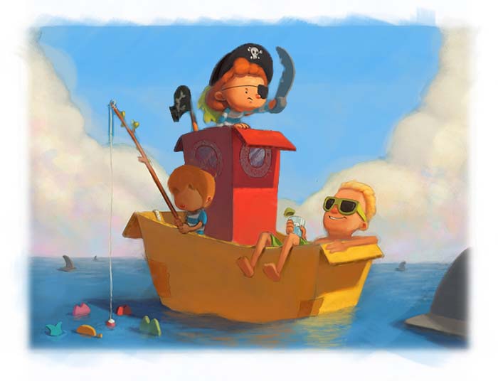
Your work is really awesome... For this one I would be tempted to drop the saturation in the sky behind the boat and add more light and air to the scene which should give your boat and characters a more prominent silhouette... hope you don't mind the paintover its just to give you the option.")
-
Great work!
The main thing that sticks out for me is the value structure. You have the clouds that are very light, but everything else is kind of mid-dark value. I tried making your sky MUCH lighter on photoshop, and I think it helps the main character (on the top of the boat) to pop more. I also decreased the saturation like @Jason-Bowen suggested I actually think the the whole background should maybe be a little lighter... I only change the sky in my paintover, but I would suggest trying to lighten the clouds and water as well. I also agree that the cardbox looks a little more like wood (too thick) in some area. I would either make it thiner, or as suggested, put a corrugated side.
Other than that, I love it!
-
One last thing... I don't know if this is on purpose or not, but the character relaxing with a drink looks much older than the other two.. like a teenage boy taking over the boat haha! And the boy in the shadow is maybe a little two small...
-
@gary-wilkinson Looks great, leave the sky alone. My only take would be the cast shadow on the yellow boat, it seems to close in value for being two different planes, i think there would be more reflective light on the tail end of the boat, is that aft? then on the shadow side. Chris
-
I really like your style! I actually like the darker sky. I might give a stronger highlight on the right side of the pirates hat to pop it, but that isn't a biggie. On another note, I had a hard time identifying the foreground object in the right front. My initial read was that was the brim on a gentleman's hat. It wasn't until I noticed the fins in the background that I figured it out. All in all I think it is fantastic!
-
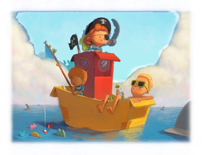
Thanks for everyone's replies. I'm sure there are a million ways I could have adjusted this piece, but your feedback was a big help in pushing it forward.
@KathrynAdebayo Thank you. I love how light and shadow work i'm glad it's helping my work to be appealing. I agree with the thickness of the cardboard and I thinned some of it out and added a few hints of corrugation, I do want to retain some of the thickness though to make it less harsh.
@Larry-Whitler Thanks Larry!
@Jason-Bowen Thank you for the paintover and I do like the idea of lightening the sky and I did try and play with going in that direction, but I decided that I wanted to keep the piece pretty saturated and adjusted other elements to help the girl pop out more.
@NoWayMe Thank you for your feedback and advice, I guess I have the same thoughts as I mentioned to Jason . I think that a lighter sky would work well with other elements adjusted and it might be a bit more realistic, but I quite like having a lot of saturation around the painting. I do appreciate you all taking the time to comment though! In regards to the guy with the drink, he is suppose to be the father of the group and the boy is the little brother to the main character. I think I could do with making the little kid's head a bit bigger though
@C-Davies You're right about the reflective light! Thanks for spotting that.
@juliepeelart Thinking about what you said about the hat I decided to give it a gold rim which I hope helps pop it out a bit more. I did try to have the cardboard shark fin to be more recognizable but it was messing up the flow of the composition. I hope due to the other ones it's easy to understand what it is.
I'm pretty happy with it at the moment so i'm going to call it done. I might even print it out for my wall to add a bit of color to it

-
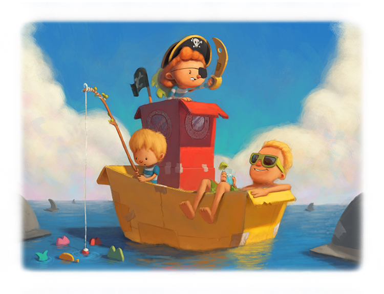
@gary-wilkinson It looks amazing! Adding another fin to the left fixed it, because it directs the eye back to the others in the background! Great work. I love the palette and intense colors. So fun to look at!
-
@gary-wilkinson This just looks SO awesome! I love the addition of more tape and seams on the boat. This little world really draws you in! Great work
-
this is adorable, great job!