Mushroom Village WIP
-
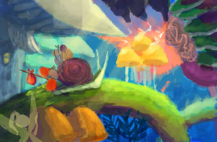
I tried colors test but not sure if it's work? any thoughts?
")
-
I like it so far
Will you be darkening the foreground, or will you be keeping the values as is?
-
I don't think your illustration is cliche at all! The little traveler and her snail companion are just darling. I'm loving your use of colours and can't wait to see the finished piece.
-
@lenwen colors are wonderful, your on your way
-
@Art-of-B thanks! I am wondering too. Maybe I will darkening a bit the foreground so it creates the depth
@kadelex thank you kindly! I am happy that you like it

@C-Davies I am a bit not sure because too much colors there but thank you to said so!
-
@lenwen I'm assuming the color sketch isn't following your sketch precisely. I do like your second drawing as it has a lot of depth and interesting details. The colors are looking good, but I think some of the tones could be adjusted to capture the depth that is inferred by your sketch. For example, having the hot reds, oranges and bright greens in the foreground draws the eye, but they're competing for my attention with the yellow-orange mushrooms in the distance. This effect flattens the illustration.
You might try darkening the tones of those foreground colors to contrast with the mushrooms in the distance. OR, you could lighten and desaturate the mushrooms in the distance to let the foreground colors sing.
-
@lenwen I would add a layer of foreground leaves as a sort of frame to create a reason to darken the foreground and use some light rays to create a more dappled effect in the main area
-
@Johanna-Kim and @rcartwright thank you so much for your advices! both of you are right, I tried to desaturate and lighten the mushrooms in distance. I also changed the mushroom's colors in foreground to a dark blue so it didn't bring too much attention. I hope now the little girl with her companion will draw more attention. But I also want people to see (although not too much) their destination that's the mushroom village. Hopefully now it works.
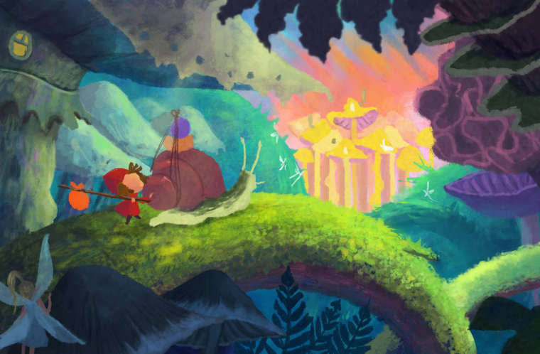
but don't hesitate to tell if anyone of you have another thoughts! I very appreciate it
-
@lenwen If you want the character & snail to be the 1st read, you'll need to adjust the colors some more. The bright, warm colors of the golden mushrooms and the orange/pink sky draw my eye right to it. The bright green arch of the branch the characters are on also points to their destination.
I would try giving the characters brighter, more saturated colors, since the red and orange could attract more attention. You could try adding some of the warm golden color into the characters--especially in the shell of the snail--maybe you could add some stripes or something on the shell in that color (or a color with some of it) as well.
Sharpness can also make a huge difference, so if everything else was kept very soft like it is now, and the characters had more detail, that would pull the focus toward them.
This environment looks very lush and magical. I like the mossy look of the branch and the different shapes in the plants.
-
@lenwen the first read is definitely the mushroom village. What comes to my mind if you want to draw attention to the girl and snail, but also to the village... I would try to make them overlap. Just the village must be more dimmed so it will read well... and with that fairy on the foreground. What about making her just silhouette? Doesn't draw much attention and the information that she is fairy is enough
-
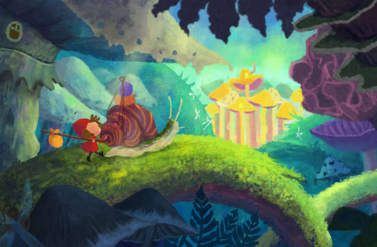
thank you so much @Miriam and @Jonas-Zavacky, I totally agree with you. The pink sky definitely catch the first attention so I changed the sky's color. I tried to turn the fairy into silhouette but it draw even more attention, so I only darken her and made her wings more transparent. The last thing I also added more warm colors to the snail and the girl. If this colors work, I will definitely give them more details
-
@lenwen I think that's starting to help, but I'm still seeing the golden mushrooms as a strong 1st read, then maybe the girl & snail 2nd--but they are about equal with everything else surrounding the mushroom village.
The snail's shell now kind of mirrors the squiggly purple plant on the left--which isn't a bad thing, but it sounds like the shell (along with the rest of the snail & girl) need to be given more emphasis for your intentions.
If you're having trouble seeing what I'm talking about--look at the color of the majority of the sail's body & how it's about the same color as the mushroom overhead. Compare the sail's shell and the girl to the plants and mushrooms on the right side. See how they have similar shapes, intensity/saturation of color, amount of texture/detail, and contrast with the background? Since the girl and snail have similar visual weight, they kind of get grouped with everything else.
There's nothing wrong with the way the image is--if you are happy with it being a picture of the golden mushroom village. If you want it to be a picture of a girl & snail traveling to the golden mushroom village, then it will need to be changed.
I hope this helps!
-
@miriam thank you! it's really helpful. I didn't think about the similarity between the snail with another mushroom's color. I think I will keep the color from the mushroom village for now but I changed the snail's color to a golden color. Hopefully it give her more emphasize. I think I will keep this color and continue work on more details.
Again, thanks for all the feedbacks! it really helps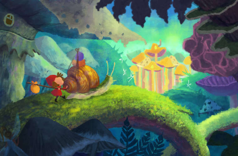
-
@lenwen I saw the final in the Contest post. The added detail & golden colors in the shell really changed the focus of the image to your characters. You did a great job!
-
@miriam Yes! all your feedbacks are really helpfull for this piece! thank you very much!