Need some help with this composition please
-
This post is deleted! -
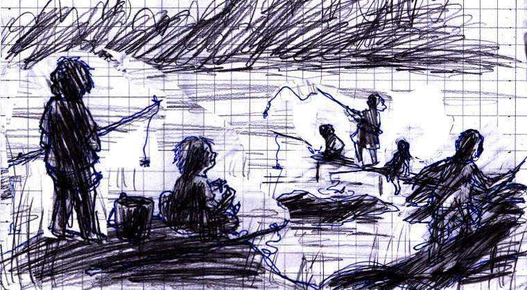
@embla I think its working. I would maybe crop the top off so the image starts where the foliage is. Maybe make the two kids in the foreground a little larger. The one kid on the left is fishing off the page, turn him so the pole is pointing toward the middle, that will help the users eye stay in the image. Same with the girl on the right, flip her so her pole is facing the middle. I did a quick tweak, i hope you don't mind.
-
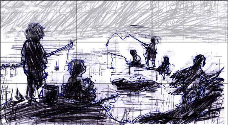
I think the composition works actually, and with the changes that @Chip-Valecek made, it works even better. The proportions seem right - with the environment in place the relative sizes of the kids should work out fine. It´s a bit bottom-heavy and horizontal, maybe. You may want to try out a slightly higher point of view, so that the kids to the right end up higher on the page and more into the top right corner.
-
@embla Not that you have to be a slave to it , but it seems to work pretty well with the rule of thirds.Chris
-
@chip-valecek Oh, Wow! Thank you so much for taking the time to do that! That is really helpful, and you're absolutely right. That works a lot better. I wanted to have it look like they're scattered about with a lot of air between them, and thought drawing them facing away from each other would help that. But seeing your suggestion has changed my mind. Seems like it didn't really make a difference.
@smceccarelli Thank you! Yeah, Chip really got it right.
I agree with it being bottom heavy. The landscape this is supposed to take place in is very flat, with a big sky. I really wanted to have that in here, but maybe I should change my mind. I think that vrsion with the sky cut out balances it out?@C-Davies Hey, that's cool! I had no idea.
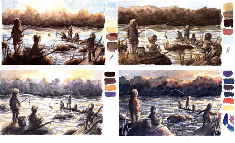
Thanks so much you guys! I made my colour tests today with Chip's version. Kept my sky, but might have to change my mind about that. Still a lot better than my first versions
Thanks again!
-
@embla I really like the bottom two, both have a different feel to me. The one on the left feels like morning and the one on the right feels like night time.
-
@embla I like the background foliage of the two on the left side, (it looks very dense in the two on the right) but if it's supposed to be a flat, open landscape, you might want to change it so it looks more grassy instead. This looks like there are plenty of trees and shrubs, so if that's ok--it looks good.
I like the smaller rock in the middle of the water (in the lower left version). (In the other ones, I think it's a little distracting.)
For colors, I like the two on the left, and I think the upper left is my favorite. I like the light blues of the one on the upper left.
But if you are going for sunset, I like the one on the lower right--I'd just change the sky color a bit. I would start on the right side of the sky with the yellow in your palette, then moving to the left, add a little of the reddish/orange. Then have that fade to a lighter blue--like the light part on the tip of the blue at the bottom of your palette and give it a gradual fade from the light blue to darker blue (using the same blue paint color), so the darker blue is on the left side of the sky.
At sunset, if you have your back to the sun, you see a darker blue sky and if you look toward the sun, you see the sunset colors (often reds, pinks, &/or oranges) with light blue sky. (I've seen sunsets with a lot of pinks and purples, too--especially if there are a lot of clouds. So you can be very imaginative with it. But since you already have a pallet that's working, I'd stick with that.)
I like how the figure on the left (in the lower right version) has some color to the clothing on the side facing the sun. Maybe you could add that to the other figures as well.
Nice composition and a fun, peaceful image.