Front Cover - Critique please
-
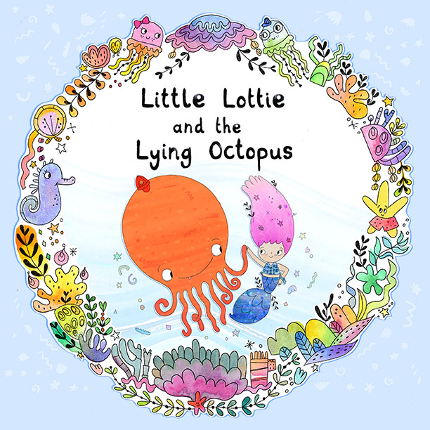
Meet Larry and Lottie. This is the front cover for a picture book I've been working on for a client. I used watercolour, ink and digital. Does anyone have any ideas to take it further? I'm sure there is something we can do. Thanks!
-
one word... elegant.
I really love when illustration is done simply and well designed. To me the only thing letting it down is the type, probably needs a bigger and better font and the lines of type need to be closer together so it create one big shape instead of three
-
Agreed with @JohnMK - the text for the title could use that space better. There's plenty of room to the left and right... any chance you can experiment with setting the type along a curve?
-
This is really beautiful. If I could offer any critique, it would be to maybe just very subtly tweak the octopus a bit- get some smaller salt granule texture on him, and get a gradation on him, like you have on the mermaid. Maybe darker toward the top of his head, gradating lighter as you go down.
Overall, great job! This is definitely a book I would want to pick up and look through.
Website: www.tessawrathall.com
Instagram: www.instagram.com/tessawrathall_art/
-
@johnmk Thanks John. I appreciate that. Yes, I can make the type stronger and better to read. This is for little children so very important they can read the text easily. Thanks for pointing that out.
-
@lei Thanks Lei. Yes, setting the text along a curve is a good idea. I'll have a go at moving the text around and see how it can read better.
-
@tessaw Thanks so much Tessa. You're right there, Larry could use some gradation couldn't he. I made his tentacles darker orange at one point but I didn't try lighter. Cool. It will be fun to try that. I will have a look at tweeking the texture on Larry aswell. Great ideas. I really appreciate it!
-
Do have plan for placing the names?
-
@rcartwright Yes, on the lower corners. What do you think?
Website http://www.judyelizabethwilson.com/
Instagram https://www.instagram.com/judyelizabethart/
Sharing positivity through art.
-
@judy-elizabeth-wilson First off I really like this overall, great colors and shapes but I think the ring may cause you some issues, the names may look squished into the corners and the company may also want a larger title
-
Day 360/365. Lol posted this in the wrong thread.
-
I really like the illustration.
Question: What does the Octopus lie about? As he sits on the illustration, he looks like a sweet, innocent Octo with nothing to hide. While he still may be a sweet, innocent Octo in the story, can you incorporate something into his pose or tentacles that fleshes out the "lying" bit?
-
The only constructive feedback I can give is I think the font is too harsh. I'd like to see a brighter colour for the font but that's just one man's opinion. The illustration, the composition and the characters are lovely! Great work.
-
Thanks for everyones critiques. I have realised something I hadn't noticed before even though I have seen so many children's book front covers. I was amazed at how many front covers have colourful text, sometimes one colour, sometimes many colours, the text is equally as colourful as the image. It's really cool to register something new.
-
@ians Thanks Ian. Great comment. I'm so glad I posted this image because the comments have been so helpful. I like the idea of a colourful font.
-
@anthonywheeler Thanks so much Anthony. Larry blames his friends. He's learning how to own up to making big mistakes. Maybe he could have something in his tentacle hiding behind his back?
-
@judy-elizabeth-wilson I think you need something. Your description of Larry isn't indicated in his art OR any of the art around the ring of of the illustration. Its cute and all but you aren't doing enough to sell the concept of Larry Lying.