Society of Visual Storytelling

    SVSLearn Forums

    • Register
    • Login
    • Search
    • Recent
    • Tags
    • Popular
    • Users
    • Groups
    • Search

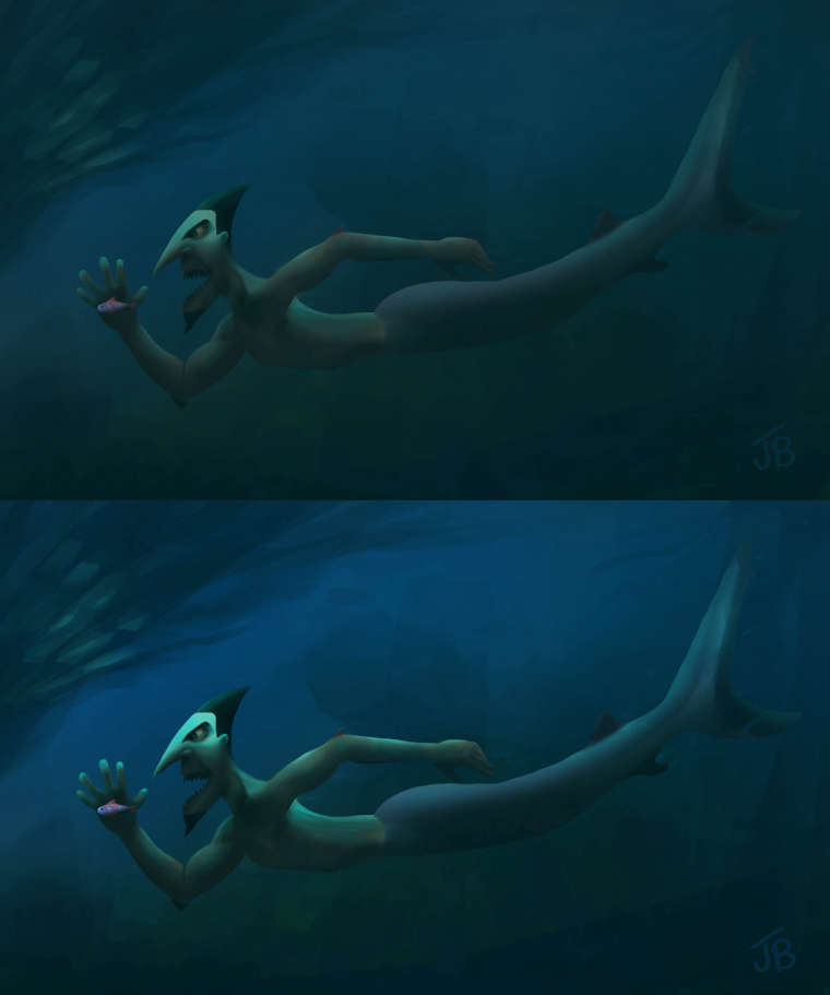
    Which sharkman is better?

    Artwork
    6
    7
    878
    Loading More Posts
    • Oldest to Newest
    • Newest to Oldest
    • Most Votes
    Reply
    • Reply as topic
    Log in to reply
    This topic has been deleted. Only users with topic management privileges can see it.
    • Jason Bowen
      Jason Bowen SVS OG last edited by

      I am currently looking at my character I created for an imaginary big budget movie lol, and I painted it and thought it looked ok but after looking at it again I thought it needed more contrast... which one do you think is the best? first or second. Thanks for any thoughts.
      0_1530815216620_wip shark merman light or dark.jpg

      https://www.instagram.com/jasonbowenoils/

      Chip Valecek 1 Reply Last reply Reply Quote 1
      • Larry Whitler
        Larry Whitler last edited by

        I prefer the second one. Both are great. I think the brighter contrast along the lighted surfaces creates an enhanced sense of magic or intrigue. Love the style, either way.

        1 Reply Last reply Reply Quote 0
        • Chip Valecek
          Chip Valecek SVS Team SVS OG @Jason Bowen last edited by

          @jason-bowen I prefer the second one. I like the lighting on top of his head.


          https://www.instagram.com/chipvalecek/
          https://www.facebook.com/cvalecek
          http://www.cshellmedia.com/

          1 Reply Last reply Reply Quote 0
          • Heather Boyd
            Heather Boyd last edited by Heather Boyd

            I like a combination of the two. I like the eeriness of the darker tones in the first but definitely more light or glow with the shark man in the second. I think just a bit more light hitting the shark man in the first one, in my opinion.

            =)@Jason-Bowen

            Instagram: www.instagram.com/heatherboyd.illustration/
            Website: https://heatherboydillustration.ca
            Shop: https://www.inprnt.com/search/products?q=HeatherBoydIllustration
            Ko-Fi: https://ko-fi.com/heatherboydillustration

            Be blessed,

            1 Reply Last reply Reply Quote 0
            • juliekitzes
              juliekitzes last edited by

              I prefer the second one and would encourage you to pump up the value contrast even more on the body to match the head.

              www.JulieKitzes.com
              www.Instagram.com/JulieKitzes

              1 Reply Last reply Reply Quote 0
              • I
                IanS last edited by

                I think (like most other folk) the second is the stronger. The contrast on the face creates a strong focal point.

                1 Reply Last reply Reply Quote 0
                • Jason Bowen
                  Jason Bowen SVS OG last edited by

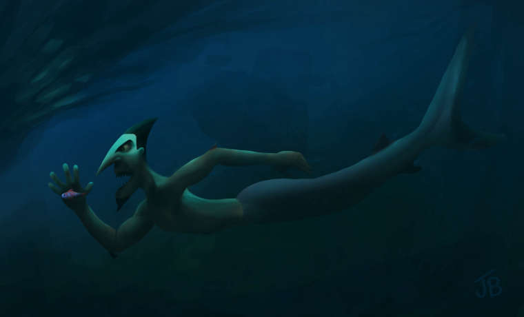
                  Thanks for everyone's thoughts. I'm going to go with the brighter one with a little tweak. Trying to keep a bit of the eerie scary look of it. 0_1530909482781_wip shark merman final.jpg
                  https://www.instagram.com/jasonbowenoils/

                  1 Reply Last reply Reply Quote 0
                  • First post
                    Last post