WIP need advice
-
No problem! I'd like to take a stab with the coloring if you don't mind. What kind of rendering style are you going for? Just line work and flat colors? Shading and light? A combo of both?
Website: www.tessawrathall.com
Instagram: www.instagram.com/tessawrathall_art/
-
@tessaw combo of both I guess. I don’t know what my ‘style’ is yet so just been trying to experiment with various things. Go for it! Ps if you come in pocket size and can come live in my studio that would be great too!

-
Haha, you're funny! xD I'd like to hang out in your studio, but maybe not pocket sized. I'm afraid I'd accidentally get sat upon.
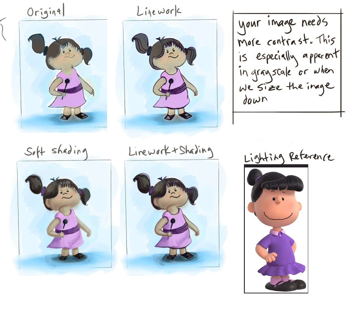
Ok, again, I'm not so great with linework, but I think your piece needs more contrast. Even with soft pastel looks, you need to add little bit of contrast here and there to help make the piece readable. I tried to keep true to your colors and your general value structure.
I pulled a reference from the new Peanuts style, as it's simplified in a similar manner to yours and you can see how shading can be done on similar forms.
Website: www.tessawrathall.com
Instagram: www.instagram.com/tessawrathall_art/
-
@tessaw very cool! like the reference you chose too - never thought of looking for a lighting reference - duh! BTW are you doing the colouring on one layer? I was tryng (unsuccessfully) to put values on one layer then use colour mode to add colour on another hopng it would show through. Maybe I am doing it wrong. (
forgive all the extra u's in colour, I'm Canadian and can't help it") )
)Thanks again for your help - much appreciated!
-
@missmushy You should take the class on shadows or the color and light class. Also look at this video
-
@rcartwright Yes! And I love Marco Bucci's videos. Very easy to digest!
@missmushy No, I don't usually work that way, it has never felt natural to me. I just go straight to color. I will keep a hidden layer up top that turns the piece to black and white so I can occasionally check to make sure my values are on track.
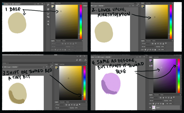
For your paint-over I started with your piece as a base layer. I made another layer and then added a darker shading color.
Here's how I chose my shade colors for your character. This wouldn't apply to every situation, but I feel it was a straightforward method for this particular piece.
- Color-pick the base color.
- Darken it and make it more saturated at the same time. If I'm working with lower opacity levels I tend to choose a darker shading color than what ultimately ends up on the piece. If I'm working more opaquely I tend not to pick as dark of a color.
3.Change the hue slightly. For the skin I slid the shadow color toward red a bit, so that she wouldn't look too sallow. For the dress I nudged it toward blue to let it harmonize with the background blue a bit. If I nudged it more toward red, it would "pop" more.
When I pick a shading color, sometimes I don't get it right away and will just need to play with hue/value/saturation a bit.
So that's what I did for this piece! There are so many different ways to go about painting digitally it can be overwhelming. Hopefully you can find a method that works for you.
Website: www.tessawrathall.com
Instagram: www.instagram.com/tessawrathall_art/
-
I always find that my sketches seem more loose and lively than my final linework... I'm not sure how to fix that lol.
My 2 cents are that maybe you should try playing with the volume and sizing of the major shapes that are used in the design, I think if it wasn't so uniform it may have more visual interest... i.e. the neck thinner, the top and bottom halves of the body not so proportional... maybe a smaller chest area with a puffier skirt... things like that.Great concept overall!
-
@lady-chamomile thanks for the feedback. I will try that! Cheers
-
@tessaw yes completely overwhelming - so much to learn! Thanks for sharing your process - will try that out.
-
@rcartwright thanks for link! Will check it out
-
Finished, not by any means perfect. Learned a lot about Procreate during the process. Still need to work more on light and shadow and the puppy is a bit unclear. Anyhoo, I feel I made progress. Thanks again for all of your help!
