Society of Visual Storytelling

    SVSLearn Forums

    • Register
    • Login
    • Search
    • Recent
    • Tags
    • Popular
    • Users
    • Groups
    • Search

    Hidden WIP

    Artwork
    16
    41
    4632
    Loading More Posts
    • Oldest to Newest
    • Newest to Oldest
    • Most Votes
    Reply
    • Reply as topic
    Log in to reply
    This topic has been deleted. Only users with topic management privileges can see it.
    • Eli
      Eli @braden H last edited by

      @art-of-b This is really coming along nicely!

      1 Reply Last reply Reply Quote 1
      • Donfito
        Donfito last edited by

        beautiful illustration, the perspective is really impressive waiting to see the final version.

        FB: https://www.facebook.com/fitografito/
        Instagram : https://www.instagram.com/fitografito

        1 Reply Last reply Reply Quote 1
        • Chip Valecek
          Chip Valecek SVS Team SVS OG @braden H last edited by

          @art-of-b I really like that green light coming out. Looking good, you should feel good about it.


          https://www.instagram.com/chipvalecek/
          https://www.facebook.com/cvalecek
          http://www.cshellmedia.com/

          1 Reply Last reply Reply Quote 1
          • braden H
            braden H last edited by

            Welp, I restarted.

            I finally watched the class on composition and I really wanted to try painting without the safety line of solid inked linework (not that there's anything wrong with solid linework, but I wanna move past it).

            A buncha thumbnails later and I've hammered out this so far. Though at least if I don't finish it I can turn in my first attempt 🙂

            alt text

            Kevin Longueil 1 Reply Last reply Reply Quote 2
            • KathrynAdebayo
              KathrynAdebayo last edited by

              I've actually been marveling at the composition of your first piece, in case that's helpful to hear. It applies the rule of thirds in such an interesting way. The second composition is so mirrored that it seems unnatural to me, but I admittedly haven't watched the composition class myself... so, I'd say, go with what you think stretches you as an artist the most.

              braden H 1 Reply Last reply Reply Quote 1
              • Kevin Longueil
                Kevin Longueil SVS OG @braden H last edited by

                @art-of-b Really nice!

                Portfolio: kevinlongueil.com
                https://www.instagram.com/kevinlongueil/

                1 Reply Last reply Reply Quote 1
                • braden H
                  braden H @KathrynAdebayo last edited by

                  @kathrynadebayo

                  "go with what stretches you as an artist the most" is most certainly the redo. I'm glad that the first one was working. There was just something about it that was off, though.

                  1 Reply Last reply Reply Quote 0
                  • braden H
                    braden H last edited by

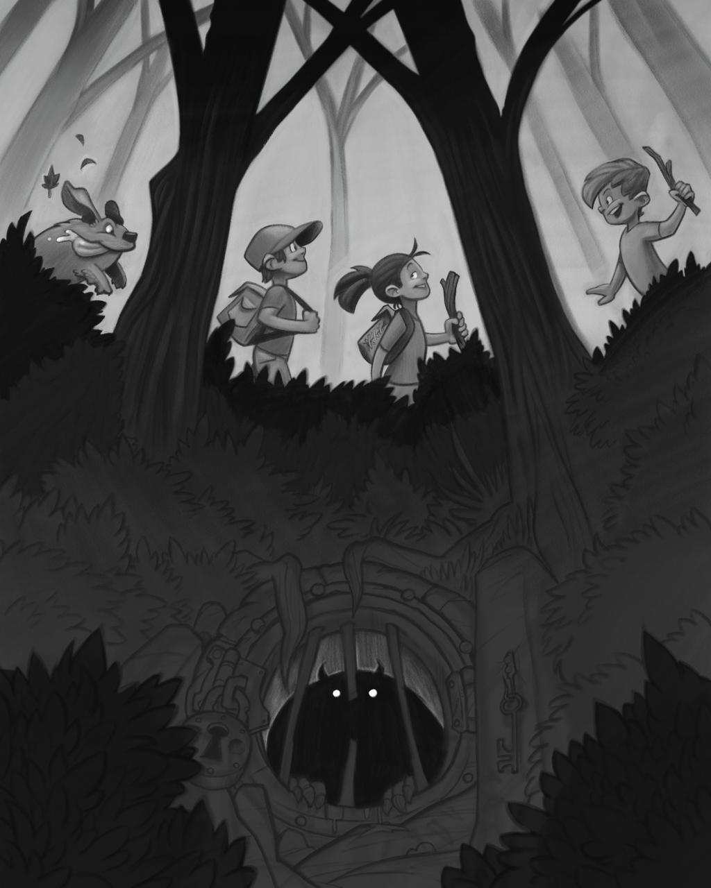
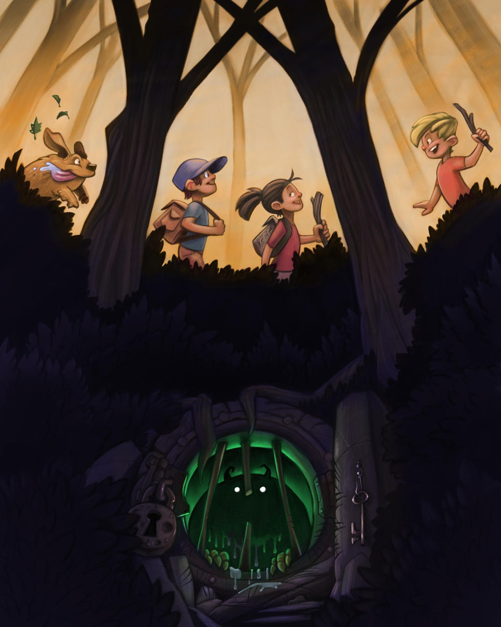
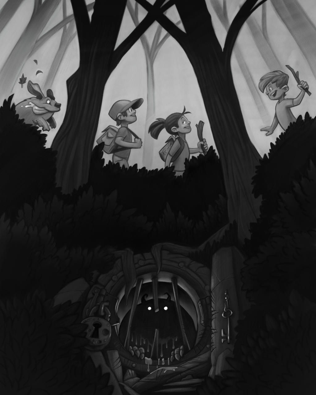
                    Work progresses! It's a lot darker than I though it was going to be, but I think it works.
                    alt text

                    Jon Anderson 1 Reply Last reply Reply Quote 2
                    • Jon Anderson
                      Jon Anderson SVS OG @braden H last edited by

                      @art-of-b The rendering for this second image is awesome and the level of rendering I wish I could do myself. However, I have to agree with a previous comment about the composition. I love the idea in this new image especially how the hidden door is managed but things seem unnaturally even up top. The characters and the trees all seem too perfectly spaced out and equal in size. Sometimes that may be appropriate but I remember a few videos of Marco Bucci having to catch himself so that things don't look evenly organized and "man-made" so to speak. Perhaps you could leave one tree large and separate the other into two or three smaller trees that strike the same balance. Maybe a slight variation in the characters size and distance to each other would be all that's needed to break up the monotony, for lack of a better word. I really enjoy seeing your work and while I really like where this one is heading I think you have a safe entry in the first one if you run out of time.

                      instagram.com/jonandersonillu

                      braden H 1 Reply Last reply Reply Quote 2
                      • rcartwright
                        rcartwright last edited by

                        Sorry to say but I feel the first comp was much stronger. The second one has issues with evenness and the way it is centered makes it feel less like they are moving along a path. I was very impressed with the first one overall it had a great perspective and utilized great diagonal lines

                        https://www.scbwi.org/members/richard-cartwright/
                        https://www.instagram.com/richardwcartwright/
                        https://www.pinterest.ca/richcartwright3/art-of-richard-cartwright/
                        https://www.richardwcartwright.ca/

                        braden H 1 Reply Last reply Reply Quote 1
                        • Heather Boyd
                          Heather Boyd last edited by

                          @Art-of-B Though I do agree and like the composition of the first one I am happy that the monster/creature and his "hidden" home takes up more space than in the first. Everything in the middle seems a bit obvious but really like your rendering and depth in value. And I like the dog in the second. However I somewhat dislike the monster/creature locked up unless the story is about how the monster/creature fears hurting others and locks himself away and looks forward to visitors but is saddened as well.

                          🙂 Heather B.

                          Instagram: www.instagram.com/heatherboyd.illustration/
                          Website: https://heatherboydillustration.ca
                          Shop: https://www.inprnt.com/search/products?q=HeatherBoydIllustration
                          Ko-Fi: https://ko-fi.com/heatherboydillustration

                          Be blessed,

                          braden H 1 Reply Last reply Reply Quote 1
                          • TessaW
                            TessaW last edited by TessaW

                            I like both of them, but they are very different. Here is how I read each comp:

                            The first composition has more movement and flow to it. It feels very much like two worlds existing in the same place. The normal world and the supernatural, with the normal world being oblivious to the supernatural world. The creature doesn't feel as sinister and it makes me wonder more what it will do rather than what the kids will do. The questions I ask are: Is the creature scared? Is it curious? Will the creature go after them? Will it stay safe and sound in it's supernatural home, with the kids never discovering it?

                            The second one is a bit more formal and static. It feels like it could work really well for a book cover or movie poster rather than a moment-in-time illustration. The monster seems sinister and it makes me wonder more what the kids will do. Will they discover it? Will they let it out? What will happen if they let it out?

                            Anyway, those are my thoughts! I think they are both great, they just give slightly different connotations and feelings.

                            Website: www.tessawrathall.com

                            Instagram: www.instagram.com/tessawrathall_art/

                            1 Reply Last reply Reply Quote 2
                            • Gary Wilkinson
                              Gary Wilkinson last edited by

                              Some great work here and although both are great, my personal preference is with the 2nd comp, but that's not to say it couldn't be improved upon. I agree with Tessa that the first comp has more movement to it as though we are part of the action, but it feels a bit too busy and almost dizzying to me. I find it hard to choose where I want to focus on, but maybe if the monster's door was larger it would help give more variety to the shapes and sizes of the characters in the scene and reduce the busyness of the rocks.

                              The 2nd comp is much more geared towards a book cover piece, although as Tessa also mentioned, there is a bit more of a disconnect between the kids and the monster and I feel like I would want to see a hit of interaction between the upper and lower part of the scene, such as the dog noticing something eerie below, markings on the trees to show something is living near there etc.

                              Whatever you do, please keep that cute dog 😛

                              www.garywilkinsonart.com
                              www.instagram.com/gwillustration/
                              www.twitter.com/GWillustration

                              braden H 1 Reply Last reply Reply Quote 1
                              • braden H
                                braden H last edited by

                                Thank you all for the feedback! It's interesting to see how different people read and react to the two different attempts. I'm gonna go back and respond to a few specific people in a little bit.

                                But for now, work progresses 🙂

                                alt text

                                1 Reply Last reply Reply Quote 7
                                • braden H
                                  braden H @rcartwright last edited by

                                  @rcartwright

                                  Fair enough 🙂 I agree that the first composition was more interesting. Definitely something to think about for next time.

                                  1 Reply Last reply Reply Quote 0
                                  • braden H
                                    braden H @Jon Anderson last edited by

                                    @jon-anderson

                                    Thanks! I think I'll be able to finish the second piece before the end of the month. I'll have to see about adding something to make it a little less even.

                                    1 Reply Last reply Reply Quote 0
                                    • MichaelMattocks
                                      MichaelMattocks last edited by

                                      the perspective on the door's is really throwing me off. Does the door open downward?

                                      Michael Mattocks
                                      Https://instagram.com/mattocksdesign/

                                      1 Reply Last reply Reply Quote 1
                                      • braden H
                                        braden H @Heather Boyd last edited by braden H

                                        @TessaW Interesting reads on the two of them! It's neat how slight changes can make such a difference in the perceived story.

                                        1 Reply Last reply Reply Quote 0
                                        • braden H
                                          braden H @Gary Wilkinson last edited by

                                          @gary-wilkinson

                                          The cute dog is most certainly there to stay 🙂 Thanks for the feedback!

                                          1 Reply Last reply Reply Quote 0
                                          • braden H
                                            braden H last edited by

                                            @michaelmattocks

                                            Yeah, in the first piece the door was a little wonky 🙂

                                            1 Reply Last reply Reply Quote 0
                                            • First post
                                              Last post