Hidden WIP
-
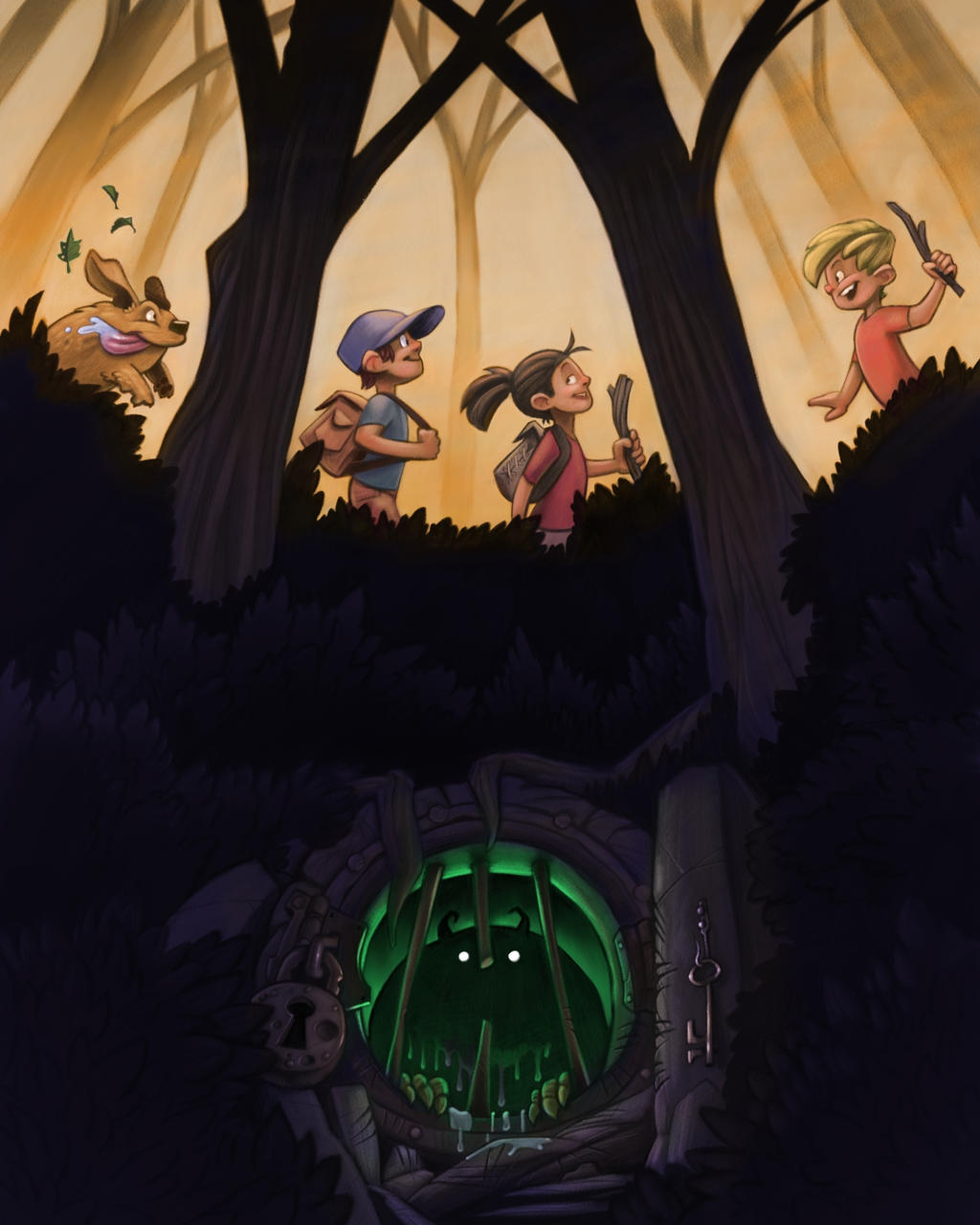
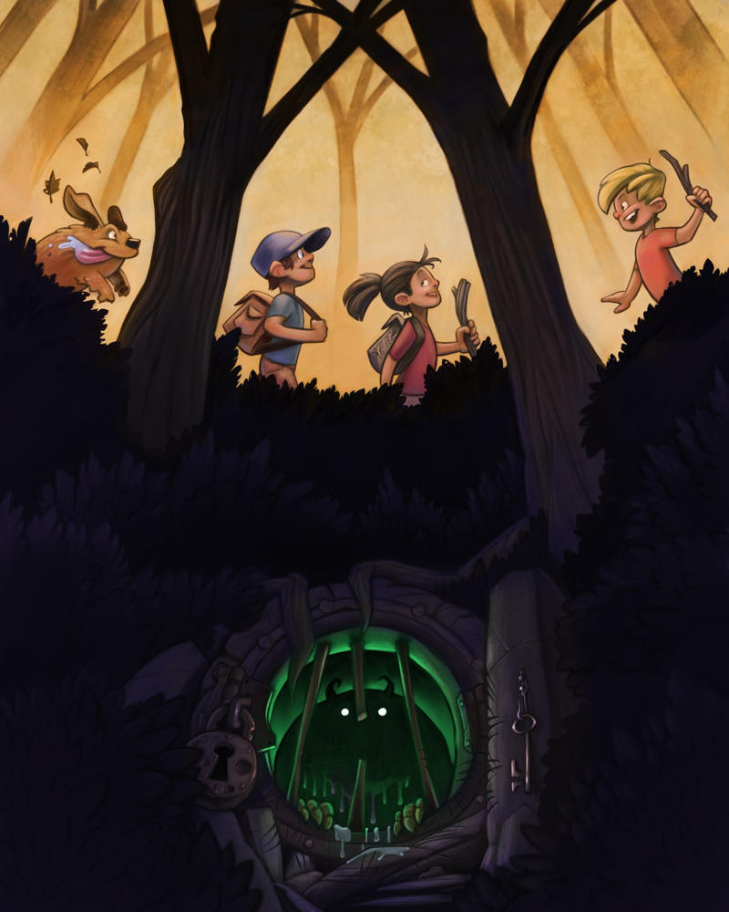
I like both of them, but they are very different. Here is how I read each comp:
The first composition has more movement and flow to it. It feels very much like two worlds existing in the same place. The normal world and the supernatural, with the normal world being oblivious to the supernatural world. The creature doesn't feel as sinister and it makes me wonder more what it will do rather than what the kids will do. The questions I ask are: Is the creature scared? Is it curious? Will the creature go after them? Will it stay safe and sound in it's supernatural home, with the kids never discovering it?
The second one is a bit more formal and static. It feels like it could work really well for a book cover or movie poster rather than a moment-in-time illustration. The monster seems sinister and it makes me wonder more what the kids will do. Will they discover it? Will they let it out? What will happen if they let it out?
Anyway, those are my thoughts! I think they are both great, they just give slightly different connotations and feelings.
-
Some great work here and although both are great, my personal preference is with the 2nd comp, but that's not to say it couldn't be improved upon. I agree with Tessa that the first comp has more movement to it as though we are part of the action, but it feels a bit too busy and almost dizzying to me. I find it hard to choose where I want to focus on, but maybe if the monster's door was larger it would help give more variety to the shapes and sizes of the characters in the scene and reduce the busyness of the rocks.
The 2nd comp is much more geared towards a book cover piece, although as Tessa also mentioned, there is a bit more of a disconnect between the kids and the monster and I feel like I would want to see a hit of interaction between the upper and lower part of the scene, such as the dog noticing something eerie below, markings on the trees to show something is living near there etc.
Whatever you do, please keep that cute dog

-
Thank you all for the feedback! It's interesting to see how different people read and react to the two different attempts. I'm gonna go back and respond to a few specific people in a little bit.
But for now, work progresses
")
-
Fair enough
I agree that the first composition was more interesting. Definitely something to think about for next time. -
Thanks! I think I'll be able to finish the second piece before the end of the month. I'll have to see about adding something to make it a little less even.
-
the perspective on the door's is really throwing me off. Does the door open downward?
-
@TessaW Interesting reads on the two of them! It's neat how slight changes can make such a difference in the perceived story.
-
The cute dog is most certainly there to stay
Thanks for the feedback! -
Yeah, in the first piece the door was a little wonky
-
Work continues! Next step is detailing the monstery area.
-
@art-of-b I feel like there should be some faint green like on the objects around the hole. The characters are fantastic!