Hidden WIP
-
@stringfellowart I like this composition and the quality of your line work. Lots of opportunity to show something hidden in the woods behind, too.
-
I'm second guessing my topic now, feels like the monster is the low hanging fruit. I might go back to the drawing board and see if I can come up with some more creative ideas.
-
I've been looking through some old old drawings, and I'm thinking about revisiting them, as some of the ideas are good, just the execution that needs work.
Bringing whimsical creatures to life.
www.stringfellowart.com
www.instagram/stringfellowart -
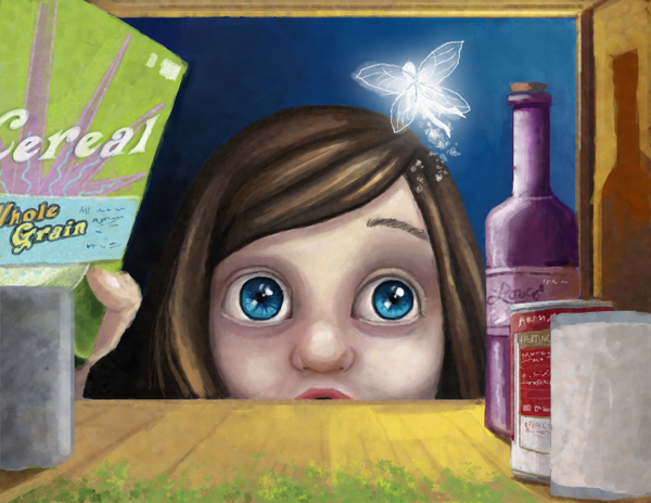
@stringfellowart I really like the idea to your last image there, the window to a girl's imaginative world of mermaids. Also on your website, under About Me you write "write" twice. Not sure that it is intentional.
"I am Megan Stringfellow. I do lots of creative things. I write stuff. Paint. Draw. Design. Sew. Write. Make my food talk"
Instead to clarify, "I am Megan Stringfellow. I do a lot of creative things. I write, I paint, I draw, I design and I sew. I also like to make my food talk."
Anyways instead of writing "I write stuff." and later ...after Sew. "Write".
But definitely I think it be great to see these ideas reworked in your present style.
") Heather B.
Heather B.Instagram: www.instagram.com/heatherboyd.illustration/
Website: https://heatherboydillustration.ca
Shop: https://www.inprnt.com/search/products?q=HeatherBoydIllustration
Ko-Fi: https://ko-fi.com/heatherboydillustrationBe blessed,
-
@heather-boyd Good catch! Thanks! I really should just rewrite my about me stuff, but I never know what to say.

-
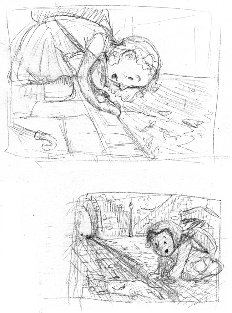
More sketches -
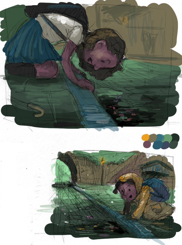
Thoughts on color
Bringing whimsical creatures to life.
www.stringfellowart.com
www.instagram/stringfellowart -
These are lovely. In this latest post, I think both a very strong and you could go with your personal fav, but as far as color goes, I like the bottom one with the rain coat. If you end up choosing the top one, I'd try to get more of the color patterning you have in the other one. A bit of that warm purple and greens in the background and a yellow element in the foreground.
-
@stringfellowart i you colors on these last 2 illustrations. I also love your line art! I love the scratchinees and texture of it. If only there’s a way you can preserve them into your final piece, i would really love to see it.
-
@stringfellowart I love where these are going and the colors are

-
-I think in the first one you can explore the different blue colors, to make a beautiful almost monochromatic scene with little color touches.
-In the second one you have a clear focal point that is the yellow coat, and you can take advantage of this making a big contrast with the cold background.
but at the end both of them look amazing, my fav is #2
-
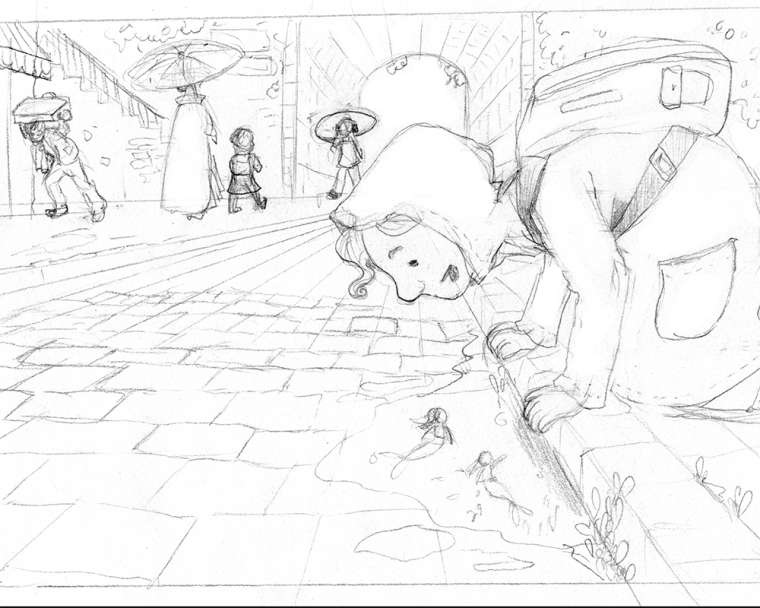
Okay, here is the final sketch. I don't know about all that details. Apparently I'm a glutton for punishment. -
Progress
-
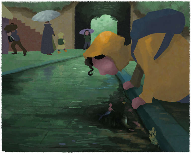
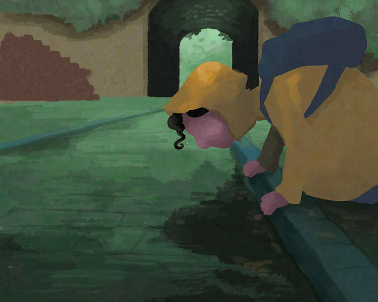
Trying to keep this one more painterly. -
Ugh, I'm at that stage of the painting where I hate it and just want to chuck it. I can't tell if its just because I'm like 80% there. And the reflections are killing me. Or if something is not working.Bringing whimsical creatures to life.
www.stringfellowart.com
www.instagram/stringfellowart -
"I'm at that stage of the painting where I hate it and just want to chuck it."
I feel your pain. I hate that stage so much...
What's even worse is that sometimes a painting we initially hate will come out fine and it won't have that stage. But most paintings I feel really good about in the beginning ALWAYS have the "this painting sucks, now..." stage. Ugh...
Looks great to me, though!
-
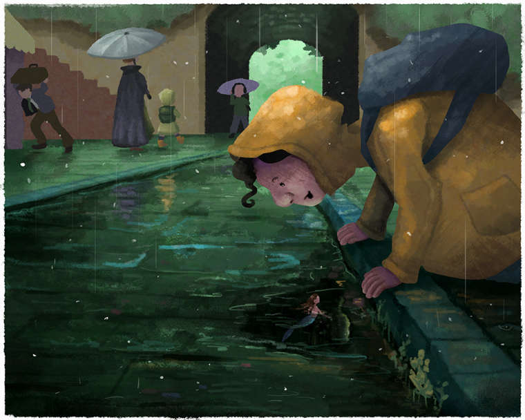
So beautiful! If I had one suggestion- it's that perhaps the archway area is a little too contrast-y. It frames his head nicely, but the contrast of the dark stone with the green foliage is a bit harsh. My eyes tend to get drawn past his head to the arch and get stuck there.
Website: www.tessawrathall.com
Instagram: www.instagram.com/tessawrathall_art/
-
@tessaw good suggestion thanks
-
This painting has made me use many dirty words. But I think I've finally worked out the reflections, so just the details are left. And the composition is way lopsided. But I just have to get it done.
Bringing whimsical creatures to life.
www.stringfellowart.com
www.instagram/stringfellowart -
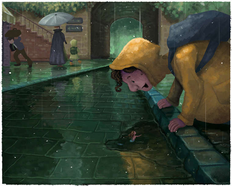
@stringfellowart the reflections looks great!
Good to see that you follow through!  I am excited to see the final look